-account-photo_listing.jpg)
-account-photo_listing.jpg)


Our Jury has worked with Prada, Nike, Chanel, Google, and Apple.
Best Restaurant Logo Designs of 2026
View the Top Restaurant Logo Designs Below
Best Logo Designs
4,200+ Submitted Designs- Advertising
- Agriculture
- AI
- Airline
- Alcohol
- App Company Logo
- Architecture
- Arts & Recreation
- Automotive
- Banking & Finance
- Beer
- Church
- Clothing Brand
- Coffee
- Content & News
- Distribution
- E-Commerce & Retail
- Education
- Engineering
- Entertainment
- eSports
- Farm
- Fashion & Beauty
- Food & Beverage
- Government
- Health & Wellness
- Hospitality
- Legal & Insurance
- Luxury
- Manufacturing
- Non-Profit
- Photography
- Professional Services
- Real Estate
- Restaurant
- Restuarants
- SEO Agencies
- Shoe Brand
- Small Business
- Software
- Sports & Leisure
- Startup
- Technology
- Travel
- Video Companies
- Weed/Cannabis
- Abstract
- Animated
- Artistic
- Bakery
- Black
- Black & Yellow
- Blue
- Bold Logo
- Brand
- British
- Business
- Circle
- Creative Name
- Dental Office
- Done by Freelancers
- Emblem
- Floral
- Geometric
- Glow
- Gradient
- Gym
- Icon
- Illustration
- Lettermark
- Logo symbols
- Makeup Brand
- Marathon
- Minimal
- Modern
- Monogram
- Multicolored
- Nature
- Negative Space
- Rebranding
- Red
- Redesign
- Simple
- Starting With the Letter S
- Successful
- Sunshine
- Trendy
- TV Channel
- Typography
- Unisex Salon
- Vintage
- Water
- Watercolor
- Wordmark
View Design
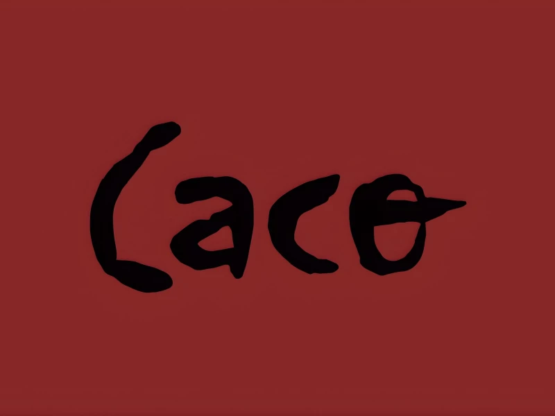
Caco
View Design
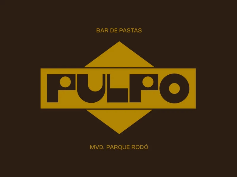
Pulpo
byPolar
View Design
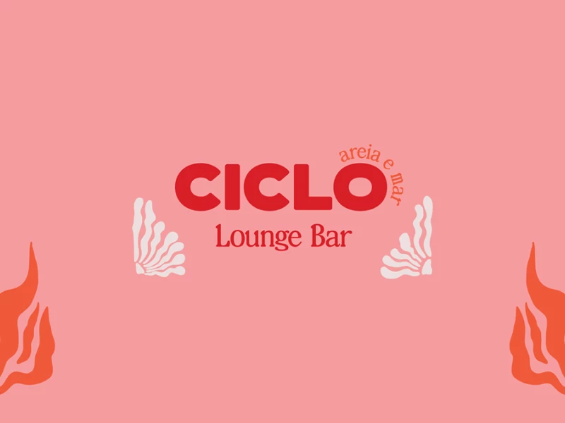
Ciclo Lounge Pop Up Bar
View Design
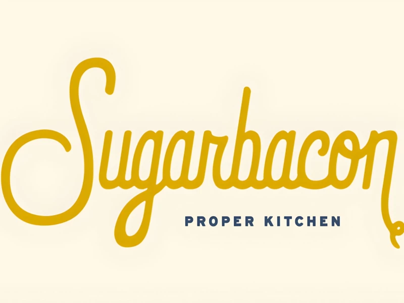
Sugarbacon Proper Kitchen
View Design
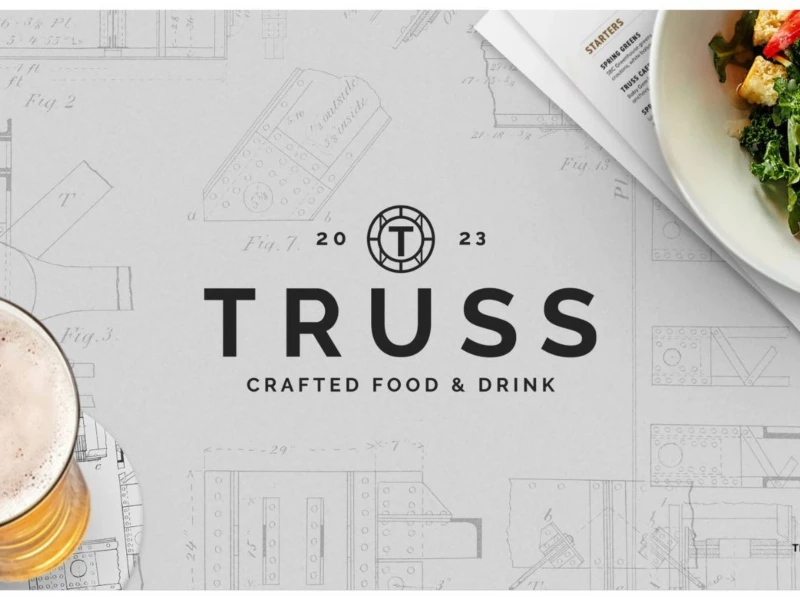
Truss
View Design
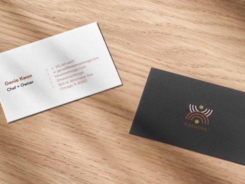
Kasama
View Design
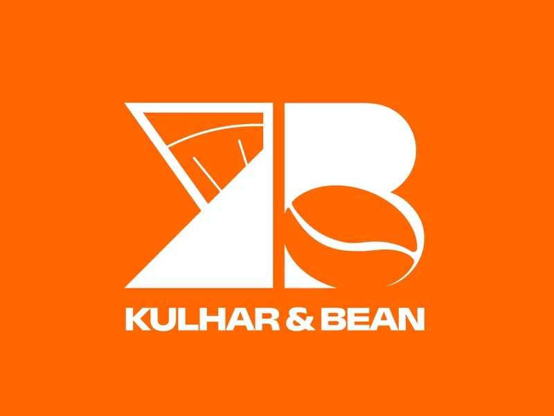
Kulhar & Bean
View Design
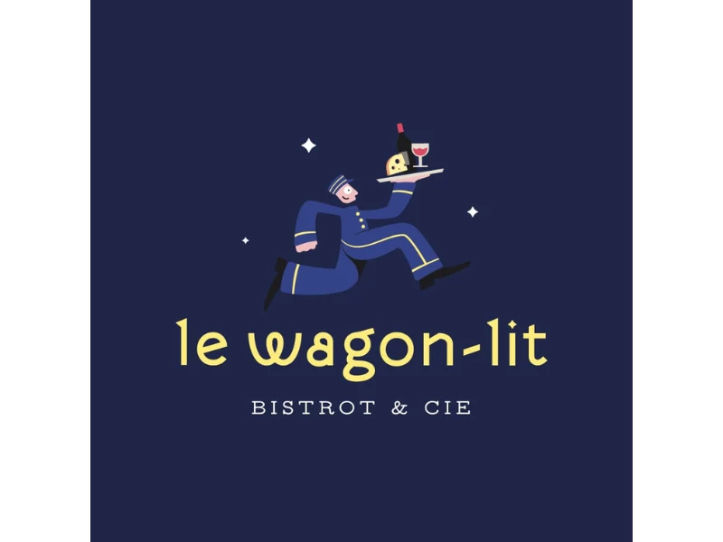
Le Wagon-Lit
View Design
ByteLogic's Unique Logo For Ball Hogs Sports Bar
Get Connected
With The Right Agency Partner
& Receive Proposals For FREE
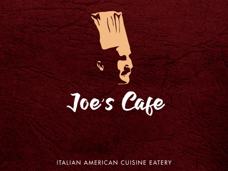
View Design
Joe's Cafe
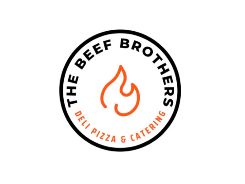
View Design
TBB The Beef Brothers
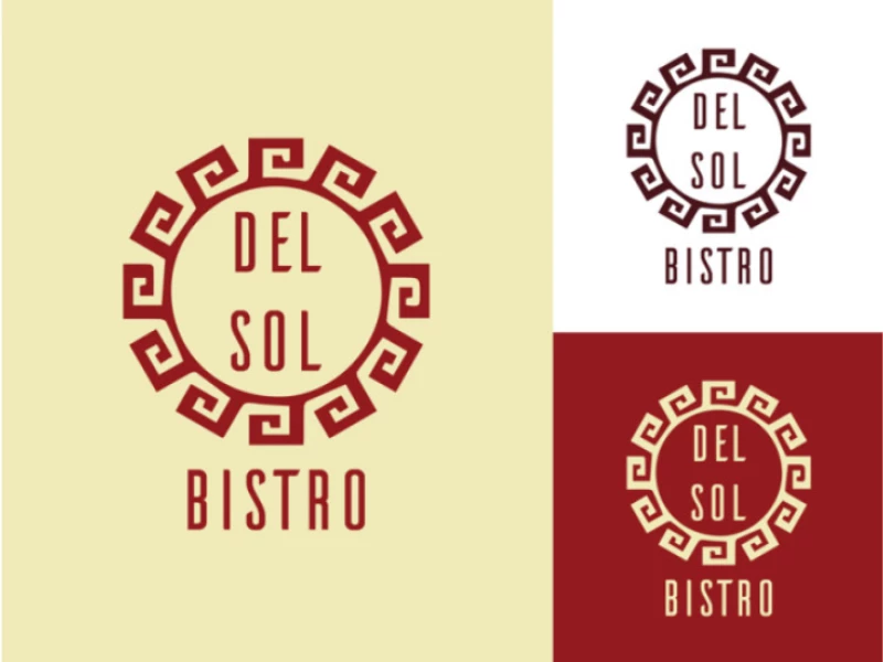
View Design
Del Sol Bistro
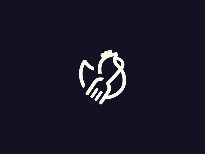
View Design
Chick 'n Dip
byCoals
View Design
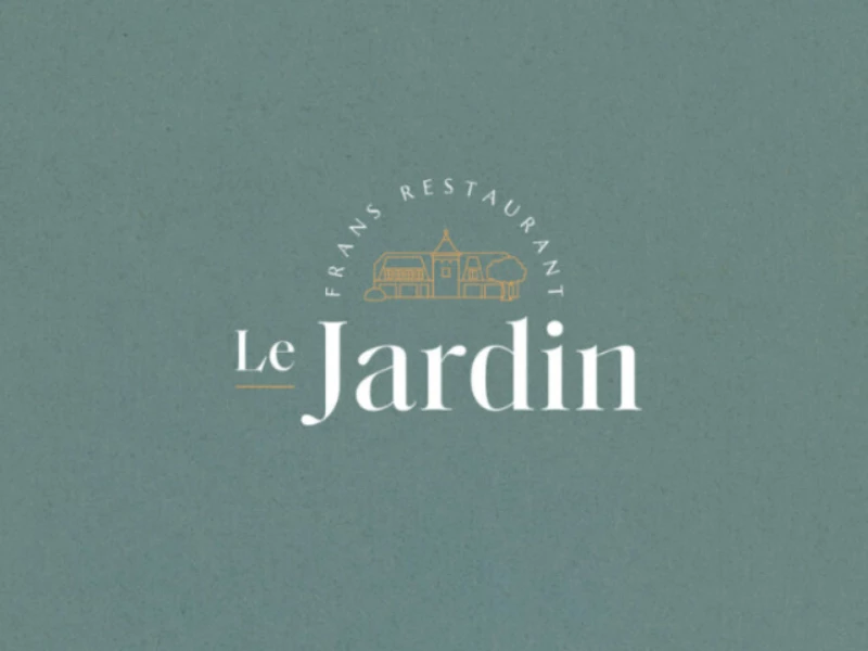
Restaurant Le Jardin
View Design
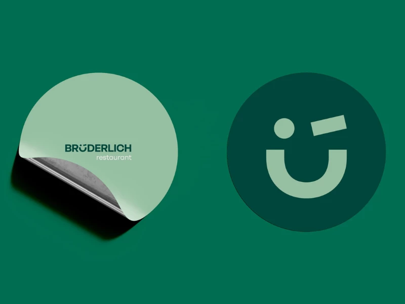
Brotherly Restaurant
View Design
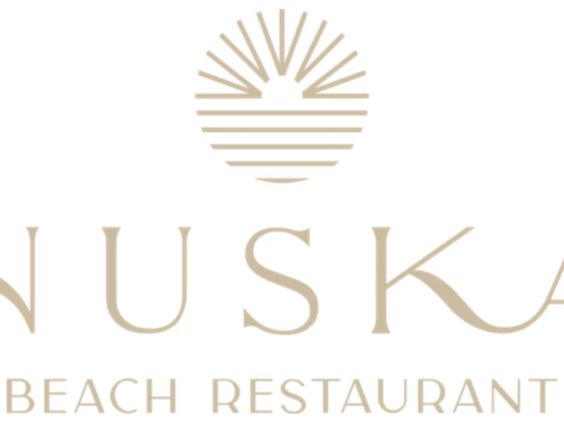
Nuska Beach Restaurant & Bar
View Design
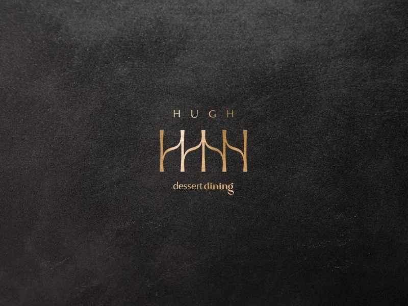
Hugh Dessert Dining
View Design
Bar Qi Cafe & Restaurant
Ready to elevate your designs?