-account-photo_listing.jpg)
-account-photo_listing.jpg)


Our Jury has worked with Prada, Nike, Chanel, Google, and Apple.
Best Technology Logo Designs of 2026
Explore the best logo designs of 2026 & get inspired by the latest trends. Elevate your online presence with creative and effective logo designs.
Best Technology Logo Designs of 2026
4,200+ Submitted Designs
- Advertising
- Agriculture
- AI
- Airline
- Alcohol
- App Company Logo
- Architecture
- Arts & Recreation
- Automotive
- Banking & Finance
- Beer
- Church
- Clothing Brand
- Coffee
- Content & News
- Distribution
- E-Commerce & Retail
- Education
- Engineering
- Entertainment
- eSports
- Farm
- Fashion & Beauty
- Food & Beverage
- Government
- Health & Wellness
- Hospitality
- Legal & Insurance
- Luxury
- Manufacturing
- Non-Profit
- Photography
- Professional Services
- Real Estate
- Restaurant
- Restuarants
- SEO Agencies
- Shoe Brand
- Small Business
- Software
- Sports & Leisure
- Startup
- Technology
- Travel
- Video Companies
- Weed/Cannabis
- Abstract
- Animated
- Artistic
- Bakery
- Black
- Black & Yellow
- Blue
- Bold Logo
- Brand
- British
- Business
- Circle
- Creative Name
- Dental Office
- Done by Freelancers
- Emblem
- Floral
- Geometric
- Glow
- Gradient
- Gym
- Icon
- Illustration
- Lettermark
- Logo symbols
- Makeup Brand
- Marathon
- Minimal
- Modern
- Monogram
- Multicolored
- Nature
- Negative Space
- Rebranding
- Red
- Redesign
- Simple
- Starting With the Letter S
- Successful
- Sunshine
- Trendy
- TV Channel
- Typography
- Unisex Salon
- Vintage
- Water
- Watercolor
- Wordmark

View Design
Q-Selection Logo Design
byVisinex

View Design
Spotify Logo: Design Analysis, History & Evolution
View Design
Roblox Logo Design Analysis
View Design
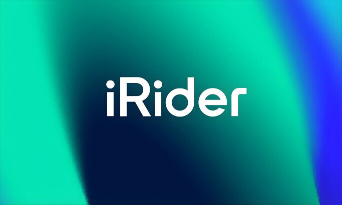
iRider
View Design
Ultra-Botics
View Design
TuSimple
View Design
Ursa Major Global Tech
View Design
Titian Space Cruise
View Design
AWS Elemental
Get Connected
With The Right Agency Partner
& Receive Proposals For FREE
View Design
Poʻokela Communications
View Design
V61 Tech
View Design
Proesc
View Design
A2B Technology
View Design
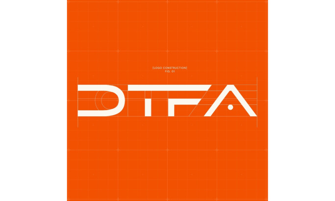
DTF Advisors

View Design
Playstation Logo
-preview.jpg)
View Design
Simomics
View Design
Signal Labs

View Design
Vitech’s Bold New Logo Redefines Tech Branding
Ready to elevate your designs?