-account-photo_listing.jpg)
-account-photo_listing.jpg)

Our Jury has worked with Prada, Nike, Chanel, Google, and Apple.
Best Packaging Designs
The best packaging of 2026 is the product as much as what's inside. See what's turning heads.
Best Packaging Designs
4,200+ Submitted Designs- Advertising
- Arts & Recreation
- Automotive
- Bread
- Chocolate
- Condiment
- Condom
- Dairy Product
- E-Commerce & Retail
- Eco and Sustainable
- Entertainment
- Fashion & Beauty
- Food & Beverage
- Frozen Food
- Health & Wellness
- Honey
- Hospitality
- Jewelry
- Luxury
- Manufacturing
- Medical & Pharmacy
- Medicine
- Olive Oil
- Pet Food
- Skincare
- Soap
- Spirit
- Sports & Leisure
- Technology
- Toys and Games
- Travel
- Watch Branding
- Wine
 Winner
★9.67/10
 BS 10.0
 KL 9.0
 DH 10.0
View Design
I AM ITALIANO Packaging Design
View Design
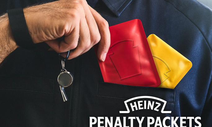
Heinz Penalty Packets Packaging Design
View Design
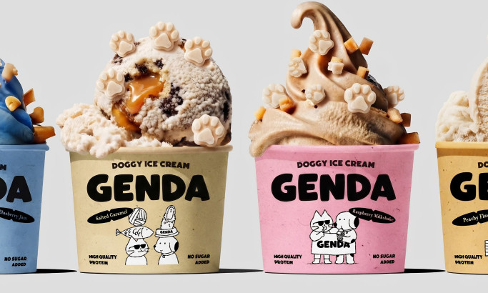
Genda Doggie Ice Cream Packaging Design
View Design
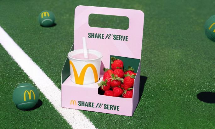
McDonald's UK – Shake n' Serve Packaging Design
byLeo UK
View Design
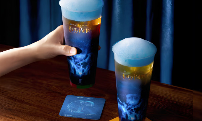
Gong Cha – Patronus Elderflower Powder Lime Teas Packaging Design
View Design
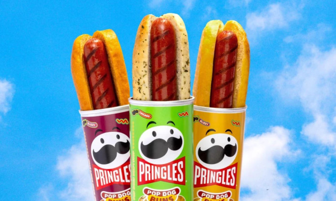
Pringles Pop Dog Buns Packaging Design
View Design
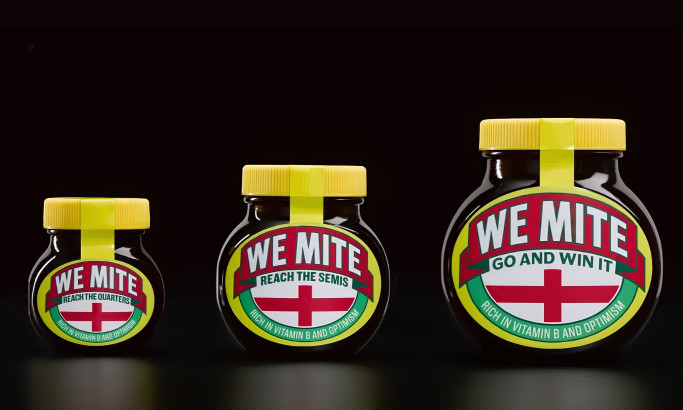
WeMite Packaging Design
View Design
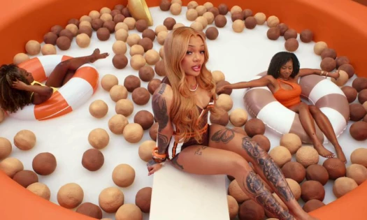
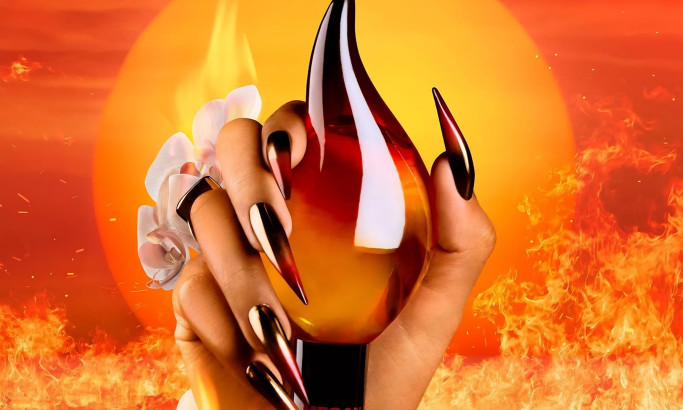
Hot Girl Summer Packaging Design
View Design
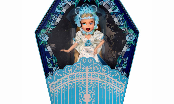
Bratz x Rodarte Collector Doll Packaging Design
Get Connected
With The Right Agency Partner
& Receive Proposals For FREE
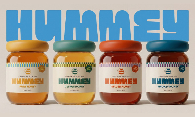
View Design
Hummey Honey Packaging Design
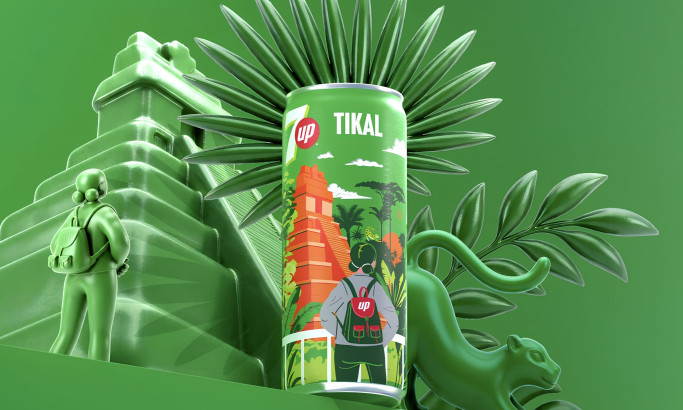
View Design
7UP Destinos Guatemala Collection Packaging Design
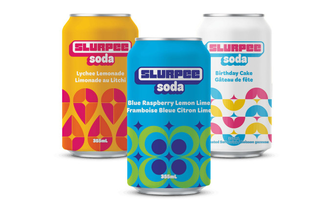
View Design
7-Eleven Canned Slurpee Soda Packaging Design
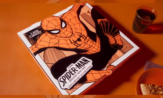
View Design
Webberoni Pizza Packaging Design
byMcKinney
View Design
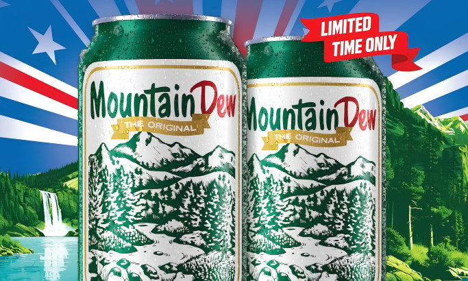
Mountain Dew 1948 Commemorative Can Packaging Design
View Design
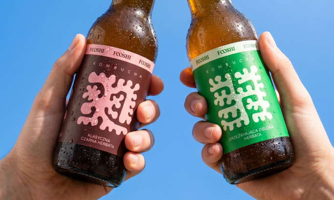
Fooshi Packaging Design
byMotyw
View Design
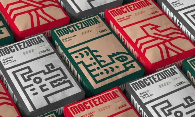
Moctezuma Packaging Design
View Design
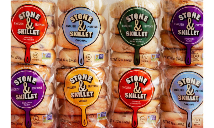
Stone & Skillet Packaging Design
byWedge
View Design
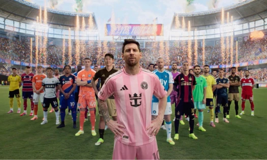
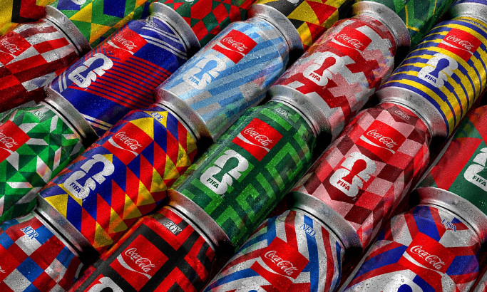
Coca-Cola FIFA World Cup 26 Collectible Country Cans Packaging Design
byGOLDEN
Ready to elevate your designs?