-account-photo_listing.jpg)
-account-photo_listing.jpg)


Our Jury has worked with Prada, Nike, Chanel, Google, and Apple.
Best Limited Color Packaging Designs of 2026
View the Top Limited Color Packaging Designs Below
Best Limited Color Packaging Designs of 2026
4,200+ Submitted Designs
- Advertising
- Arts & Recreation
- Automotive
- Bread
- Chocolate
- Condiment
- Condom
- Dairy Product
- E-Commerce & Retail
- Eco and Sustainable
- Entertainment
- Fashion & Beauty
- Food & Beverage
- Frozen Food
- Health & Wellness
- Honey
- Hospitality
- Jewelry
- Luxury
- Manufacturing
- Medical & Pharmacy
- Medicine
- Olive Oil
- Pet Food
- Skincare
- Soap
- Spirit
- Sports & Leisure
- Technology
- Toys and Games
- Travel
- Watch Branding
- Wine
-preview.jpg)
View Design
Pavillon Le Corbusier - Fantasie Architekturen
View Design
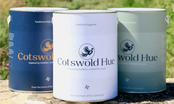
Cotswold Hue Paint
-preview.jpg)
View Design
Dylan's Ice Cream

View Design
Naked
-preview.jpg)
View Design
Muller
-preview.jpg)
View Design
Wellbeing Functionals
Get Connected
With The Right Agency Partner
& Receive Proposals For FREE
Ready to elevate your designs?