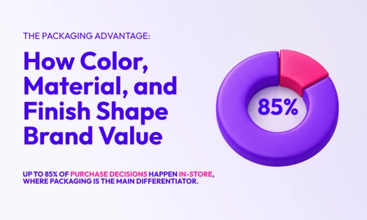
This article explores some of the most creative cereal box designs created by the best packaging designers today.
Breakfast is the most important meal of the day, and cereal is a popular choice worldwide. With numerous options available, cereal brands focus on eye-catching packaging to attract consumers. Creative packaging designs are also crucial in catching attention and convincing shoppers to add cereal boxes to their carts.
1. CeReals by The Creative Coast Studio
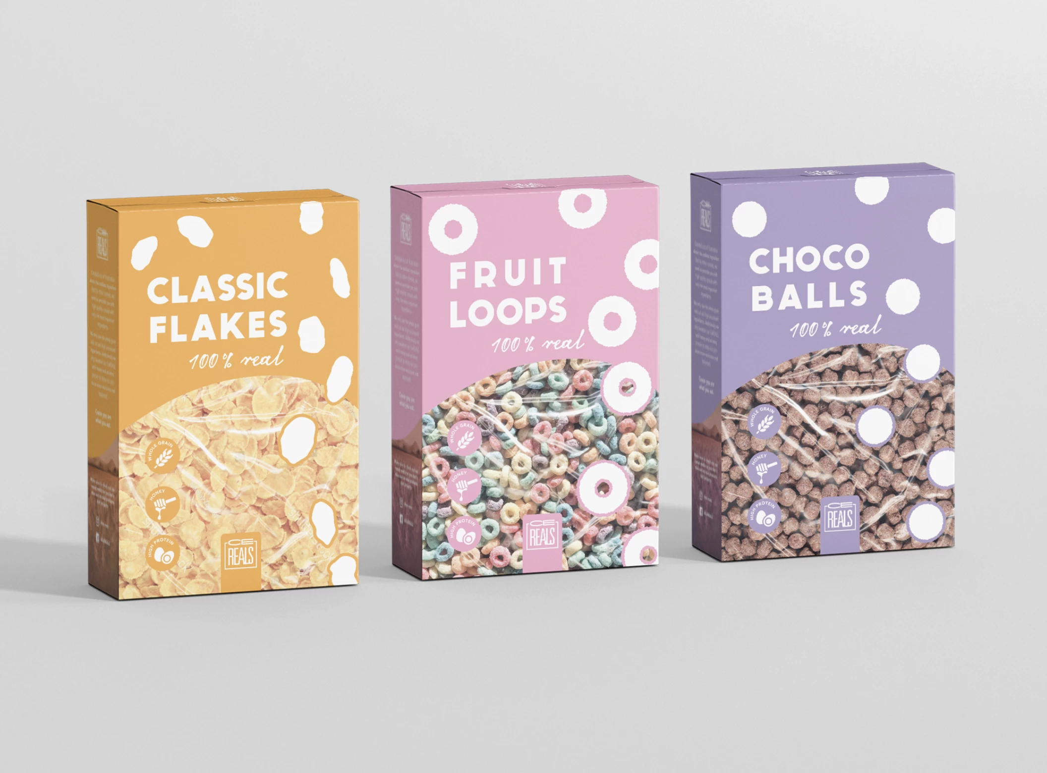
Standout Features:
- Pastel colors
- Bold images
- Random shapes
The Creative Coast Studio used one of the tried and tested methods of creating attractive cereal packaging, using pastel colors to distinguish between different flavors. The result is a pleasing cereal box packaging that stands out.
Instead of photoshopped images, the packaging features realistic and high-quality photos as if the consumer is looking directly at the product. The box design also features outlines of the cereals to add a dash of playfulness.
2. Coco Crunch by Studio.Ro
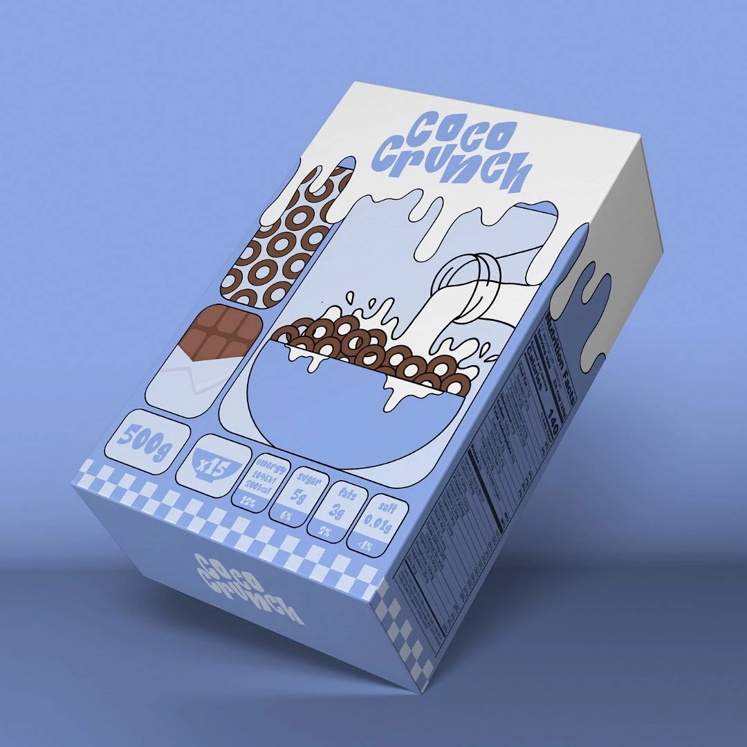
Standout Features:
- 2D comics-inspired
- Neat visuals
- Pastel colors
Coco Crunch’s cereal packaging design by Studio.Ro features illustrations inspired by 2D comics, with a playful font style and pleasing colors. There are also illustrations of chocolate bars and a cartoon version of the cereal.
The agency used pastel blue shades, off-white, and black for the cereal packaging design, with an effect as if there’s milk dripping around the box. This design move brings fun and playfulness to the overall packaging.
Check out some more packaging design inspirations.
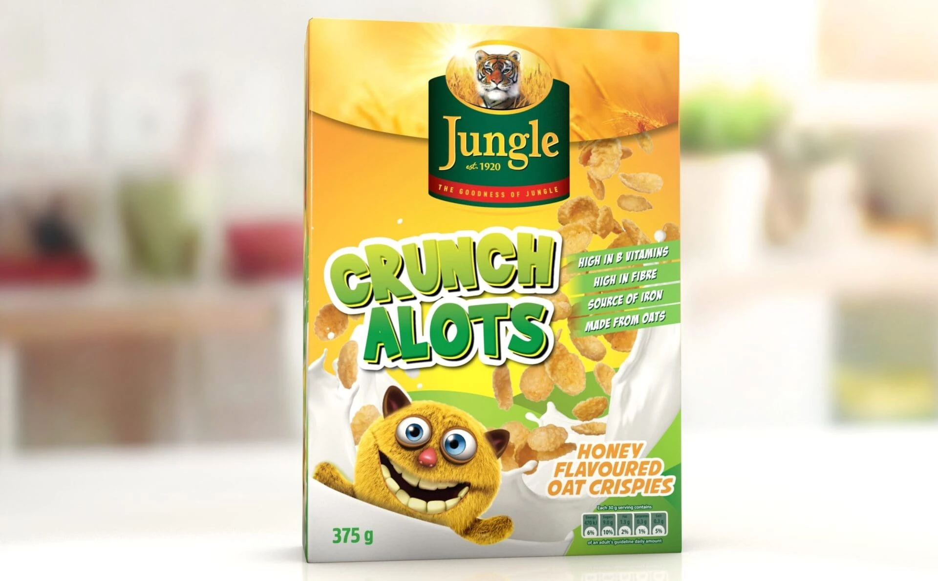
3. JUNGLE by Berge Farrell
Standout Features:
- Versatile packaging design
- Prominent logo placement
- Simple yet meaningful
Cereal brand Jungle wants a cereal packaging design that is effortless yet appealing to all audiences, and Berge Farrell stepped up to the challenge. As a result, Jungle boasts a versatile packaging design that lures in more potential buyers!
The packaging design allows it to be adaptable to different products under the brand. It features a red band with the Jungle logo design at the center and pictures of grains or cereals. Another highlight of the packaging is the nutritional information at the lower corner, letting consumers weigh its benefits easily. The design looks simple, yet holds a lot of meaning as it can be used to represent different product variations.
Look at these best sweets packaging design examples.
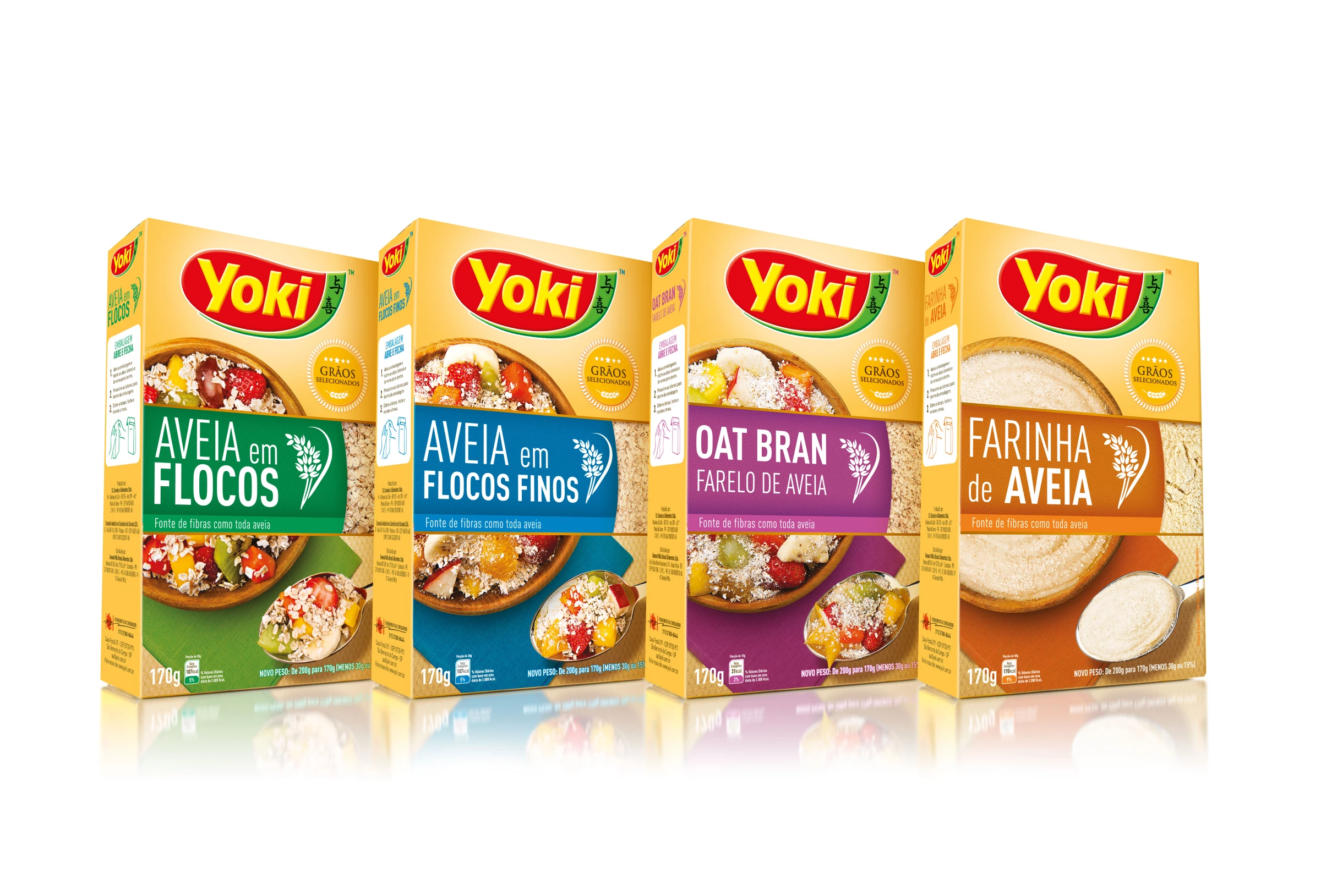
4. Yoki Oat by Thatiana Ferreira
Standout Features:
- Bright yellow colors
- Enticing yet realistic images
- Legible typography
Yoki Oat’s cereal box packaging design by Thatiana Ferreira comes in a standard box design. However, what makes it a standout are the colors. The agency utilized bright colors to create a striking and appetizing packaging design.
The designer used bright yellow and orange as one of the primary colors of the cereal box, which stimulates, energizes, and awakens the appetite. Additionally, the packaging features a serving suggestion in legible typography with delicious fruits and other toppings enough to pique one’s curiosity.
Explore some of these most colorful packaging designs.
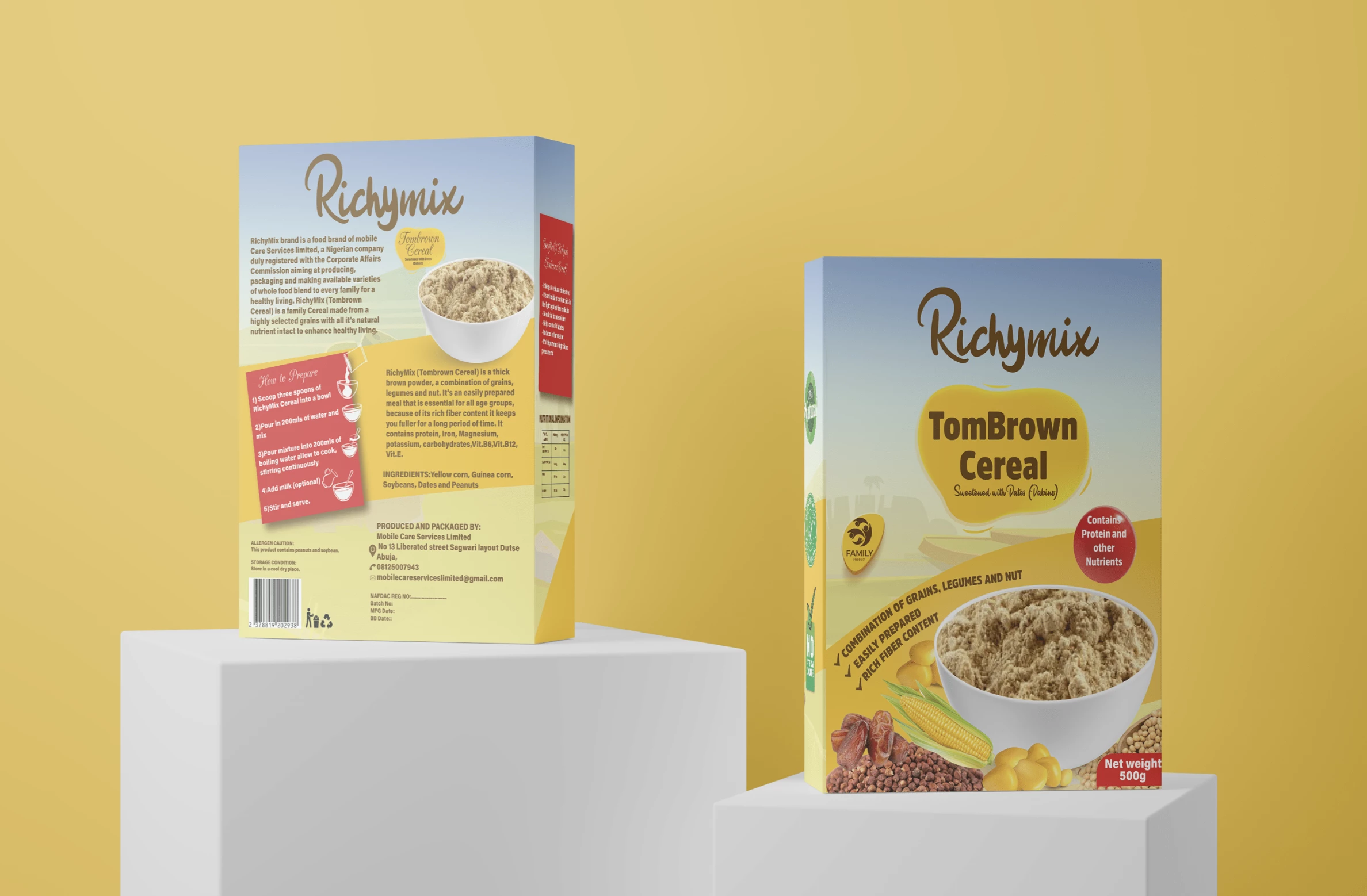
5. RichyMix TomBrown Cereal by Michael Shabi
Standout Features:
- Calming color palette
- Product image used
- Informative packaging
Another cereal box packaging design that utilized the morning sky’s color palette is Michael Shabi’s design for RichyMix TomBrown Cereal. This design shows a perfect way of using a combination of relaxing and enticing colors.
The actual product image was also used, which also doubles as a serving suggestion, along with the product’s main ingredients. The packaging is filled with informative text, such as nutritional information and ways to prepare it.
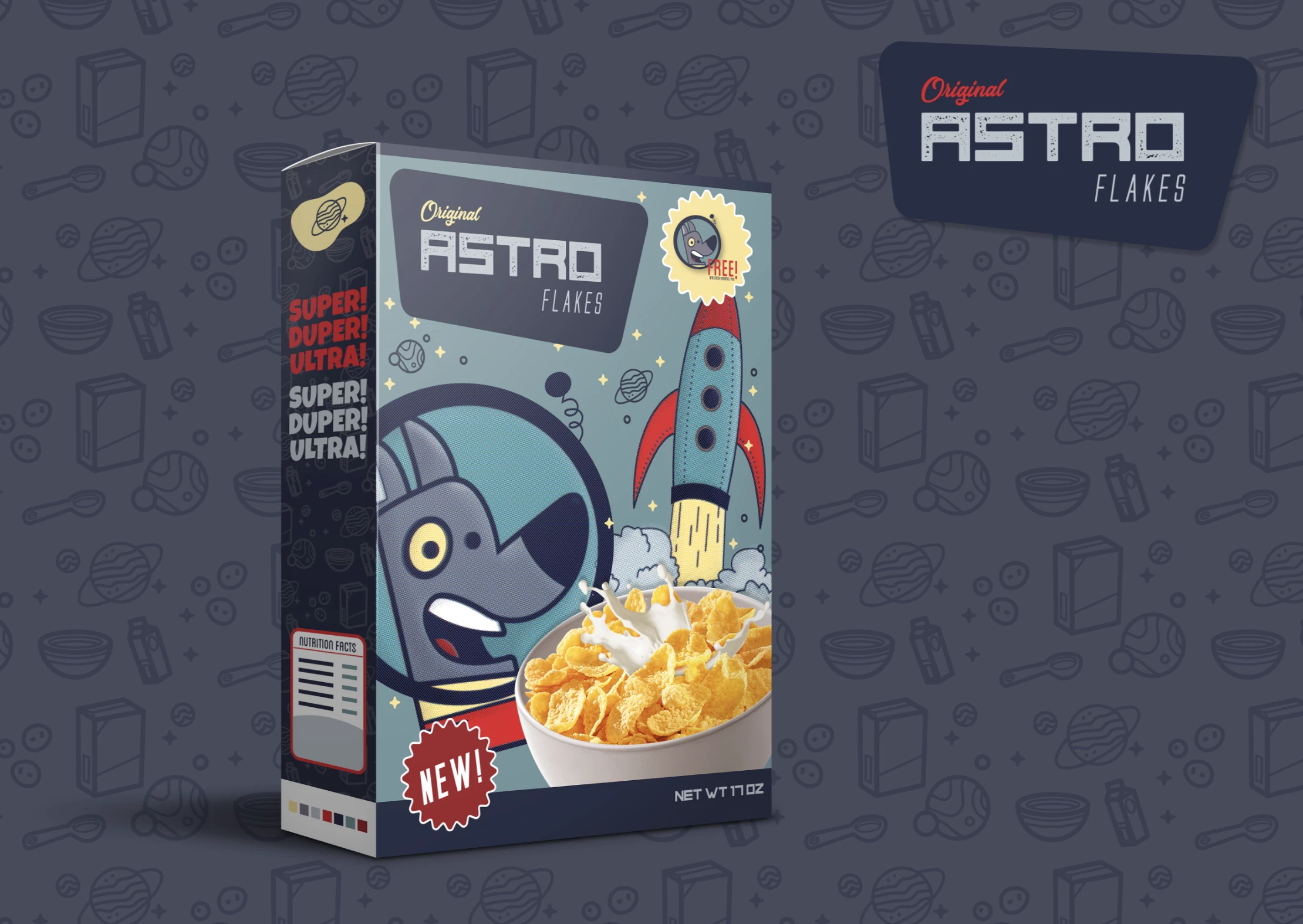
6. Astroflakes by Angelica Lora
Standout Features:
- Space adventure theme
- Cute dog illustration
- Playful design
Astroflakes’ cereal box packaging by Angelica Lora stayed true to the brand’s name, using a space theme that charms children. The icons used are also perfect for the brand, with icons of rockets and the starry night in the background painting a vivid picture for the kids.
From the colors used to the cute dog illustration in front of the packaging, the animated visuals motivate the kids to try what seems to be original-flavored cornflakes, which aren’t a conventional choice of cereal for kids. The design is also playful as it features smiling characters and a fun vibe for the target audience.
7. Honey Loops by Rachel Buda
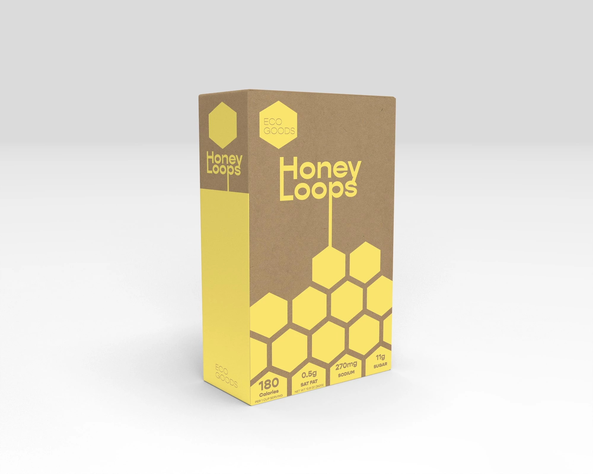
Standout Features:
- Honeycomb prints
- Relevant color story
- Product image peek
Honey Loops’ cereal packaging by Rachel Buda is another excellent example of how aligning the visual designs to the brand identity is the best way to attract brand recall and recognition.
The agency stayed true to the brand's identity and a beautiful bee theme. They used honeycomb-inspired visuals, such as hexagons and a yellow and brown color story. At the back of the packaging, they also added hexagons which offer a glimpse of the product.
8. Zlucky by Muffin Group
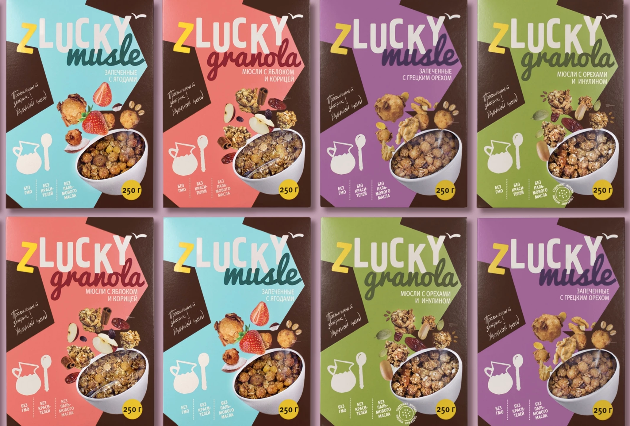
Standout Features:
- Pastel colors
- A mix of different fonts
- Tempting product photo
Design agency Muffin Group created a simplistic, albeit striking cereal box packaging design for Zlucky. The agency utilized a mix of pastel colors to create an appetite-stimulating look without being too overwhelming on senses other than your visual taste buds.
The fonts on the product are unique and eye-catching. The picture of the product looks very appealing and makes people want to buy it. The packaging also has information about what is inside, so customers can ensure they know what they are buying.
9. Sinflox by Luisa Vidales Reina
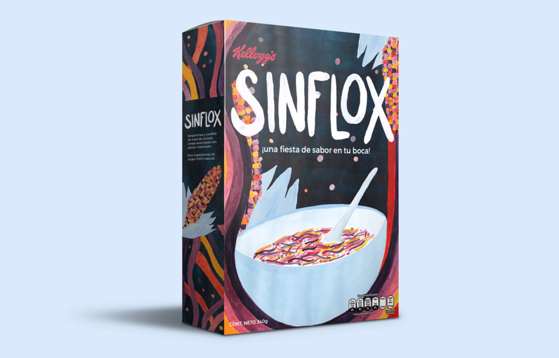
Standout Features:
- Dark-colored background
- Complementing colors
- Product image placement
Packaging designer Luisa Vidales Reina focused on using complementary colors to create a bold and attractive design for the Sinflox cereal box. The dominant hue being the various degrees of purple, it provides an energizing yet calming effect.
The product image is strategically placed, giving the customer a better feel of what they're purchasing. The dark-colored background makes the product stand out even more. The colors used for the typography in the packaging are also very eye-catching, making it easier to read and understand.
10. Morning Energy by BeBrand Studio
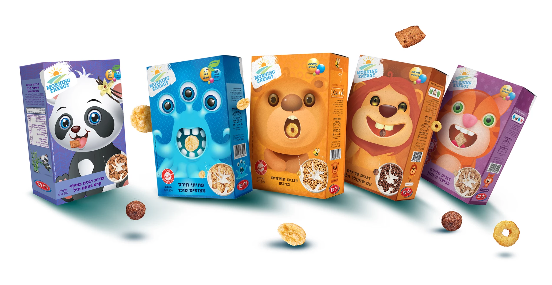
Standout Features:
- Cute animals
- Bright colors
- Design for the target audience
Morning Energy's cereal box packaging design by BeBrand Studio is an excellent example of drawing from your target audience to create a fun and inviting design.
The agency tapped into pure imagination, opting for bright colors and cutesy animals, which effortlessly "hunt" for the attention of their target market, the little ones. The vibrant and engaging colors make it more appealing to kids. Additionally, the product photo is very realistic, giving customers an idea of what they can expect when purchasing.
11. Kellogg's Despicable Me by Rainwater Creative
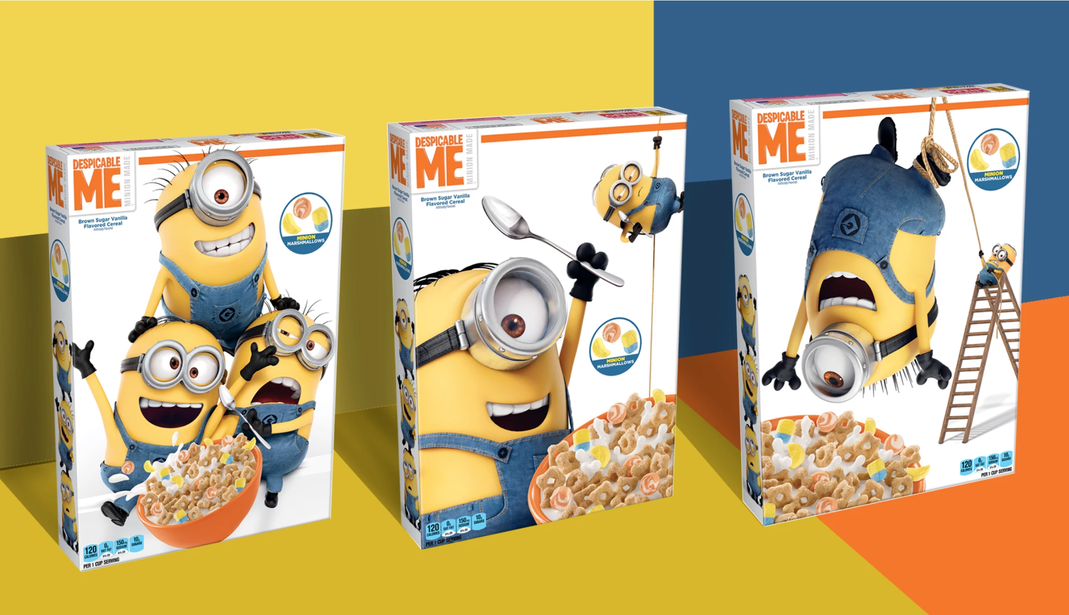
Standout Features:
- Animated character images
- On-brand design
- Colorful background
Rainwater Creative created an instantly recognizable cereal box packaging design for Kellogg's Despicable Me cereal line, using everybody's favorite Minions. While licensed products customarily rely solely on their respective characters (without putting much more effort) the agency aimed to "replay" the original hit and animated the product packaging using the "stars" to emphasize the product.
Using an on-brand design and bright colors, they were able to recapture the film's feeling, turning "despicable" into likable (and tasty!).

Our design experts recognize the most innovative and creative designs from across the globe. Visit Design Awards to see the:
- Best Logo Designs
- Best Website Designs
- Best Video Designs
- Best Print Designs
- Best Packaging Designs
- Best App Designs
Our team also ranks agencies worldwide to help you find a qualified agency partner. Visit our Agency Directory for the top Logo Design Companies, as well as:
- Top Web Design Agencies
- Top Video Production Companies
- Top Print Design Companies
- Top Packaging Design Companies
- Top Mobile App Development Companies