Volcano At Home’s Clever Packaging Stands Out From The Competition Morally And Visually
Volcano Coffee Roaster is a coffee house founded in 2010 by coffee connoisseur Kurt Stewart. This Brixton, based coffee roaster combines his passion and dedication to create a coffee that is complex and worldly.
The brand works with coffee roasters across the globe to create coffee combinations that excite and amaze, standing out from the South London competition.
London is a huge city for coffee, with dozens of coffee chains, and even more independent coffee houses lining the streets. Coffee is an integral part of a Londoner’s day, and the brand’s founder is determined to make sure these people have access to the best cup possible.
Coffee is grown all around the world, often by small farmers living on the edge. We are committed to working with these farmers and their coffee-growing communities to increase the quality and hence the value of their product. At the same time, we only work with partners and importers who actively engage in promoting sustainability and community-based improvements. It takes many more hands to produce small batch, speciality coffee than it does to turn out commodity coffee, but we wouldn’t have it any other way.This innovative, green coffee brand is intent on fostering a community of coffee lovers intent on keeping the earth a happy, healthy and safe place for all people, creatures and life. It’s a playful brand that elevates the coffee drinking experience in an exciting and sustainable way. And to capture this effervescence, the brand turned to creative agency Commission to help them create a stunning brand identity.
Volcano At Home is the latest venture of South London independent coffee roasters, Volcano Coffee Works. Commission designed the visual language for this arm of the Volcano brand, along with retail, subscription and wholesale packaging. Volcano have developed 100% compostable, Nespresso-compatible coffee pods, filled with ethically traded coffee, roasted small-batch by their independent team in Brixton. A clear consideration of science and craft runs through the brand and offered a clear starting point to inform the Volcano At Home branding and packaging.There’s an exciting mix here of sophistication and science-backed excellence, a dedication to sustainability and clever creativity.
This is a brand that knows its products and has taken their mission another step forward to infuse integrity, honor and morality into their products. It’s a brand with a soul. It’s a brand with a powerful ethos and moral compass that it instills into its products and packaging design.
This packaging effortlessly and playfully encompasses the brand’s heart and soul. It’s a creative and bright design that takes this design from ordinary to extraordinary.

These Volcano At Home Packaging Designs Use Bold Color And Minimal Copy To Make A Statement
The Volcano At Home coffee pods shine in this innovative, smooth and seductive packaging design. Instead of sitting in boxes all haphazard, disorganized and lacking in creativity, these coffee pods get their own compartments. This sleek design is innovative and futuristic, embedding its ethos and moral compass into its design to promote green initiatives and sustainability.
This isn’t just a brand that makes good coffee, it’s a brand that cares about the earth, too.
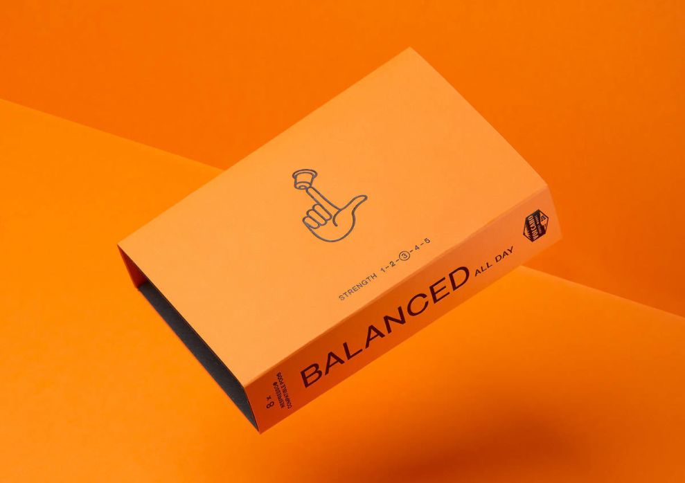
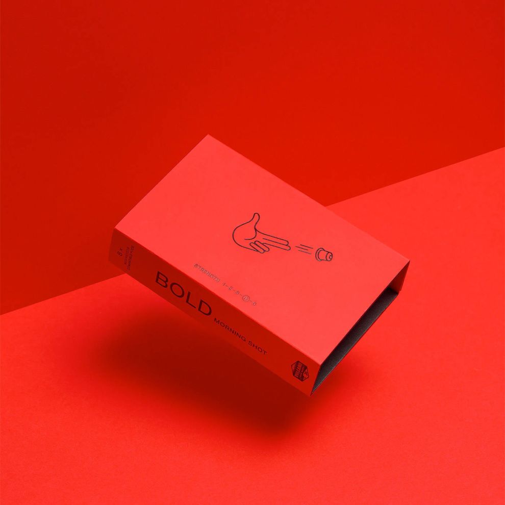
These boxes come in a structured, sleek and simple shape. These thin boxes hold six pods all with their own holders. But let’s start outside and work our way in.
These boxes are wrapped in a sleek, smooth, matte coating. They come in a range of excitingly vivid colors — red, orange and black. These colors strike an emotional chord and set the mood. They’re regal and sophisticated as well and playful and fun.
There’s a modernity in the tangibility here, the smooth surface makes you want to rub your fingers along it.
On these designs, there is also a handy and crafty illustration that puts the brand on full display. The illustrations change, but they’re all about the pods. Bullhorns blast the pods into the air, hands hold it up and fingers flick it. These illustrations are soft, simple and small — but they certainly pack a punch. There is minimal copy on the front, just a message about the brand’s sustainability which is a subtle way to promote its ethos to the world.
On the sides of these designs is where the bold typography starts to make itself known. On one edge the brand name is written out in bold, eye-catching sans-serif font in capitalized letters. On the other, an adjective is used to describe the coffee within in a similar style. Words like bold, reserve and balanced describe the coffee and elicit emotion.
Opening up this packaging is unique too, and it certainly puts sustainability first.
The pods sit in a card tray made from a single sheet of 100% recycled fibre board, folded double, to occupy as little space, and use as little material, as possible. Hand-drawn icons reflect the distinct characteristics of each coffee, while the electric red and orange of the Bold Morning Shot and Balanced All Day boxes set them apart from the richer, sweeter Reserve. The whole package offers a compact but tactile experience, delivering convenience with a conscience. Whether posted to home-subscribers or lined-up on retail shelves, the boxes aim to be as refreshing as Volcano’s ethos.These designs are light, effective and fun. ANd the inside of these designs is just as creative and innovative as the outside.
Inside, typography takes center stage. Using bright and bold text, written out in a different sized font, the brand promotes its mission and goals. It touts sustainability, prestige and heritage. It further describes the coffee, its tasting notes and where it came from.
This innovative design is all about informing, enlightening and changing perceptions. It turns coffee pod packaging on its head and creates an experience that is intuitive, serene and vivacious. There’s no denying that this packaging makes you want to dive in and explore the coffee and its tastes. But you also leave with a better understanding of how we as humans impact the earth and what our products have the potential to harm.
This packaging, like the brand, has an altruistic core. Of course, it’s pushing a product but is doing so in a way that is in-depth and layered.
This design does so much in such a small package. Illustration, typography and color entice and excite. And a strong brand ethos brings the design full circle, adding depth and compassion to the brand and its identity.
Volcano At Home’s Compostable Coffee Packages Excite And Enlighten Consumers
This packaging is bright, bold and compelling thanks to its clever use of color, illustration and typography. Similarly, this packaging design uses clean structure and superior messaging to drive home its core values of sustainability and morality.
These boxes are wrapped in a matte, sleek and soft design that shines due to its bright colors, and seductive tones. These boxes are differentiated with color and an exciting pop of bold typography that gives them a personality.
There’s is also a cute and crafty illustration on the front of the boxes. It ranges, but they all inspire movement. A hand holding a horn is illustrated using clean lines and simple design. Coming out of this horn is the word “Pods” written in capitalized, sans-serif font. In other instances, you see a hand flicking an actual pod into the air. But whatever the illustration, the creativity, liveliness and fun persona is evident. This adds depth and movement to the design, and also adds an almost loudness that makes these coffee pod boxes difficult to ignore.
Additional, simple and small copy lines the front which further emphasizes the brand’s commitment to green initiatives.
On the smaller faces of this box packaging, you have the brand name, in big, bold capitalized lettering. It’s in your face and obnoxious, daring you to get a closer look. It stands out in a smart and playful way.
And to differentiate these pods even further, different descriptors are used to call out different flavors and strengths. Words like “bold,” “balanced” and “reserve” give these pods a personality and an integrity that encourages interaction.
There’s a vivaciousness to this design that stuns. These packages are bright, bold, innovative and playful. They dare you to interact and get involved. And when they’re unwrapped, these pods really do shine.
Unlike most packaging for coffee pods, each pod gets its own little home where it can sit and be shown off.
This is an intuitive design that wants to be seen and wants to be heard.
On the inside of the packaging, there is the brand’s ethos made up of a mix of bolded, enlarged and bright text. This gives context to the brand and its initiatives in a bombastic and engaging way.
This powerful and intuitive design is emotion-evoking and thought-provoking.
There’s no denying these coffee pods stand out from the competition in terms of coffee packaging. And it’s thanks to its strong brand ethos, innovative packaging structure, bold typography and innovative use of color and illustration.