-account-photo_listing.jpg)
-account-photo_listing.jpg)


Our Jury has worked with Prada, Nike, Chanel, Google, and Apple.
Best Book Covers Print Designs of 2026
View the Top Book Covers Print Designs Below
Best Book Covers Print Designs of 2026
4,200+ Submitted Designs
- Advertising
- Architecture
- Arts & Recreation
- Banking & Finance
- E-Commerce & Retail
- Education
- Engineering
- Entertainment
- Environmental Ads and Brand Designs
- Fashion & Beauty
- Food & Beverage
- Government
- Health & Wellness
- Hospitality
- Legal & Insurance
- Luxury
- Manufacturing
- Medical & Pharmacy
- Non-Profit
- Professional Services
- Real Estate
- Sports & Leisure
- Technology
- Travel
 Winner
★8.4/10
 AO 8.80
 BS 8.40
 BS 9.60
 KS 9.20
 LB 6.00
View Design
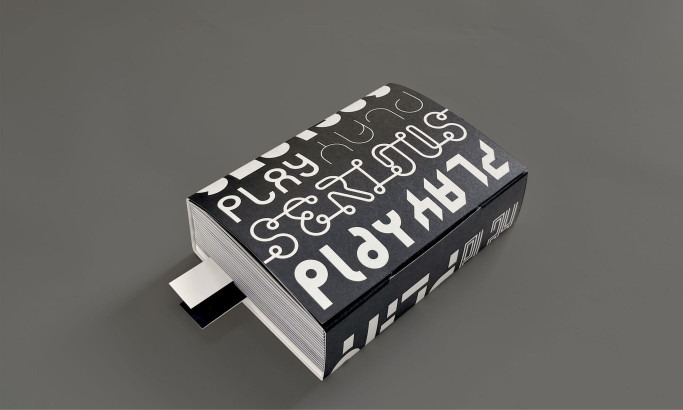
Serious Play

View Design
Cure8
 Winner
★9.53/10
- AO 9.60
- BS 10.00
 BD 9.50
 SH 9.00
View Design
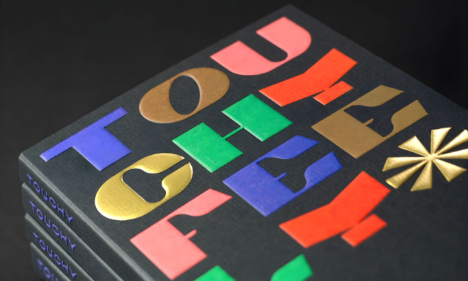
Touchy Feely
 Winner
★9/10
- AO 10.00
- BS 10.00
- BD 8.00
- SH 8.00
View Design
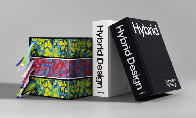
Hybrid: Curiosity in All Things
View Design
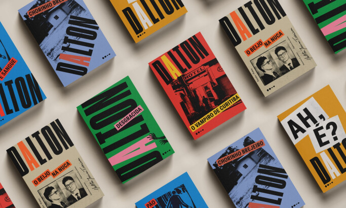
Todavia | Coleção Dalton Trevisan
View Design
Unverzollt
View Design
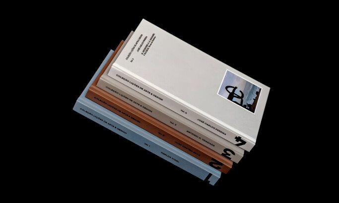
Coleção Lições de Arte & Design vols. 3-4
View Design
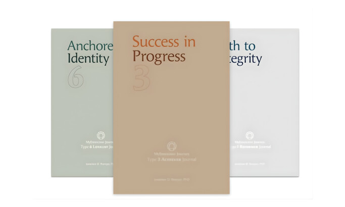
My Enneagram Journey
View Design
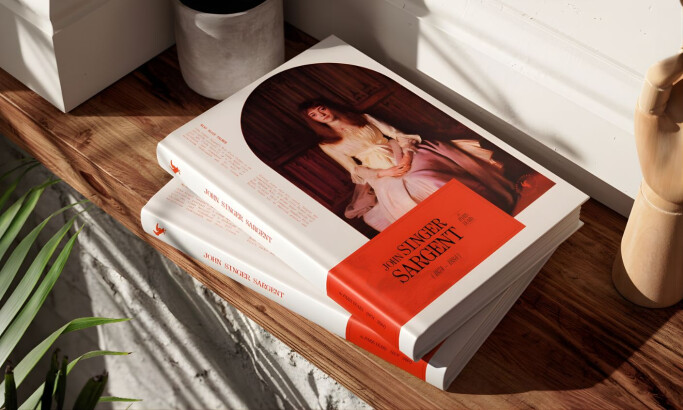
“Taschen” Style Art Book Cover
Get Connected
With The Right Agency Partner
& Receive Proposals For FREE
View Design
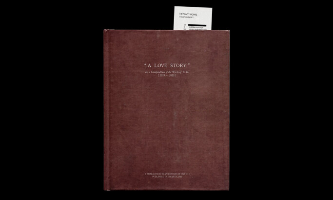
A Love Story

View Design
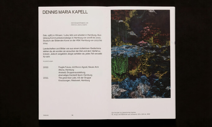
Das Gehirn: In Kunst und Wissenschaft
View Design
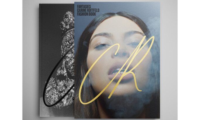
Fantasies by Carine Roitfeld
byDsorder
View Design
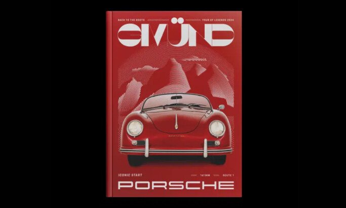
Porsche Tour of Legends

View Design
The Meriwether
byHeraphy
-preview.jpg)
View Design
From The Choices We Made
View Design
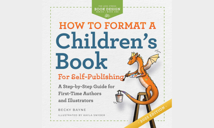
How to Format a Children's Book for Self-Publishing

View Design
555 let Jednoty bratrské v datech
View Design
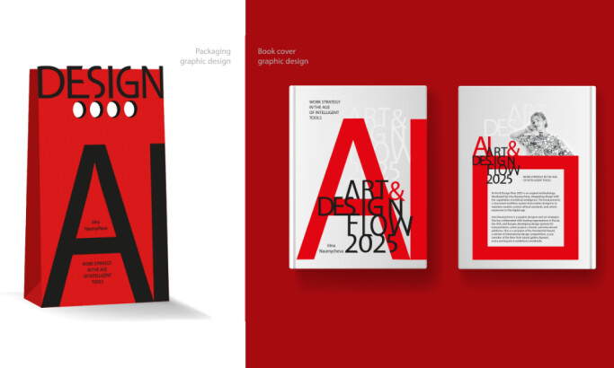
AI-Art & Design Flow 2025
Ready to elevate your designs?