The best menu print designs attract customers and showcase the establishment’s personality. This article lists the most tasteful menus worthy of being included in DesignRush's best print designs catalog.
If you want to elevate your restaurant's menu with captivating design, connect with seasoned print designers today.
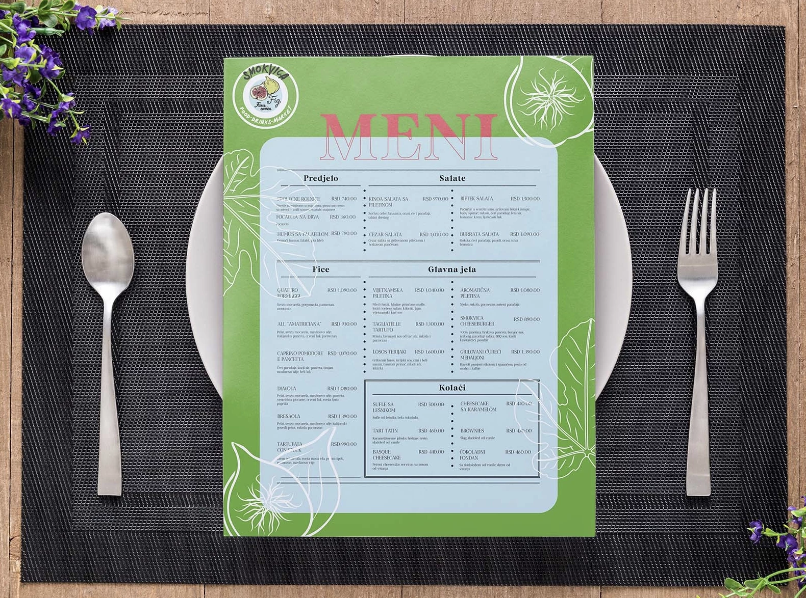
1. SMOKVICA by Ivana Tomisic
Standout Features:
- Clear and legible typography
- Fig illustrations
- Nature-inspired colors
Ivana Tomisic created a menu design for SMOKVICA, showcasing its ambiance through colors. This ensures a seamless connection to the branding, giving customers a glimpse of what the restaurant offers.
The clear and legible typography aids in easy navigation, while the nature-inspired colors add a touch of elegance. The fig illustrations accentuate the aesthetic appeal and reinforce the brand's identity, creating a memorable dining experience.
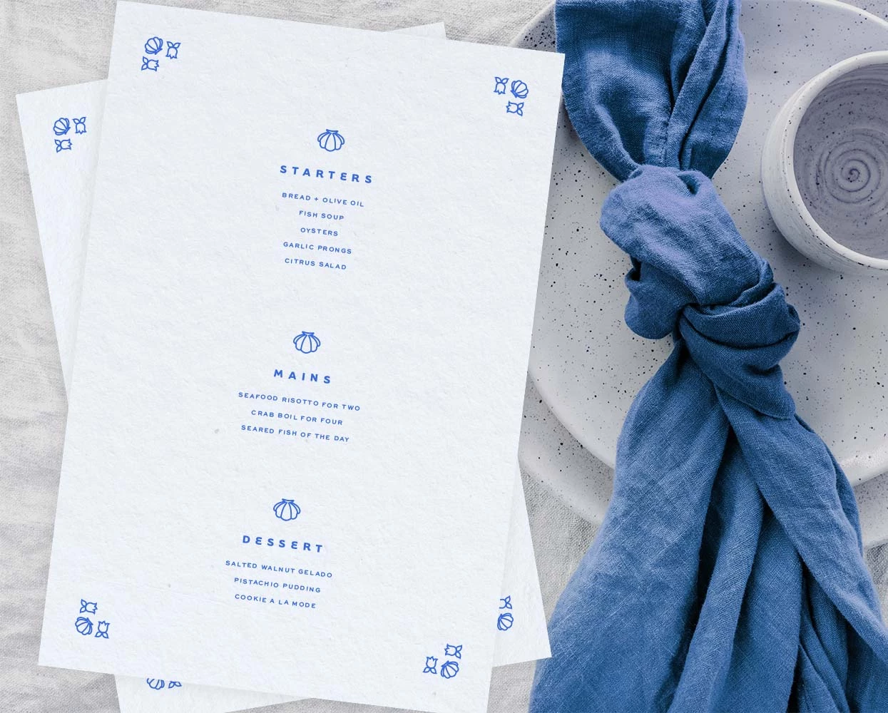
2. Seafare by Caitlin Hottinger Design
Standout Features:
- Simple color story
- Nautical illustrations
- Sans-serif typography
Caitlin Hottinger Design unveils a tranquil maritime narrative in Seafare's menu with a simple color story and nautical illustrations. The centerpiece, a lighthouse adorned with floral and aquatic icons, anchors the design, while the clean sans-serif typography ensures legibility. This boasts a sea-inspired ambiance that's inviting and on-brand.
On the other hand, the typography reinforces the simplicity of the menu print design. It features a straightforward and easy-to-read sans-serif typography. Lastly, the design displays the shell and floral illustrations, ensuring uniformity across all pages.
3. Let's Ko by Clara Jinyeong Ryu
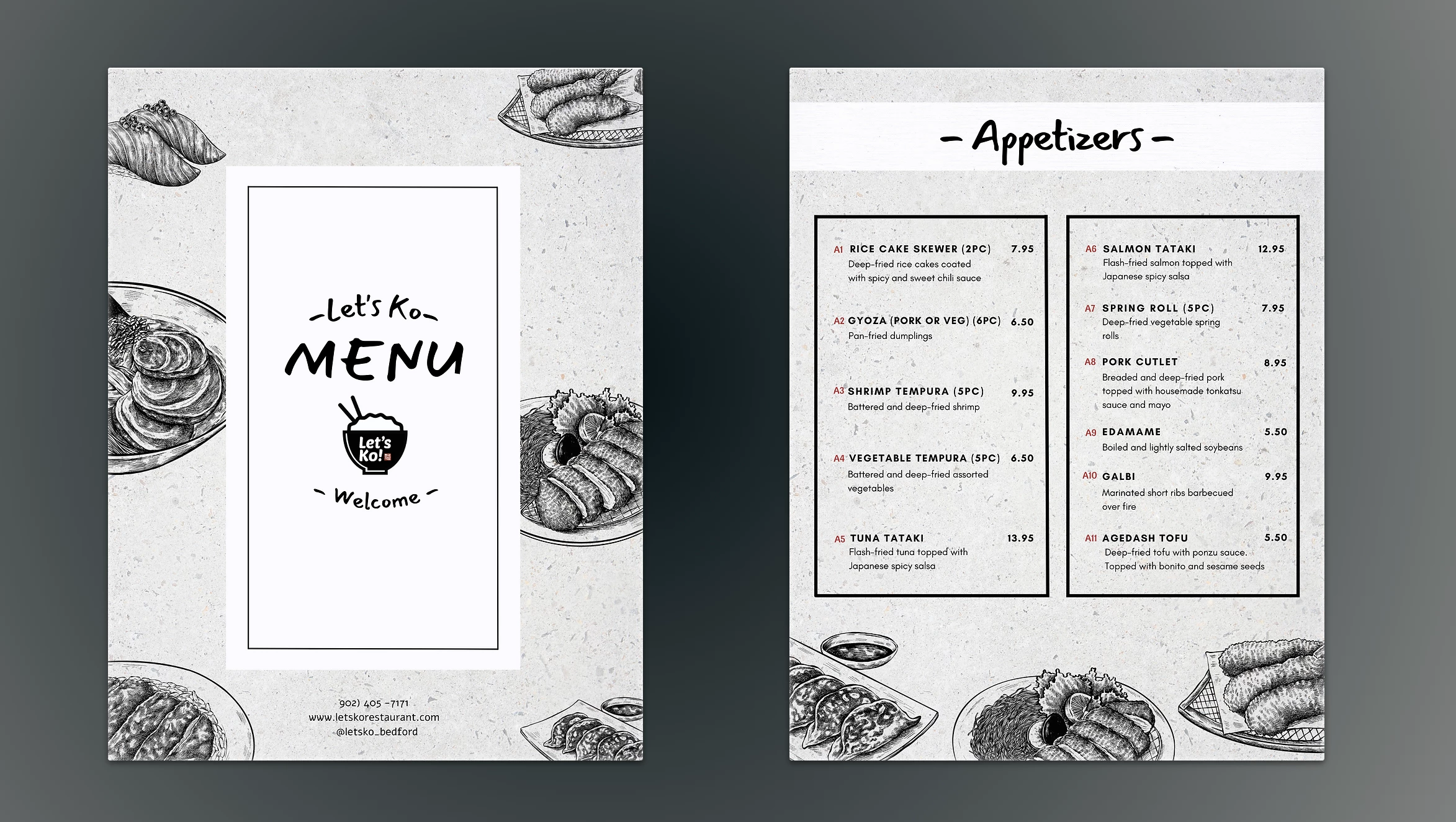
Standout Features:
- Realistic illustrations
- Monochromatic color story
- Asian-themed typography
Clara Jinyeong Ryu showcased a whimsical and traditional touch for Let's Ko's menu design. This reflects a fusion of Korean and Japanese cuisines, encapsulated in realistic illustrations, a monochromatic color story, and Asian-themed typography.
The primary colors and the handwritten font style are drawn from the restaurant's logo. Unlike most menu designs with colorful photos of the food, the menu design for Let’s Ko mirrors the simplicity and minimalistic approach of typical Asian designs.
Discover the best print designs with bold fonts.
4. Westport Café by Charlie Burt
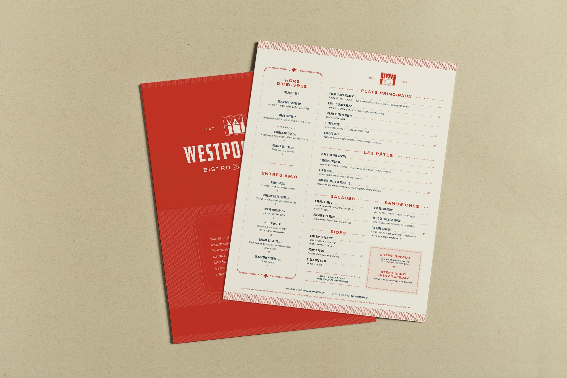
Standout Features:
- Organized layout
- Vibrant color story
- Prominent logo placement
For Westport Café, designer Charlie Burt created a menu design to usher in a new era for the restaurant. The result is a straightforward yet visually appealing menu design centered on the restaurant’s logo.
The color story, prominent logo placement, and clear delineation of food offerings make the menu easy to follow. The logo is also placed on both menu pages, strengthening brand recall.
5. Ron's Burger Shack by Human Nature Studios
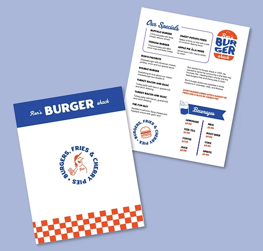
Standout Features:
- Retro
- Detailed descriptions
- Pleasing color story
Embodying the classic American diner aesthetic, Human Nature Studios designed a menu for Ron's Burger Shack that pays homage to burgers, a cornerstone of American food culture. The descriptions and simple color story evoke traditional American diners' nostalgic and hearty feel, making it an appealing invitation to potential customers.
The color choices create an inviting and lively atmosphere, and the detailed descriptions make it easier for customers to choose among the food offerings.