-account-photo_listing.jpg)
-account-photo_listing.jpg)


Our Jury has worked with Prada, Nike, Chanel, Google, and Apple.
Best Restaurant Menu Designs of 2026
View the Top Restaurant Menu Designs Below
Best Restaurant Menu Designs
4,200+ Submitted Designs- Advertising
- Architecture
- Arts & Recreation
- Banking & Finance
- E-Commerce & Retail
- Education
- Engineering
- Entertainment
- Environmental Ads and Brand Designs
- Fashion & Beauty
- Food & Beverage
- Government
- Health & Wellness
- Hospitality
- Legal & Insurance
- Luxury
- Manufacturing
- Medical & Pharmacy
- Non-Profit
- Professional Services
- Real Estate
- Sports & Leisure
- Technology
- Travel
View Design
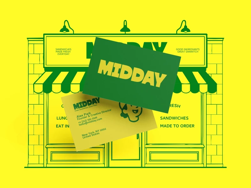
MIDDAY Print Design
View Design
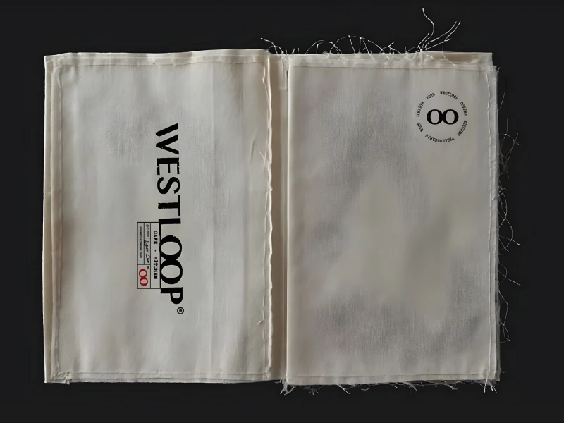
WESTLOOP
View Design
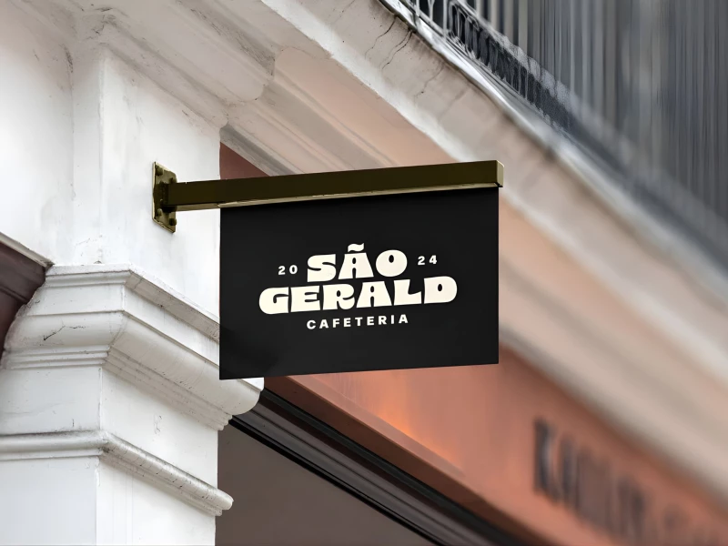
São Geraldo Cafeteria
View Design
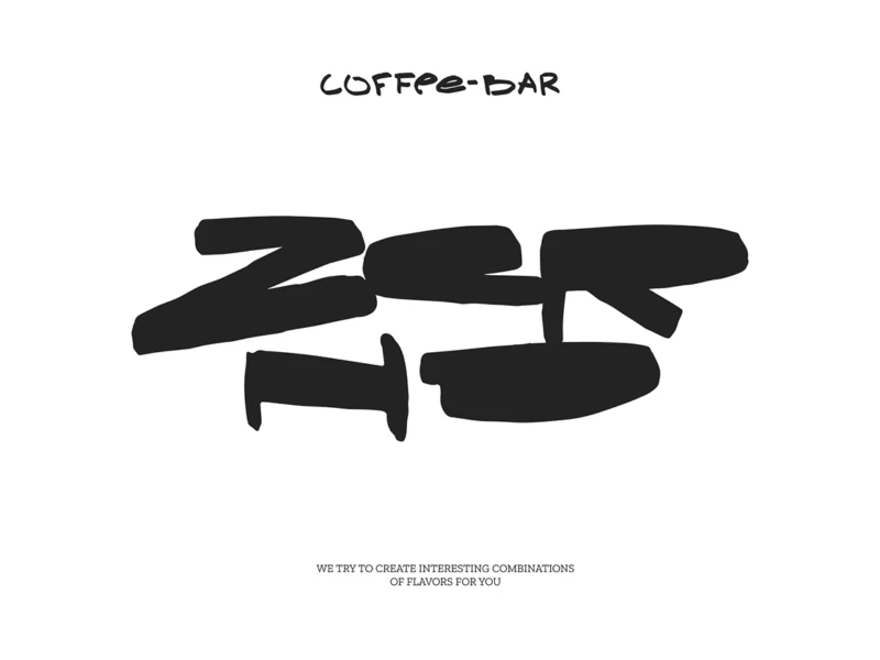
Zerno
View Design
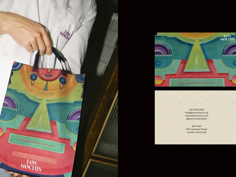
Los Mochis
View Design
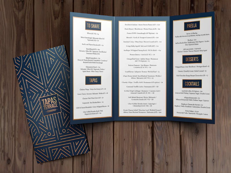
Tapas Terrace
View Design
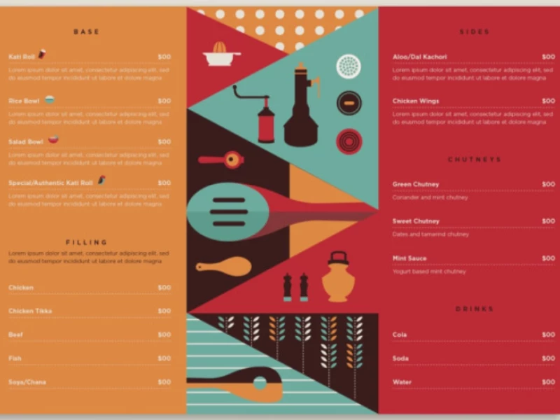
Spice N Soul
by17dnorth