Designs dedicated to kids' and babies’ needs, such as toys, clothing, and other essentials, are typically colorful and fun. While this is the typical concept, some professional designers find exploring outside the comfort zone of kids and babies needs a rewarding experience.
We have compiled a list of the best kids and baby designs for your future design projects. From fun and creative to novel and aesthetic, here are some of today's best branding designs.
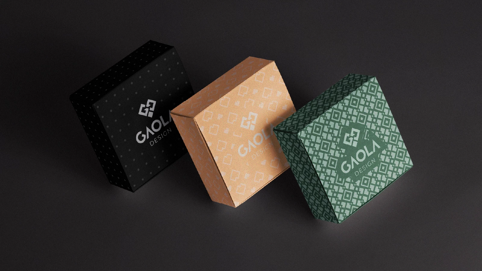
1. Gaola Design by RBR Design
Standout Features:
- Innovative design concept
- Flexible and versatile
- Pastel colors and muted shades
Many people love minimalist concepts, from household items to toys. Brazilian company Gaola Design creates wood and acrylic products for kids and toddlers. They aim to push through Scandinavian design aesthetics.
Creative agency RBR Design developed a solid branding design worthy as one of the best kids and baby designs this year. From the initials of the company name (G and D), they created a heart-shaped logo design and worked from there.
The result is an innovative and creative logo design that sends the message of love and care for kids and toddlers worldwide. The design looks superb and modern without trying too hard.
One notable thing about this design is that they made it flexible so that it can be used effortlessly on website design and in their other visual particulars.
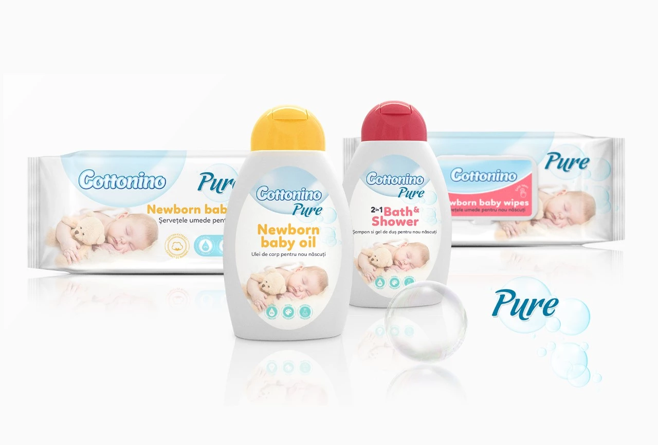
2. Cottonino Pure by Sorina Rusu
Standout Features:
- Familiar visuals
- Friendly to the eyes
- Rounded typography
Toiletries meant for babies and kids are always known to adopt a clean and pure image, which helps in marketing the products mothers can rely on to freshen up their kids.
Designer Sorina Rusu capitalized on light shades of white, red, and yellow-orange to enforce the calm and clean imagery that people are often used to in toiletries, with the design for this line of newborn baby wipes and other baby cleaning essentials.
The colors are not too sharp or bland, which is perfect because visibility on the market shelves is still a top priority. Shoppers can easily spot the packaging with their eye-friendly visuals. Another feature is the font style with rounded edges. It sends a message of safety to the parents since we all know how sharp edges can be a children’s hazard. It also looks chill and friendly.
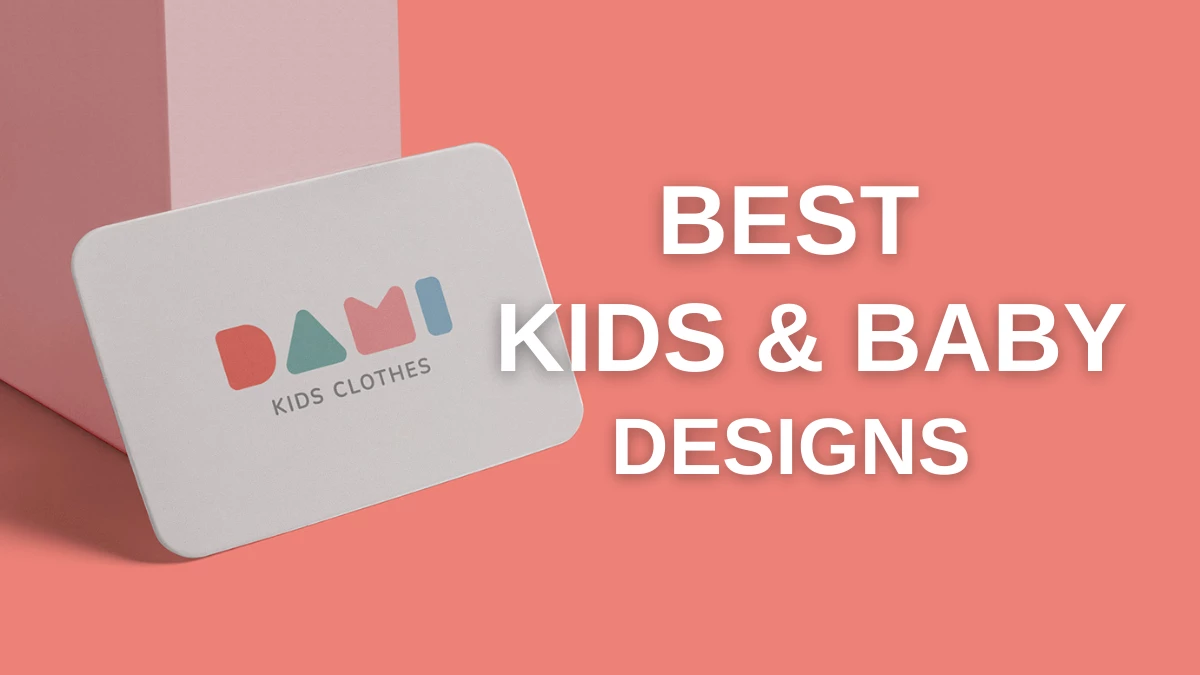
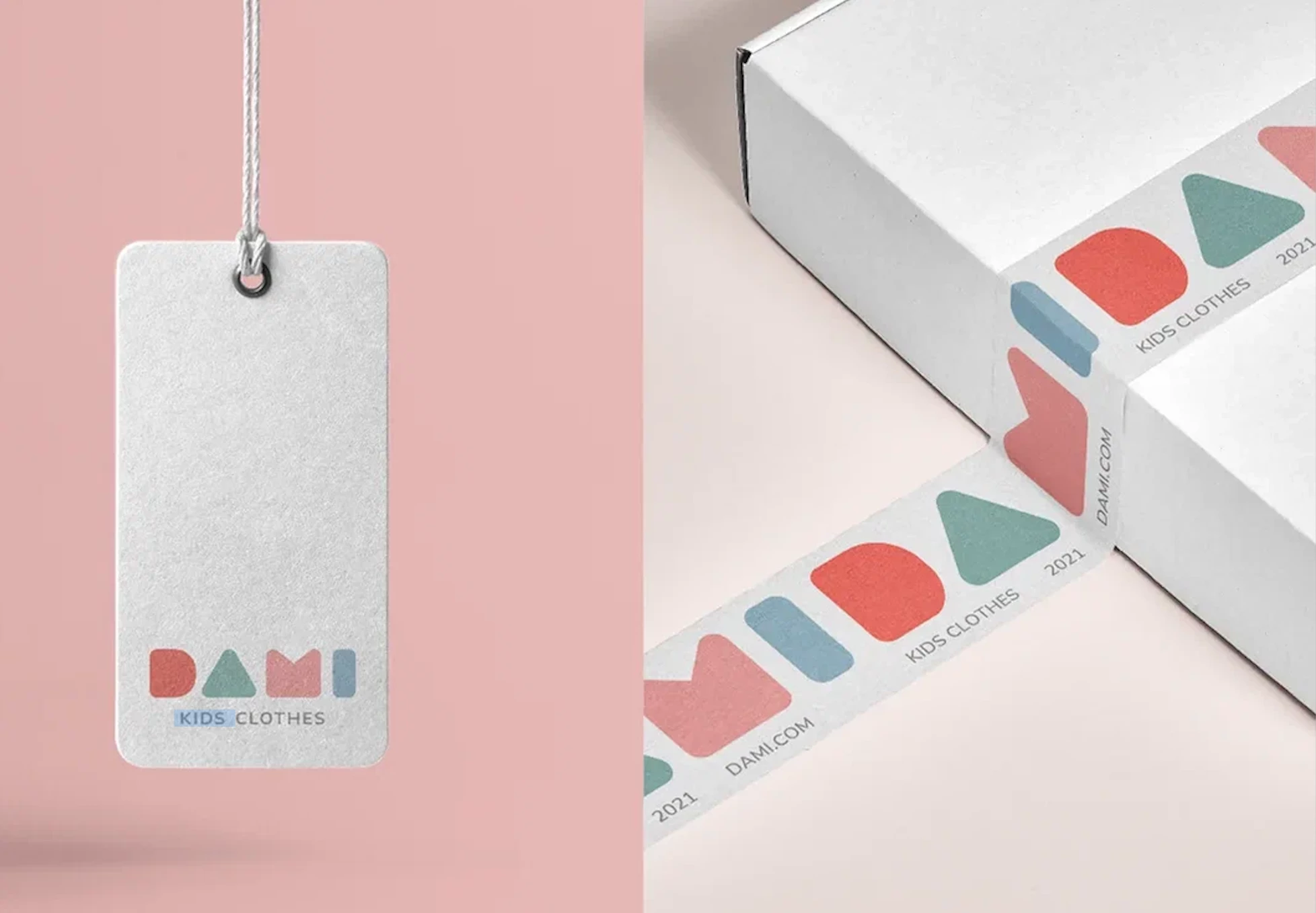
3. DAMI KIDS by Anna Khromova
Standout Features:
- A playful twist on shapes
- Subtle color story
- Easily identifiable logo
It is tempting to put a lot of visual elements on a logo design project aimed at kids and babies since they love splashes of colors and bold shapes. This next-best kids and babies design proved that basic shapes can still make things work.
For this Russian brand of kids’ apparel, designer Anna Khromova focused on the shapes babies and toddlers used to see with their playthings. The rounded edges of the shapes helped enforce the feeling of friendliness the company aims to have.
The playful take on shapes turning into letters is intelligent because it is on-brand with the company's branding identity. Additionally, the subtle shades of the colors used are also friendly to the eyes, a perfect standard feature that most brands in the industry typically have.
4. Heaven Curls by JK Creative Company
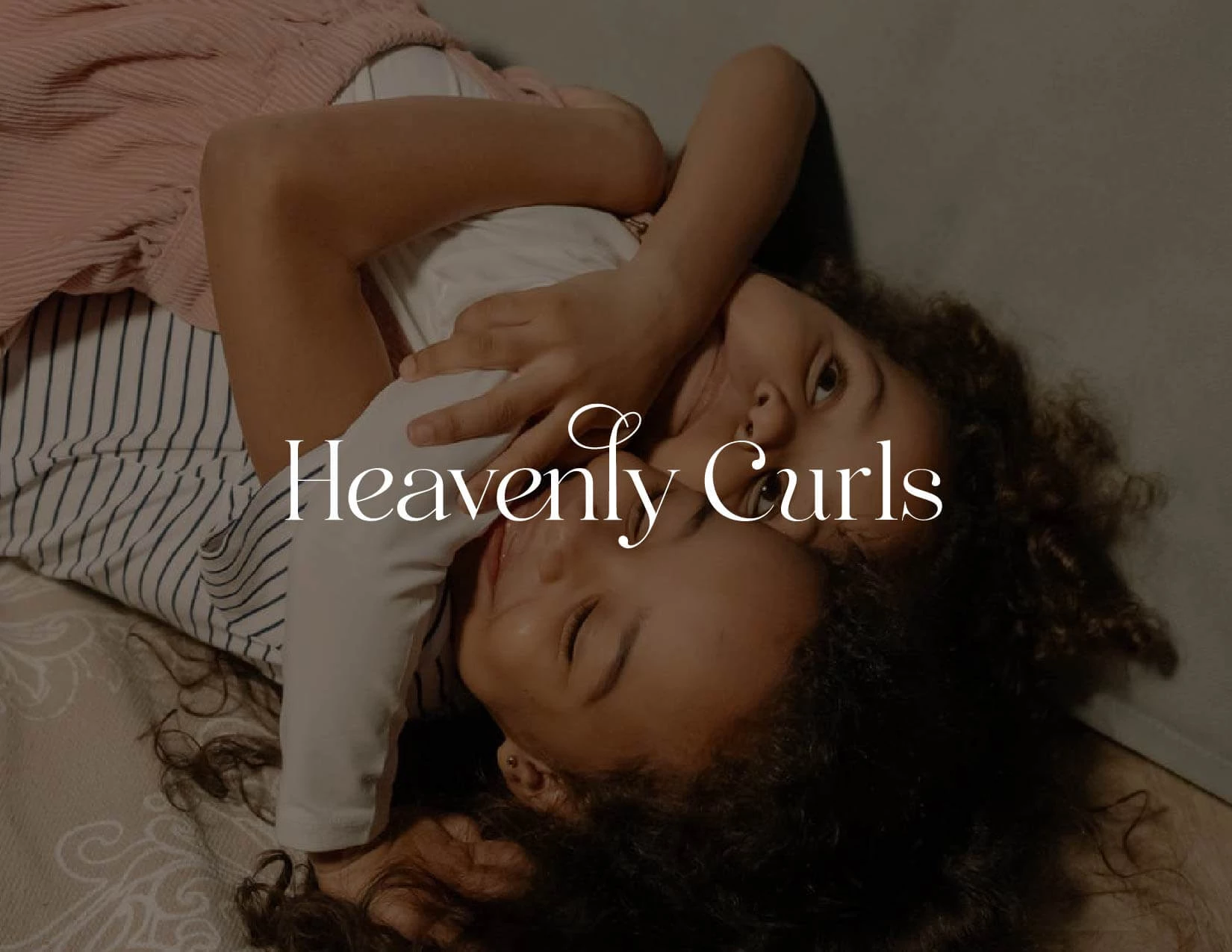
Standout Features:
- Classy packaging design
- Loopy typeface
- Softness and delicacy
For this children’s brand, branding designer JK Creative Company took it to themselves to create a solid strategy that transcends the packaging design and their branding identity to greater heights.
The brand name's loopy typeface sets the mood for the subtle elegance the brand aims to portray to its customers.
The packaging design isn't as loud as its competitors, reinforcing its classy image to its clientele. Thus, it looks elegant and, at some point, artisanal. The overall branding design, from the packaging to the branding identity, exudes an aura of fineness often associated with children and babies.
5. Baby Ann Children's Clothing by Olya Sarazhin
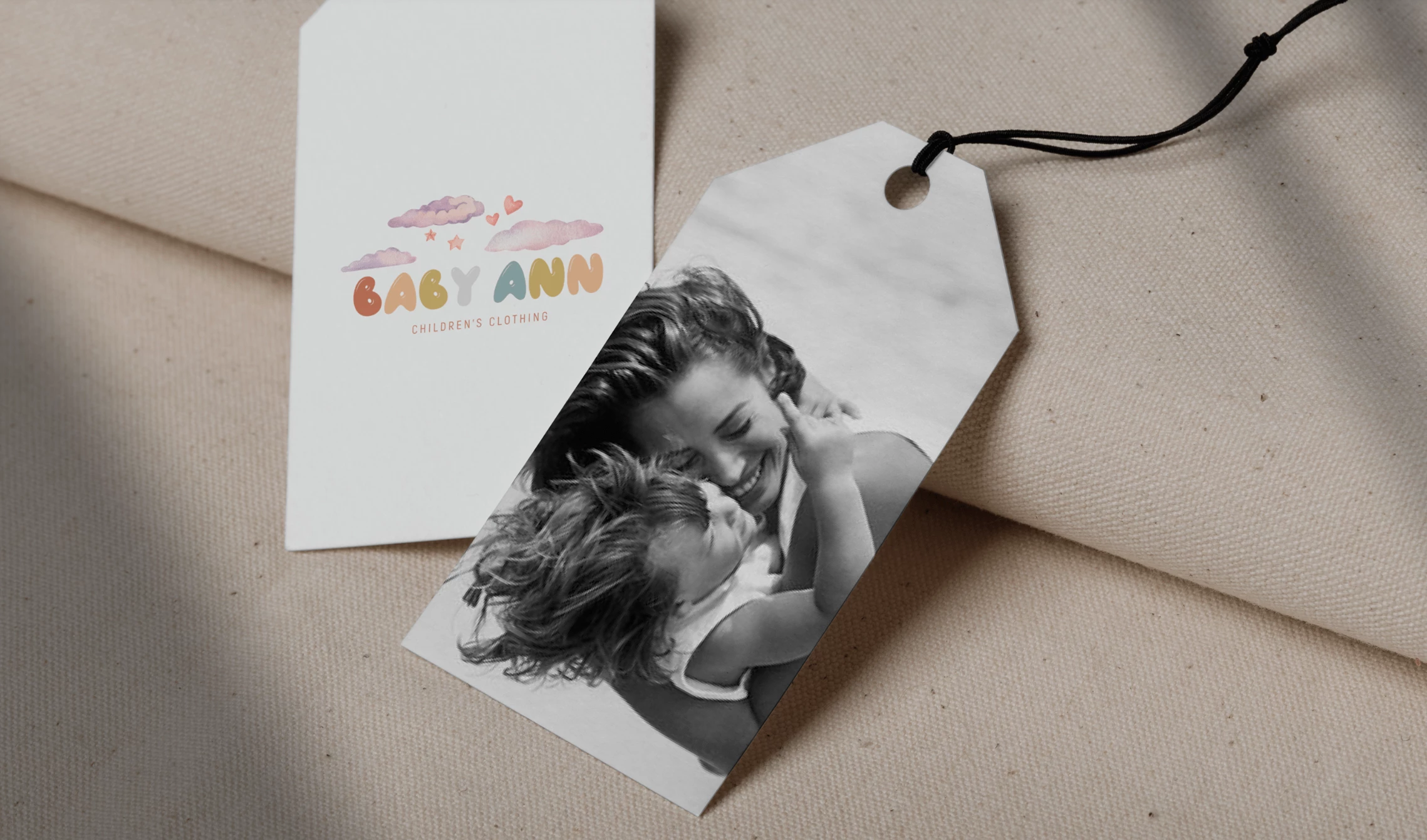
Standout Features:
- Dreamlike visuals
- Pastel color story
- Black and white images
Who says we cannot use black and white for children’s products? Sometimes, people think these colors are too dull or old for kids' and babies’ brands, but you can make this work with the right balance.
For this children’s clothing brand, designer Olya Sarazhin designed the logo with fun and warm colors. This is important because it stamps the “children” aspect of the branding identity through the logo.
The visuals used in the logo and the finished output are dreamlike and whimsical at some point, perfectly aligning with the company identity. Lastly, the agency used a black-and-white image of a mom lovingly hugging her child to reinforce the memories that mothers make with their babies, especially in infancy.
6. LITTLE UNICORN BABY PACIFIER by Kata Roman
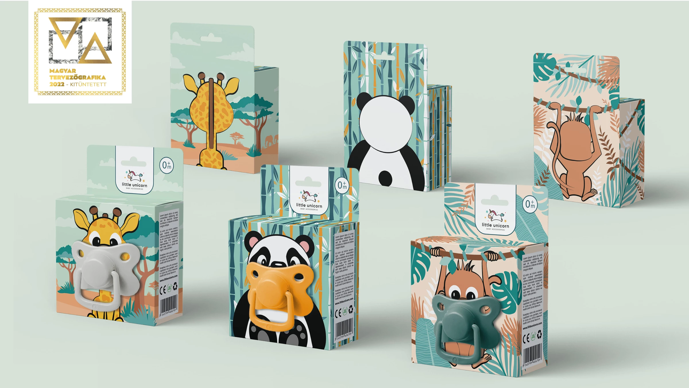
Standout Features:
- Innovative design
- Cartoon characters
- Sleek box structure
Packaging is essential for kids' and babies’ products, especially for those in close contact with them. Pacifiers must be adequately sealed to ensure the babies' safety.
Check out some fantastic hygiene and cleaning product branding examples here.
This is designer Kata Roman’s priority in designing the packaging for this baby pacifier brand. Safety and sterilization are essential factors in this design, so you cannot see the silicone teat exposed in any way.
They also effortlessly incorporated it in the design, depicting animals sucking on the pacifier. This is a fun way to package a seemingly simple item. The box packaging is also secure and tightly sealed to avoid contaminants in close contact with the silicone teat.
7. Little People by Victor Rodrigues
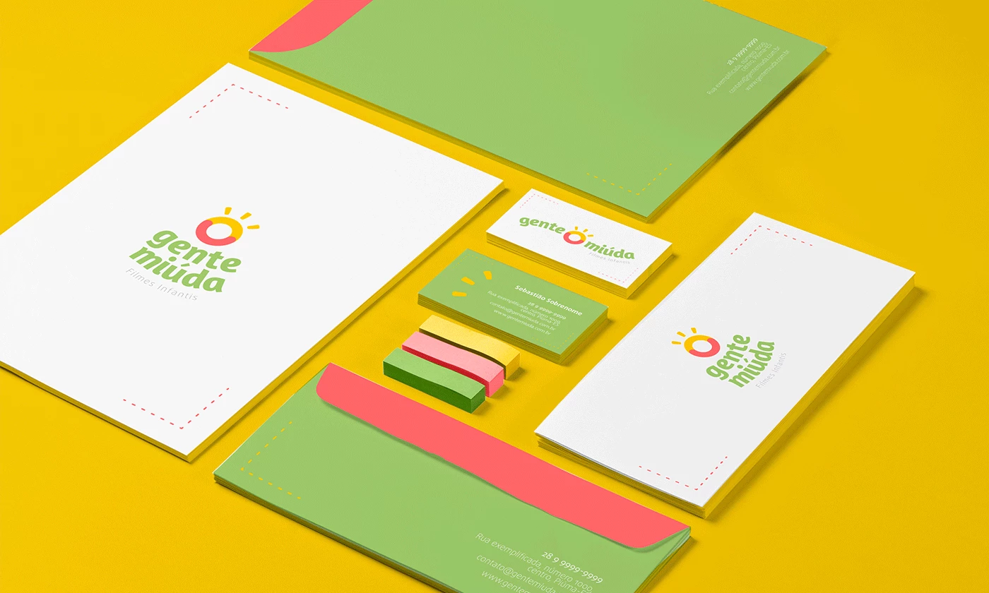
Standout Features:
- Interesting symbolism
- On-brand design concept
- Warm pastel tones
It is a must for parents to create lasting memories with their children, especially when they are still young. That’s why Little People (or Gente Miuda in native Portuguese) strives to give that experience to their customers through their products.
Their logo design by Victor Rodrigues highlights three important things to children and parents: memories, happiness, and love.
The logo itself is a combination of three known elements that convey these emotions: the sun (happiness), the camera lens (memories), and smiles (love).
Combining these icons is no easy task, but the designer did it so seamlessly that you won’t see which one is what. The colors used are also perfect in capturing that ideal environment for families to create memories everyone will enjoy. It is essential to blend various branding elements to create a solid branding strategy for your company. Browse through the most efficient branding elements here.
8. Buddy by Anna Mould
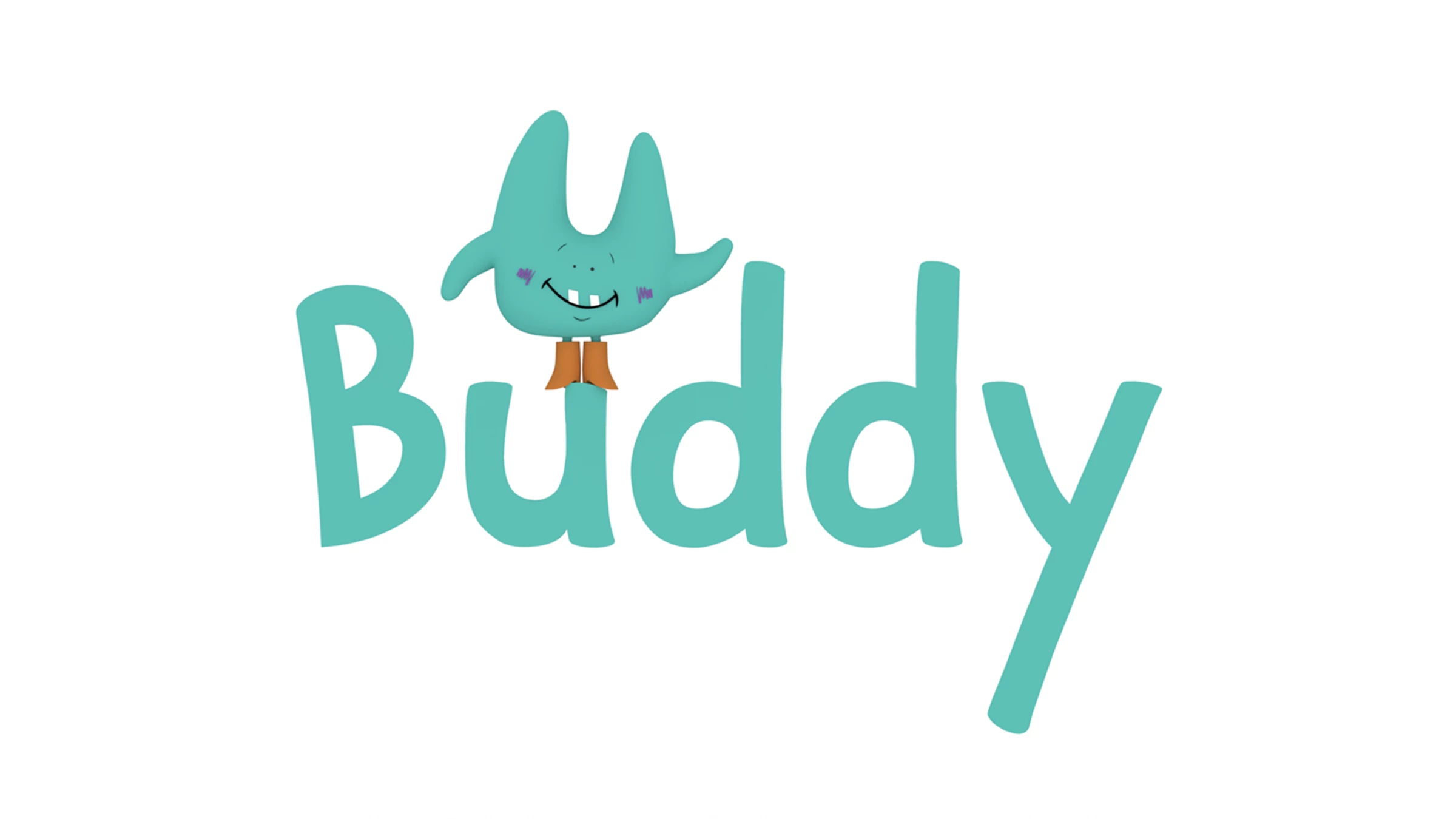
Standout Features:
- Animated logo version
- Cartoon characters
- Simple yet meaningful
Animated logo designs are perfect for kids' and babies’ products because they are playful, energetic, and fun. These logotypes can capture the childlike enthusiasm we all want and love.
Anna Mould aligned the design to the company identity for this logo design. This is important because your logo must deliver its purpose to be the face of your company to your target audience.
Putting the blue-colored bird on top of the company name is an excellent touch to direct the viewers' attention to the logo, making it easy for them to remember what the company is through the logo. The logo design is simple, yet it does its part in delivering what the logo is supposed to do.
9. Joao & Maria Baby Store by Icarus Brands
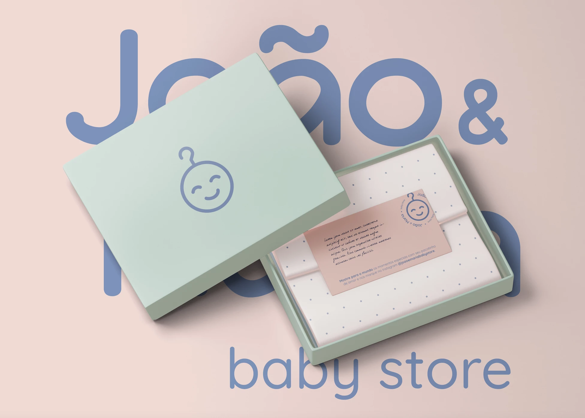
Standout Features:
- Simple branding approach
- Motherly love and affection captured
- Easy on the eyes
Love and affection must be a crucial part of their branding identity for kids' and babies' brands. Mothers love their children so much that they will work hard to provide the best products for their kids.
That’s why this mother and baby needs store aims to provide that warm hug of a mother through their expertly-curated set of items, from maternity wear to baby clothes and other accessories.
Icarus Brands was told to keep its simplicity intact while conveying that they genuinely care for its clients through sensitivity, love, and affection. The result is this branding design that includes a simple yet impactful logo design.
From the logo design to the overall branding kit, it perfectly captured the motherly love and affection that the company wanted to have for the project.
10. LOLLI POP KIDS CLOTHES by Light Design Studio
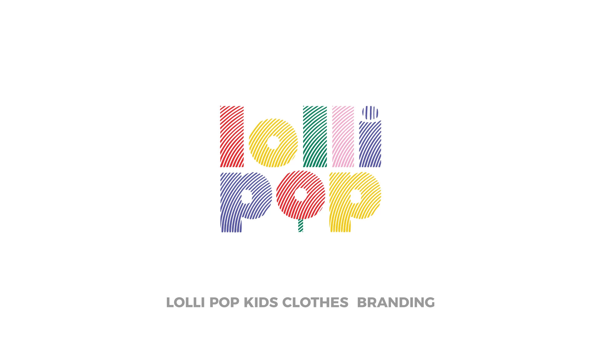
Standout Features:
- Donut-inspired logo
- Fingerprint effects
- Fun and vibrant energy
With so many kids’ clothing stores and brands offering the same items, it can be challenging for some to stand out. Thankfully, an effective and responsive logo design and a strong branding strategy can make things happen, even for the most saturated markets.
Light Design Studio developed a branding identity around the kids’ love for sweets and other treats. The company is already named after a candy type, so why not extend it to the branding strategy?
They created a logo inspired by colorful donuts that kids and adults love. The logo also features fingerprint effects on the design. This is a clever nod to the distinct identity that the company wants to stand out from the crowd.
The packaging also featured a colorful donut pattern consistent across the brand's visuals. Indeed, this branding design leaves a sweet taste in everyone’s mouths.
11. Bambinis by Branddone
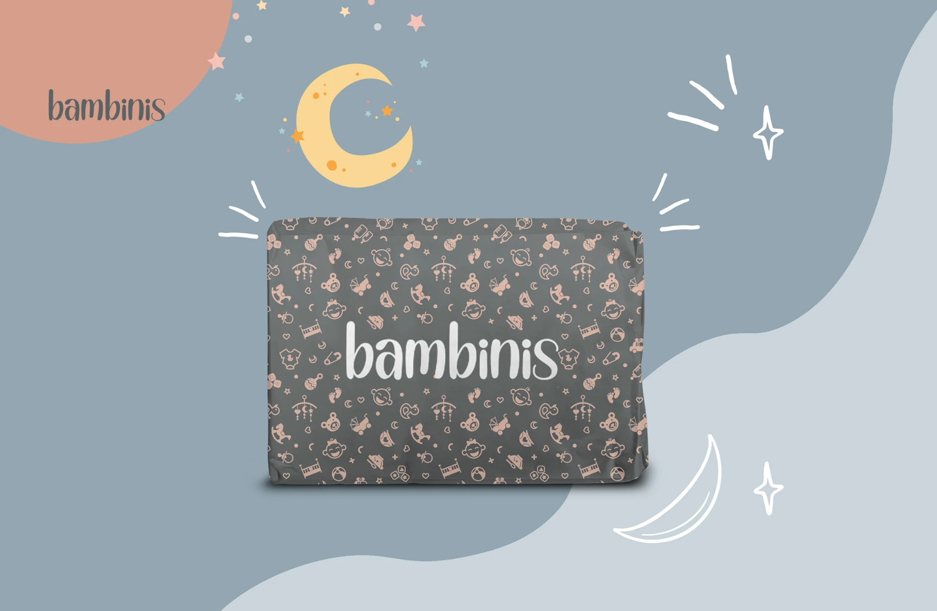
Standout Features:
- Classic typography
- Charming packaging
- Colorful and creative designs
Diapers are necessary for kids and babies, and diaper brands have always tapped into the “white as clouds” approach in design. This next-best kids and babies branding design took the road less traveled and worked perfectly for them.
Branddone pushed through with marketing the diapers as though they were luxury products for babies and toddlers. With its sleek and classic-looking typeface, customers are led to think this is quite a fortune – which is invalid.
The designs are also eye-catching and imaginative, with some even looking stylish for babies. They veered away from the usual white packaging used in most diapers and went with the patterns and designs mothers would not immediately consider when buying diapers.
The charming packaging design ties it all up, creating a branding ensemble that is one for the books.
12. Binbe Too - Baby Dreamer by Left and Right Creative Design
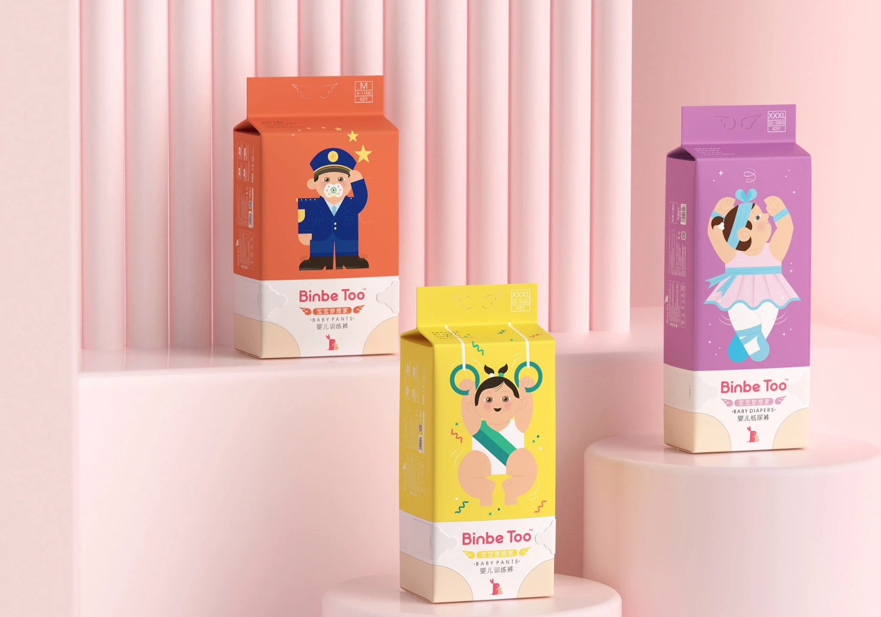
Standout Features:
- Cultural attentiveness
- Imaginative packaging design
- Roots to Chinese societal norms
China is the biggest market for anything these days, and paying attention to the enormous Chinese market is essential to win their points. That’s why designer house Left and Right Creative Design has made it a point to incorporate that thought in this kid's and baby's brand packaging.
The diaper packaging design features cartoon drawings of police officers, doctors, and other professions that the Chinese people deem dream-worthy for their children. In China, these professions are highly regarded, and it’s no surprise parents want their children to be like these.
The “Dreamer Packages” also feature eye-friendly visuals that won’t alienate the products in the diapers and baby needs aisle. Instead, these designs will be standouts when parents see them on the shelves.
Considering the societal norms of your target market is essential to reap bountiful results, and they did it spectacularly on this one.
13. Chambre D'Hestia by Squalls
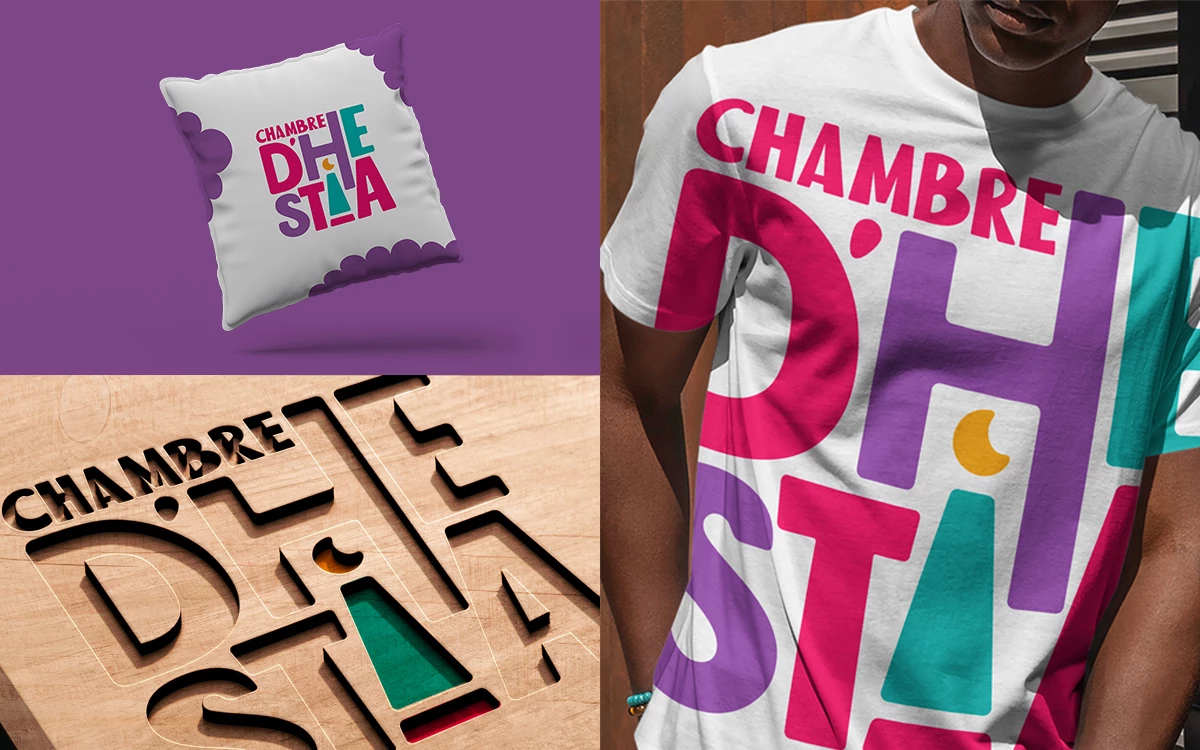
Standout Features:
- Dynamic logo design
- Sleek and organized typeface
- Vivid color story
There’s a reason why colorful designs are perfect for kids' and baby's products: they work. It’s a tried and tested formula that design houses use to generate results.
Squalls used a palette of vivid colors to relate the story of fun and creativity to their customers. Named after the Greek goddess of the hearth, Chambre D’Hestia aims to make its customers feel secure with their products.
They did that by incorporating fun colors, a personable font for the logo, and a sleek typeface for the website to blend all these factors.
They also used recognizable images such as the moon, stars, and the rocky horse to drive the point closer to home. Everything feels dynamic and energetic, which most kids and babies’ products aspire to have.
14. Cocori by Rodolfo Claros
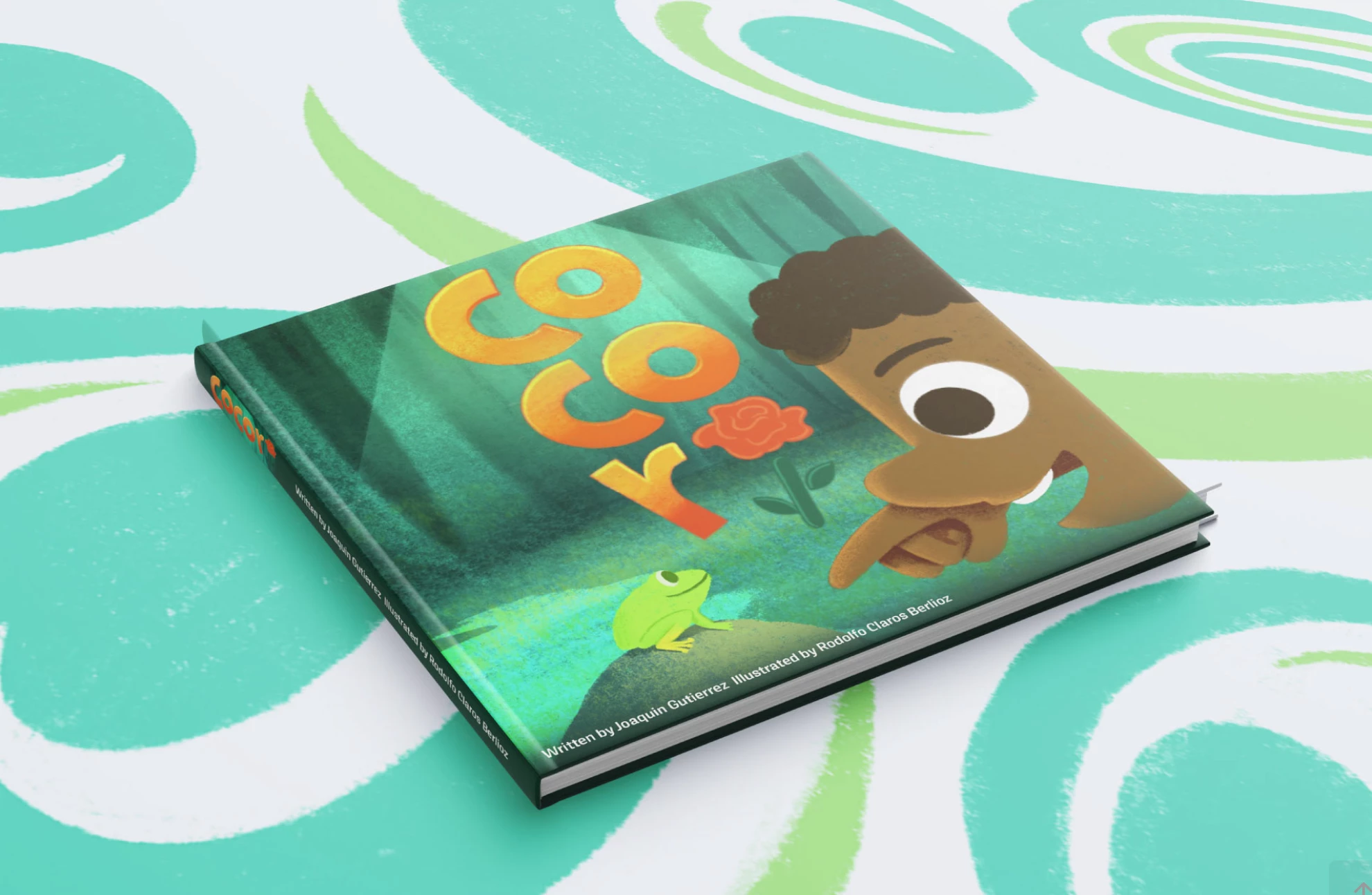
Standout Features:
- Vivid illustrations
- A warm and rich color story
- Attractive cover
For a storybook meant for children to read and enjoy, designer Rodolfo Claros tapped into Latino households' rich and inviting nature with the vivid colors, attention to detail, and correctness of the illustrations.
Check out some illustrated branding examples here.
The book cover immediately gives you an idea of who the characters are and what the story is about. This is perfect because the cover only gives away a few essential points, making the buyer buy the book. After all, it piqued their interest.
Another notable feature is the warm tone throughout the cover design, which translates to the generous love children typically give to people around them.
The quality of the design for this children’s book cover is so perfect that it would keep the attention of those reading it until they finish the book. Now that’s what we call THE experience for the senses.
15. GiliGums by ARTNOVA
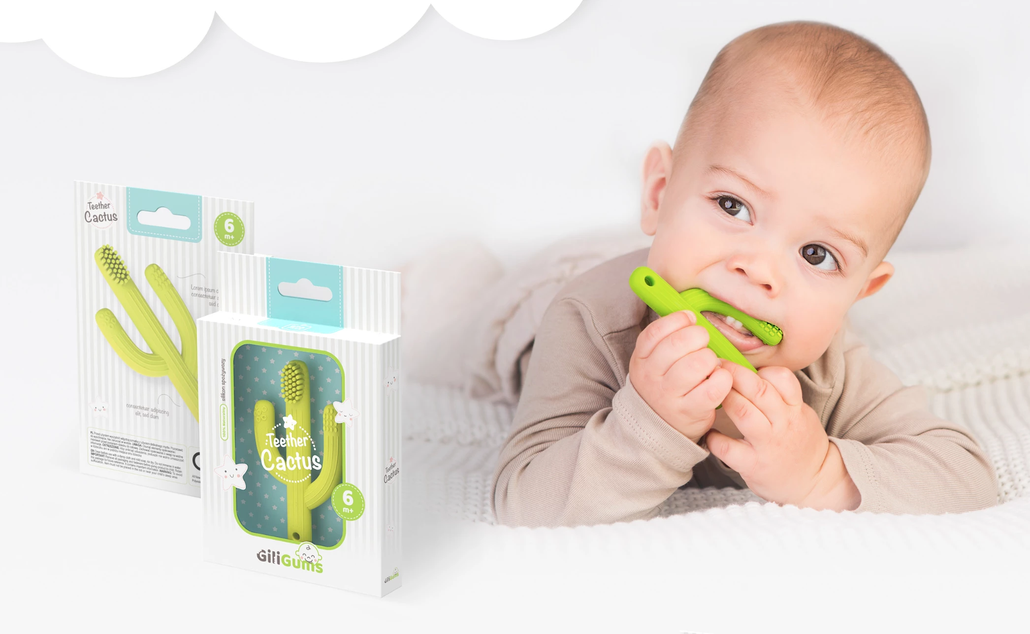
Standout Features:
- A calm and playful attitude
- On-brand imagery
- Sturdy packaging design
Packaging design always needs to be sturdy and reliable. Still, with kids and babies as the target market, it can be pressured to make the design appealing without compromising the function. ARTNOVA perfectly toed the line between function and aesthetics and balanced them.
The box packaging still looks stable and durable to the touch. Still, the designs printed on the packaging illustrated inflated dinosaurs and other images that are perfect for the branding strategy.
They found it easy to balance function and design here because they could strike a balance with the design. It gives the customers a calm and playful vibe, which is what the brand aims to have in the first place.
16. Babycan by Brandup
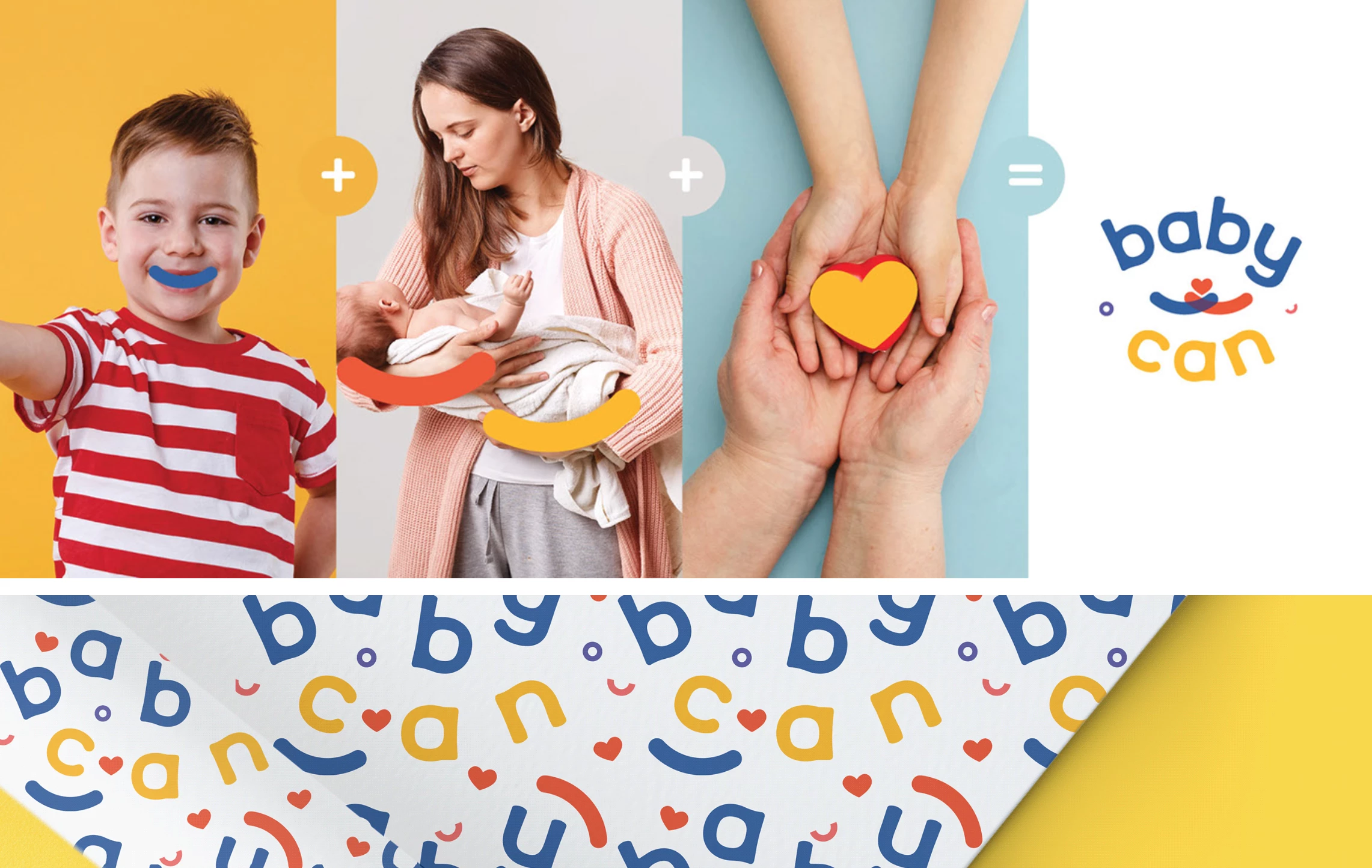
Standout Features:
- Witty images
- Warm and loving colors
- On-point design
Wrapping up this roundup is a small business that creates toys with love from one parent to another.
Using warm colors such as reddish brown, red, and orange, designer house Brandup translated those to make the customers feel that the company loves their children through their warm color story.
Seeing these colors is like a tender hug from a loving mother to her children. They capitalized on mothers' pure and unconditional love for their kids. In addition, the logo uses a symbol that looks like a heart formed from holding hands. The design concept is on-point without being too stereotypical, and it worked amazingly well. Browse through best toy packaging designs.

Our design experts recognize the most innovative and creative designs from across the globe. Visit Design Awards to see the:
- Best Logo Designs
- Best Website Designs
- Best Video Designs
- Best Print Designs
- Best Packaging Designs
- Best App Designs
Our team also ranks agencies worldwide to help you find a qualified agency partner. Visit our Agency Directory for the top Logo Design Companies, as well as:
- Top Web Design Agencies
- Top Video Production Companies
- Top Print Design Companies
- Top Packaging Design Companies
- Top Mobile App Development Companies