KPS is an architectural firm that focuses on creating visually stunning, expressive, and irreplaceable facades. The bulk of their work hinges on the surface appeal and presentational worth of a building more than any structural concerns. The company’s focus informs their web design, which is both utilitarian and graphically dynamic.
The home page, depicted above, features a beautiful skyline complemented by an equally sleek UI. Both the forms of the structures and the shapes of the interface panelling is angular and sprawling. The relationship between the background image and the interface creates a clear depth and aesthetic unity. The page is as deep with color as it is deep with perspective. Users are drawn in by the various lines and angles of these two elements, creating a UX of free eye exploration. Users can take their time scanning the page, taking in its depth and complexity.
This effect is compounded by the embedded video which provides a source of movement and renewed interest for every user’s experience. Essentially, this page reflects the capabilities and specific brand of KPS by simulating a complex and perspective-driven experience. Potential clients are given this visual cue as to what can be expected from KPS’s services should they commission a design from the company.

In stark contrast, this incredibly stripped “About” page provides a moment of pause from the site’s visual density. The very simple field of white and minimal text serves as a hold on the somewhat assaultive graphic experience of the site. Interestingly, it’s the relationship between this page and the next, that demonstrates the prowess of the design. Users scroll down to the next phase of the site and watch as this simple build is compounded into exquisite complexity as a new overlay appears over the next page.
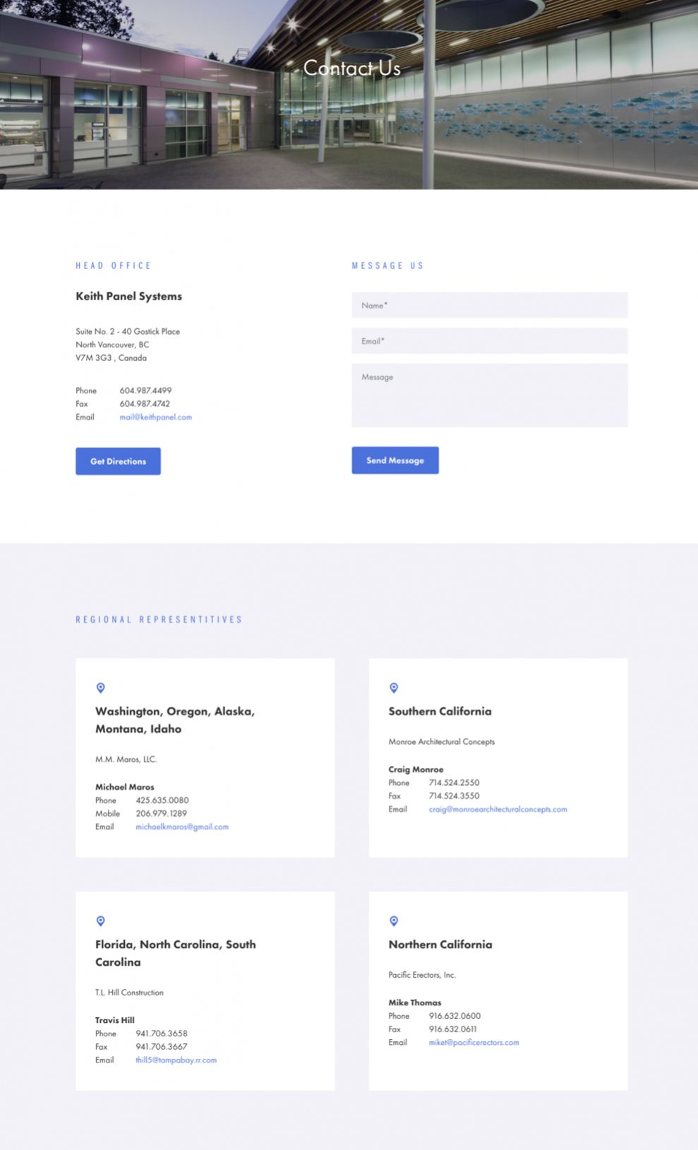
This contact page interface is multifaceted and all consuming, given that the majority of the page is covered by a menu slider overlay on the top of the page. The actual contact form exists only in a small center sliver of this page, which again creates a sense of depth. This page once again evokes depth and complexity, magnified only by the relative simplicity of the page before. This is an example of how you can create pauses and climaxes within the flow of your design, making the site more dynamic, engaging, and immersive.
KPS is a great website design in the Architecture and Technology industries.