Unlike visual design, which announces itself, interaction design hides in plain sight.
It exists in the in-between: the pause between hover and click, the frictionless scroll, and the “did-you-mean” autocorrect that prevents errors. These are decisions made long before you land on a page and felt long after you leave.
The following ten interactive design examples weren’t chosen for being flashy or beautiful, some aren’t even particularly “modern.”
But they all share one thing: the designers responsible for them understood exactly what people needed to feel, not just see, to trust the interface.
Quick Glossary of Terms
Before diving into the ten interactive design examples, it’s worth defining a few terms you'll see throughout this breakdown. Each case includes a brief reference to the interaction design “pattern” at play, which is a concept borrowed from systems design and UX.
- Pattern: A repeatable design solution that addresses a known user behavior or needs. Patterns make interfaces predictable, learnable, and intuitive. For example, “progressive disclosure” is a pattern where information is revealed only when needed.
- Microinteraction: A small, contained interaction that helps the user accomplish a single task, like “liking” a post or toggling a switch.
- Feedback Loop: The system’s way of acknowledging user input, such as animations, sound, or confirmation messages.
- Anticipatory UI: Interfaces that respond to user intent before the action is completed, often by predicting the next move.
- Contextual Design: An approach where the interface adapts based on where the user is, what they’re doing, or what content they’re engaging with.
- Progressive Disclosure: A design technique where information is shown to the user gradually, rather than all at once. Think of it as a "step-by-step" approach of giving users just enough information to move forward and offering additional details when they ask for them or when it's relevant.
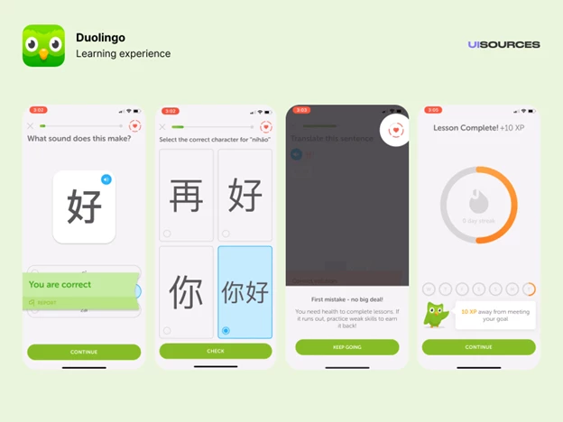
1. Duolingo’s Feedback Loops
Key Insight for Brands:
- Immediate feedback with celebratory animations encourages consistent engagement by rewarding progress instantly.
Duolingo is a gamified language-learning app that uses repetition, streaks, and progress tracking to build habits. Its interface is an archetype of positive reinforcement. Every interaction, from correct answers to streak maintenance, is paired with immediate visual, tactile, or audio feedback.
What makes this successful is the way each feedback loop is designed to build momentum. The celebratory animations aren’t just decorative, they also gamify learning and create an emotional payoff.
Want data to work harder? Get inspired by these examples of interactive infographics.
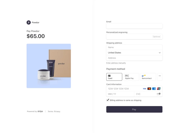
2. Stripe’s Form Design
Key Insight for Brands:
- Real-time validation and intuitive input fields reduce errors and streamline the payment process.
Stripe is a digital payments platform used by businesses to manage online transactions. At first glance, its payment flow is almost boring. No clever animations. No distracting graphics. But try typing in an invalid credit card number or leave a required field blank, and you’ll see what makes this design stand out.
Every form field is built to anticipate friction before it happens. Real-time validation kicks in quietly, suggesting instead of scolding. Autofill behaves exactly as expected. Even the smallest animation (a green checkmark after a valid input) feels earned.
Contrary to the previous entry (Duolingo), the interaction pattern at play here is not about user delight. Instead, it's about not making people think longer than they must, and in that way, it’s an incredibly respectful design.
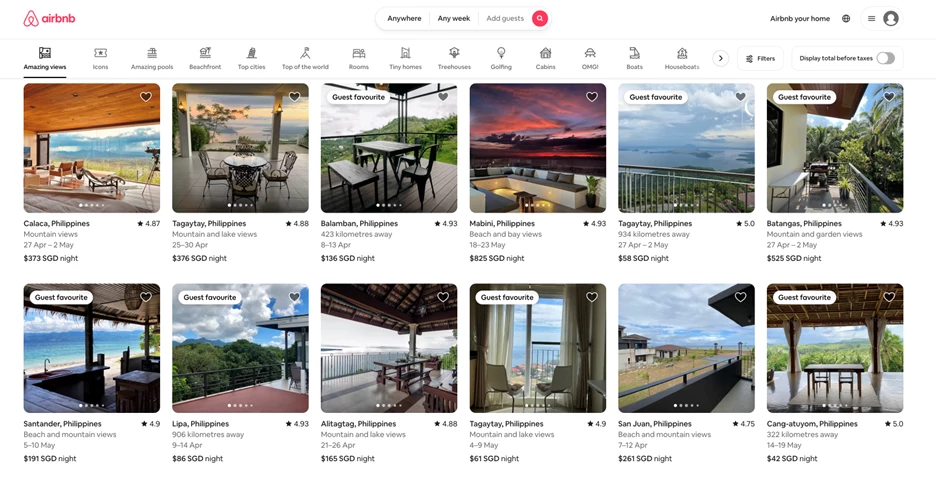
3. Airbnb’s Search Interactions
Key Insight for Brands:
- Conditional UI components and contextual microinteractions help users feel in control without being overwhelmed by options.
Airbnb is a platform for booking vacation rentals, homes, and unique stays around the world. Most websites assume they know what you want, but Airbnb doesn’t. That’s why its search interactions are loaded with conditional logic: calendars adjust based on demand, filters rewrite themselves depending on location, and prices recalculate in real-time.
The platform leverages conditional logic and responsive microinteractions to streamline decision-making.
This is one of the examples of interactive design for “wandering intent,” which is shorthand for people who want options, not commitments. Nothing feels locked in until it has to be. The design breathes with you.
It’s not perfect. But it acknowledges something most interfaces ignore: the indecisiveness of real people.
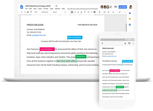
4. Google Docs’ Collaboration Cues
Key Insight for Brands:
- Multi-user presence indicators enable asynchronous collaboration with real-time context.
The cursor on the document you opened is moving, but you’re not touching the keyboard. Someone else is. Real-time cursors, live chat indicators, and comment pins in Google Docs are textbook examples of interactive design in collaborative environments. These design choices create a shared sense of space.
The highlight here is restraint. The UI never shouts “Look who joined!” or flashes avatars with effects. It just gives you a trail of movement, a signal indicating that you’re not alone.
5. Notion’s Onboarding Modals and In-App Guidance
[Source: Good UX]
Key Insight for Brands:
- Progressive disclosure with contextual tooltips supports learning by layering information gradually.
Notion is a flexible workspace that brings together notes, tasks, databases, and wikis ... all in one place. But instead of walking you through it, Notion simply lets you try and figure it out as you go and then meets you halfway with subtle guidance only when you need it.
Hover over something, and a hint appears. Drag an element, and containers light up. Click the wrong thing, and it gently nudges you toward the right one.
And instead of walls of documentation, it uses progressive disclosure: tooltips, modals, and ghost elements appear at key moments. This is interaction design as onboarding, where the interface trains you without stopping you.
The brilliance is in the pacing. Nothing feels like a tutorial. But after five minutes, you realize you’ve learned three or four features and it's not because someone told you, but because the system trusted you to figure it out.
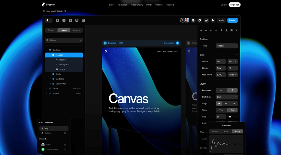
6. Framer’s Editor UI
Key Insight for Brands:
- Gesture-based controls and real-time previews lower the barrier to entry by aligning with familiar behaviors
Framer is a web design and prototyping tool for building interactive sites without writing code. Its interface borrows familiar gestures (drag-and-drop, pinch-to-zoom, quick previews) the kinds of actions most people already use on their devices every day. That familiarity makes it easy to pick up and start building. Everything responds immediately to your input, which makes the tool feel fast, tactile, and precise.
One of the examples of interaction design here mimics real-world logic. It feels like something you’ve used before, even if you haven’t. There’s almost no learning curve because the system’s fluency is “baked” into gestures you already understand.
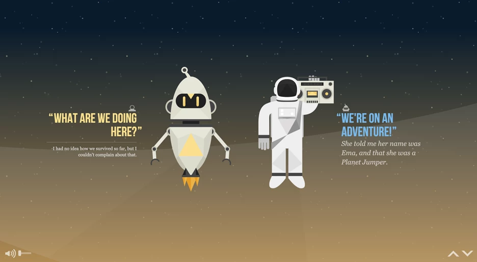
7. NASA Prospect’s Cosmic Scrolling Experience
Key Insight for Brands:
- Scroll-triggered animations with parallax effects engage users by making complex information accessible and engaging.
NASA Prospect, an interactive web experience that visualizes future space exploration missions, behaves like a mission briefing. As you scroll, the interface slowly draws you out of Earth’s orbit and into a stylized galaxy of data, story, and speculation.
Animations unfold on a fixed midline, celestial bodies glide into frame, and the dialogue between the two characters fades in alongside clickable golden orbs. These orbs serve as interactive prompts, hints that expand on mission concepts, dialogue, and world-building details.
There’s no menu to sift through, no cards to sort. The scroll is the structure. You move through the story the way an astronaut might move through a shuttle: one chamber at a time, with each new module designed to orient you before you drift forward.
Unlike many scroll-driven experiences, this one resists the urge to dazzle for the sake of it. Visual transitions are deliberate. Motion is grounded. The interaction design serves something bigger than engagement.
The result is a user experience that feels less like a microsite and more like a guided ascent into a themed narrative that's neither gamified nor cinematic. Instead, we get a website that's controlled and atmospheric and one that doesn't show off. It just carries you.
Learn how top interactive websites keep users hooked and leverage those insights to do it better.
8. LottieFiles’ Purposeful Motion Effects
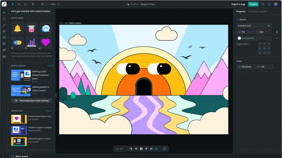
Key Insight for Brands:
- Utility-driven animation tied to user actions reinforces task flow with motion that informs, not distracts.
Animation is easy to overdo. But LottieFiles, a platform for previewing, editing, and sharing lightweight animations, understands that motion should do more than entertain. It should guide, suggest, and affirm.
Preview a Lottie animation, and you’ll notice: that load states are brief but present, hover effects are immediate, and even exporting a file triggers just enough movement to confirm progress, but not enough to feel performative. Everything moves, but only when it matters ... and only just enough.
9. Spotify’s Color-Responsive Interface
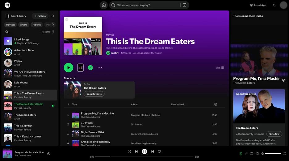
Key Insight for Brands:
- Dynamic color palettes pulled from media content create an ambient emotional connection that helps users orient themselves visually.
Spotify uses color not as ornament, but as interface language. When you open an album or playlist, the background dynamically adapts to the artwork’s dominant hues, muting UI elements to let the music set the tone. Even gradients across the play bar and navigation subtly shift, reinforcing the atmosphere of the content.
This isn’t just aesthetic styling. Instead, it’s a deliberate method of creating emotional resonance and contextual continuity without needing extra labels or transitions.
10. Figma’s Predictive Interaction Layer
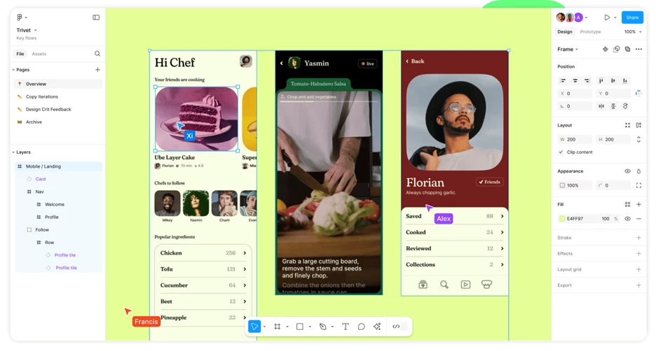
Key Insight for Brands:
- Anticipatory UI that adapts to interaction patterns reduces user uncertainty by predicting and smoothing common actions.
Figma, a collaborative interface design tool for product and UX teams, has an interface that quietly anticipates user behavior. Move an object and alignment guides snap into view. Hover over an icon, and a tooltip appears just before you click. Start typing a comment and the system knows exactly where to place it, based on proximity and behavior.
There’s almost a sense that Figma knows what you’re about to do, and it quietly clears the path for it. This is anticipatory interaction design at its best. No modals. No friction. Just gentle, invisible support that appears exactly when you need it and disappears before it oversteps.
Interaction Design Examples: The Bottom Line
The best interaction design doesn’t try to impress. Instead, it tries to understand the user.
It anticipates hesitation, smooths friction, and speaks in the quiet language of cues, timing, and feedback. And it is at its best when you don't even have to think about it: a form that fills itself out before you realize you need it to, a scroll that guides, or a color shift that sets the mood without saying a word.
These ten examples aren’t memorable because they’re flashy. They’re memorable because they worked. Because they respected your time, aligned with your instincts, and made complexity feel like second nature.
And that’s what good interaction design does. You'll walk away thinking less about the interface and more about what you just accomplished.
Interaction Design Examples: FAQs
1. What is interaction design?
Interaction design focuses on creating engaging interfaces where users and products communicate effectively. It's about designing the behaviors and actions that occur when a user interacts with a digital product, ensuring the experience is intuitive and satisfying.
2. How does interaction design differ from UX design?
While both fields aim to enhance user experiences, interaction design zeroes in on the specific moments of interaction between the user and the product. UX design encompasses a broader scope, including user research, overall usability, and the entire journey a user takes with a product.
3. What are examples of common interaction design patterns?
Some widely used examples of interaction design patterns include:
- Infinite Scrolling: Continuously loads content as the user scrolls down, commonly seen on social media platforms.
- Pull-to-Refresh: Allows users to refresh content by pulling down on a touchscreen, often used in email and news apps.
- Autocomplete Suggestions: Offers real-time suggestions as users type in a search bar, enhancing efficiency and accuracy.
These patterns help create familiar and predictable experiences for users.
4. Why is interaction design important in product development?
Good interaction design ensures that users can navigate and use a product effortlessly. It reduces frustration, increases efficiency, and contributes to a positive overall user experience, which can lead to higher user retention and satisfaction.


-preview-webp.webp)
