A logo is a physical symbol of a company. It’s the image that comes to mind when you think of a specific brand or product — like the half-bitten apple for Apple and the swoosh for Nike.
But with new trends around the corner, what it takes for a logo to be successful and effective has also changed. Now they need to be clean, minimalistic and simple. But another importance of logos is that they need to adapt in responsive web designs.
It’s 2023 — If you don’t have a responsive logo design, you might as well be doomed. And I don’t say that to be dramatic. I mean, have you ever opened up a website on your phone, and had the whole UX design look funky? Or maybe you opened an email and the logo was all disproportionate? This is because some companies aren’t utilizing responsive logo and web designs.

Logos were created before the age of computers and smartphones — back before responsive web designs became a mainstay in web design. But it’s vital that your logo can live and adapt in a responsive web design — otherwise, it’ll look messy and outdated.
And brands have been forgotten about for far less.
So it’s important to understand what a responsive logo design actually is, and what goes into creating one. It’s more than just making sure your logo can grow and shrink without any major malfunctions. You have to ensure that regardless of the medium with which you look at the logo, that it stands out — and not because its disproportionate, pixelated or squished.
Here are a few key tips to keep in mind when creating or altering your company logo — because responsive logo designs are in, and you don’t want to be left out.
Table of Contents
Simplicity

When it comes to logos, cleanliness matters. Logos should be eye-catching and recognizable — but not for their outrageousness (or obnoxiousness). People don’t have time to dissect a logo that’s confusing or cluttered. They just don’t care enough. Which is why opting for a simple, clean, and sleek logo design is where your logo brainstorms should be headed. You want people to see your logo, recognize it immediately, and form their opinions thereafter.
You don’t want them squinting or scratching their heads.
Especially when considering the need for adaptation in responsive design templates, you can’t have a logo that tells a long, complicated story. It just won’t transfer well. It needs to be clear and subtle so as to not overcomplicate things. Your logo needs to expand and shrink — too much copy, too many outrageous designs and flashy colors don’t move well.
You don’t need to make your audience work for it — they work enough as it is.
Say goodbye to bright pops of color, exaggerated drop shadows, flares and glows, and hello to clean lines, light, natural colors, and modern flare. Ensuring your logo is simple will increase its flexibility when being viewed on mobile devices, tablets, and laptop screens.
Modernity
That brings us to another must-follow best practice when it comes to responsive logo designs in 2018. We’re in the modern age, and our logos need to represent that.
Good, responsive images and logo designs are sleek. They are strong. They are clean. They aren’t overly complicated. They are up to date with the new age. This means that many companies will have to continuously adapt and change their designs in order to remain relevant and interesting.
Opt for less color and simple fonts. Play with simple shapes and stay away from things that are too abstract. Of course, incorporate your own style and base your logo on your brand — but don’t get too carried away.

Minimalism
Less is more — in web design, in print design, in apartment decor — and especially, in logos. Minimalism is in, making a minimalistic logo design a must for your brand or company. It’s ok to scale back the detailing, your audience will barely know the difference.
Minor changes and tweaks to declutter and scale back a design could actually improve your visibility. And what better time to go minimalist than right now? When everything from makeup packaging to furniture is being made minimalistic, a logo that isn’t minimalistic might look outdated.
Adaptability
Change is inevitable, and it’s important to understand that your logo will change — even if you think it’s perfect the way it is. That’s why you need to create a logo in preparation for inevitable change and adaptability.
An overly complicated design will be harder to morph and simplify over the years — instead, you will lose the integrity of the original logo in the first place. If you completely alter your logo, you lose that brand recognition that the logo is supposed to provide.
And especially in responsive website designs, having a logo that is easy to modify is beneficial for getting your logo seen by more people. If your logo can’t adapt, your company as a whole won’t be able to either.
What else can you do to optimize responsive logo designs in responsive web designs?
Depending on screen size, your logo might need to turn into something entirely new.
Well, not entirely. But depending on where it’s being viewed, your logo might need to ditch some of its characteristics.
In some instances, if your logo includes words or phrases, or additional symbols, they will need to be left behind the smaller the image gets.
Depending on whether you’re reading on a smartphone or tablet, your logo might have to ditch the wordmark, realign itself so that it is stacked as opposed to being in one line, lose a tagline, or all of the above.
This doesn’t mean that your logo will lose all recognizability. It will still be your logo, but just the bare bones of it — the image or symbol that everyone relates to your brand or product.
Domino’s does this. Their main logo looks like this:

When shrunk down, it looks like this:

You still know the last image relates to Domino’s, it just fits on smaller screens more easily.
Brands that got it right
Many brands have already started altering their logos to fit in with responsive web designs. They’ve cut down, simplified, gone minimalistic and made their logos work for them — and for users.
Twitter is just one company that has changed its logo over the years — each new iteration better than the last.

In its early years, Twitter had a very basic logo design in their signature blue color. All it was, was the name “twitter” in all lowercase letters.
It’s simple, recognizable and easy to understand. But when it comes to shrinking down, you can only make a word so small before it is illegible. Their next logo design introduced the Twitter bird we all know and love, but even then, there seemed to be too much going on.
Recently, Twitter has gotten very minimal with its logo, holding onto that signature Twitter blue, but only using the bird as its iconic logo.

Now that’s a responsive logo design!
But Twitter isn’t the only company that has played with logos. Another company that’s done a great job adapting is Spotify.

Spotify started with a logo that was funky, unique and in-your-face. To some, it was a bit juvenile looking with the font and color choices — but it worked for them for years.
But considering they live almost exclusively on mobile devices, they needed a more mobile-friendly responsive logo design.
Their most recent iteration is much simpler and more flexible. It caused some uproar when they changed the color, but Lead Product Designer Tobias van Schneider knew that he needed to jump on the modern bandwagon as he states in a blog post:
As much as we got used to the old "broccoli" green we felt that the dreary brand palette was desperate for an upgrade. It was time to give it a little refresh and make sure it goes well with our vibrant new color palette. The new green has a little more "pop" and just feels right at home in our new color palette which has grown to nearly three dozen colors. It not only looks more fresh & modern but also feels more easy on the eye, especially when applying it fullscreen.

Spotify went with a brighter green and a simpler, cleaner design for this one. It easily adapts depending on the size of the screen — and it works. Without seeing the word “Spotify” you know immediately what the Spotify symbol represents. And that’s the point.
Another successful logo change goes to Mastercard, whose logo only changed slightly, but makes a lasting impact.
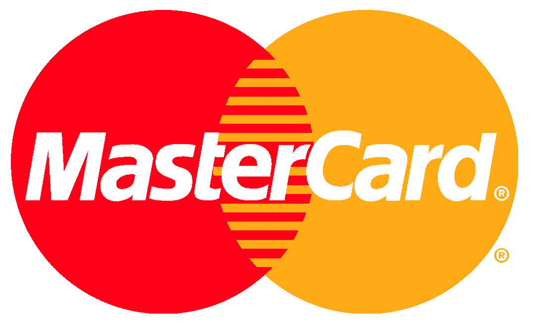
This was their old logo.

As you can see, this iconic logo is definitely eye-catching, but outdated. The way the colors alternate in the middle is a little jarring for the eyes, and the name inside the logo, while easy to read, isn’t exactly pleasing to look at. But from a mile away, you know that this is Mastercard’s logo.
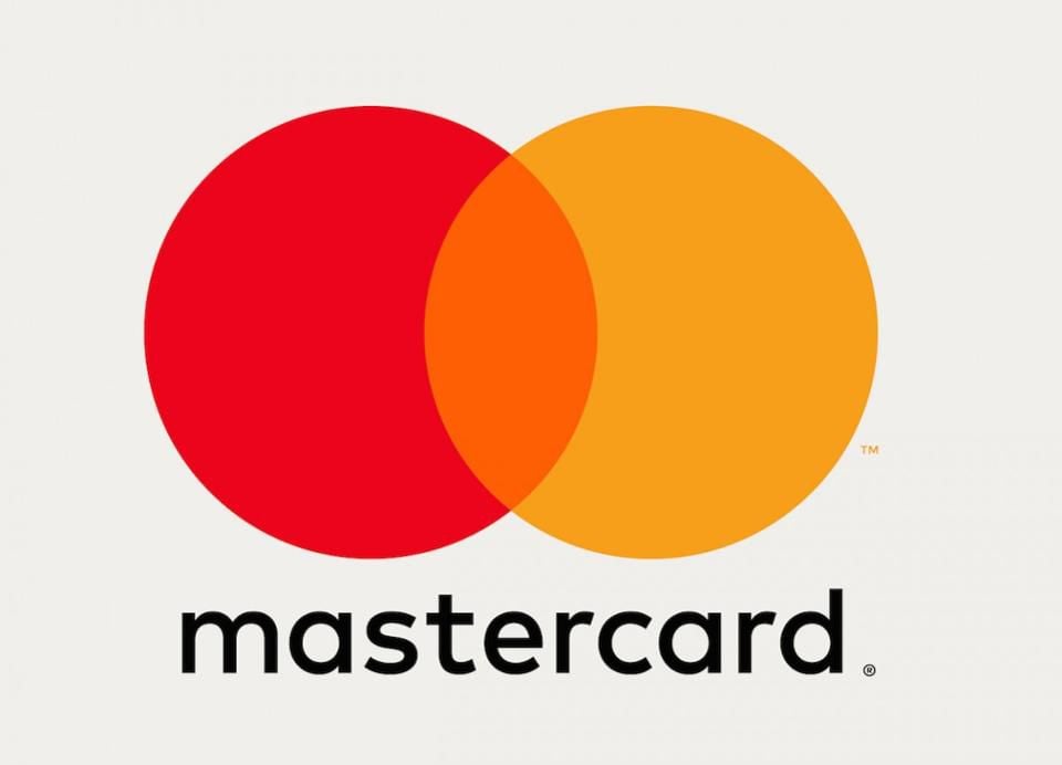
They made a switch, however, in recent years to a simpler design that flows more naturally and fluidly together.

Its new logo moves the company name below the design and changes the font to something cleaner and easier to read. They also added a third color in the middle that really balances all aspects of the logo design itself.
It’s also a great update because the wordmark can easily be dropped for smaller screen sizes. And there’s no doubt in anyone’s minds what brand this logo belongs to.
You can really learn from these successful logo designs when it comes to your own logo, or a logo redesign your graphic designers are working on.
Brands need to start capitalizing on small, clean and recognizable symbols. This way they aren’t relying on their name alone to grab attention, and don’t have to worry about how they will fit within responsive website designs.
Check out some more logo redesigns that killed it.
Brands that got it wrong
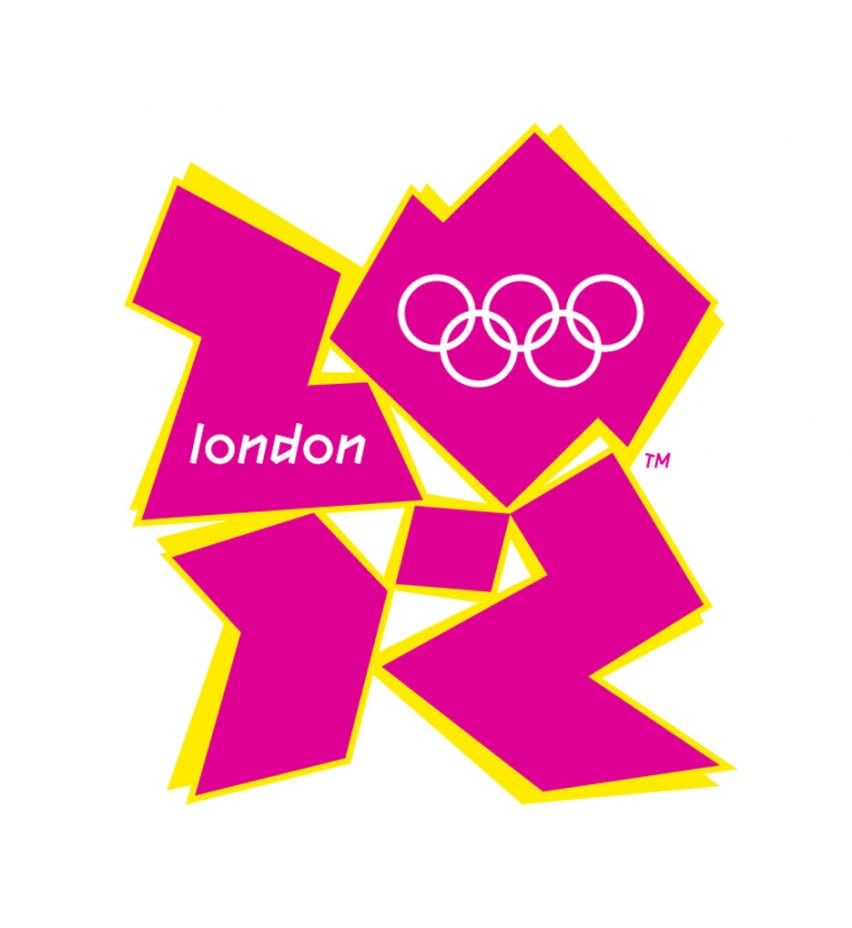
Bulky, unbalanced and abstract — the 2012 London Olympics logo is not the stuff responsive logos are made of. It's all over the place and unbalanced, and at first glance, it doesn't really give you an idea of what the logo is even for. What's more? The writing within the design ensures that there's no way you can read what it says when it gets too small.

British Telecom also underwent a logo redesign recently. In place of its old logo, the new logo — which is the fifth logo in over 30 years — includes the letters BT in front of different colored orbs. While British Telecom gets points for simplicity, the rainbow of colors isn’t modern or minimalistic at all. Not only that, but the symbol itself does not lend itself immediately to British Telecom. If you weren’t familiar with the brand already, you’d have no idea what company this was even for.

This looks like a logo straight out of the 1990s.
What you can do going forward
It’s 2018, and if your website or logo isn’t responsive, you’ve already dropped the ball. In a world that is technologically evolving every second of every day, your brand can’t afford to be left in the dust. That’s why you need to know and understand some key design best practices that’ll help your business succeed — whether you need help improving your design process, making the switch from graphic designer to web designer, or need a lesson in the different types of design.
Your logo is the most visible thing about your brand. It needs to stand out. It needs to be recognizable. And above all, it needs to adapt to a responsive web design. If your logo can’t adapt and evolve, then your brand itself won’t be able to evolve.
Responsive logo designs need to be:
- Simple
- Modern
- Minimalistic
- Adaptable
There is no room for error when it comes to logo designs. If you have a bad one, everyone will know. And in order to optimize your responsive images and logo designs, it’s important to know how you can ensure your logo adapts. To ensure your logo is optimized for all screen sizes you can:
- Drop the wordmark
- Eliminate taglines and phrases
- Realign or center your logo design
- Opt for a single symbol
Responsive logo designs are the future — don’t get left in the past. Discover the best SEO agencies logo design.


-preview.jpg)