
In eCommerce, turning a visitor into a paying customer happens in seconds. If your site isn't optimized for conversions, buyers leave as quickly as they arrived.
Success comes down to guiding users to what they need and making every second count — and none of it requires more traffic.
It's about earning more from the visitors you already have, through dozens of small, deliberate decisions across your store.
How to Increase eCommerce Conversion Rate: Key Findings
- Benchmark against your own industry, not the global average. A 1.2% rate can be excellent for jewelry yet poor for food and beverage. Find your category's range, then close the gap to its top performers.
- Fix mobile and checkout first. Roughly 70% of carts are abandoned, much of it at a clunky checkout. Cutting steps, adding digital wallets, and streamlining the final stretch recovers buyers who'd already decided.
- Treat conversion as a habit, not a project. Keep one A/B test running, change one variable at a time, and track your rate consistently. Small monthly wins compound into a much stronger business within a year.
What Is a Good eCommerce Conversion Rate in 2026?
Before you learn how to increase conversion rate for an eCommerce store, it helps to know what you're aiming for.
An eCommerce conversion rate is the percentage of visitors who complete a desired action on your site.
Most often that action is a purchase, but it can be any goal you define: an email signup, an account creation, or an add-to-cart.
You calculate it with a simple formula:
Conversion rate = (conversions ÷ total visitors) × 100%
Conversion rates track inversely with price point and consideration time: low-cost, habitual, low-risk purchases convert high, while expensive, researched, one-off purchases convert low. A 2% rate that would alarm a food brand might be a strong result for a jeweler.
Here's how the major verticals compare, based on aggregated 2026 data from Dynamic Yield, IRP Commerce, and other benchmark panels:
| Industry | Typical Conversion Rate | Why It Lands Here |
| Food & beverage | 4.5% – 6.2% | Low price point, habitual and impulse buys, frequent repeat orders |
| Health & beauty | 3.0% – 4.5% | Strong brand loyalty, subscriptions, heavy user-generated content |
| Pet care | 2.3% – 3.2% | Emotional, needs-based purchases with high repeat frequency |
| Toys & games | 2.4% – 2.8% | Gifting-driven, seasonal demand spikes |
| Apparel & fashion | 2.0% – 3.0% | Trend-driven but slowed by sizing and fit uncertainty |
| Consumer electronics | 1.4% – 1.8% | Price comparison and spec research before buying |
| Luxury & jewelry | 0.8% – 1.2% | High order values, long research cycles, offline validation |
If you're an apparel store sitting at 1.4%, your opportunity isn't to chase a food brand's 5% — it's to climb toward the 3% that strong brands in your category reach. That gap, not the market average, is where your realistic revenue upside lives.
A strong conversion rate is the result of hundreds of small design decisions — clearer navigation, faster pages, better product photos, a shorter checkout — compounding over time.
This is the heart of conversion rate optimization for eCommerce: no single site gets every decision right, which is exactly why there's always room to improve.
The following strategies break down how to increase conversion rate for your eCommerce store into 10 concrete moves you can test and implement.
1. Lead With a Clear Value Proposition
Your value proposition is the first question every visitor is silently asking: "why should I buy this here?" If your page doesn't answer fast, they'll leave to find one that does.
This is the most commonly wasted conversion lever. A homepage or landing page that greets visitors with "Welcome!" or leads with only your company name is spending your most valuable real estate saying nothing.
A strong value proposition does three things:
- Differentiates you from competitors, so shoppers see why you and not the cheaper option next door
- Articulates what's unique, e.g., the specific benefit, guarantee, or quality only you offer
- Fits in one credible sentence a first-time visitor grasps in seconds, without scrolling or squinting
If it takes a paragraph to explain why you're worth buying from, it isn't a value proposition yet.
Pro tip: Don't assume your first attempt is the winner. Value propositions are one of the highest-impact elements to A/B test. So swap the headline, the framing, or the benefit you lead with, and let real visitor behavior tell you which version resonates.
Value Proposition in Action: Nooflow's Benefit-First Homepage
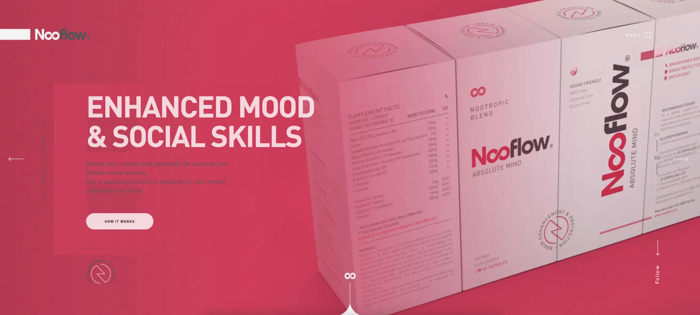
Nooflow, a nootropics supplement brand, is a useful example of leading with what the customer gets rather than what the product is.
Instead of opening with the company name or a technical ingredient list, its homepage headlines the specific outcomes for buyers: boosting memory and focus, protecting the brain, and improving mood and social skills.
By putting these up top and holding the ingredient detail for shoppers who scroll down to evaluate the claim, Nooflow answers "what's in this for me?" before it asks anyone to care about chemistry.



2. Place Your Best Offer Where It's Most Visible
Above the fold — the part of the page visitors see before scrolling — is the most valuable real estate you own. Most shoppers hunting for a deal never scroll past it, so if your best offer isn't there, they may never see it at all.
This is where your most irresistible offer belongs, paired with a clear call-to-action (CTA) that tells shoppers exactly what to do next. Put to work well, this space should spotlight:
- A new product range you want to push
- A flagship bestseller that converts on its own
- A seasonal sale, such as a winter promotion, Black Friday, or Cyber Monday
Pro tip: Rotate your above-the-fold offer to match the season or campaign, and keep the CTA singular and obvious. The moment visitors have to choose between several buttons, hesitation costs you the conversion.
Offer Placement in Action: Fashion Nova's Above-the-Fold Offers
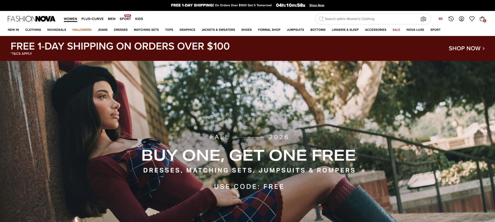
Rather than opening with a generic banner, Fashion Nova stacks its strongest incentives at the very top of the homepage. A countdown bar spans the top of the page — "Free 1-Day Shipping on Orders Over $100, Get It Tomorrow!" — pairing a genuinely attractive perk with urgency.
It sits directly above a Fall "Buy One Get One Free" hero on autumn matching sets, each with a clear "Shop Now" CTA.
By putting a shipping incentive and a seasonal offer in the first thing visitors see, Fashion Nova gives shoppers an immediate reason to click through, instead of leaving them to hunt for a deal.
3. Simplify Navigation and Search
Navigation and search are how visitors move from landing to buying, and every extra click, dead end, or failed search is a place where you lose them.
Keep the path to any product short and predictable:
- Surface categories in the top-level navigation: Visible on desktop without a hover, and visible on mobile the moment the menu opens, with no extra taps to reveal them
- Add a "View All" option in each category: Shoppers should be able to browse everything available without guessing at sub-menus
- Make on-site search forgiving: Autocomplete should handle misspellings and typos, since nearly all shoppers lean on it at some point
Poorly performing search is one of the biggest drivers of site abandonment. When someone types a query, they've signaled high intent and they know what they want. Failing to return it is one of the easiest conversions to lose and one of the most valuable to win back.
Pro tip: Stick to the navigation patterns shoppers already expect. It can be tempting to get creative with a unique menu or layout, but veering from the standard eCommerce flow usually just confuses customers and adds friction on the path to purchase.
Navigation in Action: Why Amazon Is Still the Benchmark
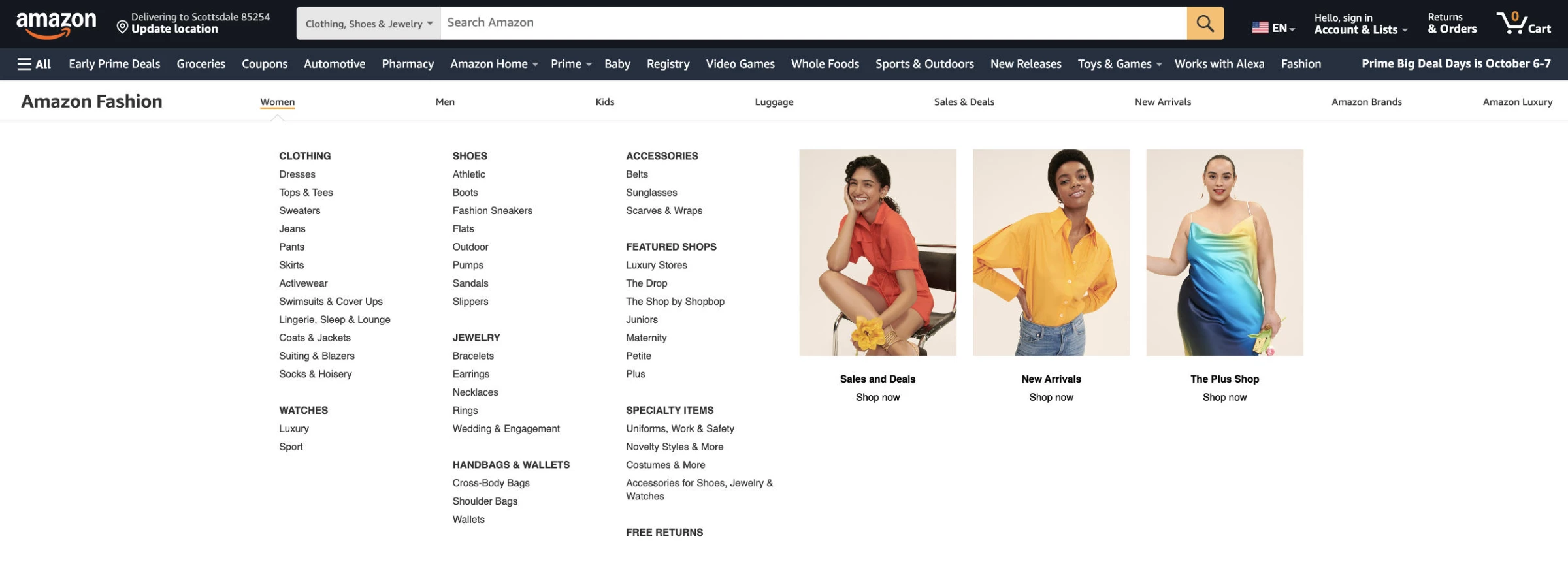
Amazon is the obvious example here — almost too obvious — but it's the standard other stores get measured against for a reason.
Its top-level navigation lists all departments, its search bar tolerates typos and suggests products as you type, and it lets shoppers search within a department rather than across the whole site. These are the patterns your shoppers already expect, because Amazon trained them to.
You don't need a billion-dollar budget to apply the lesson: meeting those expectations removes friction, and breaking them plants doubt right when someone's trying to find what they came for.
4. Reduce Distractions on Landing and Product Pages
Every extra thing on a page is something a visitor has to process. And the more choices and visual noise you put in front of them, the less likely they are to act.
Good navigation helps people find their way in; reducing distractions keeps them moving once they're on the page that matters. On landing and product pages, strip out anything that doesn't support the conversion:
- Cut the clutter: Sidebars, oversized unrelated headers, filler stock images, and secondary links pull visitors off the purchase path
- Consider dropping the nav menu on dedicated landing pages: If someone arrived to take one action, competing links only give them ways to leave
- Keep one clear action per page: The fewer directions you offer, the more obvious the right one becomes
The goal is a focused page. Everything should earn its place by moving the visitor closer to buying.
Pro tip: View your pages as a first-time visitor would and ask of each element, "does this help someone buy, or just give them somewhere else to click?" If it's the latter, test removing it. You'll often see the conversion rate rise as the distractions come off.
Focus in Action: Away's Streamlined Product Page
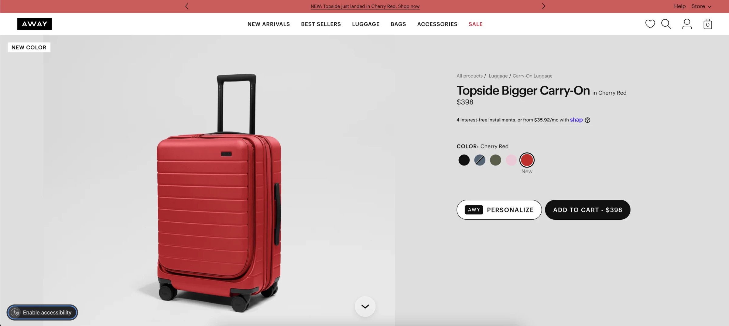
Away keeps its product pages focused on a single decision. Above the fold, you get exactly what you need to act: product images, name, price, color options, and one "Add to cart" button — no sidebar, no competing links, no unrelated banners crowding the buy decision.
The deeper details (specs, features, warranty, reviews) are all still there, just sequenced further down for shoppers who scroll to evaluate.
By leading with the essentials and holding everything else below, Away answers "should I buy this?" without making anyone wade through clutter to reach the one button that matters.
5. Invest in High-Quality Images and Product Descriptions
Online shoppers can't touch, hold, or try your product. Your images and descriptions have to do that work for them. When either falls short, buyers fill the gap with doubt, and doubt doesn't convert.
Give visitors enough to purchase confidently. Strong product pages combine:
- Clear, professional photos: Close-ups, multiple angles, and in-context shots should show the product in use
- Interactive views where they help: A 360° spin or a short product video work best for items shoppers want to inspect
- Benefit-driven descriptions: Answer real questions instead of listing specs, use bullets to make features and benefits easy to scan
- Plain language over jargon: Write so a first-time buyer understands it without decoding technical terms
Pro tip: Skip the generic stock photos and AI-generated filler. Shoppers can increasingly spot both, and fake-looking imagery erodes trust in everything else on the page. Your own product photography, even done simply, almost always converts better.
Images and Descriptions in Action: How Warby Parker Sells Glasses You Can't Try On
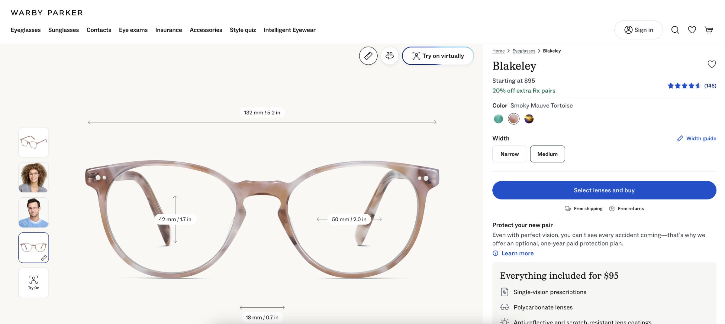
Warby Parker tackles the hardest version of this problem: buying glasses you can't put on your face.
Its product pages carry a multi-image carousel, 3D views that let them rotate a frame and preview it in every colorway, an on-screen ruler and width guide so the fit is never a guess, and a virtual try-on so shoppers can see each pair on themselves.
These visualization features include a plain-language breakdown of what's included, from lens type to coatings and materials. The descriptions answer the questions a hesitant buyer would otherwise leave to research.
By showing the product this thoroughly and explaining it this clearly, Warby Parker removes the uncertainty that normally kills online eyewear sales.
6. Address Objections Before They Arise
Every shopper reading your offer is quietly arguing with it. Do they understand what problem this solves? Do they believe your claims? Is it worth the price? Is there something cheaper or better elsewhere?
Those objections stand between a visitor and a purchase, and the pages that convert best answer them before the shopper has to ask. Start by mapping the hesitations, then meet each one head-on:
- List every objection a buyer might have: Confusion about the problem, doubt about your claims, price resistance, fear of a better alternative
- Answer them on the page: Build the reassurance directly into your product and category pages, rather than hoping shoppers dig for it
- Ask real visitors what's stopping them: On-site surveys surface the actual frustrations and doubts you can't guess at from the outside
One objection deserves its own tactic: "Is there something better or cheaper?"
Shoppers compare before they buy; that's a given. The only question is whether they do it on your terms or a competitor's:
- Build your own comparison page: When you control the comparison, you frame your advantages and justify your price instead of leaving shoppers to piece it together from reviews and rival sites.
- Don't cede the ground: If a competitor publishes a comparison that favors them and you offer no counter, many prospects will simply take their word for it.
- Keep them on your site: A comparison page lets visitors weigh their options without leaving to do it elsewhere.
Pro tip: Your support inbox and live chat logs are a goldmine of objections. The questions customers ask most before buying are exactly the ones your product pages should answer up front. So mine them, then write the answers into the page.
Objection-Handling in Action: How Spot & Tango Answers Doubts and Owns the Comparison
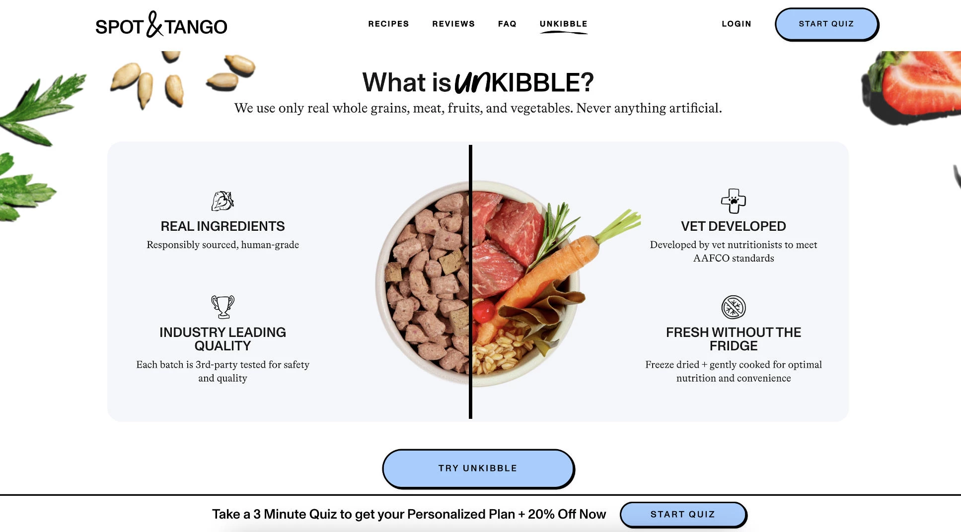
Spot & Tango, a fresh dog food brand, defuses objections before they take hold:
- A short quiz tackles the "will this actually suit my dog?" worry by building a plan around the dog's age, weight, and health needs
- A trial period lowers the "what if my dog won't eat it?" risk
- Clear ingredient and pricing information heads off the "is it worth it?" question
It also refuses to cede the comparison. Rather than leave "is there something better?" to review sites, Spot & Tango publishes its own head-to-head pages that frame its differences on its own terms and keep the shopper weighing options without ever leaving the site.
7. Build Trust With Social Proof and Reviews
Before committing, shoppers want proof that real customers have tried your product and come away happy. Social proof and reviews supply that reassurance, turning "I'm not sure about this brand" into "other people like me trust it."
Put that evidence where it does the most work:
- Feature reviews prominently: Sprinkle genuine customer ratings and testimonials across product pages, the homepage, and checkout, wherever a shopper might hesitate
- Showcase user-generated content: Reshare customers' social posts of your products, and embed those posts directly on your site so praise comes from real people, not your marketing team
- Build case studies for considered purchases: For higher-priced or complex products, a short story of how you solved a real customer's problem carries more weight than any claim you make about yourself
- Add trust signals at decision points: Star ratings near the add-to-cart button and testimonials at checkout reassure buyers exactly when doubt creeps in
Social proof is one of your most credible, non-paid endorsements. Prospects read it as a personal recommendation from someone who's already taken the risk they're weighing.
Pro tip: Set up an automated email that requests a review about a week after delivery, enough time for the customer to actually use the product. You'll collect more reviews, and better ones, since you're asking when satisfaction is highest.
Social Proof in Action: How Glossier Stacks Reviews, Real Faces, and Proof
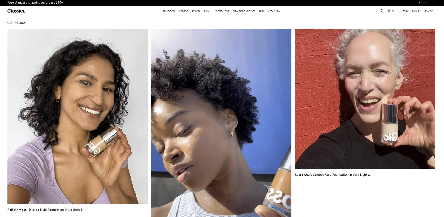
Glossier layers several kinds of proof on a single product page. Five-star customer reviews sit alongside photos and videos of real people wearing the exact shade, so shoppers see the product on actual faces rather than a promise.
For beauty, where shade match and wear are the biggest doubts, that combination does the convincing a product description can't: peer reviews, real faces, and independent proof stacked exactly where the buyer decides.
8. Reduce Risk With Guarantees and Transparent Policies
Every purchase asks the buyer to take a risk: what if it doesn't fit, doesn't work, or doesn't arrive as promised?
The more risk you absorb, the easier it is for a hesitant shopper to say yes. Guarantees and clear policies provide reassurance that often tips a maybe into a sale.
Take the fear out of the transaction:
- Offer a real guarantee: A 30-day money-back guarantee is the baseline shoppers now expect; a longer or bolder one stands out and signals genuine confidence in your product
- Make policies easy to find and easy to read: Bury returns or shipping terms in fine print and you breed suspicion. State them plainly on product pages and at checkout
- Be upfront about shipping and costs: Surprise fees at checkout are among the top reasons carts get abandoned; showing them early builds trust instead of breaking it
The goal is to remove every "but what if…" standing between the shopper and the buy button. A confident, clearly stated guarantee tells buyers you'll stand behind what you sell.
Pro tip: Test different guarantee formats to see what resonates. Free returns vs. 60-day money-back guarantee vs. lifetime warranty can perform very differently with the same audience. The right wording sometimes lifts conversions more than the policy change itself.
Risk Reduction in Action: How Brooklinen Makes Buying Sheets Feel Safe
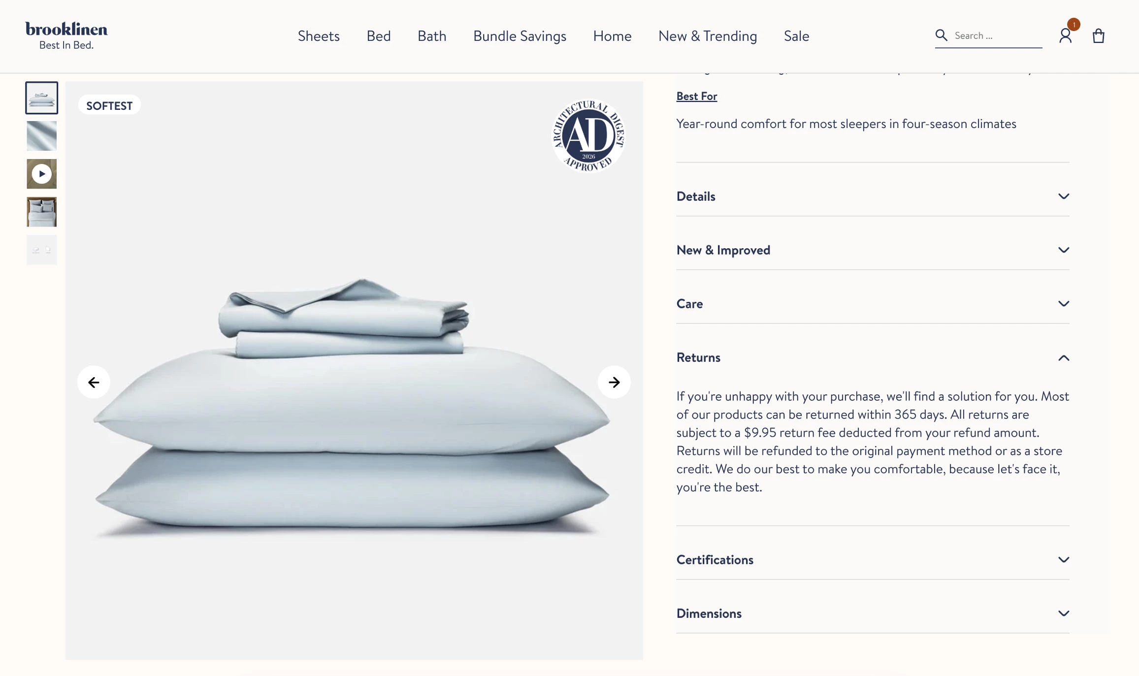
Brooklinen’s product pages state shipping terms plainly — free shipping over a clear order threshold, spelled out rather than hidden — and surface a Returns & Exchanges policy that's easy to find instead of buried in the footer.
The brand also displays an OEKO-TEX STANDARD 100 certification with an actual certification number, turning "trust us, it's safe" into a claim a shopper can verify.
For a category where buyers can't touch the product first, these signals do the reassuring: transparent costs, an easy way out if it's wrong, and third-party proof that backs the quality claim before anyone reaches checkout.
9. Nurture Buyers Who Aren't Ready Yet
Not every visitor is ready to buy on their first visit, and pushing for the sale too soon can cost you the ones who would have bought later.
Some people are just browsing; others need time, information, or a little trust before they commit. The fix isn't to pressure them into a purchase now, but to stay in touch until they're ready. Give hesitant visitors a smaller "yes" before the big one:
- Capture the email, not just the sale: Offer something worth an address (a discount, a guide, early access) so a visitor who won't buy today doesn't leave as a stranger you can never reach again
- Lead with value for considered purchases: For expensive or complex products, offer a demo, a free trial, or genuinely useful free content before asking for the sale
- Nurture with a drip sequence: Once you have the email, warm the relationship over time with helpful, relevant messages, then present the offer when trust is built
The longer and deeper your relationship with a prospect, the more likely they are to convert. A lead you can follow up with is worth far more than a visitor who bounces and forgets you.
Pro tip: Stay easy to reach and make it simple for an on-the-fence shopper to ask a question. Visible contact options and quick answers remove the last doubts standing between them and a purchase.
Nurturing in Action: How Huckberry Turns Browsers Into Subscribers
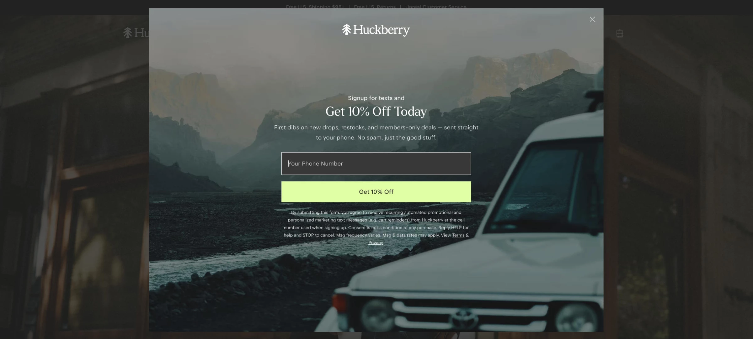
Rather than pressing every visitor to buy, Huckberry trades a small perk for a way to stay in touch: 10% off in exchange for joining its list, with the promise of "first dibs on new drops, restocks, and members-only deals."
From there it nurtures with magazine-style newsletters and low-risk perks like free shipping over $98. A shopper who wasn't ready on day one warms up over time and converts when it's right.
10. Simplify Checkout With a Flexible Commerce Platform
Even a shopper who's decided to buy can slip away if the final step is clunky: extra pages, limited payment options, or a checkout that fights them on mobile.
Often the fastest way to remove that friction isn't a series of manual fixes, but the platform underneath your store, which determines how smooth that last stretch can be.
BigCommerce is one example. It offers an optimized one-page checkout with digital wallets, one-click checkout, and buy now, pay later options — the kind of low-friction payment paths that keep shoppers from stalling at the final step.
It also supports product variants, bundles, and configurations, so stores selling complex or customizable products can let shoppers find and buy exactly what they want without a confusing experience.
Your checkout is only as frictionless as the system running it, so it's worth knowing what yours can and can't streamline.
Pro tip: Review your checkout on mobile and test each payment option regularly. Keep only the steps and fields customers actually need to complete the transaction. Every extra one is a chance for a ready buyer to reconsider.
Checkout in Action: How Mizuno USA Cut Checkout Time by 90%
Mizuno USA rebuilt on BigCommerce's flexible, API-first architecture that let them plug in best-in-class tools at each stage of the journey rather than settle for whatever a closed system offered.
The results:
- 90% reduction in checkout time, removing friction at the most decisive step in the funnel
- 33% increase in organic search traffic, helped by faster content publishing on the new platform
- Nearly 60% increase in direct traffic as the smoother, faster experience compounded
How To Track What's Working in Your eCommerce Store
Every strategy in this guide is a hypothesis until you measure it.
Two habits turn guesswork into steady gains and sit at the core of conversion optimization for any eCommerce website: tracking your conversion rate consistently, and testing changes against a control before you roll them out.
Track Your Conversion Rate Consistently
Most conversion rate improvements don't come from one big breakthrough. They come from making changes, measuring the impact, and repeating what works.
Tracking your conversion rate will help you judge whether a new landing page, checkout update, or pricing change actually improved performance. Looking at a single month's data rarely tells the full story. Instead, compare results before and after changes.
A few habits make the data far more useful:
- Measure the same way every time so you're comparing like for like
- Review conversion trends, not isolated numbers to spot meaningful shifts
- Break down results by device, traffic source, and landing page to find where conversions are gained or lost
Conversion data shows where performance changed. To understand what's causing it, watch how visitors actually use your site:
- Heatmaps highlight where attention drops off
- Session recordings expose points of friction and confusion
- On-site surveys surface objections analytics can't explain
Tools to consider:
- Google Analytics 4: This is the free, default starting point for tracking conversion rate, sessions, and segments, and it's where most stores watch the trend over time.
- Hotjar or Microsoft Clarity: These add heatmaps and session recordings so you can see where visitors click and stall. Clarity is free, while Hotjar delivers deeper analysis and survey tools.
- Shopify or your platform's built-in analytics: These give you conversion and funnel reporting tied directly to your store data, with no extra setup for platform-native metrics.
Run A/B Tests Continuously
A/B test (or split test) creates two versions of a page (the original and one with a single change) and splits your incoming traffic between them. Whichever version produces more conversions wins.
It's the difference between "we think this new layout is better" and "this new layout converted 12% higher over 4,000 visitors."
Aim to have at least one test running at all times. Individually, most wins are a few percentage points here, a fraction there. But those incremental gains compound.
A store that ships a modest improvement every month is a meaningfully different business a year later, without ever having made one dramatic overhaul.
Test your highest-impact elements first. Not every change moves the needle equally, so start where the leverage is:
- Headlines and value proposition: The first thing visitors read, and often the difference between staying and bouncing
- Page layout and information order: Where you place product images, reviews, and the add-to-cart button
- Calls to action: Wording, size, color, and placement of your primary buttons
- Offer framing: "$10 off" versus "10% off," or free shipping thresholds
- Media type: Static product photos vs. short videos vs. 360° views
Save the cosmetic tweaks for later; the biggest wins usually come from layout, offer, and messaging, not font choices.
- Test one hypothesis at a time. This is the rule people break most often. If you change the headline and the CTA and the hero image in a single test, a lift tells you something worked, but not what. Isolate one variable per test so every result teaches you something you can build on.
- Give each test enough traffic and time. A result from 200 visitors matters little. You need enough sessions to reach statistical significance before you trust the outcome, which may mean running a test for several weeks. Ending early because an early lead looks promising is one of the most common ways teams fool themselves.
Tools to consider:
- VWO: Established mid-market options with visual, point-and-click editors
- Optimizely: Enterprise heavyweight, best suited to stores with the traffic and budget to match.
- GrowthBook: Strong open-source, free-to-self-host choice for technical teams comfortable with a developer-led setup.
Increase eCommerce Conversion Rates: Final Thoughts
There's no single trick to increasing your eCommerce conversion rate, and that's good news. It means the advantage goes to the stores willing to make many small improvements and keep measuring them.
Start where the leverage is highest: a sharper value proposition, a cleaner path to purchase, less risk at checkout, and more proof that real people trust you.
Pick two or three tactics, test them this month, and let the wins stack from there.

Our team ranks agencies worldwide to help you find the best fit. Visit our Agency Directory for the top eCommerce development agencies, as well as:
- Top eCommerce Consultants
- Top UI/UX Design Companies
- Top Website Design Companies
- Top Content Marketing Agencies
- Top eCommerce Companies in Orlando
For creative inspiration, explore our Design Awards, featuring the latest winners in website design.