Want to make an impact on the world around you through science, art and conversation? Interested in spending several days with like-minded people? Then you need to keep Made In Space in mind as your go-to event!
In a smart visual move, Made In Space uses subtle and earthy tones as the platform for their design. A common font in a bold black makes for easy reading and lets the user focus on what’s really important: the event itself!
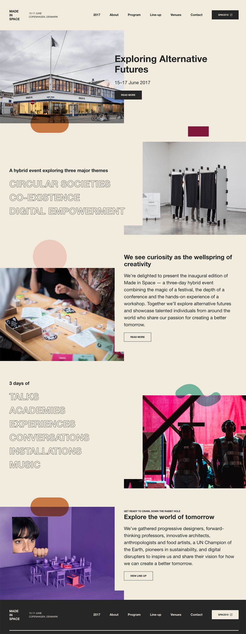
Dive headfirst into the three-day event by scrolling down for a plethora of images. Naturalistic photographs give users a bird’s-eye view of the event, immersing viewers in the experience as if they were there the whole time. Can’t see the pictures? Just move your cursor over the images and they’ll enlarge slightly for better viewing.
One color is pretty standard, two colors keeps things interesting -- but anything beyond that is pure fun!
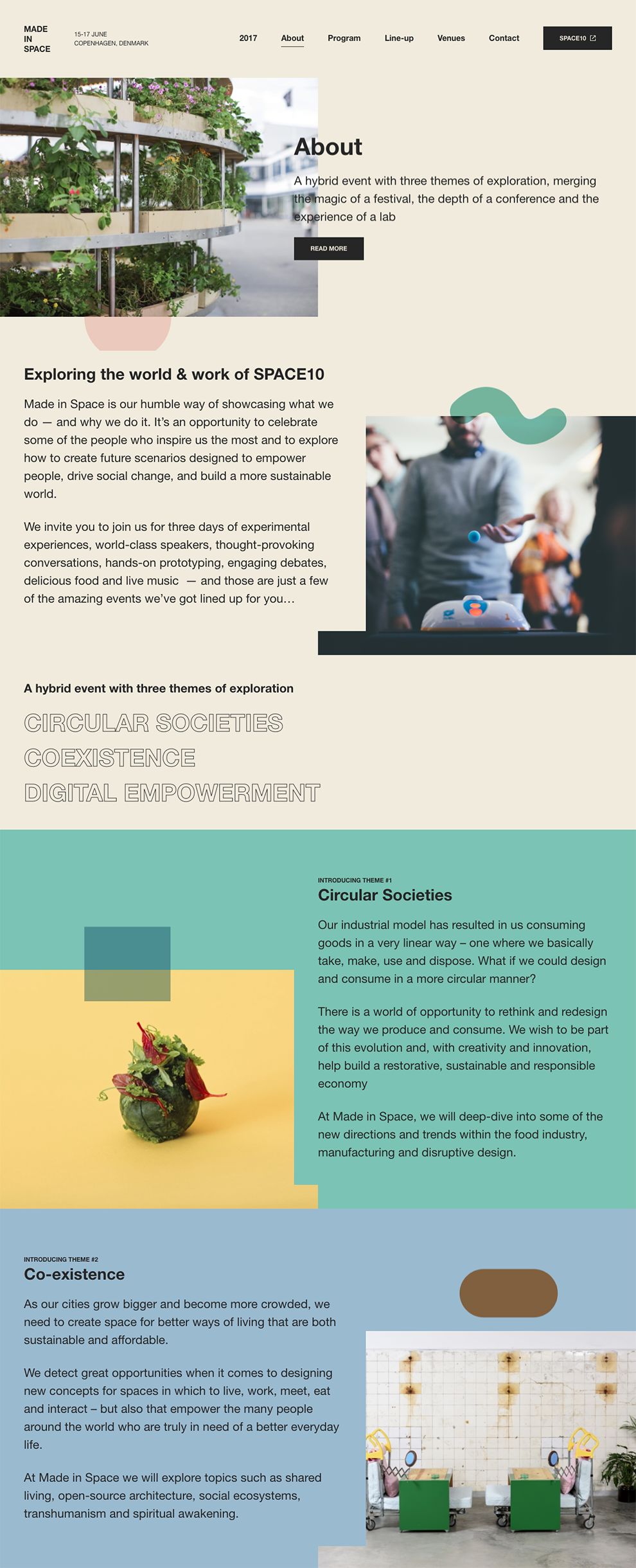
As you scroll through Made In Space’s About page to learn more about the event, the website strategically places various colors down the page to separate concepts. Translucent geometric shapes break up the intensity of each flat color with a jolt of creativity.
Diversifying fonts means diversifying the visual playing field. That initial common font is varied alongside a funky outlined font. The see-through appearance is exciting, pulling up the background colors and effectively weaving everything together into one sleek design.
With a creative stance on alignment, Made In Space’s About page is anything but boring. The opposing calibration between text segments and photographs keeps things visually intriguing.
Giving potential attendees an idea of what will happen at an event is vital in securing their interest (and ultimate presence!) and Made In Space understands that.
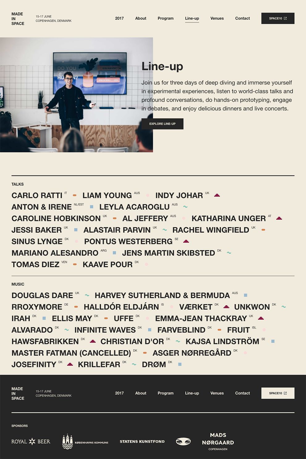
They break down the event's program by individual speaker profile, letting users pick and choose who to engage with. Subtle earthy tones put the focus on the profile name at the top of the page. Meanwhile, complementary coloring within a shape spotlights the name of the speaker. You can’t miss it!
Color is a page’s best friend; Made In Space utilizes color as a key aspect to their platform, guiding users through the page in a fun way. Stunning photographs allow for an immersive experience, drawing users into what each day of the event was like as they plan to join the next one!
Made In Space is a colorful website design in the Education and Entertainment industries.


-preview.jpg)


