
Skype App Design Makes Communication A Snap
Skype is a communication app owned by Microsoft Corporation. The app now features Microsoft's preferred flat design, which is used in products such as Windows 10 and Windows 8.
Utilizing a professional looking app design, the app stays mostly conventional and restrained. Its simple execution offers lessons for designing apps that will be used by millions of different users.
Skype Mobile App Creates Simple Navigation
The actual design of the Skype app is both innovative and simple. It exists so users can achieve one thing -- communicate with others.
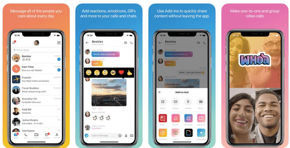
At the bottom of the screen, five icons make this communication easy -- chats, calls, camera, highlights and contacts. These icons are evenly placed with good white space, preventing an accidental click of the wrong icon when journeying through the app.
While the first two icons (chats and calls) exists to help people speak quickly and effectively with one another, the latter three foster an optional social media network-like feel on the app. People can post statuses and content, and their contacts can explore that at their leisure -- or not. Ultimately, the focus of the app design is on its bread and butter of direct digital communication.
Skype recognizes that search is an important feature of the app design, and thus, the search bar is always prominent and present at the top of the screen.
Between the navigation icons at the bottom of the screen and the search bar is your profile. The content inside the "profile" portion of the screen changes based on the section you're in.
Overall, the app has a streamlined and efficient interface that fosters strong communication between people.
Skype App Design Proudly Promotes The Skype Brand
When you boot up the Skype app, you are greeted by the blue and white Skype logo. It uses conservative, business-like shades of blue and white. This color combination will be ubiquitous in the user experience of working with the Skype communication tool.
The logo, however, is not altogether plain. It uses a bold, stylized design that departs from simple flat design.
The letter is surrounded by a hue of white to create a superhero-like icon reminiscent of the likes of Superman.
The critical difference is the choice of colors. However, the app's showcase of its brand hints at its powerful communication capabilities which have led to it becoming a hit with users.
How Skype Has Evolved
Skype started in 2003, the product of Niklas Zennström and Janus Friis. Its Swedish and Danish founders saw the app spread through Europe, then all around the world.
Its embrace of the internet for communication came at a time when there were few such tools. Using Skype was much more cost-effective for long-distance calls. In addition, the ability of the internet to span distances helped customers do business and talk with friends.
The app has been through a few different owners since then. At one point, it was acquired by e-commerce giant eBay. Then the app was owned by VF firm Andreessen-Horowitz. Finally, Microsoft acquired Skype in 2011 in a deal worth several billion dollars.
The Skype app is available on all the major operating systems. These include:
- Windows 7, 8 and 10
- Mac
- Linux
- Android
- iOS
A web version of Skype also exists, which allows a more limited set of features than the native apps.


