


-account-photo_listing.jpg)
-account-photo_listing.jpg)


Our Jury has worked with Prada, Nike, Chanel, Google, and Apple.
Best App Designs With Dark UI of 2026
View the Top App Designs With Dark UI Below
Best App Designs With Dark UI of 2026
4,200+ Submitted Designs
- Agriculture
- Android and iOS
- Arts & Recreation
- Automotive
- Banking & Finance
- Chat
- Content & News
- Cooking
- Dating App
- Distribution
- E-Commerce & Retail
- Education
- Engineering
- Entertainment
- Fashion & Beauty
- Food & Beverage
- Government
- Health & Wellness
- Hospitality
- Luxury
- Medical & Pharmacy
- Nutrition
- Professional Services
- Real Estate
- Sports & Leisure
- Streaming
- Technology
- Travel
- Video Game
View Design
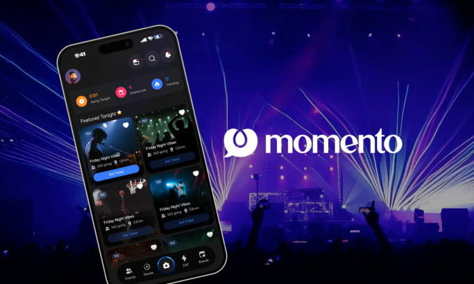
Momento
View Design
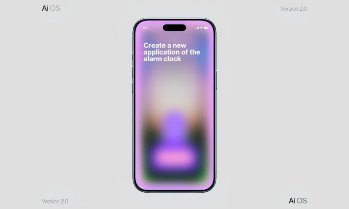
AI OS App Design
View Design
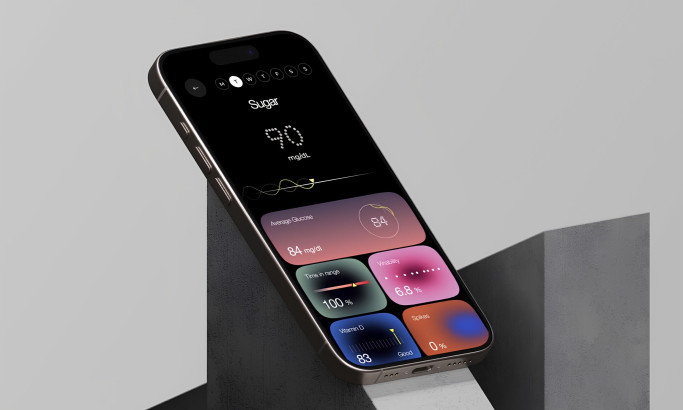
Veri Health App Design
View Design
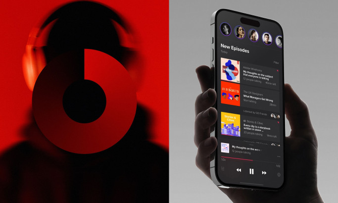
Listen
View Design
Spectra
byRobin
View Design
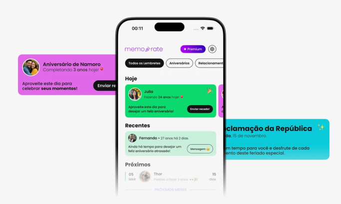
Memorate
View Design
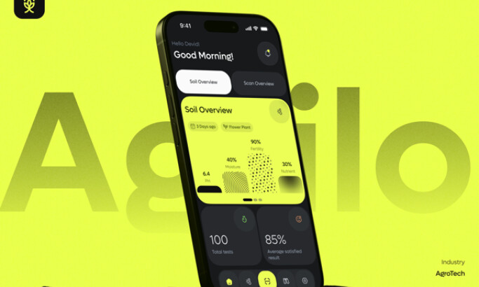
Agrilo
View Design
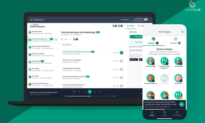
MKSAP Audio Companion App
byLunarLab
Get Connected
With The Right Agency Partner
& Receive Proposals For FREE

View Design
The Hood
byAltamira
-preview.jpg)
View Design
Speeko
-preview.jpg)
View Design
Mobile App for a Social Network
bySurf

View Design
Hackathon Event App
byUptech
-preview.jpg)
View Design
Savage
-preview.jpg)
View Design
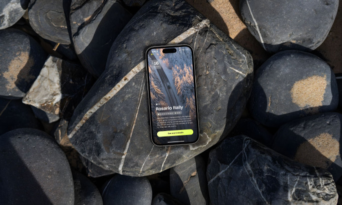
Interplanetary
byPol Mas
-preview.jpg)
View Design
Spotify UI Interactive Resume
-preview.jpg)
View Design
Imagine with Jimmy
Ready to elevate your designs?