
App designs are a huge reason why people use these apps - they offer convenience and efficiency to those using them for various reasons. App design is a critical factor in determining the success of your app, so it is essential to partner with the best app developer professionals to ensure its continuous success.
Without further ado, here’s our list of the best app features and why we chose them for different reasons:
Table of Contents
- CTRL Golf by Altamira
- HUMA App by Digis
- Bainkum App by ChicMic
- Book Bird Education Institute by Prismetric
- Raiffeisen Bank App by Droxic
- Learning App - Dark Mode by Pixalchemy XD
- Unison Cryptocurrency Exchange App by Roman Lel
- Daily Recipes by Spaceberry Studio
- Oberit by DianApps
- Examarly by RipenApps
- Sensie - Wellness App UI by Z1 Digital Studio
- Crypto Wallet App by Brandroom Web Studio
- Virtual Terminal for Salesforce by Bozor
- Christmas Gift Shop Mobile App Design by CreativePeoples
- QA. Report by Quantum Art
- Levit Bank by Fojin
- Bergen Stillas AS by Studiopresto
- CommonFloor by GoodWorkLabs
- Playtomic App - Design by Erretres
1. CTRL Golf by Altamira

Standout Features:
- User-friendly layout
- Efficient design
- Easy-to-understand concept
Golf is a sport that many people enjoy, so they need an app that can help them monitor their progress in the sport and help them improve more when needed. This app is a godsend to all golfing enthusiasts, and the design allows for efficiency.
Since adults might be using the app, Altamira decided to make the app design as straightforward as possible. The circles show stats on your daily golf game and let you compare progress from the previous days.
The app design agency created the app so that people won’t get lost clicking so many tabs and bringing them to sections they don’t need in the first place. It is straightforward to understand, indicating that they considered the demographics when designing the app.
Your app design must be accessible and convenient to everyone because users won’t bother using it if not.
Considering your app’s target demographic is very important in designing a great and helpful app, so they deserve a spot on this list.
2. HUMA App by Digis

Standout Features:
- Attention to detail
- Uplifting color story
- No-frills approach
Healthcare is something that many people value over everything else. People need apps that can help them gain access to the best quality healthcare providers near them without rummaging for a place, especially during emergencies.
This app design by Digis offers a great way of connecting patients to the nearest and best quality healthcare providers through remote clinic trials. Clinic trials help scientists develop the best drugs and medication to combat various illnesses, so making this more accessible is a breeze.
You might notice the app’s color palette. The agency used pink, a color known for its relevance in health and wellness. People often denote pink as a color of good health, which is a clever nod to the reference.
The app is also easy to navigate without annoying popups or hidden windows that might mislead people. Good thing this app allows users to get what they want without being hounded by popup windows that appear now and then.
3. Bainkum App by ChicMic

Standout Features:
- Use of the correct images
- Simple layout
- Dark mode available
Countless app designs found on the Play Store and App Store offer seamless transactions to people needing various items, from cars to use for their next road trips to the holiday getaway house they’ve wanted to visit for months. This app offers convenience and safety to renters and sellers out there.
One thing that sets this app apart from the competition is its dark mode feature that reduces eye strain, especially for those with visual problems. Apps with dark mode features are great for those who have difficulty navigating from one app to another because of the light and glare they receive. This offers ease of vision,
App designer ChicMic also used appropriate icons to guide people on what they want to sell or rent. Do they want to rent out a house? Check on the house icon. Are they considering selling their kayak? Click that boat icon for underwater vehicles and other equipment.
With its simple layout, you can experience ease in using this app, knowing that every transaction will be correct and smooth sailing.
4. Book Bird Education Institute by Prismetric

Standout Features:
- Interactive sections
- Ease of navigation
- Helpful layout
Online learning sites are abounding these days, offering digital and valid certifications to those who complete courses to find better jobs or land more significant positions in their companies. Thanks to its user-friendly structure, this app is one of the best in the field.
Designed by Prismetric, it offers easy registration, attending classes, and even taking timed quizzes needed for each course more effortlessly. The quiz sections are significant for those taking exams on the go, with their practical and lightning-fast reactions and transitions.
Since it is an educational app, the app designers put ease of use at the top of their list for considering how this app would work. Even those who are not tech-savvy can find this app very useful without having to worry about clicking the wrong sections.
We all need a stress-free e-learning app, and this one is undoubtedly the cake.
5. Raiffeisen Bank App by Droxic

Standout Features:
- Gorgeous photos
- Easy-to-use interface
- Efficient user experience
Online banking dealings can be tedious. That’s why the Raiffeisen Bank app design makes the process much smoother for its users.
Created by Droxic, this app gives you a user-friendly interface that makes navigation effortless and smooth. It also has a beautiful design with gorgeous photos of nature as the background. It adds to the user experience and makes banking feel more pleasant.
The app offers useful features like two-way communication involving the information gathered and your emotional state. It’s convenient and efficient and makes the whole experience less painful.
The attention to detail that this app has placed with its design is perfect for those who have had enough online banking mishaps.
6. Learning App - Dark Mode by Pixalchemy XD
Standout Features:
- Minimalistic design
- Dark mode
- Cool color story
As mentioned, apps with a dark mode feature are a blessing for those who find it hard to stare at their phones for a long time. This app offers ease of use in the overall user experience, with a soothing background and a relaxing design.
Many people choose dark mode features on their apps to reduce eye strain and prevent further eye problems. With this dark-themed design, users can enjoy the app minus the worry!
The cool colors complement the whole dark mode experience. Blue is also known as a soothing color, and many people enjoy seeing it due to the calm vibe it appears to bring with it. Indeed, Pixalchemy XD knows what they are doing.
Since no complicated visual elements are in sight, this minimalistic design is convenient and easy to navigate.
7. Unison Cryptocurrency Exchange App by Roman Lel

Standout Features:
- Great earth colors
- Dark mode activated
- Easy navigation
With crypto exchange apps, users want to make sure they are getting the best user experience that they can. Roman Lel knows this and has created this fantastic piece of work. The app colors help bring out a feeling of connection with nature, which is very calming and soothing for users.
The app structure and navigation are also great, eliminating the need for users to read through dense instructions to use the app.
Overall, this cryptocurrency exchange app provides a fantastic user experience with its stunning colors and dark mode features that give a calming feel, especially to a volatile topic like this. Explore the best crypto and blockchain branding examples here.
8. Daily Recipes by Spaceberry Studio

Standout Features:
- Stimulating photos
- Legible typography
- Vivid videos
Daily Recipes by Spaceberry Studio is a must-have for food lovers and adventurous cooks who like to try new recipes. The app has gorgeous photos that jump out every time users open it, inspiring them to cook something new.
The typography used in the app is also very legible, making it easier for the user to read through recipes and instructions. It ensures that information is clear and understood in translation.
Videos are also a great feature of this app; they give users step-by-step visuals on how to prepare different dishes, enabling them to follow along at their own pace.
Overall, this app brings an excellent user experience with its stimulating photos, legible typography, and vivid videos that keep users interested in cooking something new.
9. Oberit by DianApps
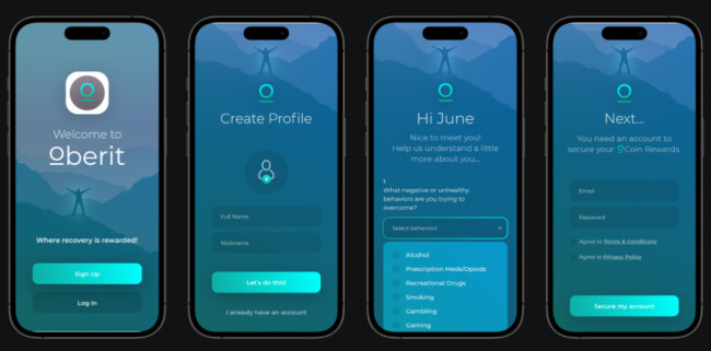
Standout Features:
- Sleek layout
- Clear objectives set
- Cohesive color combinations
When it comes to mental health and well-being, this app designed by DianApps is a great resource to help people take charge of their mental health.
It offers users a sleek layout with clear objectives that make it easy for them to get started on their journey toward better mental health.
The app also features cohesive color combinations that are calming and visually appealing. It helps create an environment conducive to self-reflection, growth and healing.
It also lets users establish goals for their mental health journey and track progress.
Users can set reminders for themselves and get tips on staying motivated as they journey toward better mental health. It’s a helpful feature, especially for those who need reminders for their activities.
10. Examarly by RipenApps

Standout Features:
- Bright color palette
- Efficient buttons
- Concise texts
Learning apps can be simple, and Examarly is proof of this. Its bright color palette, efficient buttons, and concise texts make it the perfect platform for students who want to ace their tests without going through unnecessary complexities.
Designed by RipenApps, the app boasts a bright and organized layout that makes it easy to find the different subject areas. It also has built-in study reminders so users can stay on track and never miss a beat.
One of the marks of a great app design is the harmony between various elements, and Examarly has that in spades.
With its bright and visually pleasing design, users can easily focus on the task without going through too many distractions.
11. Sensie - Wellness App UI by Z1 Digital Studio

Standout Features:
- Soothing color palette
- Instrumental sections
- Well-thought-out execution
People find apps like this one very helpful because it helps them get on track with their mental health and all the other intricacies behind them. Many people find this app very useful, and its design makes things much better for them.
The app, designed by Z1 Digital Studio, has sections with a layout so well-designed it won't be hard for older users to see how effective it is. The structure is also clean and organized, free of distracting windows and icons.
Since this app targets mental health as one of its prime objectives, the color story helps stimulate moods every time users tap on the app. The colors are not glaring or bland, which is an outstanding balance.
It helps that apps like this follow a streamlined layout that is visually pleasing and easy to use. It helps them reduce the strain from the hours of using the phone.
12. Crypto Wallet App by Brandroom Web Studio
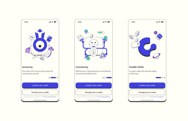
Standout Features:
- Uniquely designed images
- Technology inspired
- Obvious branding placement
One of the actual marks of having a great app design is when your design resonates with your field of interest. Crypto is a field that still makes people wary, so app designers must pull all the stops to get people to use apps in the said field.
This app designed by Brandroom Web Studio is an excellent example of that. The agency tapped into the techie side without confusing app users, incorporated technology-inspired icons, and made them look fun.
The layout of the app is also well-planned. Every icon or function is in order, which is a great thing to avoid confusion for the app users.
Seeing the colors and fonts from the entire branding kit used throughout the app is an excellent visual experience.
13. Virtual Terminal for Salesforce by Bozor
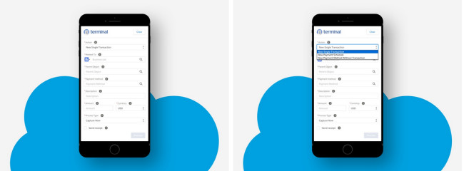
Standout Features:
- Minimalist design
- Clean layout
- Wise use of icons
Sometimes you need an app that does the work without special effects or frills.
Created by Bozor, this app boasts a clean layout where you can find everything in the right place. No need to worry about where you can check out new payments because the sections are labeled adequately without any mistakes.
The minimalist app design is great because using Salesforce as a CRM tool for businesses is a complicated device to navigate.
The icons are also placed strategically in such a way that they guide people into the proper functions and services they need in the app.
14. Christmas Gift Shop Mobile App Design by CreativePeoples

Standout Features:
- Fun layout and design
- Seasonal icons
- Legible typography
It can be a real struggle to buy holiday gifts in a rush. With so many people crowding the malls and shops, it would be the next best option to shop online and wait for your presents.
CreativePeoples considered how people would get into the season's vibe while browsing for possible gift options in this app by incorporating various images that quickly remind people of the Yuletide season.
Upon opening the app, you can see Santa Claus, the Christmas tree, and other equally iconic images perfect to set the mood, an excellent way to get into the vibe from the get-go.
Additionally, the font style and size are easy to read. It allows users to see prices and read item descriptions more seamlessly.
15. QA. Report by Quantum Art

Standout Features:
- Simple typography
- Friendly color story
- Light to the eyes
The user interface in this app is perfect for someone who wants a hassle-free, breezy user experience. The agency utilized subtle yet friendly colors in the background, and items are easy to find with the help of categories at the bottom of the screen.
The typography is also simple yet legible enough so that it's easy for someone to read what they're selecting. The font size also works well with the overall design, making it easier to read and browse the items.
Apps that are light to the eyes in terms of the user interface are great, and they can contribute generously to the overall user experience, so this app nails the requirements on the head.
Indeed, Quantum Art has done a great job conceptualizing the app from beginning to end.
16. Levit Bank by Fojin

Standout Features:
- Energetic color story
- Excellent use of gradient
- Complements the logo and branding
It is essential for banking apps to have all the things the users need in one place, neatly arranged, and without any unnecessary distractions. Fojin did a fantastic job in designing the app for Levit Bank.
The design exhibits a balanced look between the energy of color and the utility of typography.
Using bold colors such as white, orange, and black makes it easier to spot certain features, while dark blues and grays act as accent colors to make everything look cohesive.
The use of gradient makes the app look modern and up-to-date. It also allows it to blend with its logo, an excellent example of how good designs complement branding.
17. Bergen Stillas AS by Studiopresto

Standout Features:
- The juxtaposition of photos and texts
- The simple and direct design concept
- Easy navigation
Images and text go hand in hand in this excellent app design from Studiopresto. Sometimes, there are app designers who need to balance ideas and texts with one overwhelming the other.
In this app design, the photos are juxtaposed perfectly with the texts that describe the windows.
The colors are also dark enough to prevent the users' eyes from straining, a great way to maintain aesthetics but keep visitors' eye health in check.
Another standout feature of this app design is its simplicity and directness. Not only does it ensure that the contents are clear and visible, but it also helps users navigate more easily.
Users can easily find what they need without going through too many pages and menus.
This app design meets its purpose of providing people with a convenient way to check out different window designs they can use for their homes.
18. CommonFloor by GoodWorkLabs

Standout Features:
- On-brand color palette
- Excellent user journey
- Expansive real estate listings
CommonFloor.com is one of India’s largest and hassle-free, end-to-end real estate platforms that combines property search, apartment management, and vendor management. With one of the most expansive listings online, it was only a matter of time before it morphed into a convenient app. Enter CommonFloor Edge!
Designed by GoodWorkLabs, the cutting-edge app (pun intended!) covers all the touchpoints and functionalities to minute details such as color codes, fonts, visual design, and innovative technology integration.
Each step of the user journey is meaningful. Users not only browse the app for apartments for sale or rent in Indian cities but can also get 3D and aerial views, as well as locality tours to make their decisions easier.
Essentially, CommonFloor is the answer to all of your real estate needs!
19. Playtomic App - Design by Erretres

Standout Features:
- Strong community
- Flawless UI
- Ever-expanding, evolving services
Simply put, Erretres created a digital meeting point for padel players to experiment, play, have fun, and ultimately, build a community of like-minded players. Playtomic is the personal assistant for playing padel whenever you want, with whoever you want.
As one of the first Spanish sports scaleups and the first Spanish unicorn with a global impact on the industry, Playtomic built an international presence across the globe. Their evolution from a rent-a-court service to an immersive padel ecosystem demanded an exquisite app that is more than that. Playtomic app's user journey is built in such a way that it seamlessly breaks down the borders between the physical and the digital to create mesmerizing user experiences.
Essentially, it is a beautifully designed, digital meeting point for racket sport players, an all-in-one assistant to play padel, whenever, wherever, with whomever you want to. Make sure to check our article on best app designs for iPad.

Our design experts recognize the most innovative and creative designs from across the globe. Visit Design Awards to see the:
- Best Logo Designs
- Best Website Designs
- Best Video Designs
- Best Print Designs
- Best Packaging Designs
- Best App Designs
Our team also ranks agencies worldwide to help you find a qualified agency partner. Visit our Agency Directory for the top Logo Design Companies, as well as:
- Top Web Design Agencies
- Top Video Production Companies
- Top Print Design Companies
- Top Packaging Design Companies
- Top Mobile App Development Companies


