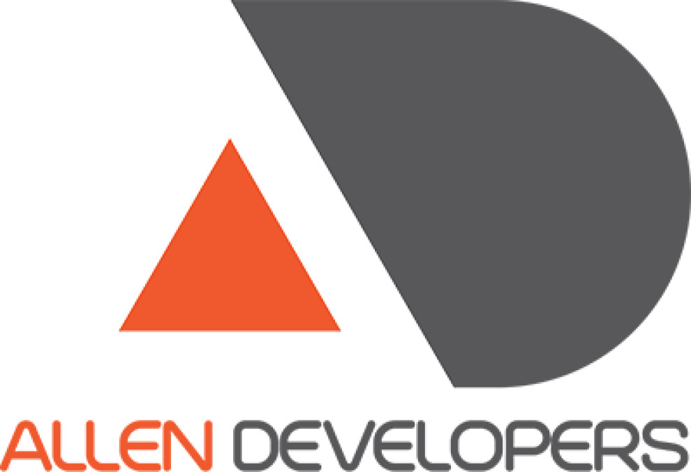
Standout Features:
- Strategic use of negative space
- Geometric logo symbol
- Dual-tone design
Allen Developers’ logo aligns seamlessly with their commitment to cutting-edge digital solutions. Moving beyond traditional design elements, it embraces a geometric symbol that ingeniously merges the A and D brand initials. It showcases the company's inventive approach and attention to detail.
The Allen Developers logo balances warmth and professionalism by adopting a striking dual-tone orange and dark grey palette. The orange imparts an energetic and innovative vibe, indicative of the company’s forward-thinking projects. The dark grey signals sophistication and strength.
Its modern and minimalist style reflects Allen Developers’ focus on clarity and simplicity. This design choice speaks to a contemporary audience and conveys the company’s commitment to efficient and future-forward developments.

-preview.jpg)


