Giani’s Logo Design Celebrates the Brand’s 60-Year-Long Legacy
Giani’s Ice Cream was first established in 1956 in the capital of India. With more than 60 years of experience, 60 outlets and over a hundred products it dominated the local market.
In their own words:
“We are a dessert joint conceived to bring a range of high-quality flavorful ice creams, efficient service and a typically friendly taste. These values are the fruit of the experience of years in this sector and a passion for innovation and research that will be able to satisfy even the most refined palates.”
However, the company regarded its rich history and experience as a perfect opportunity to continue the sweet and steady growth.
In fact, Giani’s aspired to become the go-to ice-cream national brand, which required an appropriate avatar that could serve that goal. The eight-month-long rebranding exercise resulted in a successful transformation that helped the legendary brand grow by 50% in less than two years!
The chief vehicle of that rebranding? Why, Giani’s logo design, of course!
Aarts Creative Consultancy understood that repositioning the beloved brand among its customers, demanded a logo that better expresses the established customer experience. Hence, “Love, Legacy & Ice Creams.” It’s a sweet adventure, spending time with loved ones, celebrating and sharing emotions - all encapsulated in the moment of opening up Giani’s ice cream.

Giani’s Logo Design Reveals a Multilayered Image that Signifies the Act of Opening One of the Brand’s Premium Ice Creams
There are only a few sweets that have quite the same emotional impact worldwide as delicious, refreshing ice cream. Opening/unwrapping the ice cream is a special, rejuvenating experience, deeply rooted in our collective psyche.
Giani’s new identity draws heavily from that experience and it aims to become synonymous with it. The logo embodies the brand story of opening up (without deviating from its previous identity) the ice cream cup in a slightly abstract manner.
The capital, or rather the first letter “g”, ingeniously represents the overview of an opened product. In fact, it “hides” two distinct elements: the circle (top part of the letter) acts as an ice cream lid, while the swirly element represents the ice-cold goodie, ready to be consumed on the hot summer day.
Both the letter and dominant red color were retained from the previous branding; however, it’s geometrically simplified to provide a contemporary avatar ready for conquering the national and international markets alike.
Giani’s Logotype and Typography is as Simple and Streamlined as Customer Experience
With a freezer brimming with competitors, creating a recognizable ice cream brand identity can be hard. (Ice) Screaming for attention isn’t always the best option.
Fortunately, Giani’s logo design (and accompanying tagline) doesn’t have to rely on aggressive, in-your-face branding. Like most branding agencies that use simple yet impactful fonts, this one opts for a sleek, rounded and stylish lowercase sans-serif typeface that doesn’t need any gimmick to turn heads.
As New Delhi’s pride, Giani’s already cemented its position/legacy of premium quality and accessibility and their logo reflects exactly that.
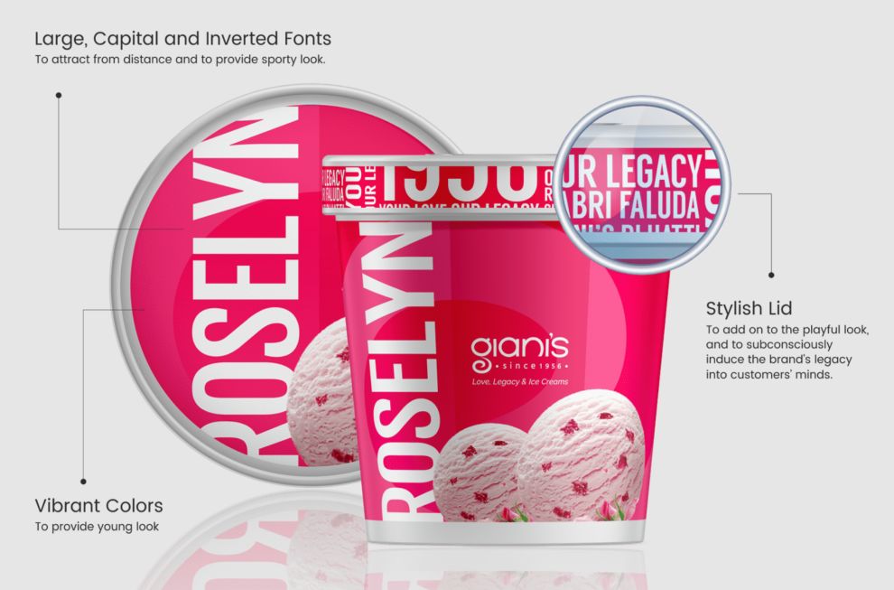
However, in order to stand out in the crowd of other brands, Aarts Creative Consultancy added an unconventional design style, where the product name was written in a vertical fashion to cover the packaging’s maximum surface area and provide a bold look that attracts the customer from a distance. The vibrant range of colors not only reflects each flavor but provides a fresh and tempting feel making it a prime example of the best ice cream packaging designs today.
Additionally, the agency introduced a playful textual pattern on the side of the lid to hammer Giani’s legacy as the go-to brand in customers’ minds.

The Logo is Seamlessly Applicable to a Variety of Media Beyond Ice Cream Products
Most logo designers strive to create logo designs that are personable and recognizable, easily applicable to different platforms. Giani's logo design exemplifies this approach, as it seamlessly translates across various channels like business cards, promo materials, and social media. Such versatility allows new customers to indulge in Giani's offerings while maintaining a consistent and strong brand presence.
Giani’s logo stands out effortlessly. It is attention-grabbing but it also perfectly blends in, becoming a pleasant background pattern if needed.
The commanding combination of red and white stands out well against both dark and light backgrounds in equal measure.
With all that in mind, it’s safe to say that Giani’s logo design is a clear winner in modern rebranding.

Giani’s Logo Design Demonstrates How to Create Future-Proof (Re)Branding
The main trait of a quality logo design is that it needs to work well on its own and stand out. The second question is: does the logo represent the brand appropriately?
Short answer? Absolutely!
Giani’s logo design follows the basic principles of memorable logos and adds a (literal) twist to that equation. While simplistic at first glance, its arrangements and symbolism offer another flavor to an already masterful effort, showcasing its mass appeal without a hitch.
Giani’s legacy and a genuine mini-story of customer enjoyment are present front and center in its logo. It forms a legible, well-rounded narrative, condensed into a welcoming and premium-looking logo design that is bound to stand the test of time.