-account-photo_listing.jpg)
-account-photo_listing.jpg)


Our Jury has worked with Prada, Nike, Chanel, Google, and Apple.
Best Logo Designs
A logo is still a brand's most important pixel. These are the marks that got it right in 2026.
Best Logo Designs
4,200+ Submitted Designs
- Advertising
- Agriculture
- AI
- Airline
- Alcohol
- App Company Logo
- Architecture
- Arts & Recreation
- Automotive
- Banking & Finance
- Beer
- Church
- Clothing Brand
- Coffee
- Content & News
- Distribution
- E-Commerce & Retail
- Education
- Engineering
- Entertainment
- eSports
- Farm
- Fashion & Beauty
- Food & Beverage
- Government
- Health & Wellness
- Hospitality
- Legal & Insurance
- Luxury
- Manufacturing
- Non-Profit
- Photography
- Professional Services
- Real Estate
- Restaurant
- Restuarants
- SEO Agencies
- Shoe Brand
- Small Business
- Software
- Sports & Leisure
- Startup
- Technology
- Travel
- Video Companies
- Weed/Cannabis
- Abstract
- Animated
- Artistic
- Bakery
- Black
- Black & Yellow
- Blue
- Bold Logo
- Brand
- British
- Business
- Circle
- Creative Name
- Dental Office
- Done by Freelancers
- Emblem
- Floral
- Geometric
- Glow
- Gradient
- Gym
- Icon
- Illustration
- Lettermark
- Logo symbols
- Makeup Brand
- Marathon
- Minimal
- Modern
- Monogram
- Multicolored
- Nature
- Negative Space
- Rebranding
- Red
- Redesign
- Simple
- Starting With the Letter S
- Successful
- Sunshine
- Trendy
- TV Channel
- Typography
- Unisex Salon
- Vintage
- Water
- Watercolor
- Wordmark
 Winner
★8/10
 AO 9.00
 BS 5.00
 KS 7.50
 KT 9.50
 LB 9.00
View Design
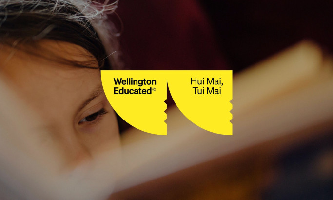
Wellington Educated
 Featured
View Design
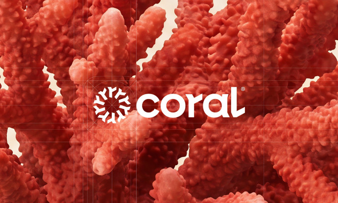
Coral Marketing Logo Design
 Featured
View Design
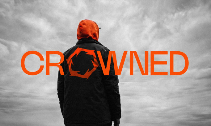
CROWNED
View Design
Kalon Sports Logo Design
byChance
View Design
CapAtlantique Logo Design
View Design
Portugal National Football Team Logo History
View Design
Norway's Crest, 90 Years in the Making: The Story Behind the Badge on the Red Shirt
View Design
Denver Nuggets Logo History
View Design
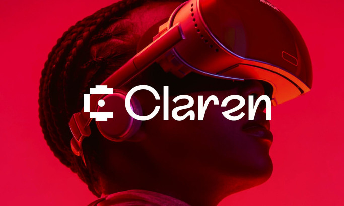
Claren Logo Design
byFocoTik
Get Connected
With The Right Agency Partner
& Receive Proposals For FREE
View Design
Ford Motor Company Logo
View Design
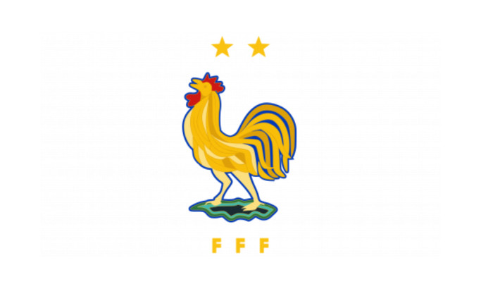
France National Football Team Logo History
 Winner
★9/10
- AO 10.00
- BS 9.00
- KS 8.00
View Design
Balance
View Design
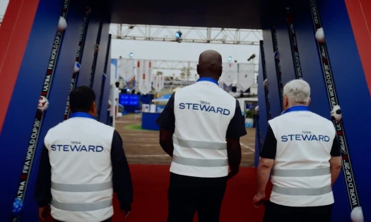
The FIFA World Cup 2026 Logo Design
View Design
The GTA 6 Logo Design Analysis
View Design
The FIFA World Cup Logo History
View Design
England National Football Team Logo History
View Design
German National Football Team Logo History:
View Design
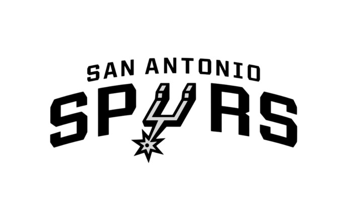
San Antonio Spurs Logo History: The Design Philosophy That Refuses to Shout
Ready to elevate your designs?