14 Abstract Logo Designs To Inspire You

14 Abstract Logo Designs To Inspire You
Article by DesignRush DesignRush
Last Updated: November 03, 2023

Abstract logos are rising in popularity for a reason. Today’s audiences like how aesthetically pleasing abstract logos look in a sea of complicated designs.

Although seemingly counterintuitive, the top logo design companies agree that having abstract logos can relay a much more exact message to the company values that it represents. Going abstract is able to convey feeling in a much more impactful way.

These superb examples of famous abstract logo designs will convince you to take a chance and create one for your company or brand.

We’ll find qualified logo design agencies for your project, for free.
GET STARTED

1. Mojeo by Eleonora Anzini

[Source: Eleonora Anzini]

Standout Features:

  • Colorful monogram logo
  • Bold lowercase M
  • Overlapping colors

For Mojeo, a Dutch startup focused on project management, designer Eleonora Anzini created a colorful monogram logo.

The logo features a bold lowercase "M" adorned with overlapping colored circles, reflecting the brand's vibrant and dynamic approach to helping clients let their "Mojo" work efficiently in managing projects.

The overlapping colored circles filling the "M" create a playful and energetic visual effect, embodying Mojeo's innovative and collaborative approach to project management.

This color interplay not only adds a layer of depth to the logo but also encapsulates the brand's creative spirit.

2. SMG Labs by Lisa Furze

[Source: Lisa Furze]

Standout Features:

  • Fresh and vibrant color story
  • Initials inside a hexagon
  • Simple and minimalist design

For SMG Labs's logo design, Lisa Furze chose a vibrant color story to add a fresh and friendly feel to the brand.

The logo has a hexagon-shaped border with the founder's SG initials (Stephanie Geer) inside. It resonates with the brand's unique position of bridging science and innovation.

This design provides a minimalist yet impactful visual and enhances the brand's professional image, aiding in better lead generation and client engagement.

3. The Smart Living Concept by Yeah, Jackie

[Source: Yeah, Jackie]

Standout Features:

  • Origami-inspired
  • Feminine color palette
  • Alternating boldface

Logo design agency Yeah, Jackie came up with a unique abstract logo for The Smart Living Concept, a venture by professional organizer Gemma Graham.

The logo captures the brand's core values inspired by Marie Kondo's philosophy on decluttering and organizing homes and lives.

The origami bird logo design reflects a sense of tranquility and precise planning, resonating well with the brand's zen values. Meanwhile, the soft color palette adds a feminine touch to the design.

The alternating boldface and familiar typography add to the abstract allure while maintaining a professional appearance.

4. Meco by Lonely Drone

[Source: Lonely Drone]

Standout Features:

  • Circles forming a diamond
  • Bigger circles forming an upward arrow
  • Different versions

Logo design agency Lonely Drone tapped into its creative roots in designing the logo for Meco. This open-source AI-powered platform moderates unwanted content in images and text.

The logo features an unconventional approach that fits the brand's identity and narrative.

The logo design features circles clustered into a diamond, with the bigger circles forming an upward arrow, reflecting their desire to rise to the top of content moderation with the power of AI.

They have two versions: alternating between black circles set on a yellow background and vice versa, showing their capability to showcase themselves on different backgrounds.

5. Lineface Productions by Jan Werthwein

[Source: Jan Werthwein]

Standout Features:

  • Animated variation
  • Bold lines
  • Monochrome static version

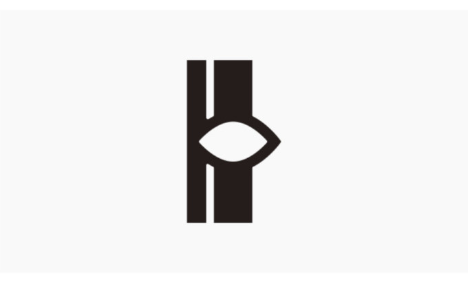
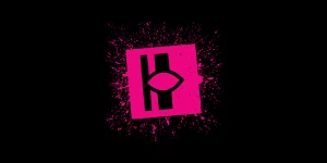
The Lineface Productions logo by Canadian designer Jan Werthwein comes alive in its animated version, where pink hues and paint splatters add a dynamic flair. The unique design, featuring two vertical lines seemingly forming an eye shape, exudes a sense of creativity and vision.

Its versatile versions ensure adaptability across different mediums, making it a strong visual identity for Lineface Productions. Meanwhile, the static version in monochrome exhibits a timeless and clean aesthetic, showcasing the logo's core design elements without the distraction of color or animation.

6. Vape Reign by Jimmy Viquez

[Source: Jimmy Viquez]

Standout Features:

  • Crown-inspired logo
  • Metallic color
  • Bold typography

For Vape Reign, an electronic cigarette company, logo designer Jimmy Viquez worked on creating a logo that best exemplifies its desire to become a premium vape brand for its consumers.

Thus, he used the initials from Vape Reign and turned it into a crown, the best icon to represent the brand's quality.

The logo design also has a metallic color to enhance its aesthetic. Meanwhile, the bold typography gives an authoritative impression, assuring people they provide the best quality electronic cigarettes for their needs.

Featured Custom Logo Designs by Top Digital Agencies
Website designed by Agency
Design description goes here
Website designed by Agency
Design description goes here
Website designed by Agency
Design description goes here

7. Leonardo Stockschneider and Luciano Ruthes Lawyers by Carlos Bauer

famous abstract logos

[Source: Carlos Bauer]

Standout features:

  • Unique iconography
  • Soothing color story
  • Innovative logo design

Brazilian lawyers Leonardo Stockschneider and Luciano Ruthes have been law partners for over a decade. They are known for being straight to the point and transparent when providing legal assistance to their clients.

This logo design by Carlos Bauer has employed an abstract perspective in interpreting the most common symbols of law and justice: the scales. Lady Liberty is always portrayed as a woman holding a pair of scales representing equality.

However, all law firms have incorporated this symbol into their logo design. Carlos Bauer has done a refreshing take on the familiar icon used by law firms worldwide.

The logo design features three lines with the same thickness and length, each placed strategically to resemble a pair of scales. Not everyone would think of scales immediately, which leads to some good discussion points among observers.

The designer also used green as the primary color in the logo. In color psychology, green symbolizes calm, freshness, and energy. The freshness they want to portray in this logo reflects their refreshing manner of dealing with their clients.

The logo design is indeed well thought out and creative at the same time.

8. Maison Prodige Mafia by Tamim Mortaza

abstract logos examples

[Source: Tamim Mortaza]

Standout features:

  • Excellent portrayal of values
  • Creative illustrations
  • Unique typography

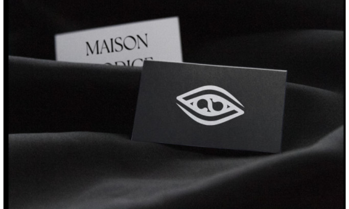
Maison Prodige Mafia is a collective group of artists who have banded together under the values of art, creativity, and artistic representation. If you need artists for your creative needs, you can find one here.

Tamim Mortaza designed this logo, which is an accurate representation of the company. He incorporated various elements of art into one abstract logo design that served its purpose.

The logo is a symbol of vision, and what better way to represent it than using an eye symbol? When you look closer, you'll see that the logo features an infinity sign right at the center.

The eyes relate to the vision that everyone shares inside the company. We also use our eyes to appreciate visual art most of the time, among any other senses.

This means that the artistic vision that the company has will always be present and will continue to accommodate its clients for a long time.

They also used black and white as their primary colors, representing the blank piece of paper and the vivid ink of their pens or brushes that the artists use to create stunning works of art for their clients.

Lastly, the font used in the logo takes us back to the carvings in the Renaissance when all forms of visual art sprung into world history.

Combining these elements forms a solid abstract logo that sends messages without hiccups.

9. BLINC by Xavier Segers

abstract logo ideas

[Source: Xavier Segers]

Standout features:

  • Creative concept execution
  • Sleek typography
  • Classy visuals

BLINC provides excellent training services. They believe in offering services that are not only efficient but also get the job done in a short time.

Xavier Seger’s creative thought process has produced this fantastic abstract logo design that includes elements representing the company and its founders.

The black and white colors represent the two founders and their values of excellence and commitment to quality service for their clients.

The logo is made of wood chunks arranged meticulously to form a circle that symbolizes the world's progress through their services. They aim to change the world into a much better place with their training, expertise, and knowledge.

Lastly, the font exuded an air of class that blended well with the overall design.

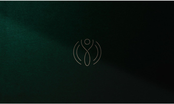
10. Thalita Macedo Nutricionista by CERBO

abstract iconography logo

[Source: CERBO]

Standout features:

  • Well-executed visual logo
  • Earthy color palette
  • Neat placement of visual elements

If you're looking for a logo inspiration that shows creativity and simplicity without compromising each other, then this logo design for Thalia Macedo Nutricionista is the perfect example.

They aim to provide generic nutrition and humanized care to their customers in line with their values and sophistication.

This logo designed by CERBO has done a great job of blending all of those qualities while adding a creative twist to the logo design for the company.

The main element of the abstract logo design is a series of curved and twisted lines, forming the image of a human stretching their arms upwards, surrounded by a halo-like light around them.

This shows their commitment to holistic health by providing nutritional guidance in a sophisticated manner. No rush, no hush. Each process is calculated and meant to nurture you in every way possible.

Bronze is used as the color for the logo, while the whole branding pack consists of earthy colors such as muddy browns and deep greens. This all goes back to their commitment to leading healthy lives for their clientele through a balanced diet of fruits and vegetables.

The placement of visual elements is arranged to reflect the client's values without sending the wrong message. In other words, this is a job well done.

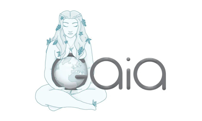
11. Gaia by Bee More Design

abstract company logos

[Source: Bee More Design]

Standout features:

  • Soft font style
  • Clever color choices
  • A clear vision for the brand

Named after the Greek goddess of the Earth, Gaia is a jewelry brand that specializes in pieces that are high quality and exquisitely done for their customers. Through their products, they empower their customers to channel their inner goddesses.

The logo design courtesy of Bee More Design highlighted the goddess-like qualities of the brand: beauty, art, and care for the environment. The logo might look too simple, but it perfectly reflects the brand's aesthetics.

The typography used in the logo has thicker lines compared to the other inclusions in this list. Still, these lines show Gaia's motherly love for everyone here on Earth as the mother of all creatures.

The designer used various shades of turquoise in executing the whole logo design, which was a smart move on their part. We all know that the waters and the sky are colored blue, with the most transparent parts of the oceans colored turquoise.

Of course, we cannot forget how Mother Gaia is hugging the Earth placed on the G of the Gaia logo. The artistic rendition of the famed Greek goddess has lent a winsome and whimsical aspect to the whole visual aesthetic.

Receive proposals from top logo design agencies. It’s free.
GET PROPOSALS

12. Black Isle Pods by Branding by Amber

abstract logo designs

[Source: Branding by Amber]

Standout features:

  • Seasonal design
  • Interesting typography
  • Excellent image choice

If you want an abstract logo design that is not too bland nor too intricate, then the logo of Black Isle Pods would be the perfect choice for you.

Designed by Branding by Amber, this stunning logo design featured three pine trees with a hollowed center and a string of words acting as a halo around the trees for added flair.

This immediately reminds people of the Christmas holidays and who says Christmas is only held in December?

One of the highlights of this logo design is the amazing choice of font styles used. It is not too thick nor too thin to lose its footing on the overall design. It gives us Transylvania legend vibes all over, which is enticing enough for people to pay attention to them.

The colors are also not too striking, as the shades used are calming yet lend a mystified aura to the overall design.

13. Fjorde & Co by Kira Chao

abstract logo examples

[Source: Kira Chao]

Standout features:

  • On-brand overall design
  • Minimalistic typography
  • Easy-to-understand imagery

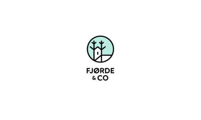
Fjorde & Co. is a home furniture company that specializes in making sustainable items with a Scandinavian aesthetic. They believe that you can always be fashionable with your furniture without spending a ton of money on buying the latest finds.

They want a logo that represents their values of evergreen sustainability and visual aesthetics, and Kira Chao has done an amazing job in doing so.

Their abstract logo design is something that looks like it belongs to a children’s storybook, which is not a bad thing as some might suggest. This simply highlights their commitment to helping people make themselves feel at home with their furniture choices.

The font used is easy to read and it fits perfectly into their overall visual aesthetic. It also looks stable, which is a great nod to how durable their products are.

Lastly, the image it portrays shows that it does not cost a fortune to have a cozy and chic home with the best furniture pieces available. This appeals to so many people, and we’re here for it.

14. ECG by Bobbyflash

famous abstract logo

[Source: Bobbyflash]

Standout features:

  • Smart iconography
  • Appealing color story
  • Remarkable overall design

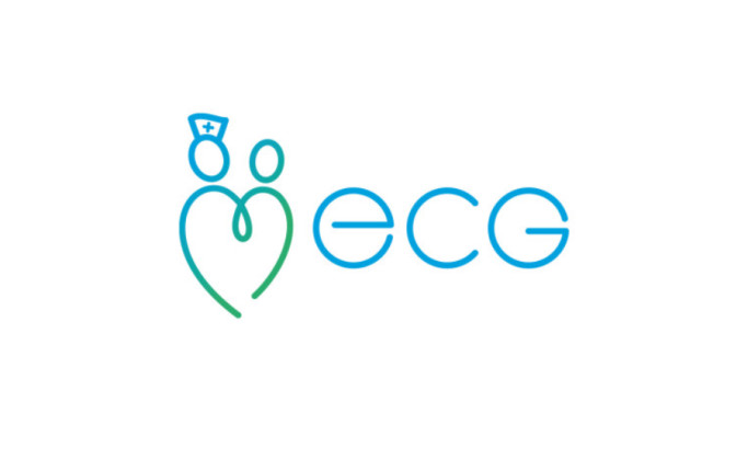
As someone who provides training for the members of the medical community, ECG aims to be a brand that upholds their commitment to saving lives with the knowledge they impart to their trainees every day.

This amazing logo, designed by Bobbyflash, is a great representation of their brand and their values.

This is one example of a logo that used excellent image play on the visual elements to create an abstract logo design that makes sense.

The colors chosen are also soothing to the eyes, which is a reflection of how they want their patients’ safety and peace of mind to be their top priority.

Overall, this design hits the right spot in combining creativity and function into a logo design that is perfect for the brand.

Get a chance to become the next Design Award winner.
SUBMIT YOUR DESIGN
Subscribe to Spotlight Newsletter
Subscribe to our newsletter to get the latest industry news