eSports teams are more than just gamers. They are global juggernauts with massive fan bases. As the eSports universe expands, a killer logo isn't just nice to have; it's a must.
The best logo designs distill the thrill of the action while encapsulating the team's spirit. They score big on creativity, impact, and brand alignment to resonate with gaming fans instantly.
This article explores some of the most impressive eSports logo designs. If you want to create one for your team, collaborate with DesignRush's top logo designers directory today.
Table of Contents
1. Cyber Wolves by Panda Marketing

Standout Features:
- Outlined wolf icon
- Electric blue hues
- Cyborg-inspired typography
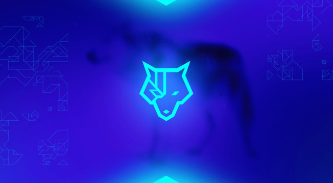
Panda Marketing knocks it out of the park with a logo that perfectly captures the dual identity of Cyber Wolves. It features a wolf's head with a bionic eye, a brilliant nod to the fusion of the wild and the wired.
The color game is just as strong. Neon blue set against a darker backdrop doesn't just make the logo pop; it brings a sophisticated yet edgy vibe. (See other examples of blue logo designs).
Topping it off is the cybernetic font, with its futuristic lines perfectly mirroring the angular design of the wolf. It's a modern and symbolic design, capturing the organization's heart and spirit.
2. Clan Mystik by MB PRODUCTION

Standout Features:
- Slanted typography
- Gradient color palette
- Armor-like logo icon
MB PRODUCTION's creation for Clan Mystik, a French eSport structure, embodies the fierce and fast-paced world of eSports.
The logo's star player? A stylized image of the brand name's initial. The resulting figure is so sharp and defined it could pass for battle armor. (Explore other powerful logo designs).
The logo sports a blend of black and orange, with a gradient that goes from light to dark for added depth and intrigue. Then there's the typography: bold and slanted, as if in motion. It screams competitiveness, adding a sense of action and dynamism to the ensemble.
3. Risky Team by Jorge Ruvalcaba

Standout Features:
- Axie-inspired illustration
- Fiery color story
- Wide and bold typography
Jorge Ruvalcaba crafted an eSports logo ablaze with energy and competitive spirit. Minimalist yet impactful, it's designed as a battle flag and a brand identifier fit for an aspiring leader in the Axie Infinity arena.
Front and center is a flaming Axie-like symbol encased in a badge-style circle. The color scheme is a fiery red, black, and orange mix. It amplifies the brand's edge while exuding a sense of trust and gravitas.
A bold font with a unique 'cropped' look complements the main symbol, radiating modernity and boldness. It's as if the letters are ready to jump into the fray!
4. Esport Club Brest by Halory P.

Standout Features:
- White color story
- Stylized B
- Simple yet impactful
Halory P.'s design for Esport Club Brest features a clever twist: the letters E, C, and B are readable in the negative and positive space. This nuance adheres to the given constraints and adds a layer of sophistication and visual intrigue.
Color-wise, the logo rocks a red, white, and black palette. It's a color trio that's as classic as it gets, but when employed here, it breathes life and dynamism into the brand.
The sans-serif typeface is wide-spaced for readability, aligning with the brand's aim for modernity and identification. It's a brilliant design choice that makes the logo accessible without sacrificing its competitive edge.
Check this collection of simple yet impactful logo designs.
5. MJ eSports Racing Team by Seis+Cuatro

Standout Features:
- Stylized "M" with motion lines
- Cursive monogram logo
- Warm color gradient
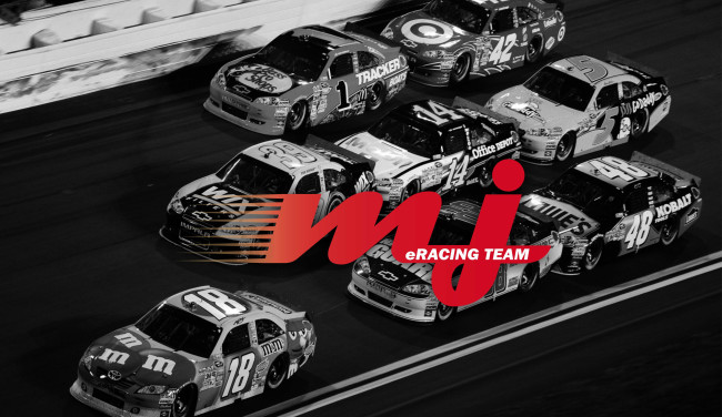
Seis+Cuatro created a design for MJ eSports Racing Team that screams speed and intensity. The star quality is a stylized M, accentuated with horizontal lines to mimic the rush of racing. It's a simple yet effective trick that gets the adrenaline pumping.
The color palette is a blazing mix of red, orange, and yellow - colors that translate the heart-pounding excitement of eSports racing. It's like the logo itself is moving at top speed!
But there's also an elegant side to this logo. The cursive monogram adds a layer of sophistication, ensuring audiences remember the brand long after the race.
6. Strike Team by Colin Finkle

Standout Features:
- Mason’s hammer on top of the brand
- Impactful color story
- Animated-looking logo design
Colin Finkle has brilliantly crafted a logo for Strike Team that seamlessly merges the world of construction and esports. The logo prominently features a mason's hammer positioned atop the brand name, symbolizing strength, precision, and impact.
The color story is both vibrant and impactful, capturing the viewer's attention instantly. What sets this design apart is its animated appearance, giving it a dynamic and modern edge, perfectly suited for the esports arena.


-preview.jpg)