
Best Simple Logo Designs of 2026
All time Best Simple Logo Designs of 2026
Select
- Advertising
- Agriculture
- AI
- Airline
- Alcohol
- App Company Logo
- Architecture
- Arts & Recreation
- Automotive
- Banking & Finance
- Beer
- Church
- Clothing Brand
- Coffee
- Content & News
- Distribution
- E-Commerce & Retail
- Education
- Engineering
- Entertainment
- eSports
- Farm
- Fashion & Beauty
- Food & Beverage
- Government
- Health & Wellness
- Hospitality
- Legal & Insurance
- Luxury
- Manufacturing
- Non-Profit
- Photography
- Professional Services
- Real Estate
- Restaurant
- Restuarants
- SEO Agencies
- Shoe Brand
- Small Business
- Software
- Sports & Leisure
- Startup
- Technology
- Travel
- Video Companies
- Weed/Cannabis
Simple
- Abstract
- Animated
- Artistic
- Bakery
- Black
- Black & Yellow
- Blue
- Bold Logo
- Brand
- British
- Business
- Circle
- Creative Name
- Dental Office
- Done by Freelancers
- Emblem
- Floral
- Geometric
- Glow
- Gradient
- Gym
- Icon
- Illustration
- Lettermark
- Logo symbols
- Makeup Brand
- Marathon
- Minimal
- Modern
- Monogram
- Multicolored
- Nature
- Negative Space
- Rebranding
- Red
- Redesign
- Simple
- Starting With the Letter S
- Successful
- Sunshine
- Trendy
- TV Channel
- Typography
- Unisex Salon
- Vintage
- Water
- Watercolor
- Wordmark
Nuage
Au78
Marco Amari
Houston Texans Logo Evolution

Arsenal FC Logo Evolution
Cleveland Browns Logo Evolution
Green Bay Packers Logo Evolution
Cooee Native Therapy Oral Care
Withers Studio
Athelo

Balance
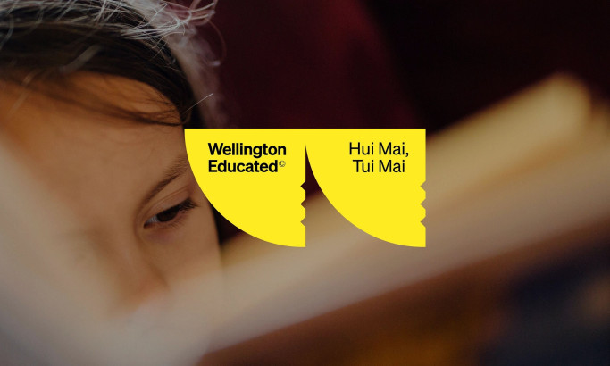
Wellington Educated
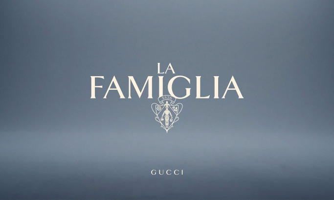
La Famiglia - Gucci
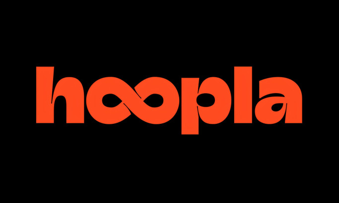
Hoopla
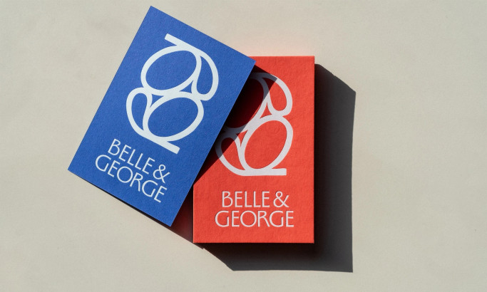
Belle&George
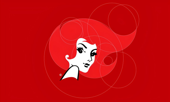
Redheads
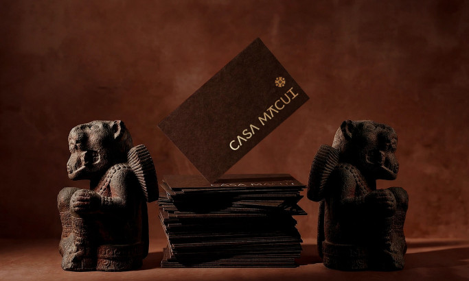
Casa Macui
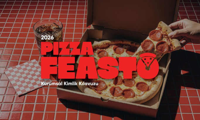
Pizza Feasto
The Design Research Process
Our design research process is a dynamic journey in the ever-evolving landscape of logo design. We search the web, contact brands and agencies, and evaluate the designs worthy of being part of our collection. To be acknowledged among the best logo designs, one must master innovation, trends, impact, functionality, and most importantly, brand recognition.
Designs that manage to transcend expectations and take logo aesthetics to the next level gain recognition, and the finest among them may advance further and compete for the title of Design Award winner.
If you believe your design embodies these principles, you too can submit it for consideration, contributing to the vibrant tapestry of logo design excellence.


-account-photo_listing.jpg)
-account-photo_listing.jpg)


-preview-webp.webp)