We’ve collected the best weed and 420 logo designs that stand out in the growing Mary Jane industry. Crafted by some of the best logo designers and agencies, we’ll take you through these memorable emblems that stand out.
If you’re a fan of niche designs or a specific logo style, you can find more entertaining lists by visiting our collection of the best logo designs.
Table of Contents
1. Higher Standards Cannabis Club by Destinee Design

Standout Features:
- Classy wordmark
- Smoking allusions
- Casual font style
Our list of best weed company logo designs starts with Destinee Design’s Higher Standards Cannabis Club.
This classy wordmark encompasses two font styles: a casual sans serif that focuses on legibility and a strong image and the script style below it that showcases the brand’s exclusivity.
The monochromatic typeface is decorated with subtle weed-smoking visuals that add charm to the design. In addition, the middle line that builds the “H” glyph slightly expands and strikes through the second base of the letter, with smoke coming out of it, alluding to a lit joint. The smoke rising from the joint makes up for the dot above the letter “i,” completing the well-crafted logo.
2. Embody Cannabis by Justin Harris Design

Standout Features:
- Minimal
- Symmetrical
- Distinctive marijuana leaf
The next spot on our best 420 logo designs list belongs to Embody Cannabis and its modern logo crafted by Justin Harris Design.
This emblem features a laid-back lowercase wordmark positioned either next to or below a minimalist-style marijuana leaf. The leaf is composed of two separate elements: the leaf’s body and a circle hovering above it.
The leaf’s body has a flat top below the round visual. The top serves as a base that extends into multiple sharp angles, giving it a remarkable appeal.
If you like minimal designs, check out these fantastic minimal logos!
3. Acapulco Gold by Pedro Miguel Xarepe

Standout Features:
- Friendly and mellow
- Nature-themed colors
- Various versions
Another representative of the best cannabis logo designs is Pedro Miguel Xarape’s Acapulco Gold. The design showcases the allure of the inviting strain.
The design features nature-themed colors like different shades of green reminiscent of cacti along the Mexican deserts as well as gold, instilling the visual association to its name and describing its quality.
The design has multiple versions with varying visuals accompanying the perpetual typeface. Some variations have minimalist lines and pointers, while others include three stars below the text and a marijuana leaf above it.
As for the typeface itself, it’s delivered using a hippie font style that sets a friendly and mellow but trippy atmosphere.
4. Mary-Jane by Nadine Daff

Standout Features:
- Feminine and personal
- Introspective
- Entirely natural
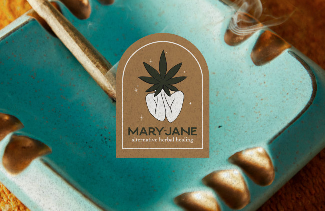
Nadine Daff’s design for Mary-Jane is the next weed company logo we have to discuss.
This design features an old windowpane frame with a naked torso covered with hands joined together, covering the character’s face. However, instead of the face, there’s a big dark marijuana leaf covering it.
The simplicity of the logo alludes to the fully organic nature of the brand’s products, with a few sparkles hinting at the feeling after trying their products.
5. Hashed by Kaejon Misuraca

Standout Features:
- Minimal
- Bold wordmark
- Symmetrical
Our list of the best 420 logo designs continues with Hashed, courtesy of Kaejon Misuraca. This emblem helps the brand introduce itself as modern and fresh.
This minimal design is easily recognizable, featuring three symmetrical leaves with a bold white outline resembling a marijuana leaf. At the base, the leaflets also entail a short white pointer.
Below the simple yet eye-catching visual, there’s a bold wordmark contributing to its modern look. The wordmark uses a strong font that complements the symbol.
If you’re looking for an excellent typeface, check out our list of best fonts for logos.
6. Medical Cannabis Collective by Felice Della Gatta

Standout Features:
- Corporate and casual
- Rounded typeface
- Subtle, stylized “R”
Medical Cannabis Collective reached out to Felice Della Gatta to get a classy emblem worthy of its spot on the best weed logo designs list.
This logo design strikes a balance between serious, corporate, and approachable. It features an inverted marijuana leaf, seemingly resembling a fairy, with intertwined leaflets in the center of a circular frame. The frame consists of two thin white lines with a rounded typeface inside.
The bold wordmark intercepts the circle below the symbol. In addition, the quirky font style features a slightly tilted “E” and a subtle, stylized “R” that looks like a leaf leaning on the letter next to it.
7. Boricanna by Darien Morales

Standout Features:
- Boat steering wheel
- Leaf in a flower
- Thick lines
Wrapping up the list of the best weed and 420 logo designs list is Darien Morales’ logo for Boricanna, reflecting the tradition and prominent agriculture of Puerto Rico.
This all-gold emblem combines an attractive symbol with an elegant wordmark below it.
The symbol encompasses a boat’s steering wheel with a minimalist rendition of a marijuana leaf centered inside. It’s outlined by a double circular line with six symmetrical arches stemming from it. The identical decorative elements also contain a small circle.
Do you like circles in logos? Check out our best circle logo designs here.
The emblem can have several iterations, including drifting off with a couple of smokes or finding balance and tranquility. The symbol can also present a flower.


-preview.jpg)