


-account-photo_listing.jpg)
-account-photo_listing.jpg)


Our Jury has worked with Prada, Nike, Chanel, Google, and Apple.
Best Packaging Designs
The best packaging of 2026 is the product as much as what's inside. See what's turning heads.
Best Packaging Designs
4,200+ Submitted Designs
- Advertising
- Arts & Recreation
- Automotive
- Bread
- Chocolate
- Condiment
- Condom
- Dairy Product
- E-Commerce & Retail
- Eco and Sustainable
- Entertainment
- Fashion & Beauty
- Food & Beverage
- Frozen Food
- Health & Wellness
- Honey
- Hospitality
- Jewelry
- Luxury
- Manufacturing
- Medical & Pharmacy
- Medicine
- Olive Oil
- Pet Food
- Skincare
- Soap
- Spirit
- Sports & Leisure
- Technology
- Toys and Games
- Travel
- Watch Branding
- Wine
View Design
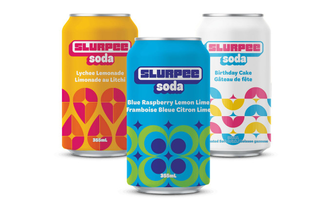
7-Eleven Canned Slurpee Soda Packaging Design
View Design
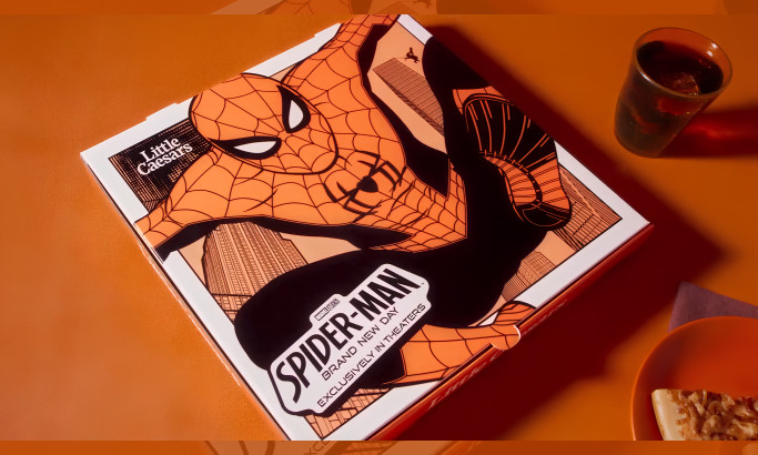
Webberoni Pizza Packaging Design
byMcKinney
View Design
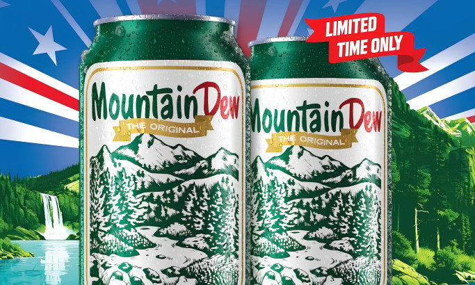
Mountain Dew 1948 Commemorative Can Packaging Design
View Design
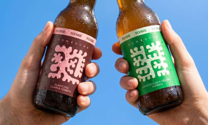
Fooshi Packaging Design
byMotyw
View Design
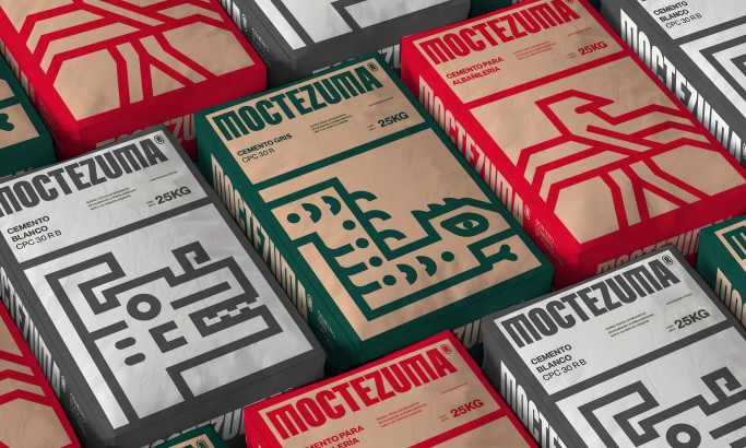
Moctezuma Packaging Design
View Design
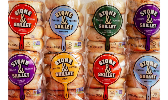
Stone & Skillet Packaging Design
byWedge
View Design
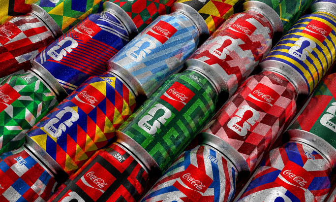
Coca-Cola FIFA World Cup 26 Collectible Country Cans Packaging Design
byGOLDEN
View Design
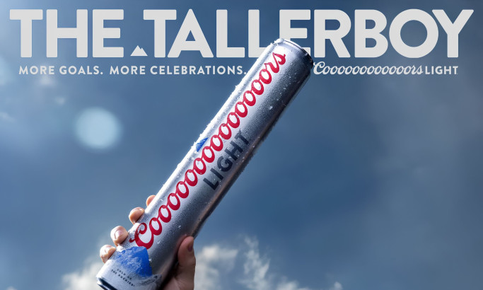
Coors Light Tallerboy Packaging Design
byDroga5
View Design
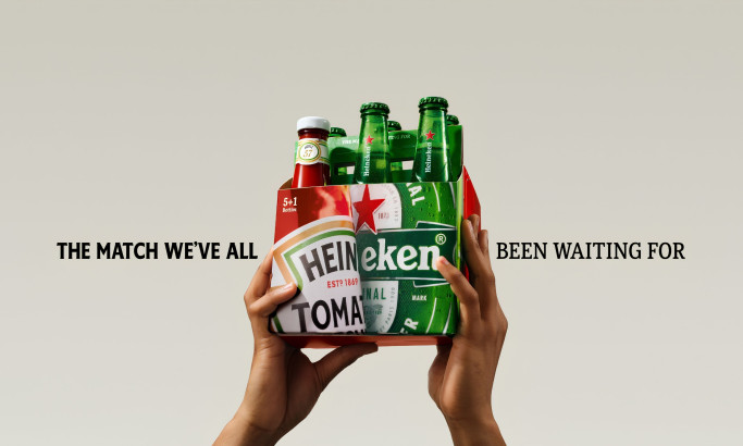
HEINZ x Heineken® Limited Edition Six-Pack Packaging Design
byLePub
Get Connected
With The Right Agency Partner
& Receive Proposals For FREE
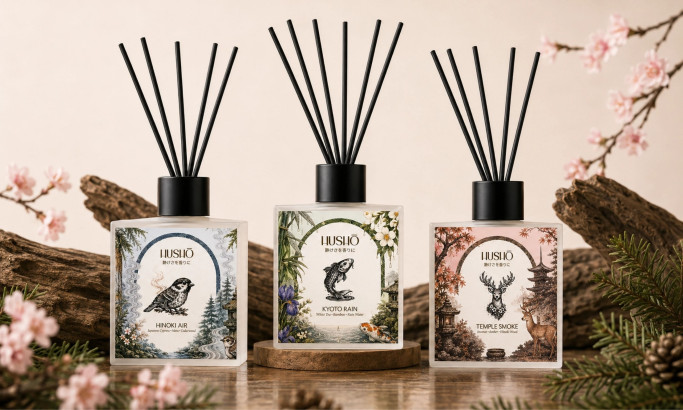
View Design
Hushō Packaging Design

View Design
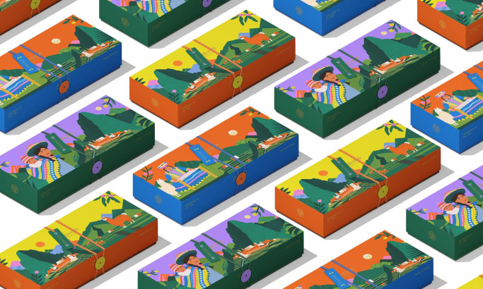
I AM ITALIANO Packaging Design

View Design
Mật Mã Gift Set Packaging Design
View Design
Super Kind Company Packaging Design
★9.4/10
 AO 10.00
 AO 9.50
 BS 9.00
 KS 9.00
 LB 9.50
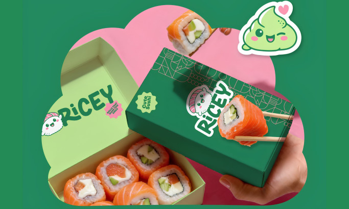
View Design
Ricey
★8.7/10
- AO 10.00
- AO 9.50
- BS 10.00
- KS 5.50
- LB 8.50
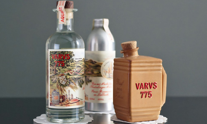
View Design
Varus 775
View Design
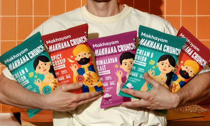
Makhyam Crunch
★8.4/10
- AO 9.50
- AO 8.50
- BS 9.00
- KS 7.00
- LB 8.00
View Design
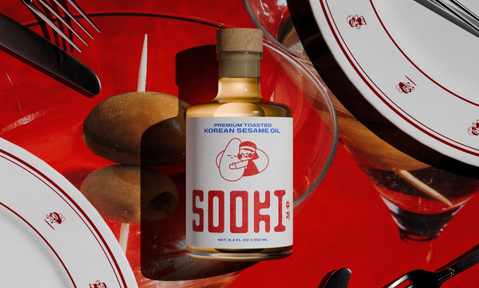
Sooki
Ready to elevate your designs?