-preview.jpg)


-account-photo_listing.jpg)
-account-photo_listing.jpg)


Our Jury has worked with Prada, Nike, Chanel, Google, and Apple.
Best Wine Packaging Designs of 2026
View the Top Wine Packaging Designs Below
Best Wine Packaging Designs
4,200+ Submitted Designs- Advertising
- Arts & Recreation
- Automotive
- Bread
- Chocolate
- Condiment
- Condom
- Dairy Product
- E-Commerce & Retail
- Eco and Sustainable
- Entertainment
- Fashion & Beauty
- Food & Beverage
- Frozen Food
- Health & Wellness
- Honey
- Hospitality
- Jewelry
- Luxury
- Manufacturing
- Medical & Pharmacy
- Medicine
- Olive Oil
- Pet Food
- Skincare
- Soap
- Spirit
- Sports & Leisure
- Technology
- Toys and Games
- Travel
- Watch Branding
- Wine
View Design
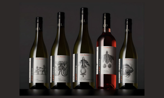
Left Field Wines
View Design
Folk Tale®
View Design
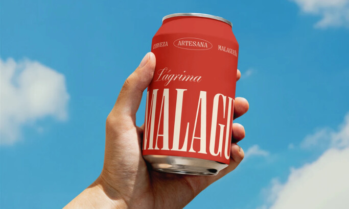
La Malagueña
View Design
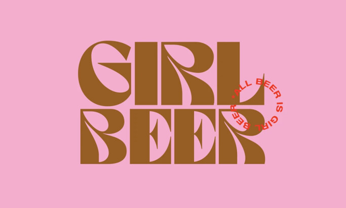
Girl Beer
View Design
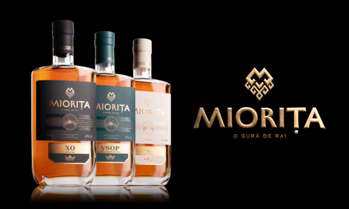
Miorita Vinars
View Design
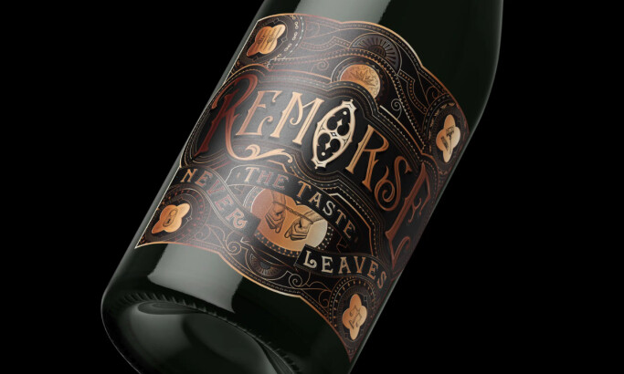
Remorse
View Design
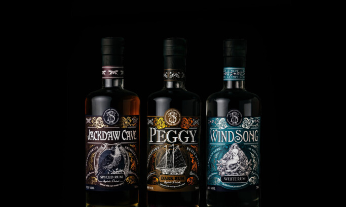
Far Shore Merchants

View Design
Fazio
View Design
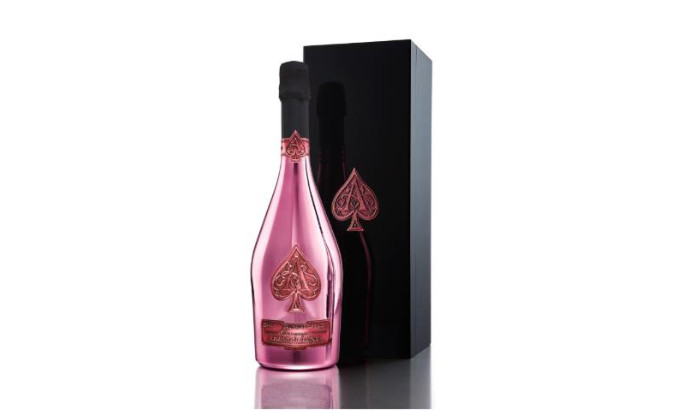
Armand de Brignac
Get Connected
With The Right Agency Partner
& Receive Proposals For FREE
View Design
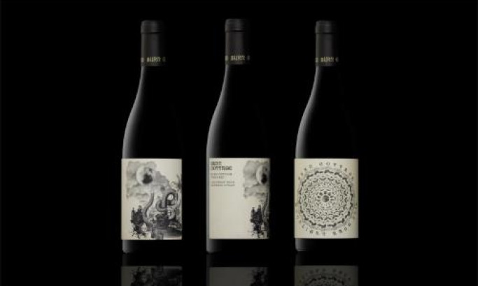
Burn Cottage Vineyard
View Design
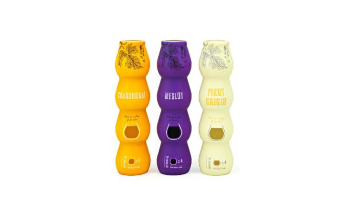
Stacked Wine
View Design
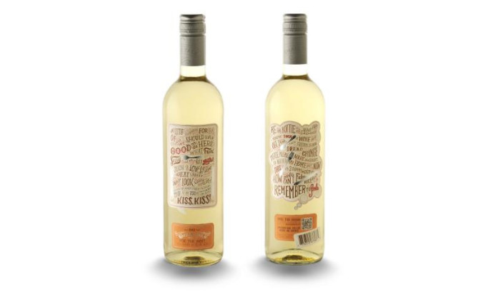
Small Talk Vineyard

View Design
Elliott Vineyard
-preview.jpg)
View Design
N de Cuco
-preview.jpg)
View Design
Panceri Wine
-preview.jpg)
View Design
Romate
-preview.jpg)
View Design
Hessischer Landtagswein
Ready to elevate your designs?