Reebok’s Image-Driven Design Puts The Emphasis On Its Dynamic Products
Find yourself inspired to get up and walk, run, dance. Reebok has you covered, no matter what kind of activity you’re gearing up to get involved in. Reebok’s versatile shoe and clothing line are great for any athletic occasion!
This athletic company is a powerful brand with a long legacy in the athletic apparel industry, with products like sneakers, workout gear and more. And they put these products on full display thanks to an image-driven interface.
A stunning and defined photograph of athletes running outside, products in action and more greet you as you enter Reebok’s site. The image sits on full display, with the header images sliding to reveal new promotions, campaigns and product lines.
The combination of bold white and red words are easily visible against these dynamic images, inviting you to take part in any number of online events or sales! It’s a simple and effective display that’s enough to pull you in, without overcomplicating the homepage setup.
Similarly, the website puts an emphasis on product imagery at every step of the way. Photographs make up the backgrounds of articles categories, product pages and headers. They grab attention instantly and show these products in use in a variety of situations.
Images are a powerful tool in a web design and they effectively lead users on their journey. They highlight key categories in creative in stunning ways, adding a playfulness that is fun for users to interact with.
And this brand wants to show off.
The product pages are equally dynamic, with the bold images of products standing against a clean white background which really makes them pop, and entices users the instant they land on the page.
This image-driven nature puts the focus on the brand and its products and shows that the brand knows what its consumers want by showing them instances where these products can be used. It’s an intuitive brand, and this imagery gives it a powerful boost.

A Functional Layout Adds A Playful Creativity To The Reebok Brand
Once you're pulled into the website design, start scrolling down to indulge in a number of the more popular articles and product collections Reebok has to offer. The page is broken down in a dynamic table. Each segment of the table includes a crisp photograph in combination with a text box.
The three text boxes are the same color, tying the page together as their scheme coordinates with the initial image that catches your attention. The overall touch is a small but great way to create a homepage worth remembering!
Each section of the website is divided into sections through boxes of text, imagery and more. This breaks up the site in a fun and creative way, adding a bold playfulness that gives the brand a modern edge.
This creative layout is clean and clear, but there is a cool and unique vibe that comes from the varying orientations of content.
Sections are there to help streamline navigation and put the products on full display. Other sections offer insights into the brand and its services. And others give you in-depth advice on how to use the products and what to watch out for.
This is more than just an e-commerce site with product pages and a quick home page to organize it all. It’s a place for users to discover, learn and grow their athletic selves. It’s a one-stop destination for athletes new and experienced to learn about fitness and motivate themselves to action.
And it’s this creative layout that helps to align the brand this way, giving it a modern and authoritative edge that makes it a leader in the industry.
Reebok isn’t just in the business of selling its products — it also wants to motivate and inspire. This helps users see the brand as one that can be approached, and it gives visitors to the site actual instances where these products are used, encouraging them to purchase in order to do the same.
Reebok Integrates Intuitive Navigation Into Its Website To Streamline The Buyer’s Journey
The layout of this website is simple and serene, leading users along their journey through the use of images and clean text. But it’s also thanks to the useful menu bars and navigational tools that make searching through the site a breeze.
As you scroll down the home page, there are clear sections to detail the products with CTAs that take you directly to those pages.
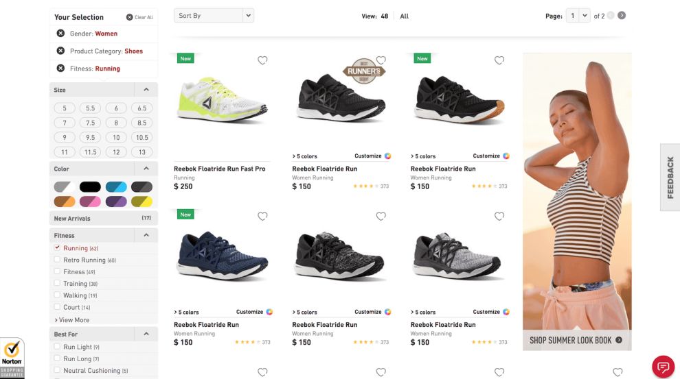
Similarly, a clean menu bar lines the top of the page with comprehensive drop-down menus that give users access to the wide variety of products the brand has to offer. And when you get to these pages, the intuitive filter and search features grow.
The product pages come with an extensive filter column on the left side of the screen. These let users choose products based on color, size, style and more. And this menu bar is clean and intuitive, with filter tools made up of colorful and creative icons.
This makes navigating the site a simple and streamlined process. Users can find the products that are perfect for them thanks to the intuitive and comprehensive menu bars and filter options, and it eases users throughout their journey, making it a more pleasing user experience overall.
And a positive user experience is vital when it comes to a successful e-commerce website. Consumers don’t have the time or patience to scroll aimlessly through the site to find what they’re looking for. And these navigational tools ensure that they don’t have to.

The Interactive 'Design Your Own' Feature Encourages Visitors TO Engage With The Site By Making It Fun To Purchase Reebok Products
Reebok offers up a wide variety of products that you can look through. Perhaps one of the more intriguing products in their shop allows you to customize your own shoe. The interactive platform is set against a white backdrop with light gray spatterings. The design is basic and lets you focus entirely on what you’re creating.
Along the left of your screen, make your way through a customizable menu where you’ll have the ability to mix and match styles until you make the shoe that “screams” your personality. Make use of the zoom options as well as the rotating tools to see your brand-new shoe from every angle possible before placing your order!
This is an exciting and fun addition to the Reebok site, aligning the brand as one that innately understands its consumers and wants to give them the products and experience that will encourage them to buy.
And who doesn’t love the idea of creating their own customizable shoe? A lot of brands are jumping on this bandwagon, but in the Reebok site, it stands out thanks to its interactive and engaging elements that let users see before their very eyes the changes they make to the shoe.
The shoe itself sits on full display against a clean, bright white background. And the menu bar to the left is full of filter and custom options that get the creative juices flowing.
This feature adds a playful approachability to the brand and gives it an authoritative and authentic edge. Users are happy and excited to play around with these features, and it gives them a much more positive feeling about the brand as a whole.
And that’s important for getting users interested.

Reebok’s Stunning E-Commerce Website Puts The Brand And Its Offerings On Creative Display
Reebok is a popular and world-renowned brand. It’s known for its powerful and robust athletic apparel and footwear, with a name and a legacy that comes with an authority and strength in the industry.
And its website design puts that on full focus, with an image-driven design, creative layout, intuitive navigation tools and interactive features that grab attention and pull users in.
Reebok’s well-known name carries forcefully within their site design, focusing on gorgeous imagery and bold lettering to draw in users. The interactive platform that lets users customize products creates a fun and quirky way to involve users in the way their site inspires them.
This website is more than just an e-commerce website. It’s a design that encourages exploration and discovery. Reebok wants to inform and inspire just as much as it wants to sell its many diverse products.
It offers visitors a host of tools and resources to let them create the experience that’s best for them. Whether they’re looking to buy a new running shoe or get into the fitness game, the Reebok website is there to make those dreams a reality. Explore the best shoe brand designs.


-preview.jpg)


-preview.jpg)