
Richard Sancho takes the idea of an online portfolio to an entirely new level. His use of minimalism allows users to freely interact with his work. The web design is a full screen, single site scheme, which enhances the UI and UX applications of the site.
The backdrop of the home page is a translucent purple, featuring animated letters. Sancho uses a nontraditional, four-corner menu, so users can easily navigate the sitemap from any page.
Viewers will also notice that the website uses a long arrow cursor in place of a short arrow or text cursor. The cursor is purposeful, encouraging users to continue to scroll or to click on the “About,” “Work,” or “Contact” titles.
Sancho uses a single site concept with parallax scrolling, which makes for an easy user transition. As viewers scroll down through the site, they’ll arrive on the “About” page first. It uses a large, bold typeface.
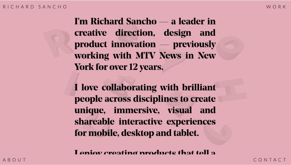
As users continue to scroll, they will notice that the backdrop changes color. For example, the “About” page background transitions to a light-pink color, however, the design of the page remains the same.

The “Work” page features a blue background. Sancho utilizes a bold subheading to introduce the work, and when users scroll down, they’ll be introduced to a “View Project” call to action button; it’s a hyperlink that guides users to the website of the work he produced. This allows users to fully experience his work, which perfectly illustrates the application of the UX.

Sancho’s “Contact” page isn’t filled with flowery content or signature boxes. It highlights the words “Email me,” where users can click to contact Sancho directly. In addition, it transitions back to the purple background also featured on the home page, which indicates the end of the sitemap.
Richard Sancho’s use of minimal concepts, transitioning colors, and large typography makes his portfolio stand out. His talents ooze onto each page, solidifying his popularity in graphic and digital design.
Richard Sancho is an awesome website design in the Advertising and Professional Services industries.


