System One’s website takes the chaos out of artist bookings and transforms complex workflows into a smooth, intuitive experience. Built by Konpo, the site combines sleek visuals, effortless navigation, and a playful edge, turning enterprise software from a simple tool into a smarter, more efficient way to work.
Key Insights for Brands:
- Use animations and microinteractions to keep users engaged
- Simplify complexity with a cohesive color palette
- Tell a story through design to connect with your audience
Animations Enhance Engagement Without Overwhelming Users
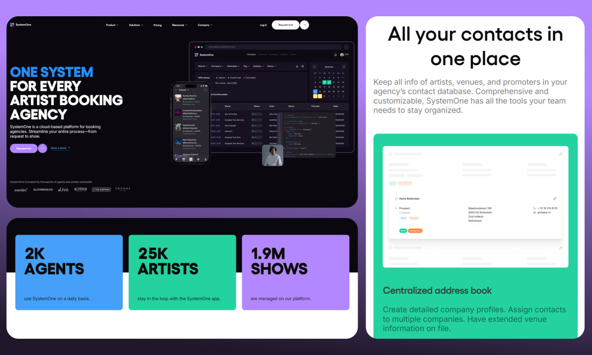
Let’s start with System One's animated logo in the header: a sleek, motion-driven intro that screams innovation before you’ve even clicked. It’s Konpo's simple move with a big impact, setting the tone for a site that knows how to grab attention without trying too hard.
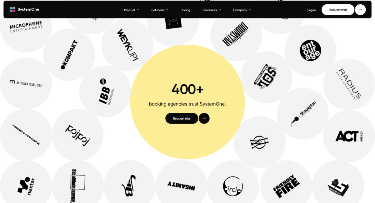
One standout addition is the "gumball machine effect," where client logos cascade onto the page, transforming what could have been a static testimonial section into a playful, interactive showcase. It’s clever, it’s memorable, and it’s a genius way to showcase partnerships without feeling stale or corporate.
Learn how motion effects in websites build an engaging digital experience.
The counter animations for the number of agents, artists, and shows System One has served do more than display statistics — they tell a story. Each tick brings real-time data to life, making milestones feel tangible and meaningful. As the counters tick up, users get a snapshot of System One’s scale and reach in a digestible, visually rewarding way.
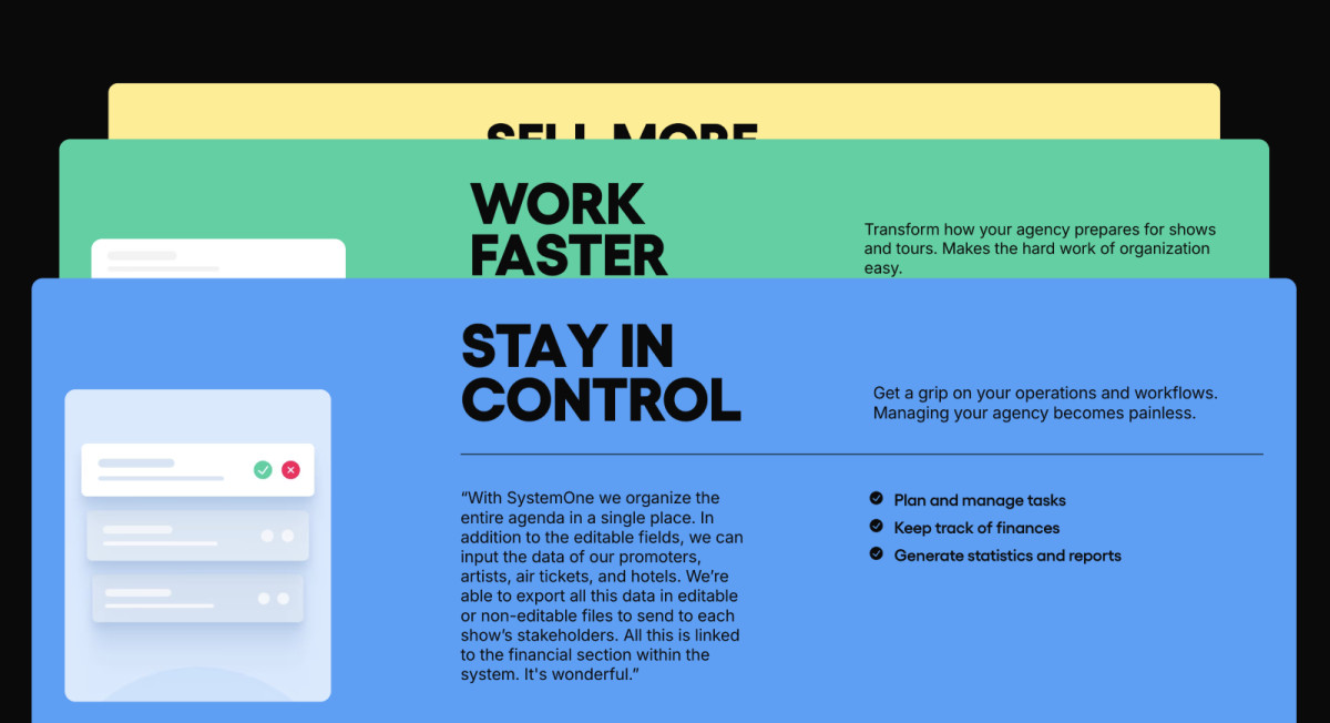
The Cohesive Color Scheme Reflects System One’s Brand Identity and Vision
System One’s palette, a mix of Caribbean Green, Lavender Indigo, Dodger Blue, and Pinkish Red, is as calculated as it is vibrant. Blue whispers, “Trust us,” green says, “We’re growing,” and yellow gives a cheeky nudge to say, “Click here, now.” This is behavioral economics in action.
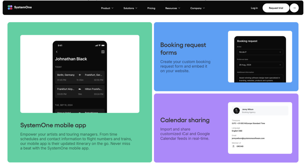
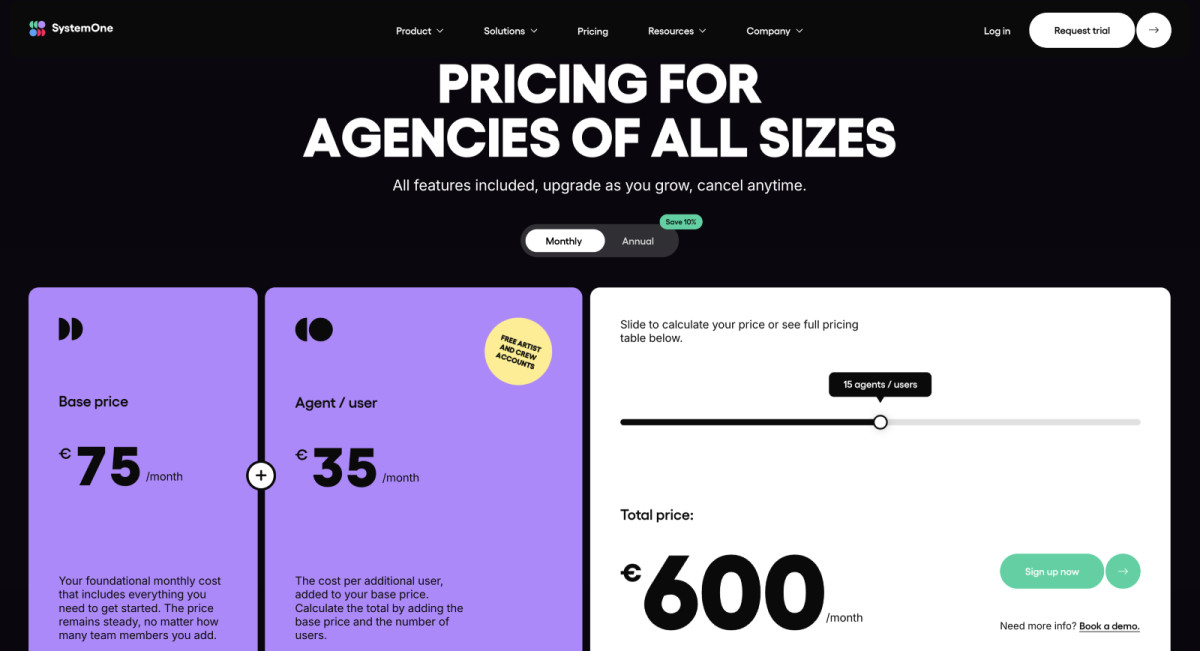
The brilliance lies in using color for the visual hierarchy and organization. Each section feels distinct yet connected, with colors defining boundaries and priorities. The bright color blocks against the black or white background break up the content, making even dense information feel accessible. The effect? Everything feels purposeful.
And then there’s the color psychology. Cool tones make you feel safe, while bright accents keep things exciting. It’s a great example of balancing reassurance with just enough urgency to make you act.
So, what can we learn from System One's color choices? It's that a cohesive color palette isn’t just about consistency; it’s about persuasion. And persuasion, when done this cleverly, makes the design feel both professional and irresistible.
Konpo Perfectly Balances Microinteractions and Transitions to Create a Dynamic Yet Seamless User Flow
Microinteractions and transitions on the System One website aren’t just there to look slick — they’re built to work. Every click and scroll has a purpose, guiding users through content without a single hiccup. The site doesn’t ask you to figure it out; it shows you the way.
Likewise, microtransitions like button hovers and responsive sliders aren’t just decoration, they’re also functional signals that provide instant feedback. This isn’t just good design from professional website designers; it’s smart psychology rooted in interaction design fundamentals.
The genius of these transitions? They’re intentional, weaving the entire experience into a cohesive narrative that mirrors the effortless efficiency System One stands for. It also proves that System One’s attention to detail goes beyond its software — it’s present in every interaction.
A polished, intentional, and professionally designed website doesn’t just look good, it also communicates a powerful message: "You’re in capable hands." That’s how design works when it’s done right.
Scrollytelling Adds an Immersive Narrative Dimension to System One’s Website
Scrollytelling has moved from a tech website design trend to a necessity, redefining how brands capture attention in a world drowning in content. System One embraces this technique. Instead of overwhelming visitors with walls of text, the site unveils content slowly, using motion to transform complex concepts into a seamless, interactive story.
It takes the intricacies of enterprise-level software — something typically reserved for insiders — and makes it digestible for everyone. Scrolly-telling breaks technical jargon into bite-sized, visually supported chapters that flow naturally, ensuring users always know what’s next. They stay hooked because they’re part of the journey, not just bystanders.
Scrolly-telling aligns perfectly with System One’s mission: to demystify the complicated. It turns an enterprise solution into something accessible, even enjoyable.
So, it comes as no surprise that System One’s website earns top marks and is a best website design winner. Konpo created a platform that does more than just look good. It works hard, delivering an engaging — and most importantly, delightfully fun —user experience while streamlining complex workflows.


-preview.jpg)

-preview.jpg)