-account-photo_listing.jpg)


Our Jury has worked with Prada, Nike, Chanel, Google, and Apple.
Best E-commerce & Retail Website Designs of 2026
View the Top E-commerce & Retail Website Designs Below
Best E-commerce & Retail Website Designs of 2026
4,200+ Submitted Designs
- Advertising
- Aerospace
- Agriculture
- AI
- Architecture
- Arts & Recreation
- Automotive
- Banking & Finance
- Community
- Construction Company
- Content & News
- Digital Agencies
- Distribution
- E-Commerce & Retail
- Education
- Engineering
- Entertainment
- Fashion & Beauty
- Film Production Company
- Food & Beverage
- Games and Entertainment
- Government
- Health & Wellness
- Hobby
- Hospitality
- Jewelry
- Legal & Insurance
- Luxury
- Manufacturing
- Medical & Pharmacy
- Museum
- Music
- News Magazine
- Non-Profit
- Professional Services
- Real Estate
- Restaurant
- Roofing
- Sports & Leisure
- Startup Business
- Tech Startup
- Technology
- Travel
- Wedding Planning
- Zoo
- 3D
- 404
- About Page
- Artisan
- Artistic
- Black and White
- Blog
- Bold Color
- Bold Font
- Book App
- Check Out Page
- Chinese
- Clean / Minimal
- Colorful
- Contact Page
- Corporate
- Custom
- Experimental
- Flat
- Footer
- Form
- Fullscreen
- Futuristic
- Green
- Horizontal Layout
- HTML5
- Illustrated
- Images / Gallery
- Innovative
- Inspiring
- Interactive
- Landing Page
- Menu
- Microinteractions
- Mobile Websites
- Motion Effects
- One-Page
- Parallax Effects
- Personal
- Pet Store
- Photographer
- Playful
- Podcast
- Pop Ups
- Portfolio
- Pregnancy
- Pro-loaders
- Product Listing Page
- Purple
- Retro
- Services Page
- Simple
- Slider / Module
- Small Business
- Soft Colors
- Sound / Music
- Storytelling
- Tech Online Store
- Typography
- Unusual Layout
- Use of Infographics
- User-Friendly
- UX Designs
- Virtual Reality
- Visible Borders
- Visually Striking
- Webflow
- Welcome Page
- WordPress
★9.38/10
 AO 9.00
-account-photo_listing.jpg) IS 10.00
IS 10.00 LS 9.00
 BD 9.50
View Design
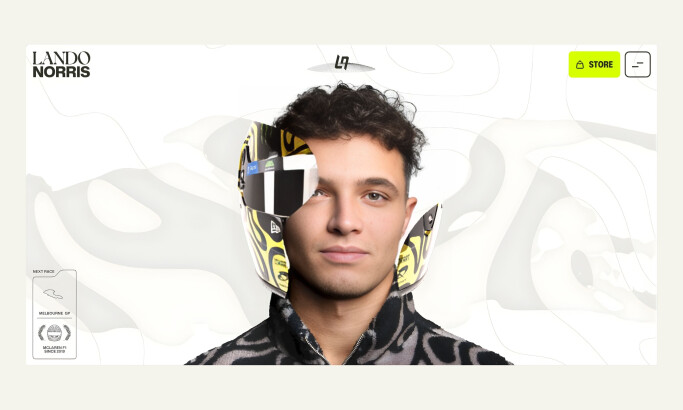
Lando Norris
View Design
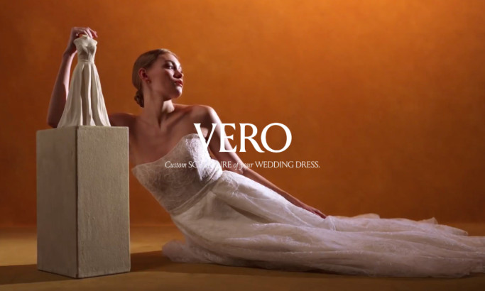
VERO Website Design
View Design
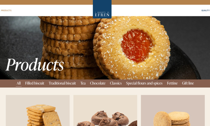
I Biscotti di Efren
View Design
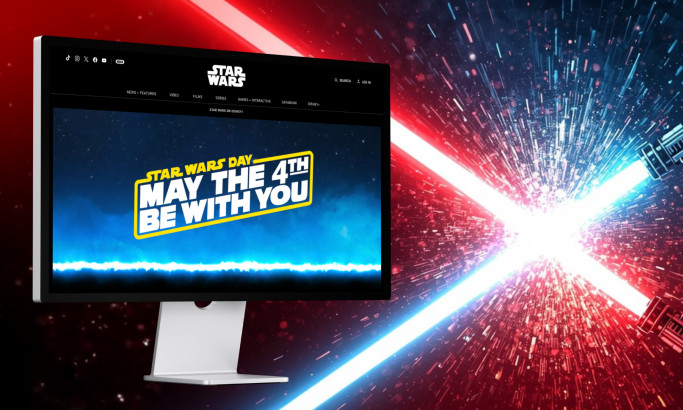
Star Wars

View Design
Amazon
View Design
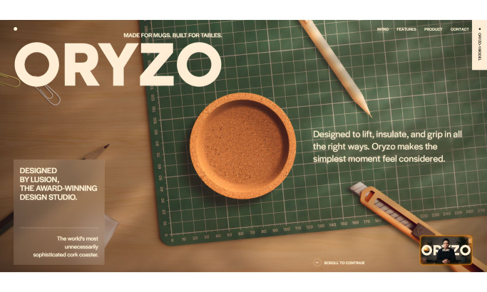
Oryzo
byLusion
View Design
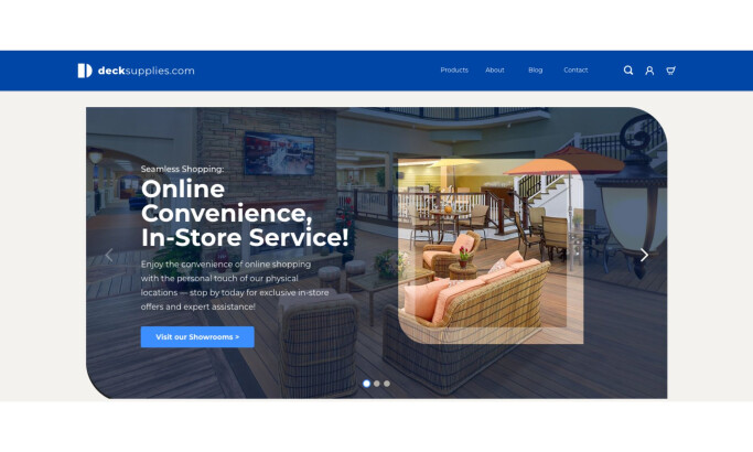
Deck Supplies
View Design
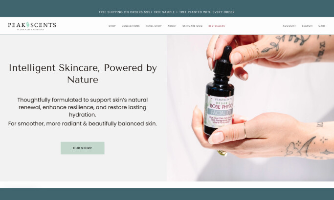
Peak Scents
View Design
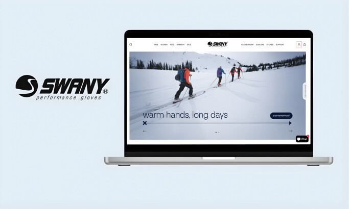
Swany
Get Connected
With The Right Agency Partner
& Receive Proposals For FREE
View Design
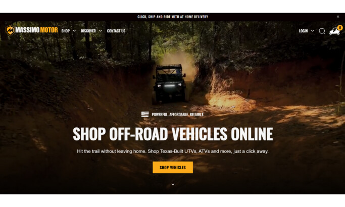
Massimo Motor
View Design
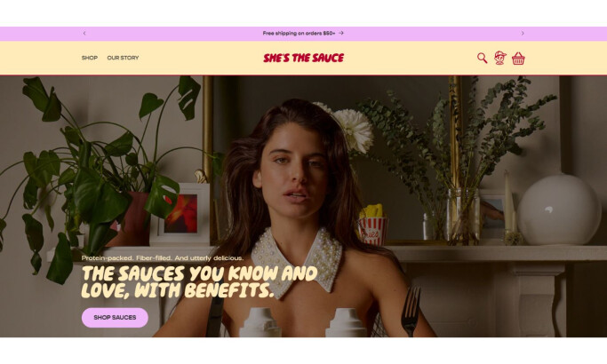
She’s the Sauce
View Design
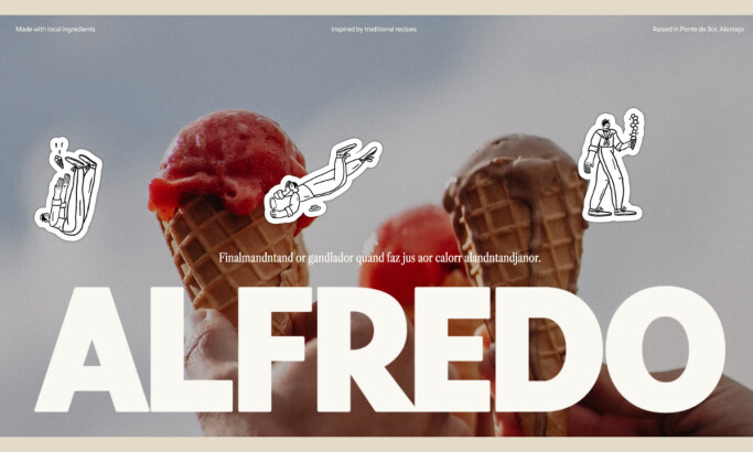
Alfredo
View Design
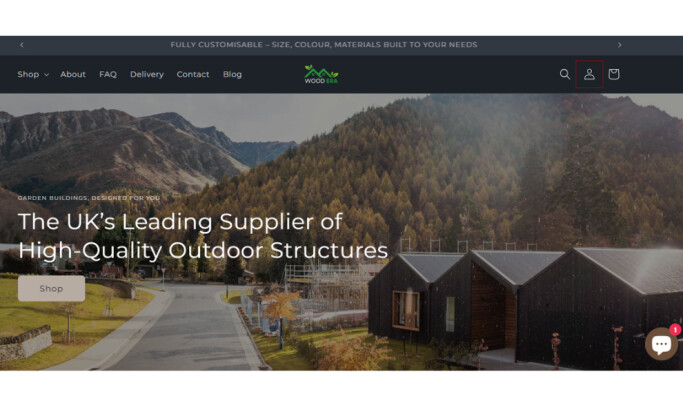
Woodera
View Design
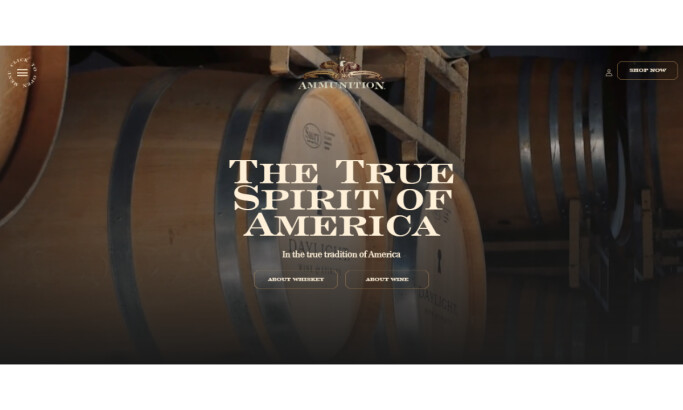
Ammunition
View Design
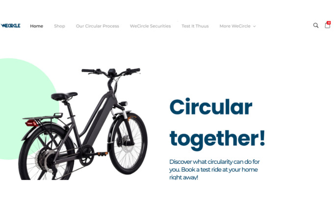
WeCircle

View Design
Walmart
View Design
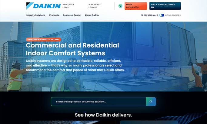
Daikin
View Design
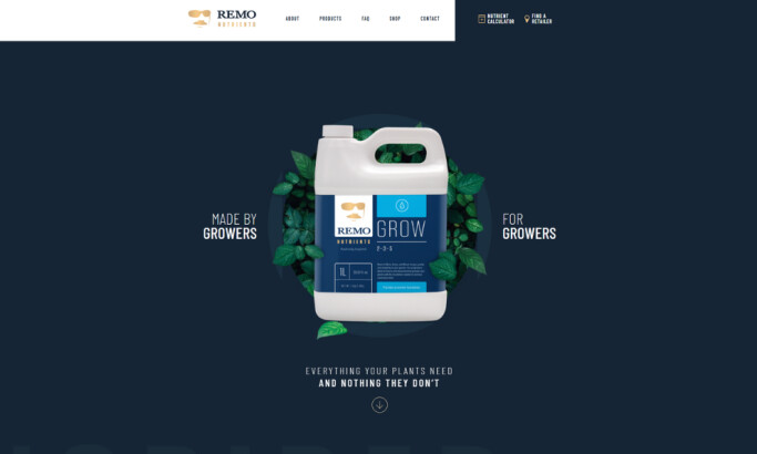
Remo Nutrients
Ready to elevate your designs?