Last Updated: 07/31/2024
The Marvel Logo – A Visual Mythological Story About Finding Your Identity
This is the story of a superhero among logos, which sets forth the fashionable movement of being direct and expressive, in line with what your brand represents. Yes, we’re talking about the Marvel logo design and its metamorphosis through the ages.
Besides Disney, Marvel’s the only entertainment company that’s managed to be as close to you as an adult as it was when you were growing up. It might be due to the nostalgia for our childhood heroes and their chivalrous agenda to stand up and defend ordinary people against all sorts of evil masterminds. Or maybe our curiosity makes us wonder what modern technology did to our favorite characters and their universes.
Whatever the case, Marvel continues to showcase modern mythology through decades of developing characters, their stories, and personalities. They carefully crafted several protagonists and antagonists with special powers, struggles, and vulnerabilities -- just like a normal human being.
Marvel stories are fantastical but still reflective of our own. Whether it’s Spidey, who went from a reckless teen to a responsible adult, the Fantastic Four, who had many family feuds but always resolved issues together, or the X-Men, who constantly face discrimination for being who they are.
Much like the characters and their worlds (as well as the Disney logo), Marvel’s logo has undergone various shifts throughout the decades, frequently tweaking its former visual identities.
From raw and blunt to refined and polished, let’s look at the Marvel Studios logo origin story and discuss its evolution.
The Pre-Marvel Era: Timely Comics and Atlas Comics
Marvel was founded under Timely Comics in 1939, then changed to Atlas Comics in 1957 until it solidified as Marvel Comics in 1961.
The Timely Comics logo was a blue coat of arms with white stripes, with the company’s nametag printed in a serif font at the top. Then, a tiny red rectangle stating “inc.” sits at the center. The shape of the shield was the same as in the original Captain America comics.
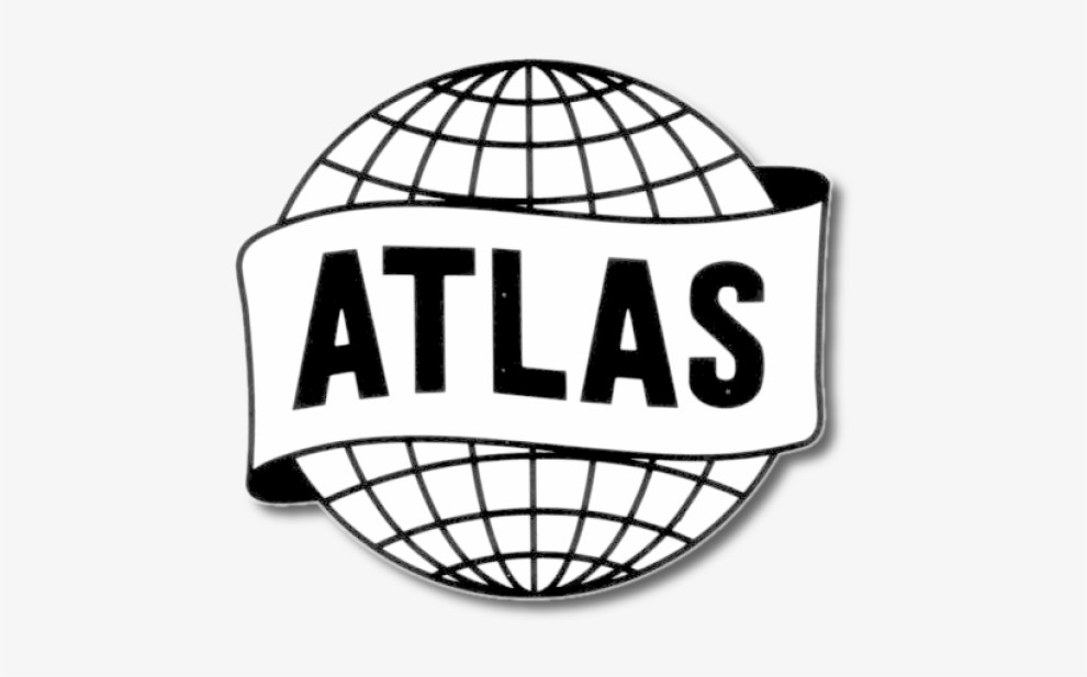
The designers took an entirely different approach to the Atlas Comics logo. This monochrome design resembled a news agency more than a fantasy world creator. It encapsulated a globe with a belt embracing it, labeled as Atlas in a capitalized bolded style.
Marvel’s Logo Experimentation Phase (1961–2002)
It is difficult to pin the specific year, but the first “real” Marvel Comics logo design dates back to the late 50s, at least color-wise. It was a stamp-like shape with a black circle on a red background with a circular company name. This design also featured a golden wheat leaf inside the black circle.
But more shapeshifting soon followed.
The 60s encompassed several completely different attempts to represent the brand visually. The 1961-1963 iteration was as simple as the MC letters placed one above the other. Then came the experimental and heterogenous era of experimentation – from 1963 to 1967, there was no consistency in the logo design. Instead, there were many different versions of the Marvel Comic Group wordmark.
The late 60s saw a more personalized logo design with an expressive orange comic-book font surrounded by the illustrated heads of the most popular protagonists. However, from 1971 to 1992, the iterations were unstable and often switched the orange one for the purely textual ones and vice versa.
From approximately 1987 to 2022, Marvel introduced a new logo. This design is similar to the classic 90s MTV logo. This version introduced a unique yellow and red color combination. The giant M was a platform for the smaller yellow “comics” splashed across it.
Enter the Contemporary Marvel Logo (2002-Present)
The Marvel Studios logo we know today, or at least its close relative, was designed in 2002.
This revolutionary version introduced and immediately affirmed the striking combination of red and white. With the color psychology at play, the logo leverages red to suggest righteousness, love, action, and adventure. At the same time, white indicates the innocence and purity of one’s intentions – all the core characteristics of the company’s superheroes.
Cyrus Highsmith and Tobias Frere-Jones designed a font for a new logo. Albeit custom, it resembles the Benton Sans Extra Comp Black font. The typeface style has been slightly altered in the following years to achieve greater harmony and give the logo a more polished look. Still, the plain white writing on a red background remained with the expanded cap height and clean block letters that provided an appealing aesthetic appearance.
The design was subtly updated in 2012 by Rian Hughes. The most noticeable changes include the prolonging of the link between the “V” and “E” and the shortened space between the “E” and “L” glyphs.
The excellence of the logo Marvel symbols lies in their simplicity. Anyone who sees this design would commend the logo designers' commitment to versatility and scalability. They can easily conform to an array of media formats and associated apps while simultaneously letting us know that, despite their stories being deep and complex, the relatable, their protagonists’ virtuous goals are simple.
The Marvel Cinematic Universe Adaptations
Marvel might have built its legacy on comic books, but the brand has grown so much more than just a comic book producer. It's a success story showcasing how professional branding agencies can transform and expand a brand's reach. The company is now behind some of the best movies, character designs, and the best entertainment website designs of the century.
Due to the brand’s massive expansion, it was renamed Marvel Studios in 2016.
With the name shift came the latest version of the famous logo. Now the red “Marvel” is carved into a rectangular silver frame. The silver “Studios” is on a red background next to it. This logo reminds us of the famous supervillain quote because it is perfectly balanced, as all things should be.