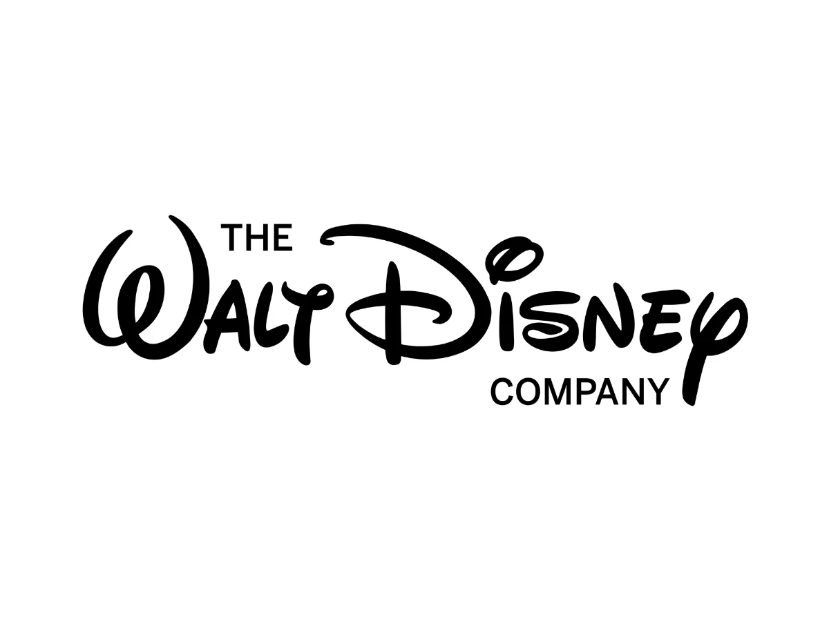

Picture the Disney logo. Depending on who you ask, you just imagined one of two completely different things: a looping cursive signature, or a castle lit by fireworks. Both answers are correct, and that split is the whole problem with the phrase "Disney logo."
The signature is the corporate mark of The Walt Disney Company. The castle belongs to the film studio, Walt Disney Pictures.
They are separate logos for separate parts of the business, and most write-ups blur the two, which is exactly what leaves readers unsure which one they came to see.
This piece keeps them apart. It walks the design history in order, breaks down the typography and golden-ratio construction of the wordmark, covers the 100th-anniversary branding, sets Disney against rival studio logos, and pulls out what a founder's-signature identity teaches any brand, one of many logo design breakdowns worth reading side by side.
Two Logos, Two Entities
The corporate logo is a wordmark: the name "Disney" set in a stylized script derived from Walt Disney's autograph. It carries no castle and no character.
The Walt Disney Company uses it across annual reports, press materials, and the broader business that now spans Disney Entertainment, ESPN, and Disney Experiences.
The castle logo is the studio ident for Walt Disney Pictures, the film production arm. It pairs an animated fairy-tale castle with the same script wordmark and plays before theatrical releases.
It is the mark most viewers picture, because it arrives with music and motion at the start of a film, but it identifies the movie studio rather than the parent company.
Keeping the two apart matters for anyone studying the brand. The script is the durable corporate signature. The castle is a divisional mark that has been redrawn many times to suit the film behind it.
The Corporate Wordmark: From Studio Name To Signature
1923 – 1928: The Studio Wordmarks
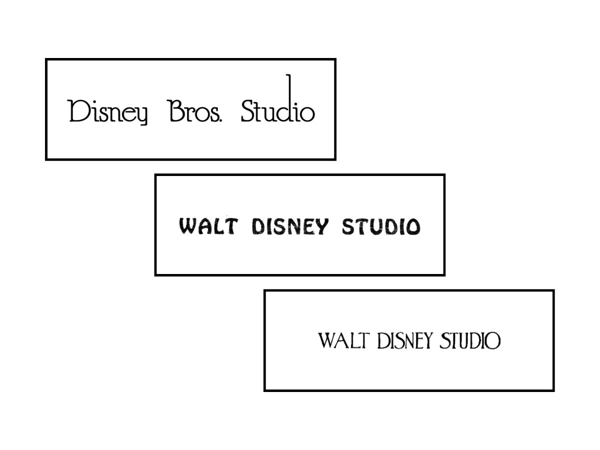
The mark started as plain type, not a signature. The first version, "Disney Bros. Studio" (1923 to 1926), sat on a single black line in thin, rounded letters that echoed the handwriting of animators of the day.
When the company began trading as Walt Disney Studio, that name ran in two different all-caps treatments back to back, both dated 1926 to 1928 on the chart: first a rough, slightly uneven hand-drawn face, second a taller, elongated decorative version closer to faces like Caslon Antique.
All three kept the name black and on one line, and none yet leaned on Walt's own hand.
1928 – 1937: Mickey Enters The Logo
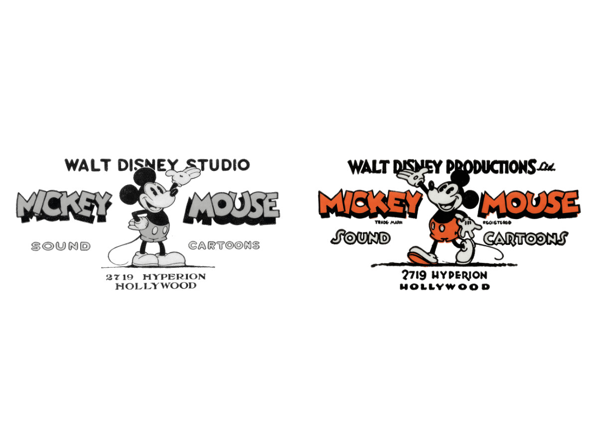
Mickey Mouse pulled the character into the logo.
"Steamboat Willie" made Mickey a star in 1928, and the studio leaned into it. The first two logos put him front and center:
- 1928–1931: Black-and-white "Walt Disney Studio" mark, Mickey illustrated in detail alongside the words "Mickey Mouse," "Sound," and "Cartoons" — right down to the Hollywood studio address.
- 1929–1937: The same idea in color, rebranded as "Walt Disney Productions Ltd."
Both were busy, illustrative layouts. The studio was selling itself through its most famous character rather than through its own name.
1937 – 1939: The Signature Becomes The Mark
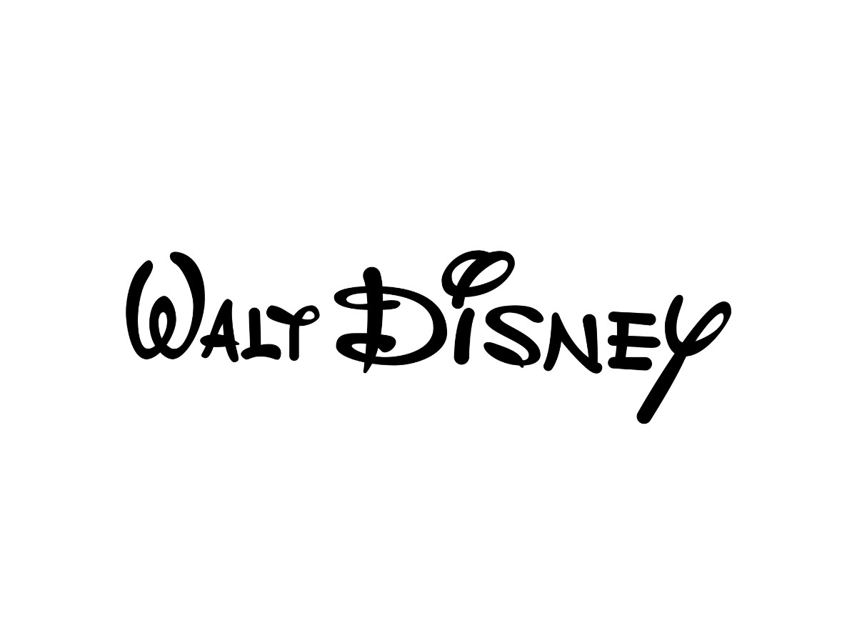
This is where the signature arrives.
In 1937 the company dropped the crowded layouts and, for the first time, made Walt Disney's signature the whole logo: a plain "Walt Disney" drawn in smooth strokes with the thick-and-thin weight of a real pen.
That single move turned a founder's autograph into the studio's most valuable asset, and the script has anchored the brand ever since.
1939 – 1986: One Constant Script
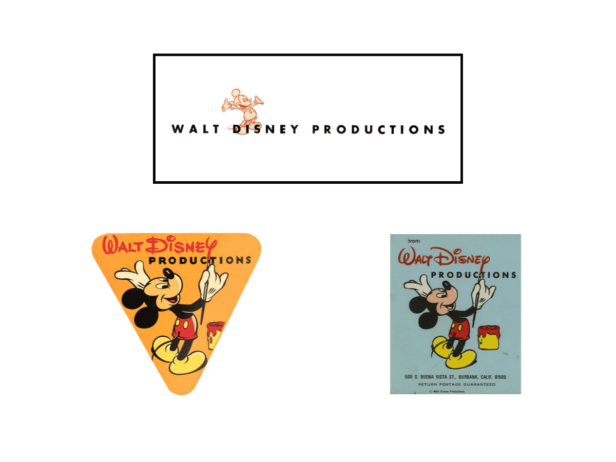
For roughly half a century the "Walt Disney" signature was never the company's only logo. It shared the stage with a rotating set of Mickey-based and corporate marks, each tied to a different use, while the script held the identity together underneath.
Three of those marks put Mickey front and center. A light Mickey silhouette, drawn in thin orange lines with his arms spread wide, sat above "Walt Disney Productions" on company letterhead, envelopes, and internal documents (1939 to 1983).
A bright orange inverted-triangle badge (1940 to 1986) showed Mickey in red shorts and yellow shoes holding a paintbrush, the brush running up into the "Y" of "WALT DISNEY" so the mouse appears to have written the name himself, with a bucket of red paint at his feet.
A near-identical mailing-sticker version (1955 to 1986) kept that painting Mickey but dropped the triangle background, filled in the paint bucket, and carried the studio's Burbank return address.
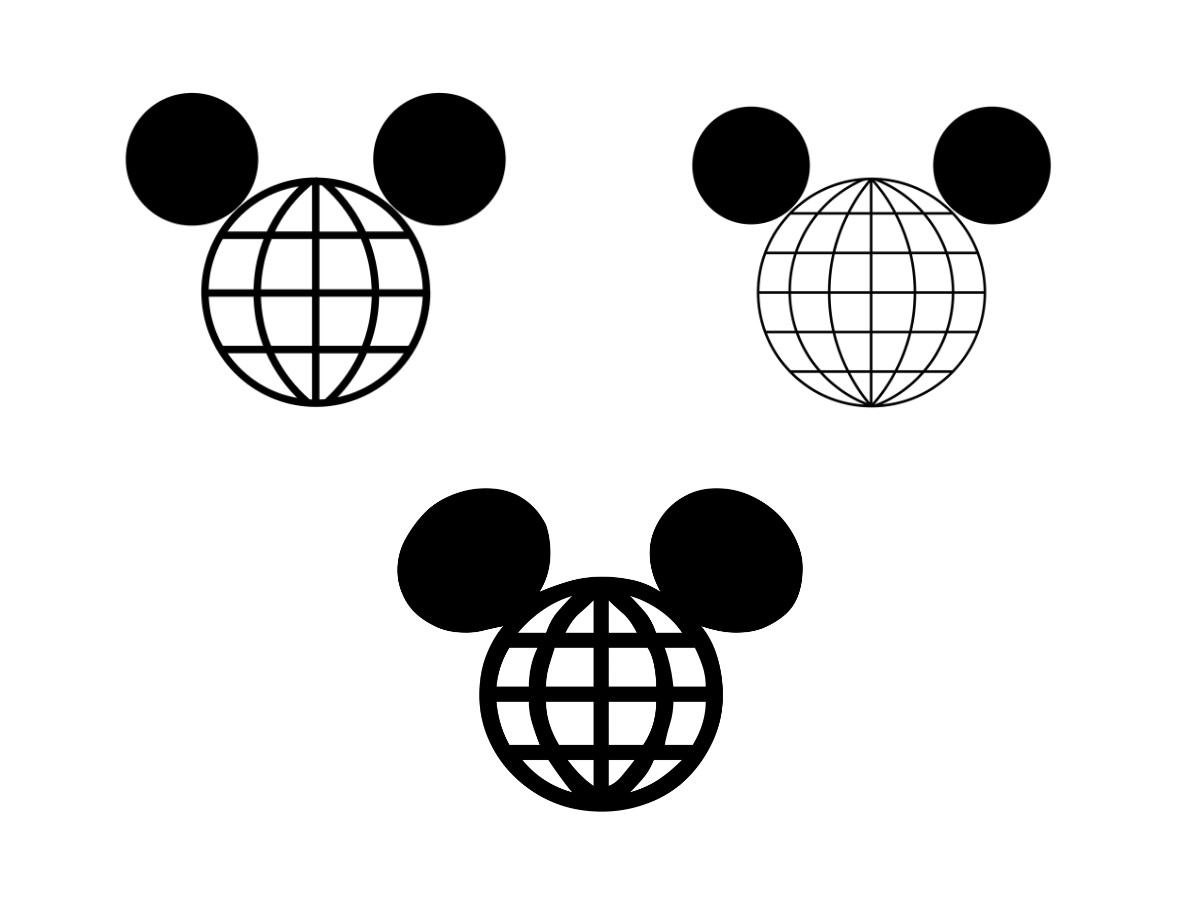
A more abstract corporate symbol ran in parallel: the globe-and-ears "Mickey head," two solid circles for ears above a gridded globe that doubles as the character's face.
It first appeared in the 1965 annual report and cycled through three variants over four decades (1966 to 2005), the grid lines thinning and the ears shifting from perfect circles to softer ovals, and it outlived the others on theme-park material well into the 2000s.
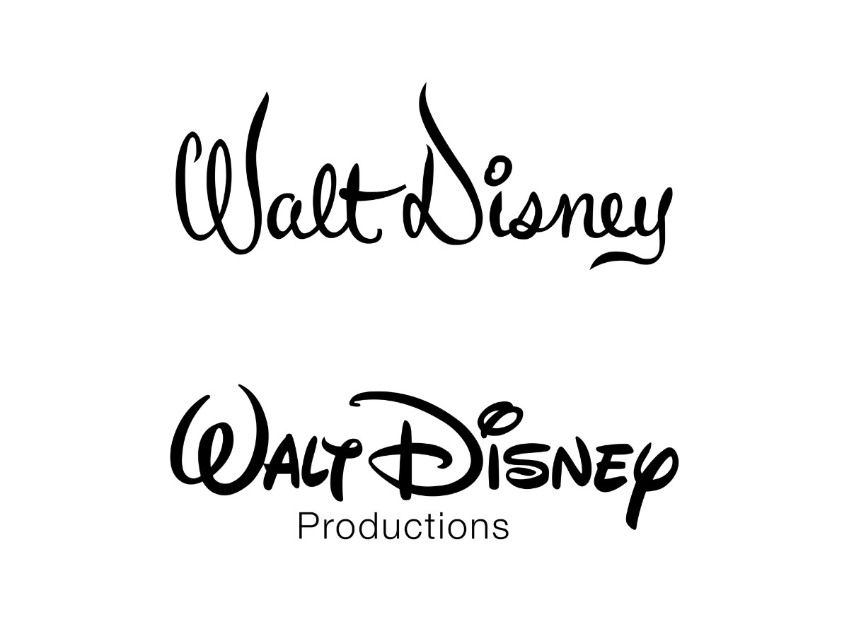
The signature itself also appeared in dedicated forms.
A standalone script version of "Walt Disney," drawn in flowing brush-and-pen strokes, ran from 1948 into the 1980s.
From 1971 a two-tier corporate lock-up stacked that same script over the word "Productions" in lowercase Helvetica, all in black, letting the neutral sans-serif play off the handwritten name above it.
Different as these marks were, the flowing "Walt Disney" script was the thread running through nearly all of them, which is why it survived when the rest were retired.
1986 – 2009: The Walt Disney Company
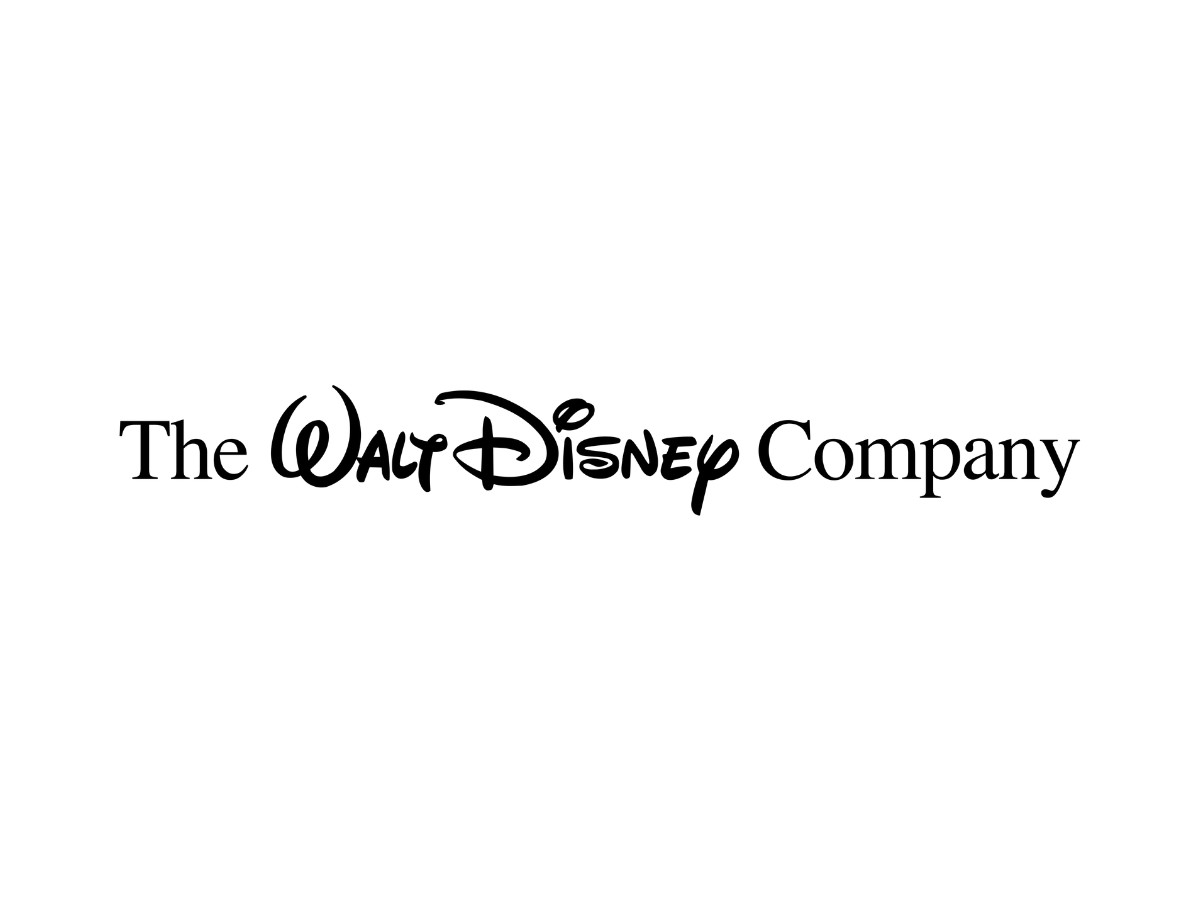
The company took its modern name in this era. In early 1986 Walt Disney Productions became The Walt Disney Company, a change meant to reflect a business that had grown well past filmmaking.
The new corporate logo set the full name on one line and framed the unchanged "Walt Disney" signature with "The" and "Company" in the serif typeface Times, a pairing that spread across divisions such as Buena Vista and Walt Disney World.
2009 – 2012: The Whitney Refresh
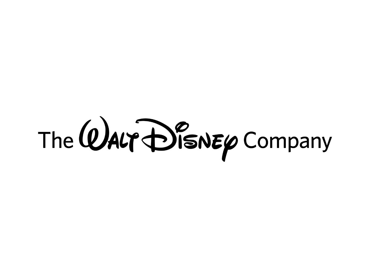
The signature held while the frame around it modernized.
In 2009 Disney swapped Times for the cleaner sans-serif Whitney on "The" and "Company," giving the corporate lock-up a more restrained, contemporary feel without touching the script at its center.
2012 – 2024: The Benton Sans Lock-Up
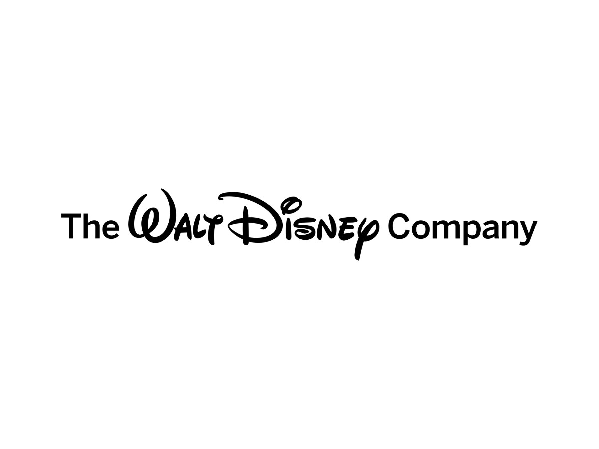
The Communication Arts team reworked the lock-up again in 2012, resetting "The" and "Company" in Benton Sans, a slightly heavier sans-serif that tightened the balance between the frame and the script.
It stayed the company's standard corporate lock-up for more than a decade.
2024 – Present: The Three-Line Redesign
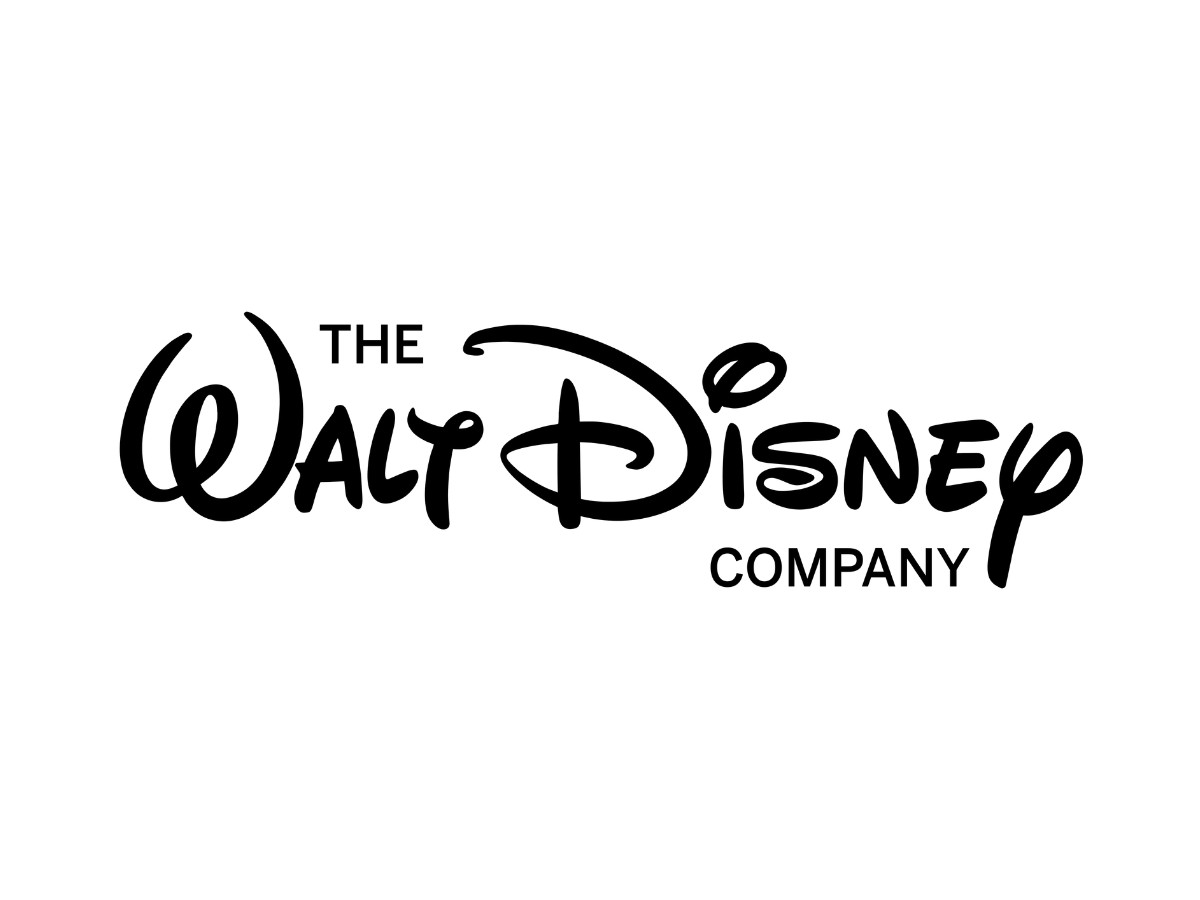
Disney unveiled a further reworking at its Content Showcase in Singapore in November 2024.
The redesign, again from Communication Arts, stacks the name across three lines, with "The," then "Walt Disney," then "Company," and introduces the in-house typefaces Inspire TWDC and Multiplane TWDC.
The rollout is gradual, and the 2012 lock-up still appears across many of the company's properties.
The Walt Disney Pictures Logo
The film studio's logo followed its own path, and for its first several decades a Disney movie opened on little more than the signature or a "Walt Disney Presents" card rather than a fixed emblem.
It became the mark audiences now expect only once the word "Pictures" and, soon after, the castle joined it.
1929 – 1937: The Mickey Mouse Ident
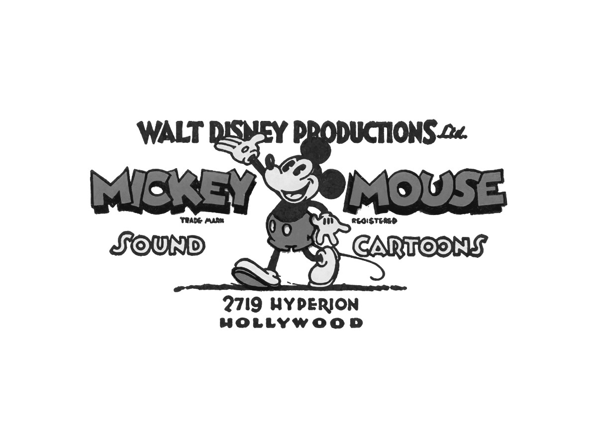
The earliest film-front mark leaned on the studio's star.
It set a walking Mickey Mouse between the words "Mickey" and "Mouse," under "Walt Disney Productions Ltd." and above "Sound Cartoons" and the 2719 Hyperion Hollywood address, all in custom lettering.
This was the same busy, character-led layout the studio used on its early cartoons.
1937 – 1948: The Signature Debuts
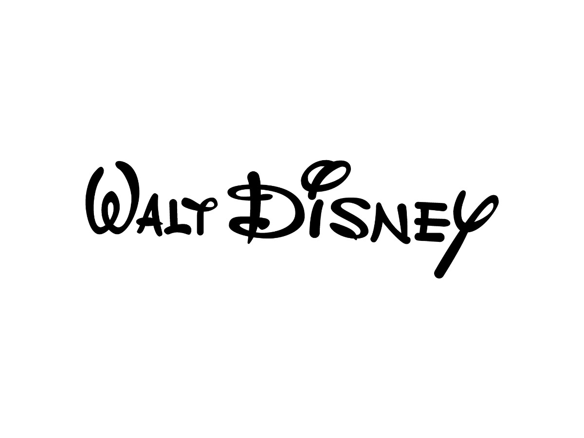
The signature took over as the film mark in 1937.
A bold "Walt Disney," mixing capitals and lowercase, ran on screen with the twisted "W" and "D" and the looping "i" and "y" that would go on to define the wordmark, a stylized enlargement of Walt's own hand rather than a typeface.
1948 – 1979: The Refined Script
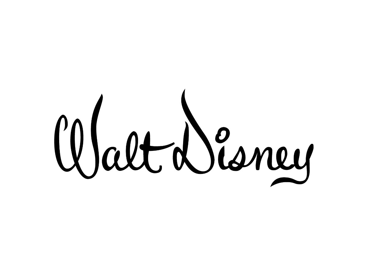
A decade later the script was redrawn.
The 1948 version kept the handwritten feel but dropped the italic tilt, giving the "Walt Disney" signature the steadier, more upright form it held on film credits for the next three decades.
1979 – 1983: Productions Added
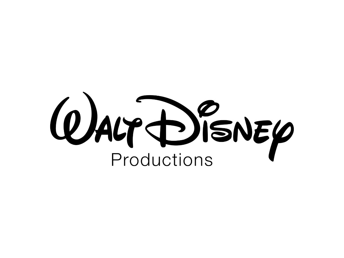
The studio name joined the signature in 1979. The familiar "Walt Disney" script gained the word "Productions" beneath it in a plain sans-serif, marking the film-front logo as the output of Walt Disney Productions.
1983 – 1985: The Pictures Wordmark
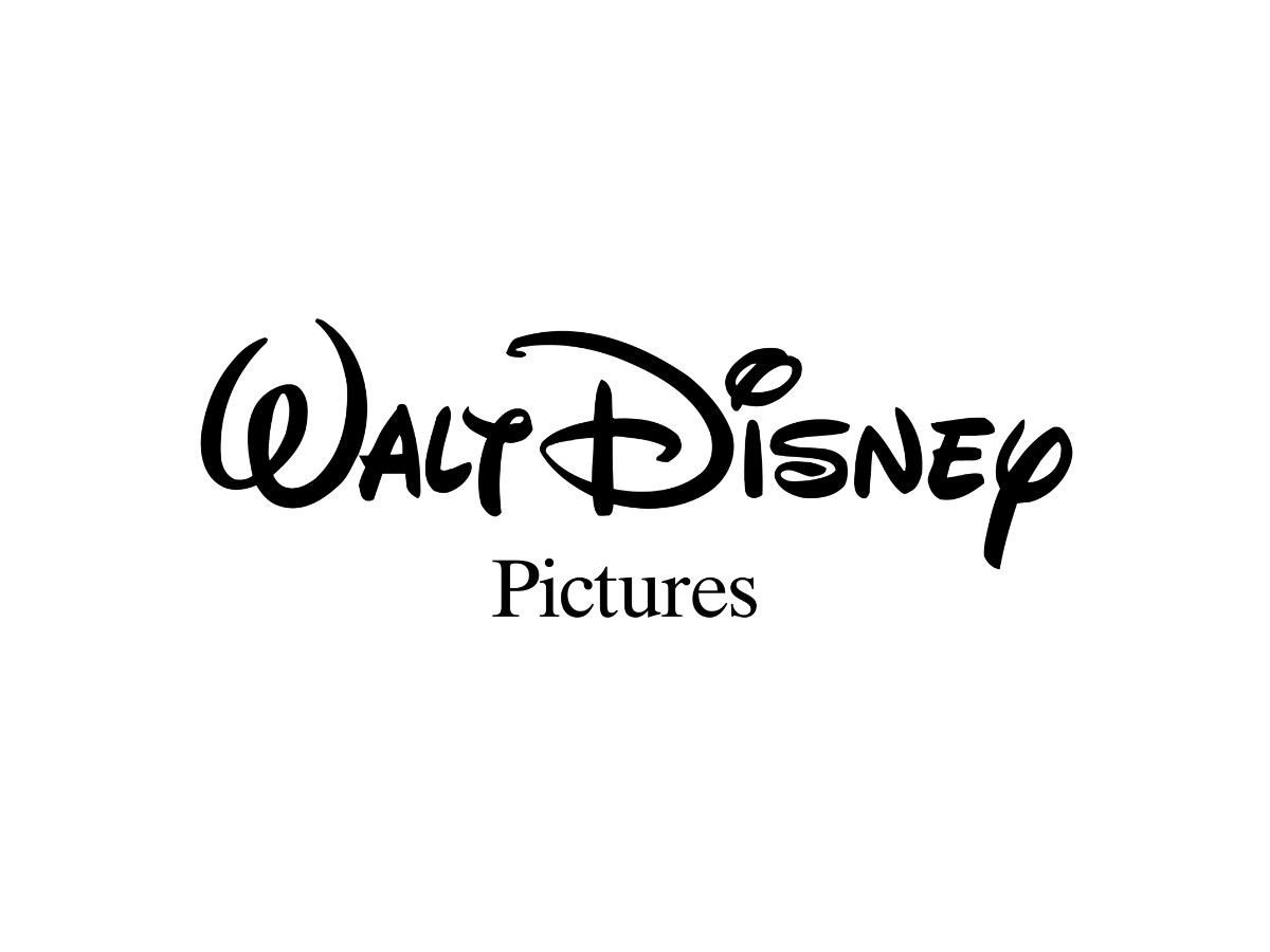
In 1983 "Productions" gave way to "Pictures." The change reflected the new Walt Disney Pictures label for the studio's film releases, with the "Walt Disney" script unchanged above the reset lower word. This was the last version before the castle arrived.
1985 – 2006: The Castle Arrives
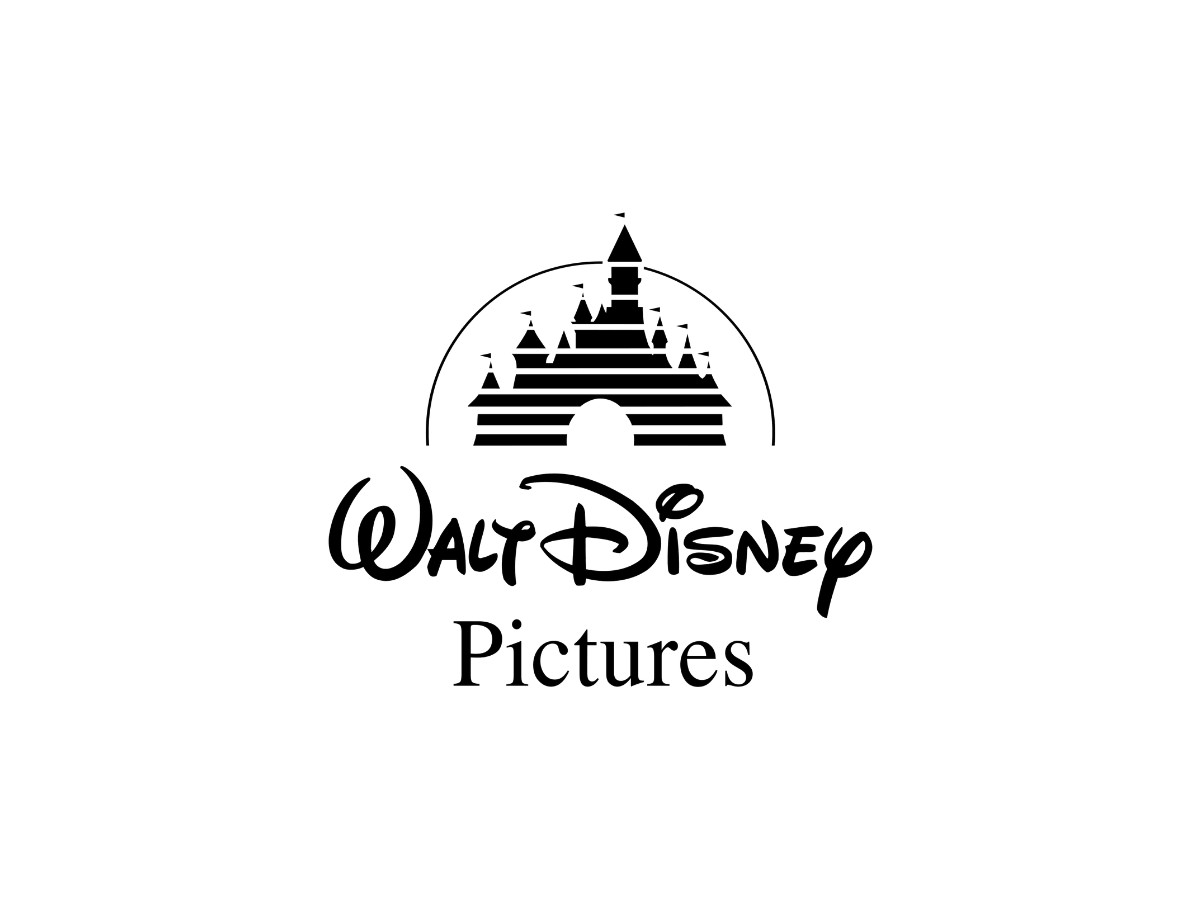
The castle joined the wordmark in the mid-1980s. The animated logo debuted in 1985 on The Black Cauldron, placing a stylized fairy-tale castle, drawn as flat white horizontal stripes inside a solid arch with a flag over each tower, above the "Walt Disney Pictures" wordmark.
The castle drew on Disneyland's Sleeping Beauty Castle and the Magic Kingdom's Cinderella Castle, with cues from European landmarks such as Germany's Neuschwanstein, so it reads as a composite fantasy structure rather than a copy of any single building.
2006 – 2011: The CGI Castle
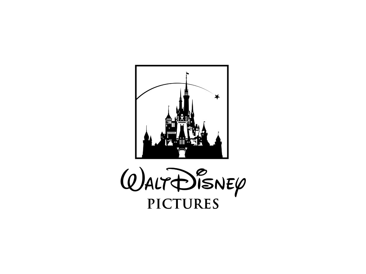
Pixar rebuilt the castle in three dimensions for 2006.
The computer-generated version debuted with Pirates of the Caribbean: Dead Man's Chest, trading the flat stripes for a detailed castle with towers, windows, open gates, and a falling star that arcs overhead, while "Walt Disney" thinned slightly and "Pictures" was reset in a new cursive.
That kind of overhaul lands differently across logo redesign campaigns, which range from quiet refreshes to full rebuilds.
2011 – Present: Shortened To Disney
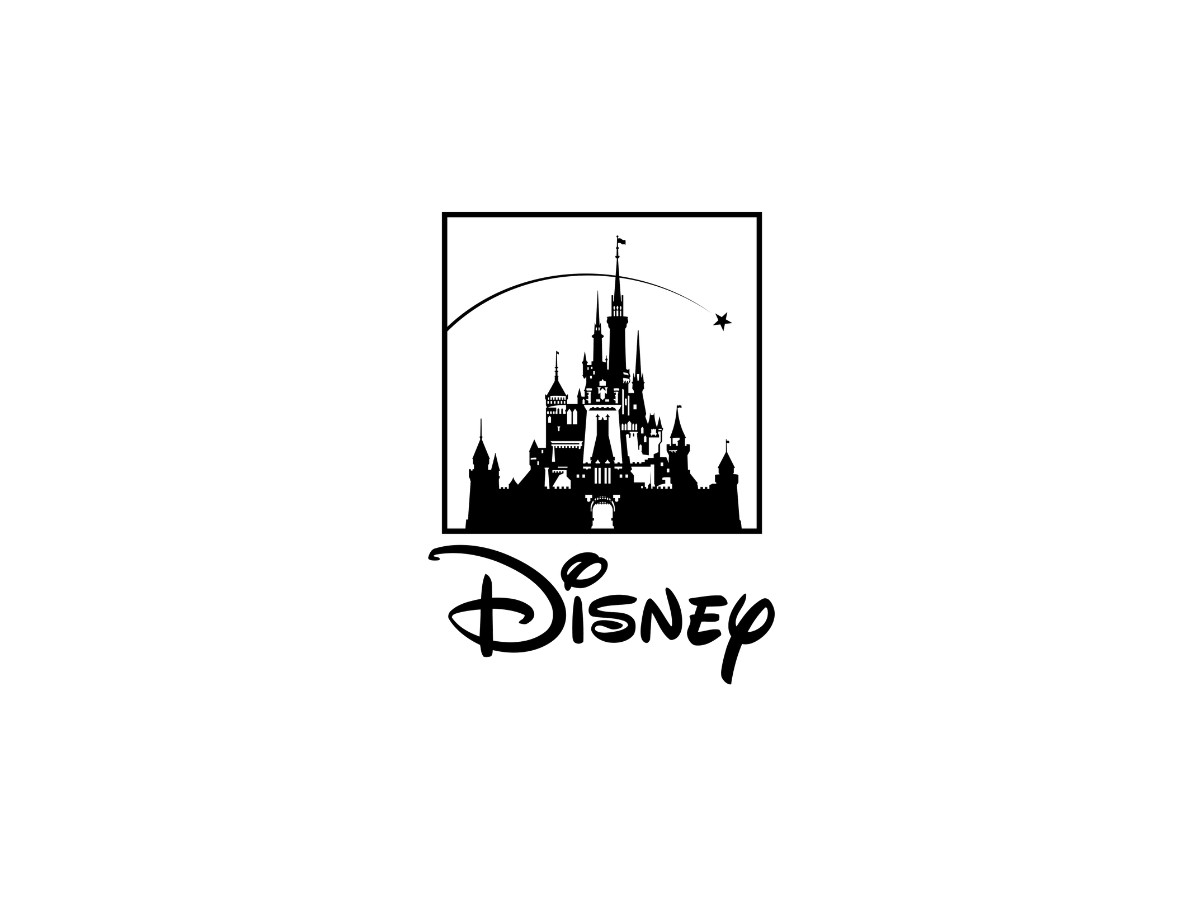
The wordmark lost two words in 2011.
The current logo keeps the CGI castle but replaces "Walt Disney Pictures" with a single "Disney," the founder's surname in the familiar script, and animators now customize the castle and its sky to match each film, from Maleficent's cliffs to Tron's city of lights.
Through every change, the studio mark kept Walt's signature at its heart, the same script that anchors the corporate logo.
Typography And Construction
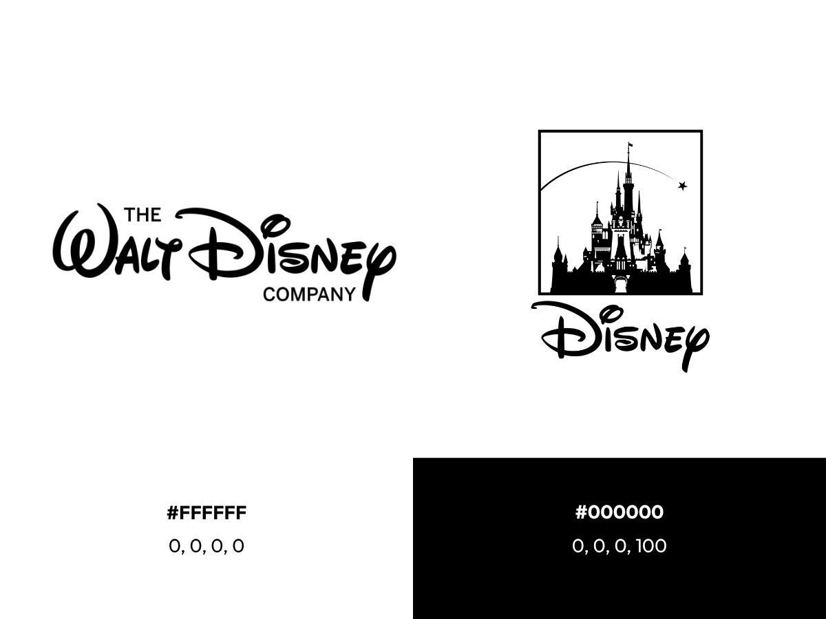
Color is deliberately minimal, and both current marks are monochrome.
The present Walt Disney Company wordmark and the present Walt Disney Pictures logo, the castle above the single "Disney" script, are each rendered in a flat black, specified as Hex #000000 and CMYK 60, 40, 40, 100 for a rich print black, matched to Pantone Black 6 C.
The only other color is the white behind it, Hex #FFFFFF and CMYK 0, 0, 0, 0, leaving both marks as pure black on white. That restraint puts the weight on the letterforms rather than color, a one-color script that works as a symbol on its own.
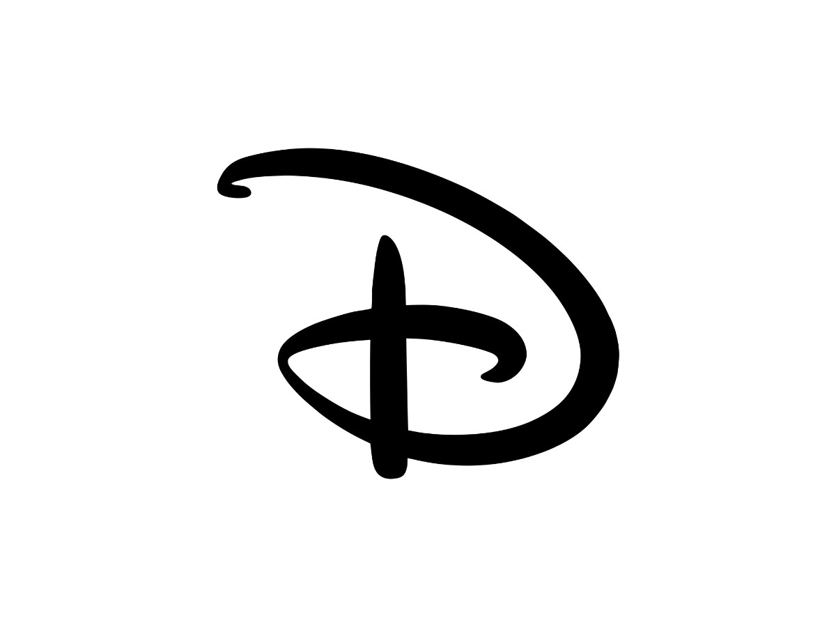
Several details separate the Disney signature from a generic cursive script.
The capital "D" is the most distinctive: its bowl curves back and down in a way no standard script replicates, and the letterform is stylized enough that some readers first read it as a reversed "G."
The dot over the "i" sits as a small filled circle rather than a plain point, and the moderate slant gives the wordmark forward motion without the hard lean of an italic.
A widely cited construction detail holds that the "D" applies the golden ratio three times in its curves, one reason the letter feels balanced rather than arbitrary.
This puts it in the display-script corner of logo typography, and it is not a font: Disney's mark is a proprietary custom logotype, and the closest public stand-in is Waltograph, a free display face by Justin Callaghan from around 2000 that fans use to approximate the look.
The 100th-Anniversary Branding
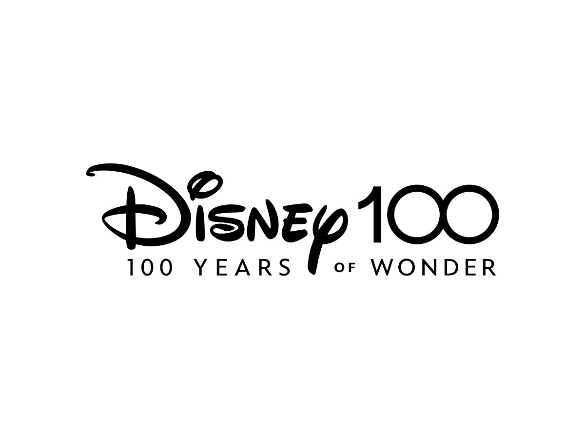
For its centennial, The Walt Disney Company ran a coordinated global campaign branded "Disney 100 Years of Wonder," with the anniversary logo first revealed at a D23 event in 2021 ahead of the 2023 celebration.
The campaign logo appeared in black and white, a nod to the earliest days of animation, with Mickey and Minnie Mouse tucked into the two zeros of "100."
The studio also produced a commemorative castle intro.
Created by Disney Studios Content and Industrial Light & Magic, the sequence rendered the castle in platinum tones and threaded in references to decades of Disney films and park landmarks, set to a new arrangement of "When You Wish Upon a Star" by composer Christophe Beck.
It first ran ahead of Strange World over Thanksgiving 2022 and played in front of Disney theatrical and streaming releases through 2023.
What The Signature Says: The Design Read
The wordmark works because it does one thing without ambiguity. The script names the company and, through its link to Walt, signals authorship and craft. There is no puzzle to solve about who the brand is.
That clarity is also its strategic core. In the founding years the "logo" was literally a founder's sign-off, an artist's signature on his own work.
Brand commentators point to this as the useful lesson for smaller companies: a founder's name or a clean wordmark is direct and honest, and authenticity tends to matter more than a polished corporate mark when a business is still taking shape.
Disney's mark grew from the company's first real asset, which was Walt himself.
The signature has been read as an embodiment of the company mission, which the corporation states as a goal "to entertain, inform and inspire people around the globe through the power of unparalleled storytelling".
Analysts of lettermark and signature logos file Disney alongside Kellogg's as a case where a founder's handwriting became a durable identity, adding a human quality that a geometric typeface cannot reproduce.
How Disney's Logo Compares To Peer Studio Logos
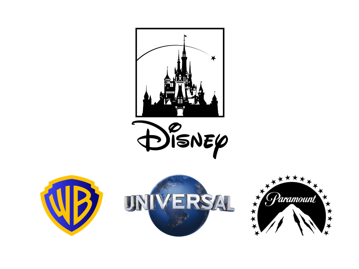
Set against the other major studios, Disney's approach stands out for centering a person rather than a symbol of scale or prestige.
Warner Bros. uses a shield with a bold "WB" monogram, a mark that dates to the 1920s and reads as corporate authority and tradition.
Universal Pictures spins a globe, emphasizing worldwide reach.
Paramount opens on its "Majestic Mountain," the oldest surviving movie-studio logo in Hollywood, where the ring of stars originally counted the actors under contract. Globes, shields, and mountains all argue for size, reach, or permanence.
Disney's corporate mark argues something else.
It is a name in a founder's hand, so it claims authorship and heritage instead of scale. The studio's castle competes on the same fairy-tale terrain as the others' grand imagery, but the wordmark that sits beneath it keeps pulling the identity back to one person.
The same pattern shows up in other entertainment marks worth comparing, from the Barbie logo to the Spotify logo.
For an agency-directory audience weighing how to position a brand, the contrast is instructive: symbol-led marks sell the size of the operation, while a signature sells the story of who is behind it.
Frequently Asked Questions
Who designed the Disney logo? The wordmark was not designed by a single person in the conventional sense.
It grew from Walt Disney's own signature, which became the studio's central mark in 1937 and has anchored the brand since.
The framing around the script has been refreshed by Disney's design partners over the years, most recently by the Communication Arts team in 2012 and 2024.
The castle logo for Walt Disney Pictures is a separate, studio-produced mark, and its 2006 CGI version was created for Pirates of the Caribbean: Dead Man's Chest.
Is the Disney logo a font? No. The wordmark is a proprietary custom logotype, not a licensed typeface. The free font Waltograph, designed by Justin Callaghan, imitates the look but is a fan-made approximation rather than Disney's official lettering.
When did Disney change its logo? The "Walt Disney" signature became the studio's mark in 1937 and has stayed at the center ever since.
The corporate name and logo, The Walt Disney Company, arrived in 1986, with the surrounding typography updated in 2009, 2012, and again in a three-line 2024 redesign.
The Walt Disney Pictures castle debuted in 1985 and was rebuilt in CGI in 2006, and the company ran a separate "Disney 100" identity across 2022 and 2023.
What does the Disney castle represent? The castle is the ident for the film studio, Walt Disney Pictures, not the corporate logo.
It signals the studio's fairy-tale storytelling and draws on Disney's own theme-park castles plus European landmarks such as Neuschwanstein, so it reads as an idealized fantasy structure rather than a real building.
Why is the corporate Disney logo just a signature? The signature ties the modern company directly to its founder. Because the letterforms are custom and hard to reproduce with any existing font, the mark functions as a symbol in its own right while carrying the authenticity of a founder's name.
The Takeaway
The Disney identity is really two marks doing two jobs: a corporate wordmark built from a founder's signature and a studio castle built for the movies.
The wordmark's lesson outlasts the specific letterforms. A name in a founder's hand can carry a company for a century when the work behind it is good and the mark stays consistent.
Most companies do not have a founder as famous as Walt Disney, but the principle holds for any brand deciding whether to lead with a symbol or a signature: the symbol sells scale, and the signature sells authorship.
Our team ranks agencies worldwide to help you find a qualified partner. Visit our Agency Directory for the Top Logo Design Companies as well as: