This article explores some of the best blue and orange logo designs crafted by the top logo designers today.
Most logo designs are in blue and orange colors because these are eye-catching hues. Blue symbolizes peace, stability, and the free flow of ideas, while orange implies energy, vibrancy, and movement.
Together, these colors convey strong brand stories that resonate with broad audiences. They communicate positivity and reliability, and these outstanding logos are prime examples!
1. Journee Nationale Citoyennete et Fraternite by Akihiro Takeuchi
Standout Features:
- Symbolic bird illustration
- Circular logotype layout
- Simple and clear typography
Akihiro Takeuchi crafted a deeply symbolic logo design for Journee Nationale Citoyennete et Fraternite. This French national holiday celebrates citizenship and brotherhood.
The logo features hands that form a bird's figure. That's two images in one! This universal symbol of hope and freedom perfectly captures the holiday's essence.
The design also incorporates a circular logotype formation, which lends a sense of unity and cohesiveness. This further underscores the values of togetherness and community, reinforcing the holiday's core principles.
Explore the most effective simple logo designs.
2. Symbiosis Custom Travel by Joe Ogden
Standout Features:
- Minimalist globe icon
- Striking sun rays
- Legible serif typeface
Joe Ogden created a stunning logo design fitting for Symbiosis Custom Travel's Southeast Asian expeditions. The main icon features a modern and minimalist globe illustration. It instantly conveys the exciting journey of traveling the world, specifically in Asian regions.
The orange-yellow sun rays in the background add visual interest and evoke a sense of adventure. Plus, it captures the tropical nature of the travel agency's beautiful destinations.
The prominent "S" at both ends of Symbiosis is a clever play on typography. The serif font also improves legibility, enhancing brand recall.
Get inspired by these modern logo designs.
3. Blu Flamingo
Standout Features:
- Recognizable flamingo brandmark
- Circle icon frame
- Bold sans-serif typeface
Blu Flamingo showcased their creative prowess with a vibrant logo design for their brand. The main icon features a bright blue flamingo with orange wings. This striking combination is an instant eye-catcher!
The color contrast adds a dynamic element, reflecting the brand's creative and unconventional approach. The logo's equally eccentric and professional character aptly represents Blu Flamingo's brand identity.
The circular frame creates a balanced layout and modernizes the icon's look. The bold, sans-serif typeface also ensures the brand name is clear and impactful, helping brand recognition.
4. New Aurora Group by ReflexZion
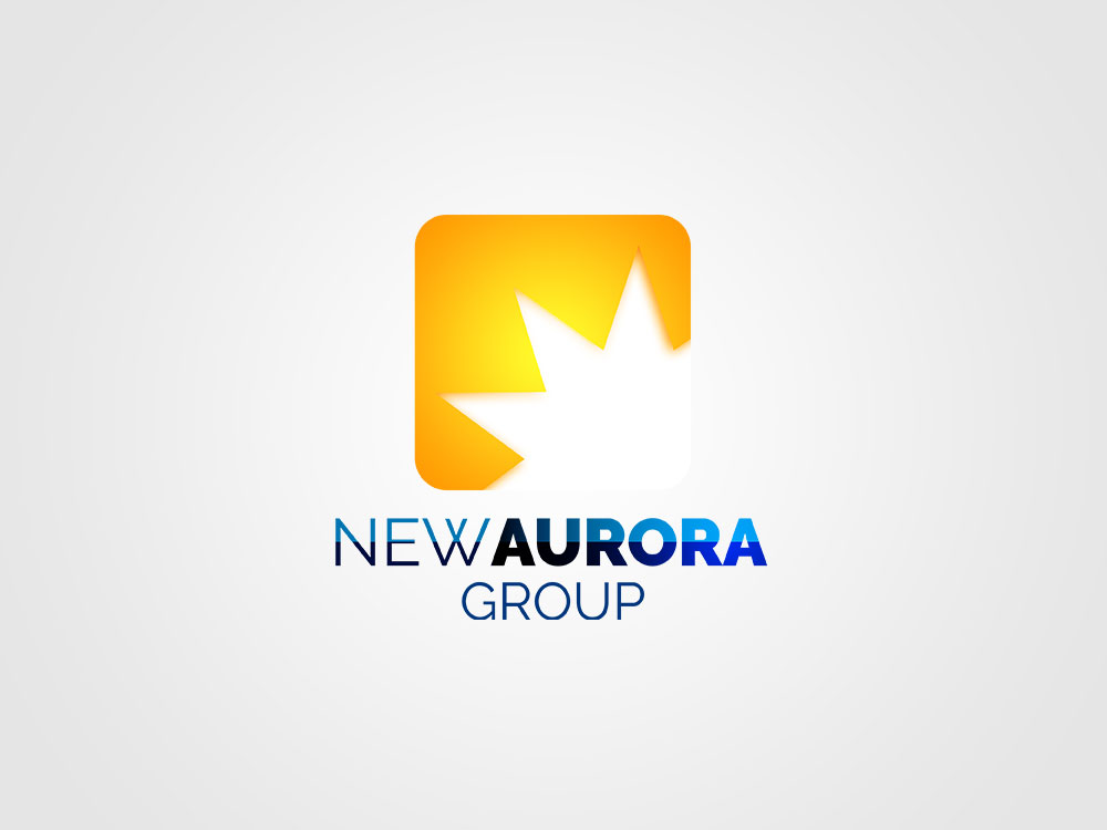
Standout Features:
- Gradient icon and logotype
- Vibrant color combination
- Contemporary typography
Design agency ReflexZion crafted a logo full of energy and innovation – two values that best represent the New Aurora Group.
Like the sun rising on a new day, the logo features a cropped icon of the bright star. The vibrant yellow-orange gradient symbolizes new beginnings or dawn. This fits with the name "Aurora" in the company.
The typography also sports a gradient look that transitions from sky blue to deep blue. This stands boldly against the white background, enhancing visibility and recognition. This design's clever use of gradients adds depth and interest to straightforward typography!
Check out these innovative graphic design logos.
5. Mr. Matipid by Felias Designs
Standout Features:
- Modern Filipino avatar
- Noticeable peso symbol
- Clear and bold typography
Felias Designs crafted a logo for Mr. Matipid that cleverly blends cultural and linguistic elements. At the heart of the logo is an illustration of a Filipino man proudly wearing a national costume. This perfectly symbolizes the brand's cultural identity and heritage!
The logo takes creativity further by replacing the "P" in "matipid" with a peso sign. It is the Filipino word for thrifty, so this subtle tweak emphasizes the brand's focus on value and frugality.
The logotype's bold letters enhance the brand name's legibility, while the supporting slogan adds context without cluttering the design. Overall, the innovative yet organized layout makes the logo an appealing and thoughtful brand representation.


