
This list of the best sunshine logo designs encapsulates a new day's warmth, optimism, and energy. More than symbols, they are beacons of positivity often used to signify growth and happiness.
Created by the finest logo designers of today, these logos are ready to inspire and enhance your brand's vision with its blend of creativity and meaning.
Still looking for more? Check out our Best Logo Designs, especially best yellow and green logos, and get inspiration for your next design project!
Table of Contents
1. Sun on Fire by La Sashata Design Studio

Standout Features:
- Elaborate sun illustration
- Monochromatic color story
- Thick serif typography
Logo design agency La Sashata Design Studio's work for Sun on Fire, a Mexican natural incense brand, features a hand-drawn sun illustration that reflects the brand's bold and natural essence.
The design combines a monochromatic palette with thick serif typography, evoking elegance and sophistication. This visual approach perfectly represents Sun on Fire's range of natural incense and appeals to those who love a fragrant and relaxing ambiance.
Explore more black logo designs for a dose of sophistication and modernity.
2. SHINE by Karma Design Studios

Standout Features:
- Two halves of a sun placed diagonally
- Simple logo design
- Bold typography
Logo design agency Karma Design Studios created a striking concept for SHINE, an innovative brand known for its dynamic approach. Their design is anchored by a yellow sun logo, divided into two halves, and placed diagonally. This symbolizes the breaking of dawn and the brand's cutting-edge vision.
This imagery is visually impactful and metaphorically represents SHINE's ethos of bringing new perspectives and ideas to light. Complementing this is the text’s simplicity, speaking to the brand's straightforward approach.
3. SunDensity by BZDesign

Standout Features:
- S and D encased in one icon
- Sun rays inside the letter
- Lively color story
In their logo redesign for SunDensity, logo design agency BZDesign perfectly captures the brand's essence. The new logo merges the letters 'S' and 'D' into a single monogram, with sun rays intricately integrated within, symbolizing energy and clarity.
Like these impressive logo redesigns, SunDensity's logo offers a new, improved, and more approachable identity. The design is set against a lively color story, echoing the brand's refreshed image.
Explore our collection of the best letter logo designs.
4. Sunny Daze Cannabis Supply by Shelby DiTrani

Standout Features:
- Stylized letters
- Rounded edged typography
- Brand name inside an oval
Logo designer Shelby DiTrani's design for Sunny Daze Cannabis Supply showcases a playful and unique approach to sunshine logos. The standout feature is the stylized letters that add a creative and playful twist.
Rounded edges in the typography and the brand name framed within an oval add to the logo's approachable feel. These design choices reflect Sunny Daze's commitment to being a fresh face in the cannabis industry, emphasizing its focus on innovation and customer connection.
5. Sun by BrandSpark

Standout Features:
- Rounded edges on the sun’s rays
- Vibrant yellow color
- Circle in the middle of the sun
BrandSpark demonstrated its creative expertise by designing Sun's logo, featuring a sun with rounded rays in a vibrant shade of yellow.
The circle in the middle of the sun adds a unique touch, symbolizing insight and setting the brand apart with a distinctive look. This design effectively captures Sun's innovative spirit, making a memorable impression in their industry.
6. Original Sunshine by Aleisha Samek Design

Standout Features:
- Rising sun shaped like a fan
- Various shades of yellow
- Bold serif typography
Aleisha Samek Design brings fun and vibrancy to Original Sunshine's branding, an all-natural and gluten-free wheat flour brand. The logo showcases a rising sun shaped like a fan, symbolizing daybreak and the wholesome essence of the product.
Using various shades of yellow in this design adds depth and energy and mirrors Original Sunshine's flour's vitality and health benefits. The bold serif typography makes the brand name stand out, ensuring the logo is memorable and visually appealing.
7. Sweet Sunshine Villas by GrafikonArt

Standout Features:
- Minimalist art style
- Thin lines and typography
- Sleek and modern design
Logo design agency GrafikonArt's creation for Sweet Sunshine Villas in Rethymno, Crete, encapsulates the essence of this tranquil destination. The logo depicts a sun rising above the mountains, a serene image reflecting Crete's natural beauty and peaceful atmosphere.
This imagery captures the essence of Sweet Sunshine Villas and invites viewers to imagine themselves enjoying the stunning views. Thin lines and typography in the design add to its sleek and modern vibe and align with the contemporary and elegant nature of the villas.
8. Sunrise Preschool by Lydia Dahl

Standout Features:
- Smiling sun rising from the mountain
- Bold typeface
- Lively and energetic colors
Logo designer Lydia Dahl's concept for Sunrise Preschool features a playful, smiling sun rising from the mountain, reflecting the school's joyful and nurturing environment. The design also includes Mt. Baker, known for its iconic twin peaks and visible from the school, tying the logo to the preschool's location.
This combination of cheerful imagery and local significance captures the essence of Sunrise Preschool's commitment to a bright, engaging learning experience.
9. Dina Ivory Photography by Red Berry
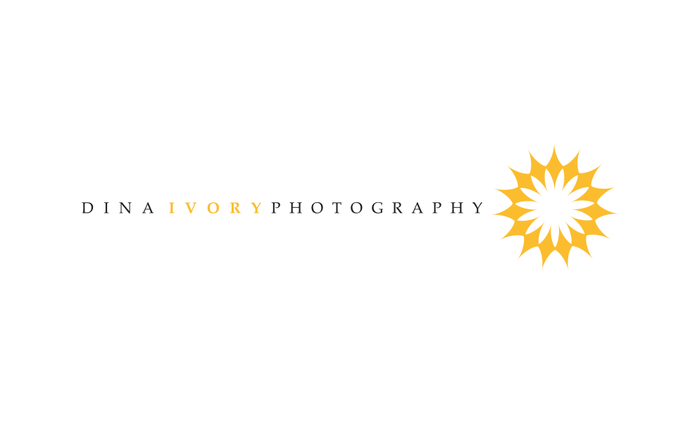
Standout Features:
- Elegant typography
- Unique sun illustration
- Symmetry
Photography logo design is a beast of its own. Often found in the corner of the images professional photographers take, these need to be discernible enough to be noticed, but also subtle in order not to draw focus from the "product". Dina Ivory Photography logo, designed by Red Berry is a perfect example of how to achieve this meticulous balance.
It is eye-pleasing and clean, using warm, sun-bathed orange to instill the feeling of a warm welcome, however, it shines with elegance, emanating sophistication and high professionalism. Discover the best blue and orange logo designs.

-preview.jpg)