Burger King's significance in the fast-food culture transcends its scrumptious whoppers and crispy fries. With its roots traced back to 1953, Burger King stands as one of the pillars of the global fast-food industry. From drive-thru services to home delivery operations, its influence has been immense, shaping and innovating the fast-food landscape.
Table of Contents
- Unveiling the Whopper-Sized Impact of Burger King's Logo History
- The 1953 Logo's Simple Monochromatic Start
- Burger King's Logo Changes Through the Decades
- The Iconic "Bun Halves" Era
- The 2021 Rebrand: Nostalgia Meets Modern Simplicity
- Beyond the Bun: What Burger King's Logo Evolution Tells Us About Branding Mastery

Unveiling the Whopper-Sized Impact of Burger King's Logo History
Just as its food menu has evolved to satisfy the shifting taste buds of consumers, Burger King's branding has transformed, catching the attention of patrons and design enthusiasts alike. Any professional agency can tell you that branding is critical in the fast-food industry, serving as a visual identifier, shaping perception, driving recognition, and fostering customer loyalty.
And at the heart of this branding journey, the logo has remained a constant symbol of the brand's resilience and adaptability.
We will unravel a rich tapestry of design decisions as we walk through the history of Burger King's logo evolution, from its monochromatic beginnings to its recent colorful rebranding.
Browse our collection of the most successful logo designs.

The 1953 Logo's Simple Monochromatic Start
Burger King's original logo was introduced in 1953. It was a textbook example of a minimalist design. Its design features were simple and understated, primarily black and white, mirroring its initial mission of offering straightforward, quality fast food without unnecessary frills.
This logo's simplicity was embodied in its straightforward typography, with no intricate imagery to dilute its message. Meanwhile, the layout and composition maintain consistency, with the brand's name featured prominently. This ensures immediate recognizability.

Burger King's Logo Changes Through the Decades
Burger King's logo underwent several transformations through the decades, marking a significant phase in the company's history.
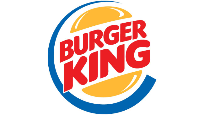
The logo was redesigned in 1969 to feature a more complex and colorful design, introducing the "bun halves" concept. 1994 saw another redesign, retaining the "bun halves" but introducing brighter colors and a more solid typeface. The 1999 logo still had the same concept but a more modern presentation, with the wordmark placed diagonally between the bun halves with a blue circular outline.
These logo transitions were not merely aesthetic updates. They were deliberate strategic decisions reflecting periods of ownership changes and a response to the evolving fast-food landscape. Each new logo encapsulated where the company was in terms of its growth journey and where it intended to go.

The Iconic "Bun Halves" Era
The "bun halves" logo became a defining identifier for Burger King. This version featured a visually striking sandwich-like logo, with the company's name nestled between two bun halves. Also, the vibrant color scheme stimulates appetite.
This iconic design received minor tweaks over the years. The 1999 redesign retained the bun concept, but the typography was revised to a sans-serif typeface. A blue crescent-like swirl was incorporated, enveloping the logo and adding a modern edge.
The "bun halves" logo era signifies Burger King's commitment to innovation and adaptability, with its design changes further echoing the brand's changing market strategies.

The 2021 Rebrand: Nostalgia Meets Modern Simplicity
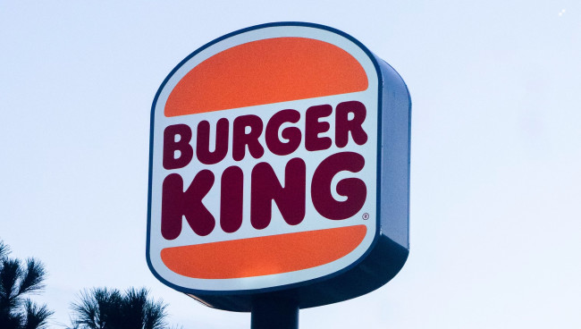
In 2021, Burger King unveiled a logo redesign, a vibrant and delightful blend of nostalgia and modern simplicity.
The new design draws inspiration from the classic "bun halves" logo. It features a custom, rounded sans-serif typeface and a flat layout. The new logo's color palette flaunts a vibrant red and orange, giving it a warm, delicious appeal.
This rebranding was driven by the need to better align the company's visual identity with its evolving services, including digital and delivery services.
Explore more powerful logo design examples.
It reinforces the brand's ability to evolve while preserving its distinct elements. The impact on customer perception has been substantial and positive, contributing to reinforced brand recognition and business performance.
Beyond the Bun: What Burger King's Logo Evolution Tells Us About Branding Mastery
The journey of Burger King's logo designs narrates a tale of branding mastery, market adaptability, and business strategy. It reflects the brand's responsiveness to industry trends, ownership transitions, and customer expectations.
Each logo, from the simple monochrome start to the iconic "bun-halves" to the current colorful rebrand, mirrors the brand's mission and commitment to staying relevant to consumer preferences.
While keeping core elements of Burger King's identity, these shifts in design strategy demonstrate a perfect balance of consistency and adaptability. It's a testament to the power of effective logo design and branding, a silent yet influential ambassador for the brand that has stood the test of time and trends.
With every bite of a Burger King meal, customers partake in a brand legacy represented by the logo, rich in history, and geared towards a future of continual adaptation and innovation. Make sure to check out our dedicated article for more burger branding examples.


-preview.jpg)