Turn up your speakers, and get excited for a memory-making technology like no other.
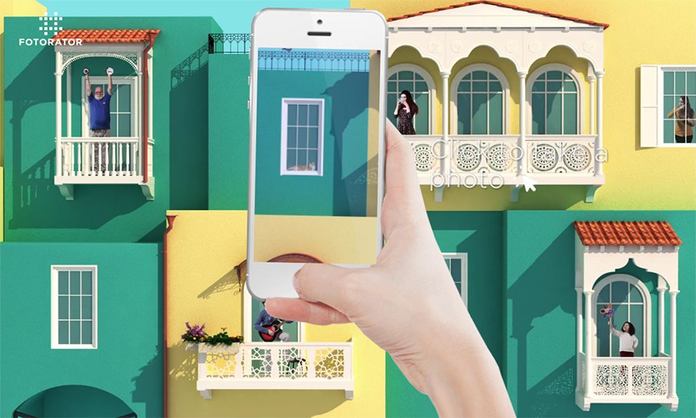
Fotorator opens with a noisy, interactive platform that gives users the chance to see what the company’s photo process is really about. The two-page interactive entrance to the website is an enticing way to bring consumers into the world of Fotorator. It allows them to discover how the company’s equipment works.
The semi-realistic design of the little town on the home page gives a comfortable view of an inviting scene. With mellow yellows and vibrant greens, the analogous colors create a harmonious and inviting atmosphere for the website’s introduction.

To keep things simple, Fotorator has created a one-page website where consumers are able to discover everything they need to know about the product, how to use it, and how to contact the company itself. This one-page design presents as a vertical slider that consumers can manipulate at will. They can use the scroll on their mouse or the navigation buttons on their keyboard.
Each piece of information presented is kept brief, and everything is separated by naturally contrasting colors. Illustrations and images are centered within each individual screen to make use of visual learning. Fotorator utilizes muted colors for the wide negative space, placing the focus solely on the content of the page.
The website utilizes a sidebar hamburger menu aligned to the right of the page for consumers who know what kind of information they are looking for. The menu opens with white negative space, contrasting the red lettering vertically centered within the menu. A thin sans serif font is used to make the page titles easy to read.

The only way to rent Fotorator’s equipment is to contact them, so the company presents an easy-to-use platform for consumers to reach out to them. The most versatile version is a plugin form embedded at the bottom of the page, where consumers simply put in the necessary information. The translucent plugin form sits centered on the page against a muted negative space, drawing the eyes of consumers to the form.
The interactive, immersive platform of Fotorator’s website attracts users. With its vibrant colors and animations, users gain a strong feel for everything the company has to offer with their experimental product.
Fotorator is an awesome website design in the Advertising, Arts & Recreation and Technology industries.