-account-photo_listing.jpg)
-account-photo_listing.jpg)


Our Jury has worked with Prada, Nike, Chanel, Google, and Apple.
Best Cardboard Packaging Designs of 2026
View the Top Cardboard Packaging Designs Below
Best Cardboard Packaging Designs of 2026
4,200+ Submitted Designs- Advertising
- Arts & Recreation
- Automotive
- Bread
- Chocolate
- Condiment
- Condom
- Dairy Product
- E-Commerce & Retail
- Eco and Sustainable
- Entertainment
- Fashion & Beauty
- Food & Beverage
- Frozen Food
- Health & Wellness
- Honey
- Hospitality
- Jewelry
- Luxury
- Manufacturing
- Medical & Pharmacy
- Medicine
- Olive Oil
- Pet Food
- Skincare
- Soap
- Spirit
- Sports & Leisure
- Technology
- Toys and Games
- Travel
- Watch Branding
- Wine
View Design
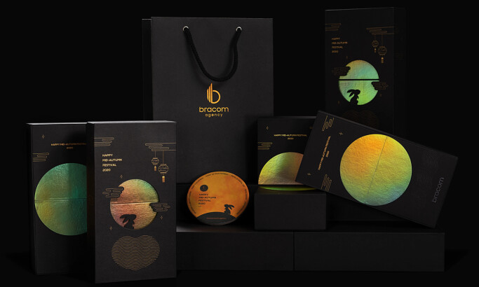
Bracom Mooncake Magic Giftbox
-preview.jpg)
View Design
Magtie Fragrance Packaging
View Design
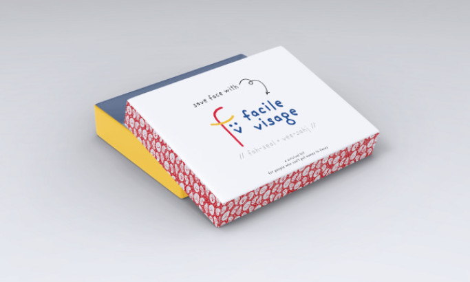
Facile Visage
-preview.jpg)
View Design
Levain Bakery Cookies
View Design
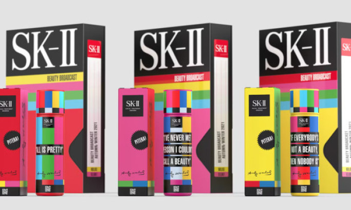
Andy Warhol X SK-II
byLOVE.
Get Connected
With The Right Agency Partner
& Receive Proposals For FREE
Ready to elevate your designs?