Have you ever wondered how much a company invests in redesigning its logo? We all know a logo design is crucial for crafting an identity that stands out. But what happens when the stakes are high, and the budget is even higher?
Join us as we explore the 10 most expensive logo redesign campaigns ever, where creativity meets colossal expenditure.
![]()
10 Expensive Logo Designs That Cost a Pretty Penny
Successful branding often involves hefty costs and complex processes. We’re here to share insights into the most noteworthy and bank-breaking examples of logo redesign done by some of the best agencies specialized in branding.
Whether you're a designer, company owner, or PR professional, these cases offer valuable lessons in balancing familiarity with attracting new customers. Let’s dive into this list of the most expensive logo redesign campaigns that have redefined brands and revolutionized industries.
- Posten Norge
- BP
- City Of Melbourne
- I Love New York
- Cardiff City Bluebirds
- BBC
- City of Belfast
- Pepsi
- Tropicana
- Symantec's Complete Rebranding From VeriSign
1. Posten Norge
Estimated Cost: $55,000,000

To start things off, we'll look at this example from the Norwegian National Post Service, Posten Norge.
This case centers around rebranding, and visual logo redesign. The reason behind the change was modernization. And as you can see, the old logo is quite traditional and outdated as far as design goes.
Upon examination, we can see that the color scheme was changed from a royal red-gold to a more modern silver-red. The reason behind this rebranding move is not only visual, however. The Norwegian Post acquired twelve other companies from the same industry and needed to freshen up.
The famous "Pokeball" was about to be a visual part of Bring, another daughter company of the Norwegian Post.
This included a new brand identity for Norway Post and Bring, which included 10,000 vehicles, 80 tons worth of staff uniforms, 300 IT systems, 1,398 post offices, and 275 containers for 20,000 employees. The sole scale of it shows us that it was an important update.
The total cost of $55 million seems ridiculously high, but it turns out that it helped strengthen the bond between Norwegian Post and the people of Norway. The process started in 2008 and lasted for several years, with Bring having the silver-green combination for its corporate colors.
This case should be taken as a successful example of rebranding. But it can also be considered an easy rebranding, with the national service already enjoying the respect of its citizens, especially Norwegian people, who are famous for being loyal.
There wasn't much at stake, but luckily it worked.
2. BP
Estimated Cost: $200,000,000

In 2000, BP debuted a radical redesign of its logo. The original logo, a crest bearing the company’s initials in capital letters, was replaced by a sunflower shape (called the Helios mark) done in a modernized palette that nevertheless held true to the brand’s original colors.
The updated logo is much friendlier, sunnier, and more modern than the one that preceded it. In collateral introducing the logo, the company wrote:
We’re the helios mark, whose interlocking parts represent the diversity of our people, products, and services. Its radiance is a constant reminder of our aspirations and purpose: to affect life on earth in positive and profound ways.
According to The Telegraph, the logo, created by Landor, cost about £4.6 million, but including the rollout of the logo across properties and collateral, the total cost was £136 million over two years.
Though the costly redesign was criticized by some for being overly expensive and even disingenuous, from a marketing perspective it was considered successful in rebranding the company as more environmentally friendly.
That is at least until the 2010 Deepwater Horizon disaster, which has forced BP to once again focus on rebranding itself to escape the negative associations of the past. As we can observe, the business model can impact the visual aspect of the company, and vice versa.
That said, BP gave itself a fresh redesign and saved face.
3. City Of Melbourne
Estimated Cost: $625,000

The next example up is kind of a strange one: the rebranding of a city. How come a city can brand, or even rebrand itself, one might ask? Well, as it turns out, towns and cities were amongst the first “companies” to have a brand, in the form of a sigil or a crest.
The city of Melbourne jumped on this task, deciding to act by popularizing several of its key attractions back in 2009. The old city logo was not from that long ago, but it was robust nonetheless, and it needed a change. Being a booming business center, city officials decided to hire Landor to redesign the well-known city logo. And they delivered.
The new Melbourne city logo had to go hand in hand with the existing city departments' visual identity while giving off the vibe of a modern business and tourist city at the same time. The designers went with a modern, yet minimal blue-green colored solution, created in a geometrical style.
This made the update quite popular, and it was even reported by several agencies that it helped bring the city to the public attention of Australian people, and tourists all around the globe.
This case should be taken as a prime example that visual identity matters regardless of industry or niche.
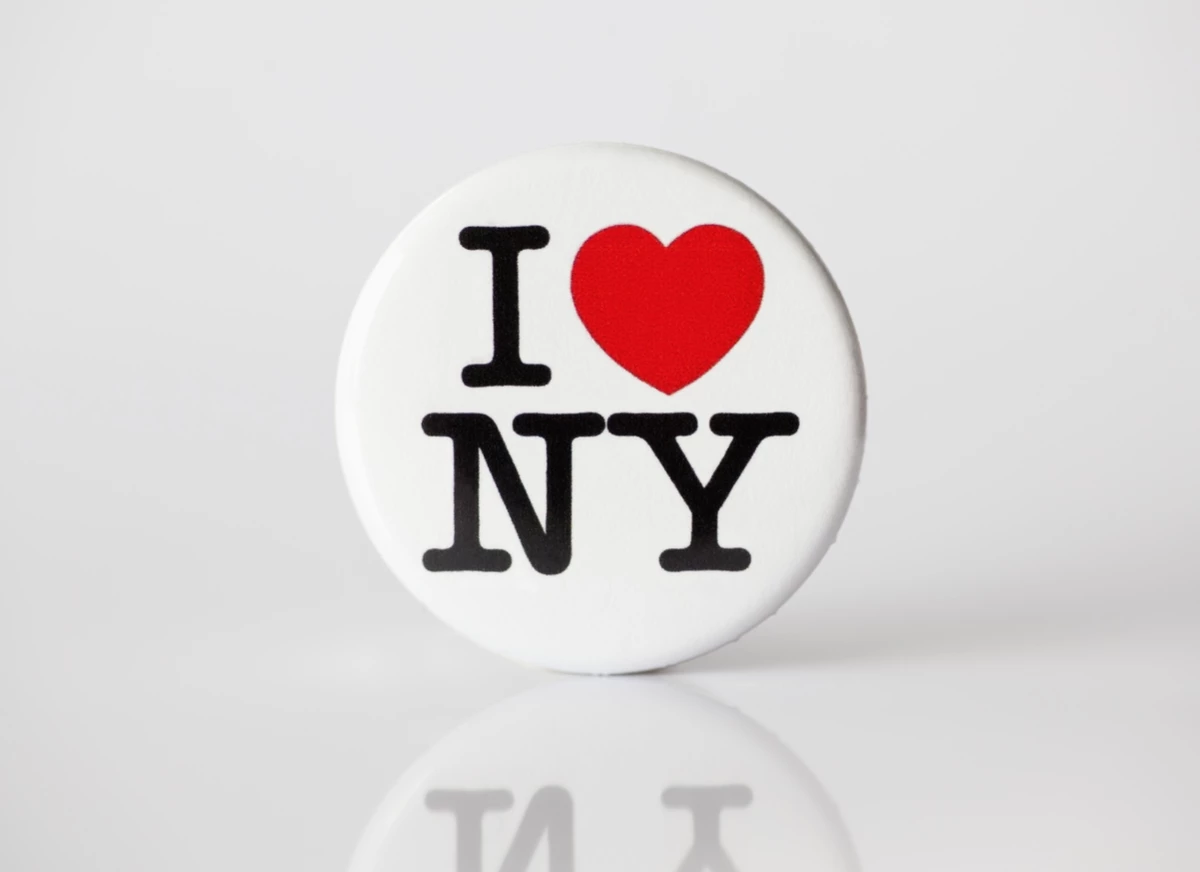
4. I Love New York
Estimated Cost: $16,000,000

Speaking of cities that pay well for a job well done, this next case takes the dollar amount up a notch. The I Love New York logo is right up there when it comes to iconic logos. It was designed by Milton Glaser in the late 70s as part of an initiative to increase tourism in the state of New York.
Anyone familiar with the history of NYC knows that in the seventies the city didn’t exactly have a reputation as a fun, family-friendly vacation destination. The “I Love New York logo”, which endures to this day, had a hand in changing that reputation and making NYC a top tourist attraction.
In 2007, Saatchi & Saatchi won the contract to take over the I Love New York campaign, with a budget of $16 million. By this point, NYC was already a world-class destination that attracted major tourism every year.
The goal of the new campaign was: “To make I LOVE NEW YORK speak to the entire state. To show that the passion and energy present in the city is pervasive throughout every exquisite acre that is New York State.”
As part of the campaign, the I Love New York logo received new treatments that were designed to “breathe life into the iconic logo and showcase that New York is more than just New York City.” The logo treatments were used across print and digital collateral marketed towards specific seasons and New York activities.
5. Cardiff City Bluebirds
Estimated Cost: $100,000,000

Now onto a more controversial story of a soccer team from Cardiff, Wales: The Cardiff City Bluebirds. This case is considered a design failure, and we will analyze the whys and the hows of it. Even though this case has less to do with selling, the vast amount of money invested is no joke.
Back in 2012, the newly appointed CEO, Vincent Tan decided to change the soccer team`s crest and color scheme. As you might have deduced, the team had a bluebird on its sigil, and the official color of the team was blue. Tan decided to change the crest animal to a red dragon and all the team colors to plain red.
But what makes things worse is the reasoning behind the change, which was to “bring good luck to the team." This decision was met with more than a few frowns within the team communication and the fanbase.
Now, to get things clear, changing the crest and colors meant also changing the stadium colors, getting new sports gear, and changing everything even slightly related to the team. And all of that comes with a hefty price. The cherry on top was the decision to keep a small blue bird beneath the dragon, so the nickname Bluebirds was still relevant.
All the changes were reverted a few years later because they were confusing for people familiar with the brand. A that was being generous. The club lost a lot of fans, and all that was due to bad and expensive design calls.
6. BBC
Estimated Cost: $1,800,000

The British Broadcasting Corporation (BBC) hasn’t made any dramatic changes to its logo since the late 50s, but the logo has been revamped many times since then. The most recent redesign was in 1997, and even though the logo in its current iteration is now 20 years old, it still looks fresh.
The 1997 redesign, which is reported to have cost $1.8 million, marked a move away from the italicization that had existed since the three-box logo’s earliest days. The new logo features simpler, lighter typography against a bolder black. If nothing else, the current BBC logo design can stand the test of time.
This case shows us that rebranding is a part of the game, but it doesn't have to be drastic. Minimalism is fair game when it comes to redesigning because the rule stands: less is more. Even though minimalism is everywhere and stuffed down our throats for some time now, it is the safest card to play in the design world.
7. City of Belfast
Estimated Cost: $280,000

As a city with a notorious and violent reputation, Belfast needed something to attract fresh faces. And what better way to do it than with a fresh, new, and modern logo to represent this up-to-date metropolis that has a lot to offer. The simplicity of the easily recognizable heart shape with “Belfast” written inside gives it an enthusiastic new look.
Additionally, there is a version with just the letter B in the heart-shaped box which is instantly captivating and tugs at your heart.
This campaign included a huge amount of promotional material in several colors (lime, blue, fuchsia, maroon, and aqua, etc.). To add to this, the city of Belfast invested in micro-promotions, like stickers and free colorful balloons in the streets, the day a new design was launched.
Some sources report that Belfast experienced a consistent rise in tourist visits as a result of this campaign, and a significant part of this advancement is thanks to a well-executed logo redesign, along with a solid follow-up.
Being consistent with the changes you implement in your visual design is almost as important as deciding to make the change in the first place. And this city proved that rule with its example.
Considering the size of this campaign, the price of $280,000 can be considered quite cheap, and “on budget”. The fact that it succeeded tells us that a good logo and good visual identity need a good follow-up to make it land naturally.
These might be expensive - but it's not all about the money. Read on for our article on Best Digital Marketing Agencies that will save your pennies!
8. Pepsi
Estimated Cost: $1,000,000

The Pepsi logo, with its iconic color combination and swooshing lines, is considered one of the most recognizable logos in the world. The red, white, and blue logo has been around since 1940, though it has gone through many evolutions since then.
In 2009 the logo was redesigned again, resulting in a flatter, more minimalist look for the iconic Pepsi globe. The shape of the elements within the globe also changed, reportedly to conjure the idea of a smile — a friendly and approachable look for a brand looking to appeal to consumers globally.
Arnell Group was behind the 2009 redesign. According to AdAge, the design work itself probably cost upwards of $1 million.
But that's just the beginning. The real cost, said an expert, is in removing the old logo everywhere it appears and putting new material up. When you add up all the trucks, vending machines, stadium signage, point-of-sale materials, and more around the world, it could easily tally several hundred million dollars, the expert said.
With any high-profile logo redesign, there are bound to be haters, and many in the design world were quick to criticize the $1 million price tag for a logo they said didn’t change all that much.
Looking back at the logo from the early 2000s though, it’s clear that a revamp was desperately needed. Despite what the detractors say, the redesigned logo does give Pepsi a more modern appeal. Make sure to check out our article on Pepsi logo design.
9. Tropicana
Estimated Cost: $35,000,000

Tropicana is one of the most well-known juice brands in the world, and its packaging has always been recognizable in supermarket aisles. What’s not to love about the bright colors, the tropical typography, and the evocative image of an orange with a straw in it?
But in 2008-2009 Tropicana decided the old packaging wasn’t cutting it and the company spent $35 million for a new design and a campaign to support it. The only problem was consumers hated it.
The new packaging eliminated the image of orange in favor of a glass filled with juice. It also revamped the Tropicana logo, which was suddenly flipped vertically, diminishing its prominence on the packaging. The Tropicana logo change was so radical that customers didn’t even recognize the brand on the shelves anymore.
It also revamped the Tropicana logo, which was suddenly flipped vertically, diminishing its prominence on the packaging. The change to the Tropicana logo was so radical that customers didn’t even recognize the brand on the shelves anymore.
All in all, the redesign and ad campaign cost Tropicana $35 million, but the brand reportedly lost 20 percent of its sales over the months that followed the launch, meaning the total cost of the whole debacle was ultimately much higher. The company quickly reverted to the original packaging after less than 2 months.
The reverting process took its toll, and the company admitted that rebranding was maybe not the best idea at the time. Here we can learn that tradition has its great value and sometimes it is what brands should stick to.
10. Symantec's Complete Rebranding From VeriSign
Estimated Cost: $1,280,000,000

Yes, you read that right, and yes, that is the correct number of zeroes. The story behind this extremely expensive rebranding venture has a business background, of course.
What VeriSign brought to the game as a new part of the family is the famous checkmark design. But this symbol is not an ordinary check mark. The pixelated version was recognized as a symbol of security among most client groups.
And being recognized, especially in the cyber-security game, is a valuable asset that should be exploited. So, Symantec, after the merger, decided to add this famous sign to their old logo.
What VeriSign brought to the game as a new part of the family is the famous checkmark design. But this symbol is not an ordinary check mark. The pixelated version was recognized as a symbol of security among most client groups.
And being recognized, especially in the cyber-security game, is an asset that should be exploited. So, Symantec, after the merger, decided to add this famous sign to their old logo.
Not only did they decide to add the checkmark, but they also eliminated the spherical shape and made the color scheme simpler. With only two colors, black and yellow, combined with the famous symbol, they arrived at the logo used today.
Even though this is a prime example of utilizing every opportunity a company can get, this move rallied up a lot of skeptics in the field of design asking the same question: “Was it worth it?”.
The point of this type of criticism is aimed at reckless spending, which is frowned upon, especially in the world of visual identity. Truth be told, this billion-dollar merger was a good design solution. However, whether it paid off or not is kind of hard to conclude, considering the economic factors and vast business sectors this company indulges in.
The Best Logo Design Companies in 2024
1. Lounge Lizard
Lounge Lizard has been the go-to agency for top-shelf websites and digital marketing since 1998. With deep roots in advertising and technology, its team crafts best-in-class branding strategies, SEO, digital marketing campaigns, website designs, and mobile apps. Led by a Webby Award Judge and Forbes writers, it has the expertise and experience to help you grow your business in the ever-evolving digital landscape.
The agency takes pride in delivering personalized attention and custom solutions that exceed expectations. Whether you're a startup looking to make a splash or an established brand seeking to reach new heights, Lounge Lizard has the knowledge, creativity, and passion to make it happen.
2. 500 Designs
500 Designs is an award-winning full-service design agency. With a portfolio featuring renowned brands like Google, TikTok, and HubSpot, its work has reached hundreds of millions of users worldwide. Its 100+ expert team approaches every project with passion, and it shows in its creativity, methodology, approach, results, and client relationships.
Founded and led by serial entrepreneurs, it partners with ambitious leaders to design radically better online businesses, leveraging their expertise in branding, website design and development, UI/UX design, and AI strategy
3. Propaganda Creative
Propaganda Creative is your one-stop shop for all your design and marketing needs. Its team of experts covers every aspect of the creative process, from branding and graphic design to digital advertising and social media strategy. With a focus on innovation and a commitment to staying ahead of industry trends, Propaganda Creative ensures your brand stands out in the ever-evolving digital landscape.
4. Digital Silk
Digital Silk is a results-driven agency specializing in crafting custom websites that elevate brands online. Its proven track record spans a diverse clientele, from startups to Fortune 500 companies like SONY, P&G, and Xerox. By focusing on driving higher conversions and maximizing SEO value, they empower businesses to achieve significant growth in the digital landscape.
Whether you need a brand refresh, a cutting-edge e-commerce platform, or a comprehensive digital marketing strategy, Digital Silk's team of experts delivers tailored solutions that get results. Its specialization in branding, web design, SEO, and content marketing ensures a holistic approach to enhancing your online presence and achieving your business goals.
5. Big Human
Big Human has been solving complex problems, creating beautiful digital experiences, developing world-class brands, and incubating its own ideas. It has created innovative products and services for a wide range of clients, from startups to non-profits to household names like Netflix and Gemini. You might have heard of its creations: HQ Trivia, Vine, or Subdial.
Big Human's small but mighty team of designers, engineers, and strategists thrive on tackling complex problems and building beautiful, impactful digital experiences. It has helped people understand what they are watching, invest in cryptocurrency, access food in low-income communities, and take better care of their pets.

Conclusion
So, there we have it — brands paying a small fortune to hit the winning combination to strengthen or reinvent their name. These most expensive logo redesign campaigns offer valuable insight into the importance of a brand's visual identity and the impact it can have on a company's success.
The funds invested and the efforts made often paid off, but sometimes they can cost you if you don't know what you're doing. The real importance of branding resurfaces when the process of rebranding takes place — forcing brands to ask themselves who they are, who their audience is, and if a change will make a positive impact on its base.
After all, a logo can cost between a dollar and a billion dollars, but the rewards reaped from a well-executed rebranding campaign can be invaluable!
Our design experts recognize the most innovative and creative designs from across the globe. Visit Design Awards to see the:
- Best Logo Designs
- Best Website Designs
- Best Video Designs
- Best Print Designs
- Best Packaging Designs
- Best App Designs
Our team also ranks agencies worldwide to help you find a qualified agency partner. Visit our Agency Directory for the top Logo Design Companies, as well as:
- Top Web Design Agencies
- Top Video Production Companies
- Top Print Design Companies
- Top Packaging Design Companies
- Top Mobile App Development Companies


