IBM manufacturers computer hardware and software, and is a research mega titan. They hold the record for most patents generated by a business for 24 consecutive years.
They are worth $162.4 Billion and employ over 300,000 employees worldwide.
That’s enough people to start their own mid-sized city.
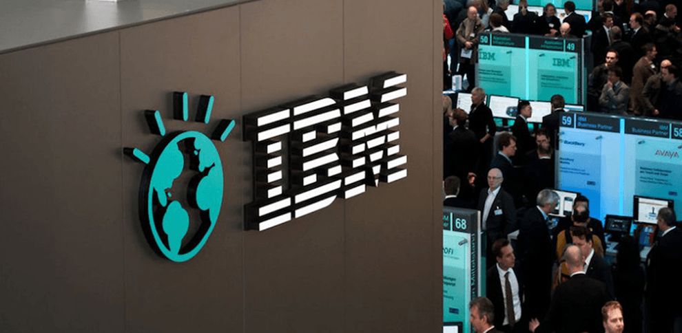
The iconic eight-bar logo has thrived for over 43 years, signaling the company’s power-of-design epiphany in the 1950’s.
International Business Machines sounds boring. It sounds like they sold punch card time-keeping machines in the 1940’s.
They did.
Good Design is Good Business. Those were the words of then CEO Thomas J. Watson, after he stumbled into an irresistible NYC store display of Olivetti typewriters.
His mission? Create a new logo with a contemporary intuition and unique character.
A Pioneering super designer by the name of Paul Rand created the logo. The strong-looking typeface is called City. Rand was not satisfied. Not yet.
He reconstructed the shape of the letterforms. He lengthened the serifs. He made the stacked square in the “B” larger.
1972. Rand decides to add stripes to deliver a sense of oneness to the symbol. Expert logo design companies use stripes to infuse their projects with a sense of motion, usually moving forward.
Fast forward to 2017, Scottie. Though we do not have hoverboards, we have a rapidly changing culture that inspired IBM to create a new symbol—a rainbow version of their iconic 8-bar logo.
The rainbow is recognized worldwide as a symbol of LGBT equality. The rainbow colors are not just any rainbow colors.
They were adopted from the original rainbow colors designed by artist Gilbert Baker and authorized by cultural icon Harvey Milk, before his assassination. Here we can see the crucial element of storytelling in logo design at work.

In addition to storytelling, the logo reflects simplicity in retaining the original eight-bar design. IBM retained its logo legacy by not tinkering with the structuring of Paul Rand’s masterpiece.
IBM is positioning itself as a progressive leader in diversity, advocacy and innovation, at a time where factors like gender inequality in tech reign rampant.
If we are to learn any parcel of information from a best design perspective, it is this:
Iconic logos get better with age.

IBM is a classic logo design in the Manufacturing and Technology industries.