- Home
- Best Designs
- Best Website Designs
- Nerd Wallet
- 404
- About Page
- Black and White
- Blog
- Check Out Page
- Clean / Minimal
- Colorful
- Corporate
- Footer
- Form
- Fullscreen
- Horizontal Layout
- Illustrated
- Images / Gallery
- Landing Page
- Masthead
- Menu
- Microinteractions
- Motion Effects
- Parallax Effects
- Pop Ups
- Portfolio
- Pro-loaders
- Product Listing Page
- Services Page
- Slider / Module
- Sound / Music
- Storytelling
- Typography
- Unusual Layout
- Use of Infographics
- Advertising
- Aerospace
- Agriculture
- Architecture
- Arts & Recreation
- Automotive
- Banking & Finance
- Content & News
- Distribution
- E-Commerce & Retail
- Education
- Engineering
- Entertainment
- Fashion & Beauty
- Food & Beverage
- Government
- Health & Wellness
- Hospitality
- Legal & Insurance
- Luxury
- Manufacturing
- Medical & Pharmacy
- Non-Profit
- Professional Services
- Real Estate
- Sports & Leisure
- Technology
- Travel

Exciting Imagery Gives The NerdWallet Brand A Playful Online Presence
Ready to make the most of out of your money? Let NerdWallet help. Get advice tailored to your needs and access to the right tools to start making better money decisions. This service, which was launched in 2009, aims to help people manage their money more efficiently and offers a host of different tools to help them do so.
According to the brand:
NerdWallet's tailored advice, content and tools ensure you're getting more from your money. We're thinking way outside the box. We all face financial choices at some point. And for a long time, people have been forced to navigate some pretty important decisions without a whole lot of clarity. We set out to change all that in 2009. Our straightforward tools and honest advice help guide you out of debt, calculate your mortgage, make sure you’re on track to retire and so much more.
NerdWallet takes the serious topic of finances and brings a light atmosphere for users to indulge in. Vivid images and playful designs add a flair of life visually, making it easy for users to become immersed in the company’s website.
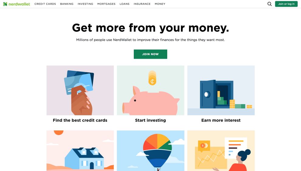
When you first land on the home screen, you’re met with a grid of vibrant and eye-catching images. These illustrations are made up of colorful cartoons that help guide users along the journey, letting them choose the type of service they need.
Each service is represented by a clever block of imagery that makes the brand more approachable and makes users feel better about engaging in the brand’s services.
It’s not always an easy thing to admit you need help financially, but this website design takes the stress and anxiety out with the use of icons, images and colorful effects that create an atmosphere of ease and excitement.
These images are bold and in your face, and they live on every page of the website in some form bringing with them a sense of brand cohesiveness.
This is a financial service that actually wants to help you stay on top of your finances and be in charge. It’s not messing around, either — it’s comprehensive offering makes it clear from the start what users are getting themselves into.
But the use of imagery lightens the mood and makes the experience all the more fun.

NerdWallet’s Simple And Unique Layout Leads Users On A Journey To Money Management
The NerdWallet website layout is clean, modern and fun. There is plenty of white space interspersed with clever imagery and clear organization that makes it easy for the user to choose what service they are in need of.
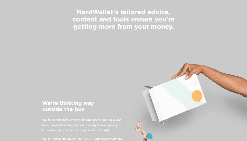
Reminiscent of pouring milk and cereal into a bowl, the page takes a quirky approach to guiding you through each informative passage. Wooden particulates create a steam down the page alongside a flow of milk, walking you past each part of the page and making sure you don't miss a single thing. The entire display combines beautifully with the gray background and white font. It creates a simple and unique website design that’s a fun to look at as you learn about NerdWallet.
This subtle touch of creativity is just enough to keep you scrolling and clicking, but not enough to take away from the powerful information contained within. And there’s an additional, extensive and comprehensive menu bar up at the top of the screen that makes it easy for users to choose what services they need help with — whether that’s banking, credit cards, investing, mortgages or others.
This NerdWallet site screams simplicity and ease. Navigation is a breeze, most of the information readily available on the home screen and easily clickable from there on out. The subtle and creative elements breathe life into this design without getting too off-brand or unbecoming for a financial website.
It’s a serene user experience that creates a journey that takes the thinking out of finances.
As you choose to make the most out of your money, head on over to NerdWallet’s news center to find the latest in financial news that can help you to make more educated decisions. The page is broken down into three different segments by alternating between white and gray backdrops, offering the ability to visually tell the difference. It gives you the chance to pick what area you're going to dive into based on what you're looking for.
Each article is presented with a large and enticing photograph to preview a tad bit of what the article is about. The strong presence of images brings a wide range of colors to the page, giving it a bright and lively feel as you scroll.

The NerdWallet Website Engages Uses Interactive Elements To Immerse Visitors
NerdWallet specializes in making your life easier and what better way to do that than to get you interacting with them from the very start?
The homepage opens with a whimsical image of a man sitting at his computer just like you! You get the feeling he’s researching something and NerdWallet makes it easy for you to join in the researching credit cards efforts with a customizable option to meet your needs. It's the perfect way to pull you into what the site is all about and get you involved from the very beginning.
Similarly, the blocks of images that line the home page in a clean grid have stunning rollover effects, with the colors shifting as your mouse slides over it. This highlights each service individually, while also allowing your mind to subconsciously make note of it and mark it as important.
Similarly, moving images, gifs and more live throughout this website, bringing with them a playful and creative edge that further drives home the easiness that comes with using the site and the approachability of this financial services brand as a whole.
Finances are hard. Managing money can sometimes feel impossible. But NerdWallet wants to dispel those fears and provide you with a financial experience unlike any other. And it does so with interactive elements.
When you decide on a service or click to learn more, you’re brought to pages like the credit card page where a popup flashes across your screen. This asks for more information about your concerns so that it can better give you the information you need.
This is an intuitive and interactive feature that makes consumers trust the brand even more because they can see the dedication right from the start.
The exciting interactivity here is truly one-of-a-kind and sets this financial service apart from the rest.

How To Decide What Direction To Take Your Professional Online Presence
Financial websites are necessary. Whether you’re a corporate entity that’s been around for decades or a modern service that’s looking to shake up the industry — you need a website that works.
Of course, there are different elements right for each, and they are all extremely powerful in their own way. But the first thing brand’s have to do is decide on what they want to come off to their consumers as.
Do they want to be a corporate platform that’s known for their prominence, prestige and authority? Or do they want to be more approachable and down-to-earth? This comes from understanding your audience.
If you’re looking to grab the attention of big businesses, it would make sense to go for a more corporate, sleek and sophisticated vibe. This can be done using a sleek color palette, streamlined organizational pattern, information-focused structure and clean layout. On the other hand, if you want to interact with a consumer-based audience, the human approach is always effective.
But ultimately, this decision comes from your audience and your understanding of their needs. If you don’t know who or what that is, you should make that a priority. Because you could have a knockout website design, but if it doesn’t hit your target audience, it’ll always fall flat.

NerdWallet Elevates Their Brand Identity With Quirky Elements
The NerdWallet website is a unique representation of a financial service that was created with the consumer in mind — you can see this in its tone, its imagery and its overall layout. This website design was made to be easy and fun to interact with — and it was meant to inform with ease and satisfaction.
NerdWallet’s design is clean and playful, making heavy use of clever imagery, iconography and interactive elements to keep users engaged at every step of the way.
And they are led throughout this journey with ease. Clear menu options, a comprehensive drop-down menu and a clean design makes it easy for users to find the information they need, and get an exciting financial education they never thought possible.
The NerdWallet online presence shines thanks to its approachability and playfulness, making it a must-visit destination for users in need of financial advice.
- Industries:Banking & Finance Technology
- Tags:Illustrated Menu Slider / Module Storytelling


