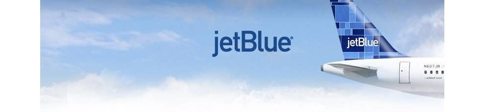
The JetBlue Logo Is Simple And Strong — Just Like The Brand Itself
JetBlue is synonymous with casual comfort, affording users with inexpensive flights of high-quality and transporting them from point A to point B with ease.
This low-cost airline is headquartered in New York City. Founded in 1998 as NewAir, this aviation brand is followed by a legacy of commitment and distinction as a U.S. airline carrier.
After the events of September 11, JetBlue was one of the only airlines to rise to the occasion and continue to drive profits and success. This is a result of their brand’s devotion to providing the best services to its customers.
JetBlue is dedicated to customer satisfaction and aviation excellence. They provide the best they can for their customers — whether they’re in line at security, waiting at their gate, or on board the flight itself.
To match that mission, they needed a logo that was modern, flexible and simple -- something that could become recognizable while still allowing itself to mold and transform in unique circumstances.
They landed on a simple text-based logo that's so iconic and heavily-implemented, it's basically responsive.
JetBlue’s Iconic Blue Symbol Plays With Quirky Capitalization
JetBlue's logo design's most prominent feature is its unexpected capitalization. Like many modern businesses, JetBlue's brand is written as one word.
However, unlike in type, the "j" remains lowercase while the "B" is capitalized, adding an extra dash of creativity to the type trend.
This fun and quirky capitalization choice adds style and personality to the logo design. There’s an otherwise, overall simplicity to this wordmark logo design. But the added capitalized “B” helps the logo to stand strong and powerful against the competition.
This is accompanied by the iconic JetBlue blue, and a sans-serif font that makes this logo bold, responsive and sleek. There’s a modernity to the minimalism that surrounds this logo design, and it’s one whose elements can be seen across collateral.
These simple, strong design elements create a logo that stands out from the competition and their logos.
Maybe it’s the subtle differences in capitalization, maybe it’s the eye-catching bright blue, or maybe its the fact that this design was condensed into one, simple word — but whatever elements give this design its edge, there’s no doubt that this recognizable logo is hard to ignore.
JetBlue’s Logo Emphasizes The Brand’s Commitment To Customer Satisfaction
JetBlue's entire brand identity takes the monotony and outdated personality out of airline travel. Every facet of the company, which was founded 18 years ago by David Neeleman, creates a cohesive vibe of cool, effortless travel that won't break the bank.
After all, their aim is to "bring humanity back to air travel." This feeling of engaging ease is reinforced greatly through their effective, minimal and unique logo design.
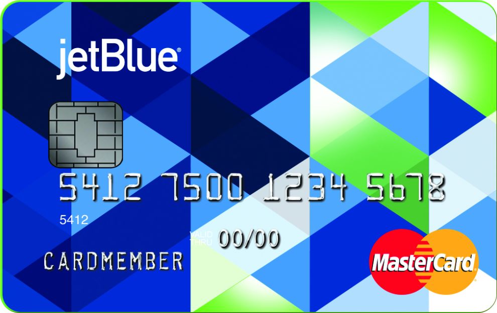
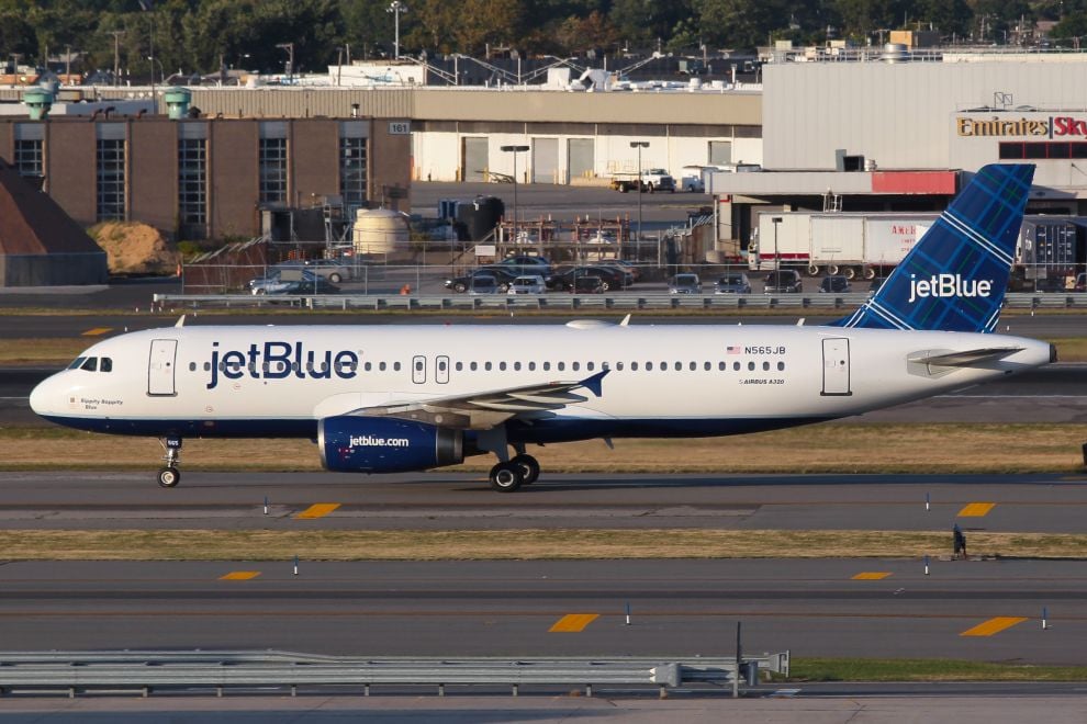
While (obviously) associated with the color blue, many tones and geometric patterns grace the company's collateral. Unique triangle shapes, symmetrical patterns, and their iconic dots grace everything from airplane tails to branded credit cards (complete with brand loyalty rewards, to boot!).
Although all different, they are unified in the same cool blue hues and simple sans-serif logo design, branding each item as JetBlue.
This design and its individual components can be seen across all JetBlue materials. From onboard reading materials to their app design and beyond — you’re met with that same iconic blue, the geometric and modern shapes and the flare that proves that JetBlue is a company made up of people that are dedicated to the job that they do, and are dedicated to making sure you have a flying experience that you’ll never forget — in a very good way.
JetBlue is a brand that is approachable and fun. It’s a brand that is determined to change the face of flying. To recreate this message and further emphasize their intentions, JetBlue uses design elements to give aviation a facelift and change the perception people have about flying.
The JetBlue Logo Is A Powerful Example Of Clean, Modern And Simple Design
JetBlue is a modern and sophisticated aviation brand dedicated to changing the way people perceive flying from point A to point B.
To further emphasize their commitment to change, they integrate a variety of visual design elements to grab attention and open minds.
JetBlue uses quirky capitalization in its logo, typing out the “j” in JetBlue as a lowercase letter and typing out the “B” as uppercase. They also condense the logo into one simple, modern wordmark to create a responsive logo that can be used across a variety of collateral materials.
Similarly, the sans-serif font and bright blue coloring can be seen everywhere you look — from its website design to its food menus provided during your flight. They keep branding consistent and emphasize approachability and friendliness. Check out our article on best airline logo designs.
JetBlue is a brand with a personality, and their design elements make it one you want to interact with.