We've curated a list of the best coffee place logo designs that effortlessly encapsulate a good cafe's warm and energizing essence, representing their respective brands well.
Browse more stunning symbols like these in our best logo designs catalog to get inspired. And if you're brewing a coffee brand or looking to refresh your logo, connect with top-notch logo designers who can bring your vision to life!
Table of Contents
- Cafe Camtown by INK105
- Odyssey by Angela Castro
- Cafe Watt by The Magee Design Company
- Chill Café by Drake Alan
- Roots Coffee House by The Cooper Studio
- Sketchy Beans by Phillip Lehnert
- Duck Lane by InsideOut Consulting Ireland
- C3 Coffee Bar by Dylan Thompson
- Bronze Star Coffee Co. by Arturo Peralta
- The Crossing Coffee Bar by Laura Reid Design
- 205ºF by Cakejira
- Starling Lounge Coffee Bar & Taproom by Porter Graphic Design
1. Cafe Camtown by INK105
Standout Features:
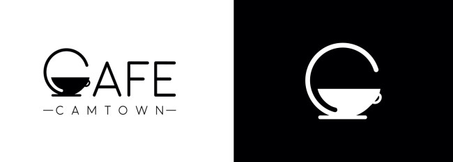
- Cup of coffee integrated into the design
- Sans serif font
- Monochromatic color story
The Cafe Camtown logo by INK105 combines simplicity and symbolism. It cleverly incorporates a cup of coffee at the end within the letter C, representing the brand's initials while paying homage to the beloved beverage.
In addition, its sans-serif typography maintains a clean and modern aesthetic. The monochromatic color story adds a touch of sophistication, making the logo adaptable and instantly recognizable. This is pivotal for building a solid brand identity in the competitive coffee market.
2. Odyssey by Angela Castro
Standout Features:
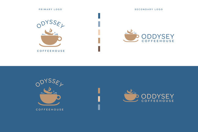
- Two logo versions
- Soothing color palette
- Cup of coffee at the center
Designer Angela Castro used a soothing color story for Odyssey's logo, creating a serene yet inviting visual identity. The design comprises two versions with different placements of the visual elements, making it a versatile logo.
The designer used simple geometric shapes and clean lines to ensure a modern and uncluttered look, ultimately creating an adaptable logo design for different backgrounds. This well-thought-out design represents the brand perfectly and resonates with the calm and enjoyable atmosphere of a good coffee place.
3. Cafe Watt by The Magee Design Company
Standout Features:
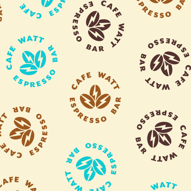
- Lightning bolts incorporated within the coffee beans
- Simple yet symbolic
- Delicate colors
For Cafe Watt's logo design, The Magee Design Company developed a simple yet symbolic creation featuring three coffee beans with lightning bolts at the center of each.
This inventive design is the perfect symbolism of the cafe's name and reflects the energizing effects of coffee. The aesthetic balance between simplicity and symbolism makes this design stand out. Overall, it embodies the essence of Cafe Watt — a mobile espresso bar aiming to provide a rejuvenating coffee experience on the go.
4. Chill Café by Drake Alan
Standout Features:
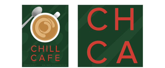
- Multiple Cs
- Thin sans-serif font
- Impactful logo design
Chill Café's logo by designer Drake Alan is part of a broader project for an experiential design class. The project includes various design elements for a hypothetical restaurant, like a poster design, an invitation to a grand opening, an envelope, a menu board, and a billboard. This endeavor helped the designer deepen his understanding of typography, hierarchy, and color theory.
The logo design features multiple Cs resembling coffee's stirring effect, which is a clever visual metaphor connecting to the café theme. The simple color story and impactful design make the logo memorable and relevant to the cafe it represents.
Check out our collection of the best artistic logo designs.
5. Roots Coffee House by The Cooper Studio

Standout Features:
- Coffee plant stem
- Bold typography
- Vintage aesthetic
The logo design for Roots Coffee House, courtesy of The Cooper Studio, was part of a brand refresh under new management. The design features a vintage aesthetic with bold typography and an illustration of a coffee plant, symbolizing the roots of coffee cultivation.
This vintage look and bold typography bring out a rustic yet timeless vibe. It may also resonate well with coffee enthusiasts who appreciate a touch of tradition in their coffee experience.
Find other inspiring examples of using bold letters in logo designs.
6. Sketchy Beans by Phillip Lehnert

Standout Features:
- Fun, quirky typography
- Pale blue color story
- Simple yet full of personality
Logo designer Phillip Lehnert injected a fun personality into the logo he created for Sketchy Beans. It features quirky typography that carries most of the essence and character in this coffee place's logo design. There are also fun icons adorning the logo, including a set of utensils, a coffee bean, a coffee cup, and a laptop.
The logo design is more straightforward compared to its competitors, but its simplicity, paired with its amusing and unique vibe, makes it stand out.
7. Duck Lane by InsideOut Consulting Ireland
Standout Features:
- Duck icon
- Simple typography
- Rustic color story
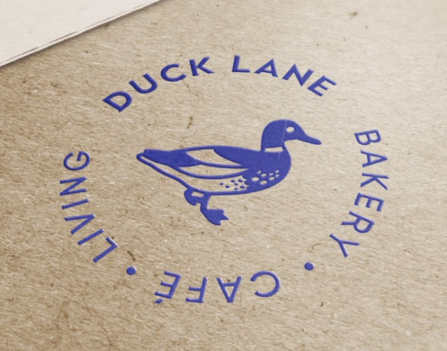
For the coffee shop Duck Lane, logo design company InsideOut Consulting Ireland stayed out of the usual symbolism associated with coffee shops. It used a duck, a direct symbolization of the cafe’s name.
The duck is portrayed right at the center of the logo, with the name of the coffee shop encircling the duck. Its simple typography adds a straightforward and elegant touch to the overall look. Lastly, the rustic color story featuring blue, white, and brown gives the coffee shop a cozy and inviting impression.
8. C3 Coffee Bar by Dylan Thompson

Standout Features:
- Flag with three stars
- Brand name encircling the flag
- Bold, confident typography
Logo designer Dylan Thompson created an impactful coffee place logo design for C3 Coffee Bar. It gives the coffee shop a premium boost since it is not your average coffeehouse with traditional offerings.
The logo features a flag with three stars inside, with the brand's name encircling the flag. Below the logo is the tagline, giving customers a glimpse of what the coffee place offers. The bold typography emphasizes the cafe’s name, effectively capturing one’s attention. To wrap up, the designer used a solid font to convey confidence and make a proud statement.
9. Bronze Star Coffee Co. by Arturo Peralta

Standout Features:
- Interconnected monogram logo
- Earth-toned colors
- Stamp-like visuals
Designer Arturo Peralta showcased their creative prowess in the logo for Bronze Star Coffee Co. With a circular logo and earth-toned colors, it briefly resembles a stamp.
The earth-toned and coffee-inspired colors and interconnected monogram further accentuate the brand's narrative of offering top-quality coffee. Overall, the design elements create a timeless logo that stands out from its contemporaries.
10. The Crossing Coffee Bar by Laura Reid Design

Standout Features:
- Railroad illustration on the letter "N"
- Thin, sans-serif typography
- Minimalist design
The Crossing Coffee Bar’s logo design by Laura Reid Design is an excellent example of incorporating the brand name into the logo without being too obvious. Its standout feature is the railroad illustration on the letter "N."
Additionally, the logo uses sans-serif typography, giving it a cleaner and more polished look. The combination of these small touches overall makes the design more impactful.
11. 205ºF by Cakejira

Standout Features:
- Earthy colors
- Bold typography
- Versatile logo versions
For 205ºF’s logo design, logo design agency Cakejira leaned towards minimalism to attract new customers. The logo design has different versions, perfect for different needs and settings.
The logo design is inviting and cozy, featuring earthy colors inspired by nature and coffee. Another standout element is the stylized “O” in “Two,” adding a unique touch. This circle is also included in other logo versions and usually comes in a different color. These elements combined to create a cohesive coffee shop logo design that fits perfectly with the brand.
12. Starling Lounge Coffee Bar & Taproom by Porter Graphic Design

Standout Features:
- Handwritten typography
- Metallic gold color
- Iconic black bird
For Starling Lounge Coffee Bar & Taproom, Porter Graphic Design developed a logo that infuses elegance with a personal touch. The metallic gold color is an instant eye-catcher. It adds a layer of luxury and warmth, inviting patrons into a space that promises quality and comfort.
The black bird, chosen as the iconic symbol, lends an air of graceful sophistication and is instantly memorable, embodying the venue's spirit and creating a strong visual anchor for the brand's identity.





-preview.jpg)