Designing a logo is arguably the most crucial part of brand-building. Ask anyone, the professionals on both sides of the fence: expert logo designers or brand professionals. Your logo serves as the visual representation of your business. It’s that one image that helps audiences understand your identity. But logos go far beyond that!
A well-designed logo can communicate your brand's values, message, and personality, creating a memorable and lasting impression on your customers. It also helps to differentiate your brand from your competitors, making it easier for customers to find and choose your value proposition.
Why don’t we look at some examples to get those bright ideas coming? Here are some of the most eye-catching and unforgettable logo designs by UK-based agencies that take brand identities to the next level.
Table of Contents
- Solo60 by Danny&co
- Goldenoak by This Is What We Do
- EatSleepSki by penna.design
- Ficus by Winter Graphic Design
- Gain The Edge by Hallmarked Design
- Phil Drinkwater by Creative ID
- Create & Inspire by Martin Barnes Creative
- Cargo by Studio Hicks
- Mama & Flo by James D Whitaker
- OneRegistry by Fuz
- Beauty By Noon by Millside Creative
- Utility Source by Goodinson & Pound
- Refind by Howell & Hicks Creative
1. Solo60 by Danny&co

Standout Features:
- Athletic and professional brandmark
- Linear and slashed icon design
- Clear, minimalist typography
Solo60 is not your regular gym; it’s the UK’s first self-operated gym. It empowers individuals to squeeze in a 60-minute workout on their busy schedules with the convenience of mobile.
We’re amazed by how this flexible, fast-paced, on-the-go value proposition is well-translated on the brand’s logo designed by Danny&co! (Here's how you can strengthen brand identity with USPs)
We were instantly drawn towards the brand icon: an athletic and professional ‘60’ symbol with exciting elements. The white space, square framing, and the invisible X mark resembling an hourglass fit the brand very well.
Plus, that’s how you can create the illusion of movement – even from a static image!
2. Goldenoak by This Is What We Do

Standout Features:
- Outlined tree icon
- The metallic gold color palette
- Spherical visual layout
Talk about turning a brand image into a majestic work of art! Liquor brand Goldenoak stands out in a sea of labels with its intricately designed logo courtesy of This Is What We Do.
The outlined icon of an oak tree is an absolute stunner – illustrated with delicate outlines that branch out in the open. The brand name sits at the center of the image in golden metallic glory.
Rounding up the design is an outer line that combines all elements. But it’s not just a typical frame; it’s the brand’s tagline written in a circular layout for that emblematic style.
3. EatSleepSki by penna.design
Standout Features:
- Luxurious color story
- Elegant logotype and symbol
- Snowflake-inspired icon
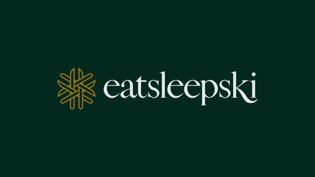
EatSleepSki opens up a world of luxurious ski destinations and this elegant logo creation by penna.design instantly takes us to that one-of-a-kind experience.
The complementary pairing of deep green and royal gold is painted with royalty and exclusivity, immediately establishing the brand as a luxury option.
The subtle yet unmistakable winter themes also do wonders for brand recognition. From the snowflake-inspired brand icon to the classy serif font with a slope-like flick, EatSleepSki’s logo is truly a sight to behold!
4. Ficus by Winter Graphic Design

Standout Features:
- Leaf-like icon illustration
- Wide and bold font
- Gradient color palette
Script developer Ficus takes inspiration from its roots, or its leaves, instead.
The word Ficus means “fig leaf” in Latin, and Winter Graphic Design took this meaningful element and integrated it with the brand’s identity to create a clean and distinctive logo.
We’re talking about a modern outlined illustration of a leaf designed to resemble the brand name’s initial – the letter F. That’s two images in one!
The accompanying logotype is written in broad and bold font. Not only does it make the text more legible, but it’s also got that focused and professional character.
5. Gain The Edge by Hallmarked Design
Standout Features:
- Monochromatic-themed logo design
- Simple yet distinct brand icon
- Minimalist logotype
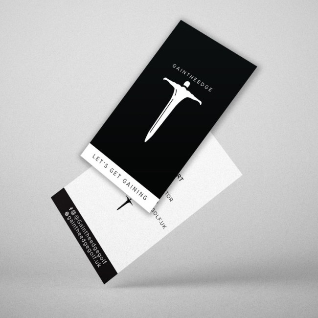
Minimalist logos can go both ways; look plain and uninteresting or like Gain The Edge – simple yet impactful.
Hallmarked Design did a great job creating an emblematic flat icon – an illustration of a man’s figure a la Oscars. It’s an image able to imprint itself on the minds of audiences and create brand recall immediately.
With this iconic visual, the subtle serif logotype at the top accentuates the design and keeps the layout clean and streamlined. The monochromatic palette also adds to the logo’s refined and modern character.
6. Phil Drinkwater by Creative ID

Standout Features:
- Multicolored gradient logo
- Asymmetrical lines
- Sharp and professional font
Here’s the magic of a gradient logo: its colors are guaranteed to grab and hold your attention. Look at this colorful contemporary logo design by Creative ID for Phil Drinkwater! (Explore other examples of gradient logos here)
The asymmetrical lines of the brandmark are painted in shades of solid colors: purple, blue, magenta, and pink. Altogether, they create this aesthetically pleasing vibrant gradient.
With this captivating icon, pairing it with a simple yet sharp sans-serif typeface translates to a more professional look. It establishes the brand as a marketing expert fueled by creativity but still means business.
7. Create & Inspire by Martin Barnes Creative

Standout Features:
- Intertwined logotype design
- Framed brand name layout
- Streamlined brand symbol
Create & Inspire is an independent interior designer who speaks to a high-end market with unique one-off pieces. Its logo design by Martin Barnes Creative is the perfect representation of a robust design principle: less is more.
The delicate, lowercase sans-serif typography evokes that sense of refinement and bespoke quality that the brand is known for. That intertwined detail connecting the brand name is also a nice little touch!
The designer also integrated this style into the logo’s accompanying brandmark, a compact “C&I” symbol that’s easily distinguishable.
Framing the logo in a boxed outline also made for a cleaner, more organized, and sophisticated look – very fitting for an interior design brand!
8. Cargo by Studio Hicks
Standout Features:
- Bright color pop
- Deconstructed logotype layout
- Bold font
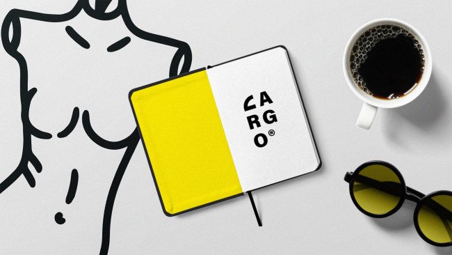
Another interior design company that boasts a creative logo is Cargo. Designed by Studio Hicks, this modern brand image is guaranteed to make you look with its deconstructed beauty.
Having jumbled letters is easily an attention-grabber, but this style choice also fits the brand very well. Rearranging the brand name is a design move that goes with the value of interior design.
And most importantly, the brand name is still legible even with the letter breaks!
The secret? A bold, heavy font. That one little streak of yellow highlight also made the logo more noticeable.
9. Mama & Flo by James D Whitaker

Standout Features:
- Pastel color story
- Fun and lively typeface
- Cutesy heart icons
Colorful logos are always a joy to look at, and this design for Mama & Flo by James D Whitaker is no exception.
The logo conveys the brand's soft and bright identity through its pastel palette of green, gray, yellow, and orange. This aesthetic is on point for a personalized clothing line that caters to mothers and their little ones!
Pairing it with a dainty lowercase logotype translated the brand’s fun and youthful character. Those mini hearts inserted into the letters are also a fun design touch!
10. OneRegistry by Fuz

Standout Features:
- Outlined logo icon
- A clean, straightforward layout
- Simple and sleek typography
OneRegistry is the UK’s go-to cloud collaboration platform for equity and portfolio management, and design agency Fuz created the best logo that represents their top-of-the-line solutions. (Interested to create your portfolio? Here's the step-by-step guide to help you)
The brandmark features a circular icon connecting the brand name’s initials. The image's simplicity and modernity perfectly encapsulate the brand’s innovative technology.
Also, the outlined style makes the logo easily adaptable to any background or illustration.
The logotype’s two-toned color also translates to a more professional yet refreshing look, and the thin sans-serif font is the key to a clean and straightforward layout.
11. Beauty By Noon by Millside Creative
Standout Features:
- Integrated brand name and symbol
- Chic and minimalist brand name
- Classy gold accent
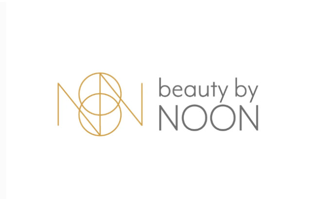
Looking at Beauty By Noon’s logo is like staring at a precious jewel – its golden and rare beauty is sure to catch someone’s gaze.
Millside Creative crafted a brandmark that combines the brand name's letters to create one sophisticated icon. The classy gold accent instantly communicated that Beauty By Noon offers premium brow treatments that help you “be your beautiful.”
The logotype sits beside the icon in a chic and minimalist style, giving the brand a modern touch. Painted in a neutral color, the simplicity of the text drives the focus back into the visual without losing its impact.
12. Utility Source by Goodinson & Pound

Standout Features:
- Light and dark color contrast
- Outlined initials design
- Authoritative logotype
As experts in gas, water, and electric installation services, Utility Source needed a brand image that established their competence. And with their logo designed by Goodinson & Pound, they sure make a great impression!
The logo’s brandmark - an icon featuring the company’s initials - resembles a water pipe or electrical wire. Very much on-brand! Its wavy outlined design is unmistakable and easy on the eyes.
The accompanying logotype in a classic sans-serif font creates an authoritative image, reinforcing the idea that Utility Source is a reliable provider!
13. Refind by Howell & Hicks Creative

Standout Features:
- Fluid-feeling typography
- Open-ended cropped edges
- Clear and concise tagline
It’s impressive how Refind, a Singapore-based glassware provider, pushes for sustainability using recycled materials.
What’s even more remarkable is how Howell & Hicks Creative was able to translate that meaningful brand mission into a unique logo design.
The green bottle, glass graphic, and fluid-feeling typography are the perfect visual representations of the brand. The cropped edges added an extra design flair, too!
And top it all off, the tagline “Repurposing Singapore’s Glass” allows consumers to connect with the brand’s value proposition from the get-go.

Our design experts recognize the most innovative and creative designs from across the globe. Visit Design Awards to see the:
- Best Logo Designs
- Best Website Designs
- Best Video Designs
- Best Print Designs
- Best Packaging Designs
- Best App Designs
Our team also ranks agencies worldwide to help you find a qualified agency partner. Visit our Agency Directory for the top Logo Design Companies, as well as:
- Top Web Design Agencies
- Top Video Production Companies
- Top Print Design Companies
- Top Packaging Design Companies
- Top Mobile App Development Companies





-preview.jpg)