Via’s Ride-Sharing Logo Design Puts The Brand Identity First
Via is one of the newest ride-sharing options to hit the American market. This transportation service is based in New York City and was founded in 2012. In the six years since its conception, the service has grown slowly, but surely. It now services commuters in New York City, Chicago and, Washington D.C.
The service works via a mobile phone app. Commuters can get a flat rate for group ride sharing, getting anywhere in the city for individuals or large groups alike.
Via’s services focus on carpooling — users pay a flat rate to get to their destination, and can either include multiple people from their destination or pick others up along the way. These services have expanded to other cities including Paris and Austin, but Via’s services are currently only widely available in the five boroughs of New York City, parts of Chicago and Washington D.C.
Via is marketed as a friendlier, cheaper alternative to ride-sharing services like Uber and Lyft. It’s not nearly as fast, and the process isn’t as convenient as it is with the others, but that’s because the goals behind each are different.
Via picks up passengers at communal places, intersections, and corners nearest to a rider's location or destination. This is due, in part, to expedite the process, but to also make it easier for others to jump in and jump out along the route.
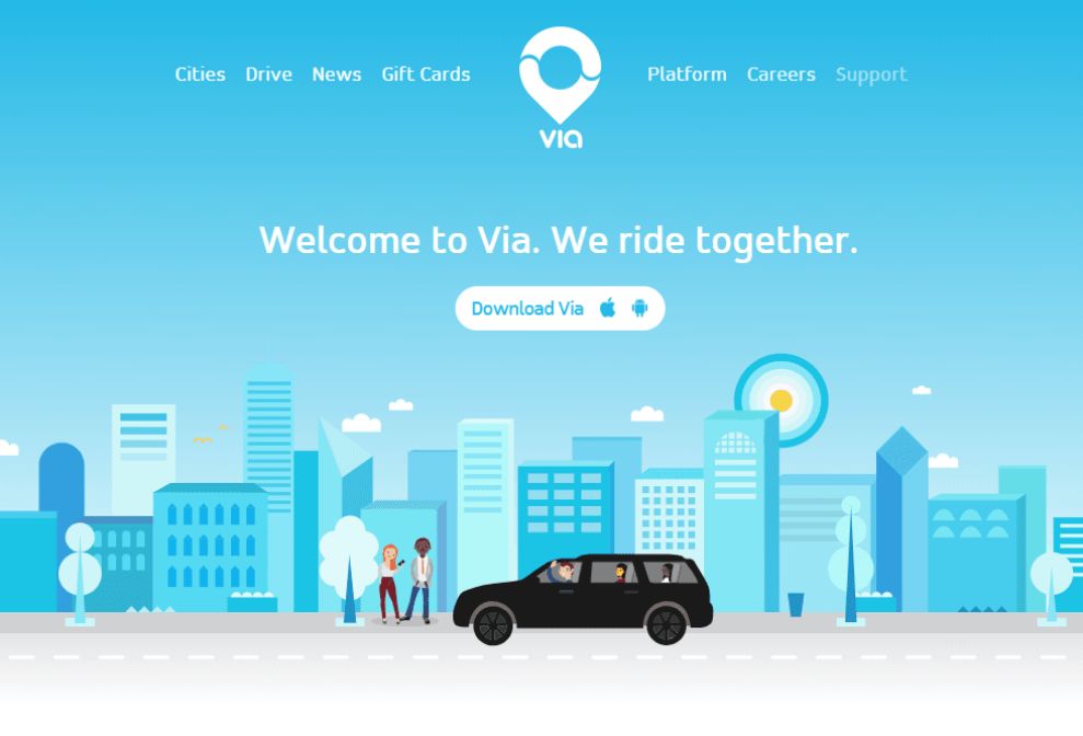
This service is also much cheaper than the competition, and the brand as a whole emits a much friendlier, approachable and down-to-earth vibe. You can see this in its friendly web design, intuitive and creative app and even in its logo design.
The Via app is instantly noticeable, with a lightness and a brightness that further promotes the brand’s dedication to its consumers and the environment.
The Via Symbol Is A Cute, Creative Symbol That Embodies The Brand’s Services
The Via logo is a soft, fluid and bubbly symbol that’s made up of two creative and engaging parts. The first part is the wordmark and the second is the clever and recognizable illustration that sits on most Via marketing materials.
Via’s wordmark is a light, colorful and airy design that instantly evokes happiness and a laid-back vibe. The letters are all written in a lowercase, bubbly font that is thick inviting and comfortable.
The bubbly look of the letters is bright and fun. It makes you happy. It makes you smile. It’s a logo that ditches the sleek, modern and corporate feel of other logos for a feeling of friendliness and approachability.
It also looks like it was written out like a road (almost). The lines are direct and straightforward. They flow with ease and tranquility — taking you on your journey and getting you there with positivity and satisfaction.
The illustration that accompanies this wordmark holds a similar feeling in its creation.
The same baby blue applies to this symbol, and its an image you instantly recognize.
The Via logo includes the image of modern location markers — whether looking at a paper map or on your phone, when you pin a location or mark a destination, you notice a very specific, circular symbol with a pointed bottom.
It’s instantly understood to indicate a location, and it makes perfect sense that this brand — a ride-sharing app — would make use of this modern emblem.
It’s also drawn out in that same baby blue which is happy, carefree and fun.
Overall, the Via logo is modern, fresh and inviting. It makes you feel happy and puts you at ease, while also giving off a subtle authority that makes the brand one you can trust — it knows its brand, it knows its values and it believes in its services. And you should too.
Via's Modern Logo Design Promotes A Friendly And Approachable Atmosphere
The Via logo promotes happiness, positivity and user satisfaction. It matches the overall branding of the platform with ease — capturing an essence of lightness and friendliness that can’t be ignored.
There’s an airy vibe that comes from the light blue color — calming users into happiness and peaceful tranquility. And this color matches the fun and light cartoons that dance across the app and website design.
It’s soft, fluid and fun — the lettering is big, bubbly and full of infectious happiness. It makes you smile in its lack of a corporate, stoic and modern feel. This clean and comforting logo design makes you happy to interact with the brand and its services.
The illustration accompanying the lowercase, bubble-like wordmark is also extremely clever and creative. It is created in the image of modern location services and symbols. It’s drawn out in that same light baby blue but stands strong on its own. It has a point. It has a message. You know what this symbol is the instant you see it — and it’s fitting for a ride-sharing service that drives you from location to location.
This logo design shows a deep understanding of the brand by its creatives. It’s intuitive and straightforward, while still holding a creativity and a lightness that promotes the brand’s identity and opens it up to wider audiences.
The Via logo is a stunning display of intuitive design and clear understanding of a brand and its services.


