-account-photo_listing.jpg)
-account-photo_listing.jpg)


Our Jury has worked with Prada, Nike, Chanel, Google, and Apple.
Best Clothing Brand Logo Designs of 2026
View the Top Clothing Brand Logo Designs Below
Best Clothing Brand Logo Designs of 2026
4,200+ Submitted Designs
- Advertising
- Agriculture
- AI
- Airline
- Alcohol
- App Company Logo
- Architecture
- Arts & Recreation
- Automotive
- Banking & Finance
- Beer
- Church
- Clothing Brand
- Coffee
- Content & News
- Distribution
- E-Commerce & Retail
- Education
- Engineering
- Entertainment
- eSports
- Farm
- Fashion & Beauty
- Food & Beverage
- Government
- Health & Wellness
- Hospitality
- Legal & Insurance
- Luxury
- Manufacturing
- Non-Profit
- Photography
- Professional Services
- Real Estate
- Restaurant
- Restuarants
- SEO Agencies
- Shoe Brand
- Small Business
- Software
- Sports & Leisure
- Startup
- Technology
- Travel
- Video Companies
- Weed/Cannabis
- Abstract
- Animated
- Artistic
- Bakery
- Black
- Black & Yellow
- Blue
- Bold Logo
- Brand
- British
- Business
- Circle
- Creative Name
- Dental Office
- Done by Freelancers
- Emblem
- Floral
- Geometric
- Glow
- Gradient
- Gym
- Icon
- Illustration
- Lettermark
- Logo symbols
- Makeup Brand
- Marathon
- Minimal
- Modern
- Monogram
- Multicolored
- Nature
- Negative Space
- Rebranding
- Red
- Redesign
- Simple
- Starting With the Letter S
- Successful
- Sunshine
- Trendy
- TV Channel
- Typography
- Unisex Salon
- Vintage
- Water
- Watercolor
- Wordmark
★9/10
 LS 9.00
 AO 10.00
 SH 9.00
 BD 8.00
View Design
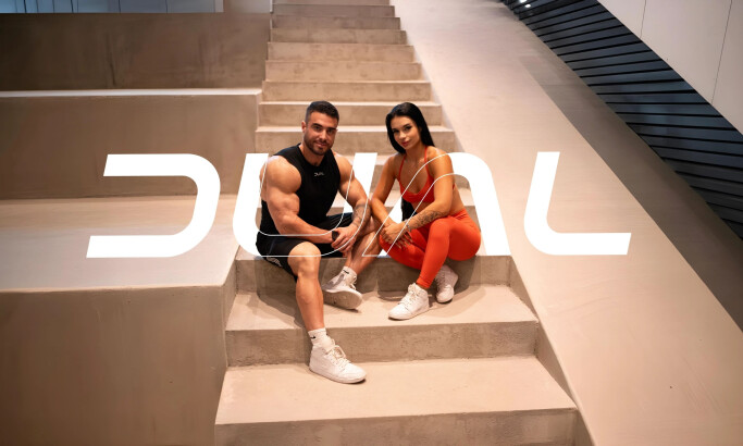
DUAL Fitness
View Design
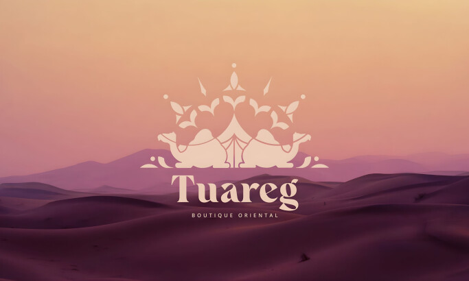
Tuareg Boutique Oriental
View Design
Atelier Lapsa
View Design
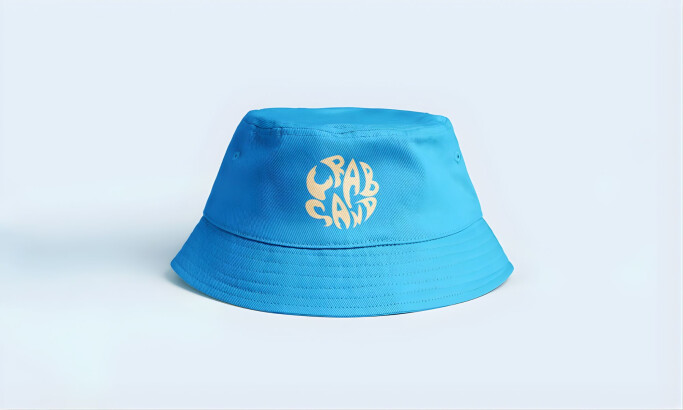
Crab Sand
View Design
Pacific Adventure Works
View Design
Lali Chic
View Design
Pedant

View Design
Daedalus

View Design
Tocatì
Get Connected
With The Right Agency Partner
& Receive Proposals For FREE

View Design
CD BRAND – Female
byLotipa

View Design
TANSU studio

View Design
Insomnia - Through The Pain

View Design
Bianquine Store

View Design
MAUVAIS CHOIX

View Design
maybe later

View Design
A Dream
View Design
HYDRO
Ready to elevate your designs?