


-preview-webp.webp)
Receive our NewsletterJoin over 70,000 B2B decision-makers growing their brands
Branding Trends
Read up on emerging trends in the branding world to stay ahead of your competition. We present how-to guides, examples, and techniques to become better in this field. Our resources will equip you with insights to navigate the landscape of brand development.

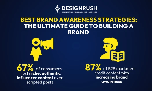
15 Best Brand Awareness Strategies: The Ultimate Guide To Building a Brand
| 11 months ago | 10 min read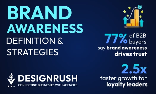
What Is Brand Awareness? Key Drivers, Strategies, & ROI in 2026
| 7 months ago | 12 min read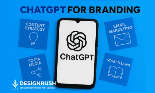
ChatGPT for Branding: 15 High-Impact Use Cases with Prompts & Best Practices
| 1 year ago | 18 min read
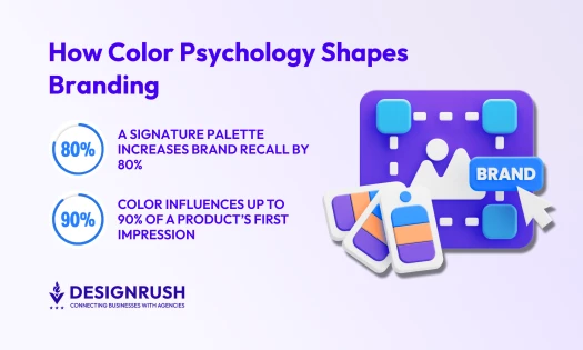
Branding Color Psychology: How To Choose Colors That Define Your Brand
| 7 months ago | 6 min read
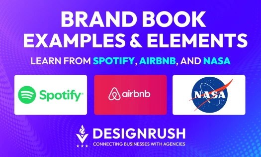
Brand Book: Core Elements, Examples & How To Build One That Lasts
| 5 months ago | 15 min read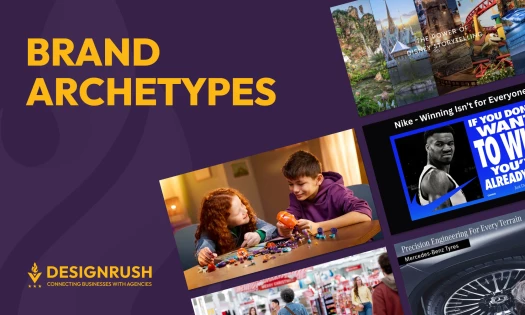
Brand Archetypes: What They Are and How They Shape Memorable Brands
| 1 year ago | 9 min read
Receive our NewsletterJoin over 70,000 B2B decision-makers growing their brands