-account-photo_listing.jpg)
-account-photo_listing.jpg)


Our Jury has worked with Prada, Nike, Chanel, Google, and Apple.
Best Negative Space Logo Designs of 2026
View the Top Negative Space Logo Designs Below
Best Negative Space Logo Designs
4,200+ Submitted Designs- Advertising
- Agriculture
- AI
- Airline
- Alcohol
- App Company Logo
- Architecture
- Arts & Recreation
- Automotive
- Banking & Finance
- Beer
- Church
- Clothing Brand
- Coffee
- Content & News
- Distribution
- E-Commerce & Retail
- Education
- Engineering
- Entertainment
- eSports
- Farm
- Fashion & Beauty
- Food & Beverage
- Government
- Health & Wellness
- Hospitality
- Legal & Insurance
- Luxury
- Manufacturing
- Non-Profit
- Photography
- Professional Services
- Real Estate
- Restaurant
- Restuarants
- SEO Agencies
- Shoe Brand
- Small Business
- Software
- Sports & Leisure
- Startup
- Technology
- Travel
- Video Companies
- Weed/Cannabis
- Abstract
- Animated
- Artistic
- Bakery
- Black
- Black & Yellow
- Blue
- Bold Logo
- Brand
- British
- Business
- Circle
- Creative Name
- Dental Office
- Done by Freelancers
- Emblem
- Floral
- Geometric
- Glow
- Gradient
- Gym
- Icon
- Illustration
- Lettermark
- Logo symbols
- Makeup Brand
- Marathon
- Minimal
- Modern
- Monogram
- Multicolored
- Nature
- Negative Space
- Rebranding
- Red
- Redesign
- Simple
- Starting With the Letter S
- Successful
- Sunshine
- Trendy
- TV Channel
- Typography
- Unisex Salon
- Vintage
- Water
- Watercolor
- Wordmark
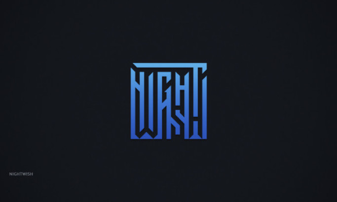
View Design
Nightwish
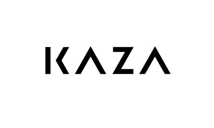
View Design
Kaza Interior
View Design
Monogram Logo Design
View Design
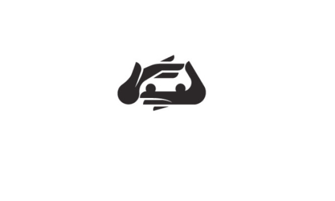
Hands Sharing Car
View Design
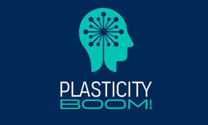
Plasticity Boom

View Design
The Swan & Mallard
View Design
Soil Skincare
View Design
The Grove

View Design
First Artist Bank
Get Connected
With The Right Agency Partner
& Receive Proposals For FREE
-preview.jpg)
View Design
Bar Cardinale at Severin Hotel
Ready to elevate your designs?