
See the measurable business impact our winners achieved after receiving recognition
Winner


See the measurable business impact our winners achieved after receiving recognition
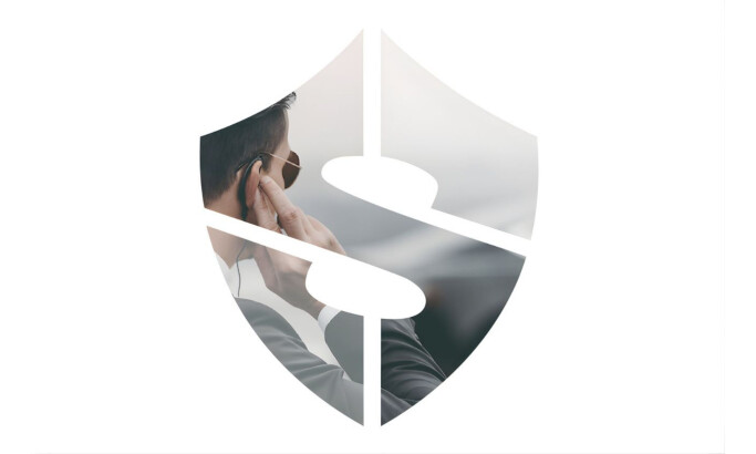
Our design research process is a dynamic journey in the ever-evolving landscape of logo design. We search the web, contact brands and agencies, and evaluate the designs worthy of being part of our collection. To be acknowledged among the best logo designs, one must master innovation, trends, impact, functionality, and most importantly, brand recognition.
Designs that manage to transcend expectations and take logo aesthetics to the next level gain recognition, and the finest among them may advance further and compete for the title of Design Award winner.
If you believe your design embodies these principles, you too can submit it for consideration, contributing to the vibrant tapestry of logo design excellence.
Ready to elevate your designs?


-account-photo_listing.jpg)
-account-photo_listing.jpg)


-preview.jpg)