-account-photo_listing.jpg)
-account-photo_listing.jpg)


Our Jury has worked with Prada, Nike, Chanel, Google, and Apple.
Best Geometric Logo Designs of 2026
View the Top Geometric Logo Designs Below
Best Geometric Logo Designs of 2026
4,200+ Submitted Designs
- Advertising
- Agriculture
- AI
- Airline
- Alcohol
- App Company Logo
- Architecture
- Arts & Recreation
- Automotive
- Banking & Finance
- Beer
- Church
- Clothing Brand
- Coffee
- Content & News
- Distribution
- E-Commerce & Retail
- Education
- Engineering
- Entertainment
- eSports
- Farm
- Fashion & Beauty
- Food & Beverage
- Government
- Health & Wellness
- Hospitality
- Legal & Insurance
- Luxury
- Manufacturing
- Non-Profit
- Photography
- Professional Services
- Real Estate
- Restaurant
- Restuarants
- SEO Agencies
- Shoe Brand
- Small Business
- Software
- Sports & Leisure
- Startup
- Technology
- Travel
- Video Companies
- Weed/Cannabis
- Abstract
- Animated
- Artistic
- Bakery
- Black
- Black & Yellow
- Blue
- Bold Logo
- Brand
- British
- Business
- Circle
- Creative Name
- Dental Office
- Done by Freelancers
- Emblem
- Floral
- Geometric
- Glow
- Gradient
- Gym
- Icon
- Illustration
- Lettermark
- Logo symbols
- Makeup Brand
- Marathon
- Minimal
- Modern
- Monogram
- Multicolored
- Nature
- Negative Space
- Rebranding
- Red
- Redesign
- Simple
- Starting With the Letter S
- Successful
- Sunshine
- Trendy
- TV Channel
- Typography
- Unisex Salon
- Vintage
- Water
- Watercolor
- Wordmark

View Design
Meow
View Design
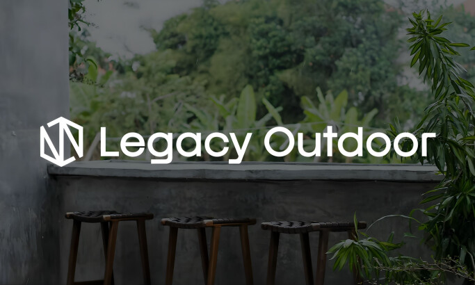
Legacy Outdoor
View Design
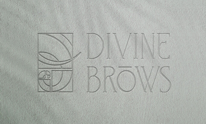
Divine Brows
View Design
IIM - Generative Museum
View Design
Pacific Adventure Works

View Design
Playstation Logo
View Design
Juno Hotel Sofia
View Design
Alma by Gelutz

View Design
Mercedes Benz
Get Connected
With The Right Agency Partner
& Receive Proposals For FREE

View Design
Tinder
View Design
Munich RE
View Design
Eternal Luxury
View Design
Arizona Coyotes Logo Evolution

View Design
Woolf Logo Design
View Design
Voka

View Design
Trifecta

View Design
Toblerone
View Design
Rubi Residencias
by22DG
Ready to elevate your designs?